
“In nature, light creates the color. In the picture, color creates the light.” – Hans Hofmann
Colors play a big role in design. They have a huge impact on the mood of the designer and the viewer. They could either be made to feel like they’re basking in the sun’s glory or like they’re cradling a hot cup of tea on a rainy day. And to invoke those emotions, designers and artists alike use the famed color wheel.
Wondering what exactly a color wheel is? Well, just like music, colors have patterns and combinations that make us feel differently. The color wheel represents all the possible combinations of colors an artist could use.
Taking the analogy of music further, color patterns that look good together are commonly known as color harmonies. And with regards to harmonies, there are a bunch of color theory terms you need to learn, including complementary colors, analogous colors, and triadic colors.
But for the purpose of this guide, we’ll be taking a look at everything you need to know about complementary colors on the wheel. Starting with the color theory and then the color wheel. Continue reading for the full details below.
Bonus: Learn How To Create A Brand Identity Using Complementary Colors
Color Theory and the Color Wheel
You can’t have a comprehensive study about complementary colors without first getting a deep understanding of the color theory and color wheel.
Understanding the Theory of Color
Color theory is the art and science of using color to express and perceive emotions. It is the study of how colors mix, match, and contrast with each other to express certain thoughts. It also involves understanding what colors go well together and how to use different color combinations to capture different moods.
Dated back to the late 17th century, Sir Isaac Newton designed the color wheel at the heart of the color theory by mapping the color spectrum into a circle. Since then, the geometric connections illustrated on the color wheel have made the color wheel a go-to for designers and artists looking for harmonious color combinations.
During school days, we learned that color is the name given to the wavelengths of light grasped by the color receptors in our eyes. The objects we see absorb and reflect different wavelengths of light, and then those combinations are picked up by our eyes, which transform them into what we call color. But when it comes to art, there’s a bit more to that.
Bonus: 6 Tips For Designing Graphics That Are Colorblind Friendly
Complementary Colors Wheel
The color wheel consists of 12 hues of pure colors, which are further broken down into three subsets of colors, namely, primary, secondary, and tertiary colors.
What are Primary Colors?
There are three primary colors, namely, red, yellow, and blue. While these are the primary colors for artists and designers, physicists see red, green, and blue as primary colors instead.
The reason for this is that there are two different color theories. One for material colors used by artists and designers and the other for colored lights. If you’re interested in geeking out over colors, go crazy with the HowStuffWorks explanations.
But regarding what we are dealing with here, all you need to know is that Isaac Newton was the one who discovered that we could use prisms and mirrors to combine red, green, and blue (RGB) to create white light. Hence the name ‘primary colors’, as they are the basic ingredients that make up pure white light.
What Are Secondary Colors?
There are three secondary colors, which are green, orange, and purple. They are formulated by combining primary colors.
Secondary colors are created as follows:
- Yellow + Blue = Green
- Yellow + Red = Orange
- Red + Blue = Purple
What are Tertiary Colors?
Tertiary colors are the colors you get when you mix primary and secondary colors together, and they are known by two hue names.
Tertiary colors are six altogether, and they are:
- Blue-Green
- Red-Violet
- Yellow-Orange
- Red-Orange
- Red-Purple
- Blue-Green
- Yellow-Green
Pure Colors, Tints, Shades, and Tones
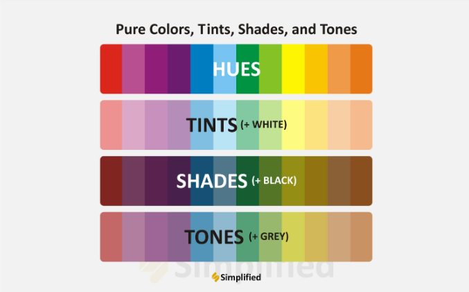
Source: Simplified
Pure colors, also known as “hues,” are a gradation or variety of colors on the color wheel known as tints, shades, and tones.
To obtain a tint, you simply add white to the hue (or pure color). For example, to get a red tint, add white to the hue, and it will give you pink.
On the other hand, you’ll have a shade when you add black to a hue. For example, if you mix black with pure red, you get the shade of burgundy.
And a tone is when you add grey to a pure color or hue. This will darken the original hue and make the color less intense. This trick is best employed to create a subtler effect.
Another thing you need to know about navigating the color wheel is that there are warm and cool colors on the color wheel. Drawing a line across the center of the color wheel will separate warm colors from cool colors.
Warm colors are reds, oranges, and yellows, and are generally used to express energy, brightness, and action. On the other hand, cool colors are blues, greens, and purples, and are usually used to express calm, peace, and serenity.
Are you feeling a bit more confident with the color wheel now? Good! Let’s see what colors have the potential to work well together (according to the color theory).
What Colors Work Well Together?
You can develop many color schemes with the color wheel. However, we are focusing on complementary and split complementary color schemes.
Complementary Colors
In a simple term, complementary colors are colors that complement each other. These are usually the two opposite colors on the color wheel.
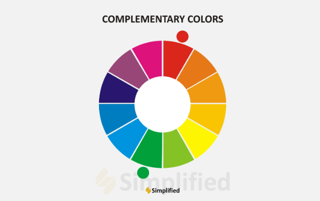
Source: Simplified
For example, the opposite colors on the complementary color wheel in the image above explain the theory. The sharp contrast between the two colors makes designs and works of art pop.
Split Complementary Colors
A split-complementary color scheme is a variation of a complementary color scheme. But rather than being a mixture of two opposite colors, split complementary colors are a combination of three colors on the complementary color wheel.
When you mix one primary color and the two colors adjacent to its complement, you get split complementary colors. This way, you would get a greater contrast than if you had used only standard complementary colors.
If you’re on the hunt for split complementary colors, start with a base color, combine it with two colors adjacent to the opposite color on the color wheel, and leave the complementary color out.
For example, if you take orange to be your base, combine it with blue-purple and blue-green to get your split complementary. However, make sure you don’t end up with an image that’s too busy or over-contrasted.
To make it simpler, here are the 12 basic split-complementary color schemes you can work with:
- Red + Blue-Green + Yellow-Green
- Orange + Blue-Purple + Blue-Green
- Red-Orange + Blue + Green
- Red-Purple + Yellow + Green
- Yellow-Orange + Purple + Blue
- Yellow-Green + Red + Purple
- Yellow + Blue-Purple + Red-Purple
- Green + Red-Orange + Red-Purple
- Blue + Red-Orange + Yellow-Orange
- Blue-Green + Orange + Red
- Blue-Purple + Yellow + Orange
Working With Complementary Color Palettes On Simplified
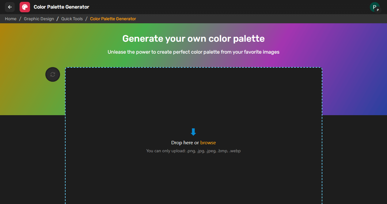
Source: Simplified
The Simplified Color Palette Generator tool offers hundreds of free templates, assets, images, and more for you to use while experimenting with complementary colors. Whether you’re working on your own or as part of a team, Simplified offers a color scheme that perfectly matches your favorite designs.
Simply upload your photo or design and the tool will use the hues in your photo or design to create a perfect palette for you.
Bonus: 5 Golden Rules of Crafting Creative Logos: Welcome to the World of Creative Logo Design
Conclusion
Understanding color theory is crucial to making an informed decision. This will help you choose complementary colors schemes that blend perfectly with your design projects. By using the Simplified Color Palette Generator tool, you can create harmonious color schemes for engaging, impactful, and memorable visual designs.


")