An app icon can have a tremendous impact on impressions and interactions. So, any business or individual needs to try and make it meaningful. A good app icon design not only helps the user recognize the app on their device itself but also generates interest in the app store.
Moreover, an ideal app icon should convey its purpose and benefits instantaneously. So, are you wondering how to create the perfect app icon design? Check out our guide below for all the know-hows.
What is an app icon?
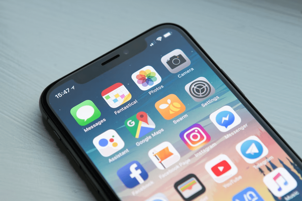
Right off the bat, it’s important to note that app icons are not logos. Of course, logos can be used as your app icon. However, it depends on the brand. That’s because a logo doesn’t always present the best user experience.
App icons essentially have the same purpose as a logo – identification. The only difference is that a logo identifies a company across a vast series of mediums, while an app icon solely identifies one product from a company on mobile devices.
Yes, they are extremely different. For example, company X can have multiple game applications. However, each game has a specific app icon design to help users identify it. To simplify it further, logos can be scalable and be used in all of the company’s marketing activities, like ads, flyers, etc. App icons, on the other hand, will always be limited to identifying a single app.
What are the current app icon design standards?
The Apple App Store and the Google Play Store are where you can find almost all applications. Both businesses have set guidelines for the appearance of your app. Following these guidelines will help the app keep up to date with current trends.
When it comes to downloads, it is preferable to go with the tide and receive more downloads than to stand out and attract minimal notice.
Google’s most recent design language, known as Material Design, advocates creating a visual experience while designing an app icon design. They want the app’s users to have a sense of interaction with it. Additionally, the style of the app icon helps people imagine the experience of using it.
What’s truly brilliant about the Material Design guidelines is that they provide extremely detailed recommendations for end-to-end app icon creation. From size to color schemes, you’ll find everything you need! Similarly, Apple has recommended certain guidelines for its iOS ecosystem.
Although Apple’s Human Interface Guidelines are not as detailed as Material Design, it basically recommends designers create app icons that look less like pixels and more like visually appealing graphics. Apple asks designers to create an app icon style with one single identifiable point that captures the user’s attention. Most importantly, they recommend keeping it simple.
Related: 9 New Year Resolutions For Graphic Designers
App Icon Design: Size & Format
The size and format of the app icon are extremely important to the overall user experience. App icons are usually tiny and don’t have a ton of flexibility. Other than the home screen, you can find them at an even more reduced size in the sub-menus.
Now, what if the designer doesn’t create a good-quality app icon? These various size fluctuations can really hurt the user experience. You don’t want legibility issues or strained eyes to be the reason for uninstallations.
So, what are the recommended dimensions?

When creating an app icon for Android, ensure it is in line with the following:
- Final size: 512px x 512px
- Format: 32-bit PNG
- Color space: sRGB
- Max file size: 1024KB
- Shape: Full square – Google Play dynamically handles masking. Radius will be equivalent to 20% of icon size.
- Shadow: None – Google Play dynamically handles shadows.
Additionally, developers will save different-sized app icons for various screen densities. Then, they’ll store them in a density-specified directory within the application. This is beneficial as the app icon design looks consistent across various android devices.
For iOS app icons:
On the other hand, iOS icons are recommended to have a size of 1024×1024 pixels. However, you don’t need to have multiple variations in a specific folder as Apple will take care of the resizing across various devices and sub-menus.
As for the format, both Android and Apple recommend saving the app icon as a PNG file.
Tips for Designing the Perfect App Icon
1. Uniqueness
Your app is going to have to stand out. It’s going to be constantly competing with millions of apps on each store it can be found on. Additionally, your app icon design needs to stand out even when it is downloaded and on a user’s home screen. If not, engagement will dwindle after the initial download since users will forget it’s even on their phones.
So, uniqueness becomes extremely important. We recommend you gravitate towards a design with purpose. Something that will evoke an emotional attachment. The app store is the best place to start. Start by researching the most popular apps in your industry and analyze their design, elements, symbols, colors, and graphics.
2. Simplicity
Simplicity is key when it comes to recognizability. However, simplicity doesn’t have to be boring. By removing distracting elements, you can expect the app icon to pop more. This will result in instant recognition.
If you’ve noticed, all the major brands only use a couple of elements or colors. Keeping it simple also has its practical benefits. It helps the app icon design stay legible and consistent across various sizes.
Experts also recommend using symbols instead of words as it’s easier to understand.
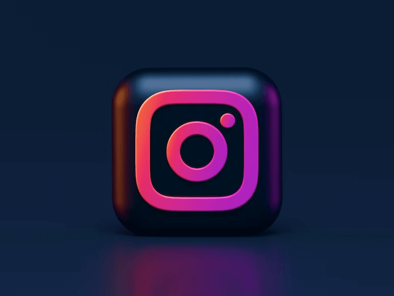
For example, Instagram is easily identifiable due to its camera app icon style. It also clearly tells its users what to expect after opening the app. Cramming words into a tiny app icon can make it look busy and, worse, illegible.
3. Color
When it comes to app icon style and overall app icon design, color is a necessity. Vibrant colors will always help the app stand out and can even contribute to an increase in user engagement. For example, Instagram’s spectrum of colors is always pleasing to the eyes.
You should also ensure that the app icon looks good on various backgrounds and stands out just the same. This is especially important, as there’s a variety of wallpapers out there that can mask your app’s existence. When choosing a color, make sure it aligns with your business, industry, or niche. Most importantly, ensure it stands out from your competition.
Final Thoughts
As mentioned earlier, app icons are extremely important to any business as it helps users identify and interact with the company’s digital product or service. Since it has such a significant role in user engagement, the app icon style must be designed with care.
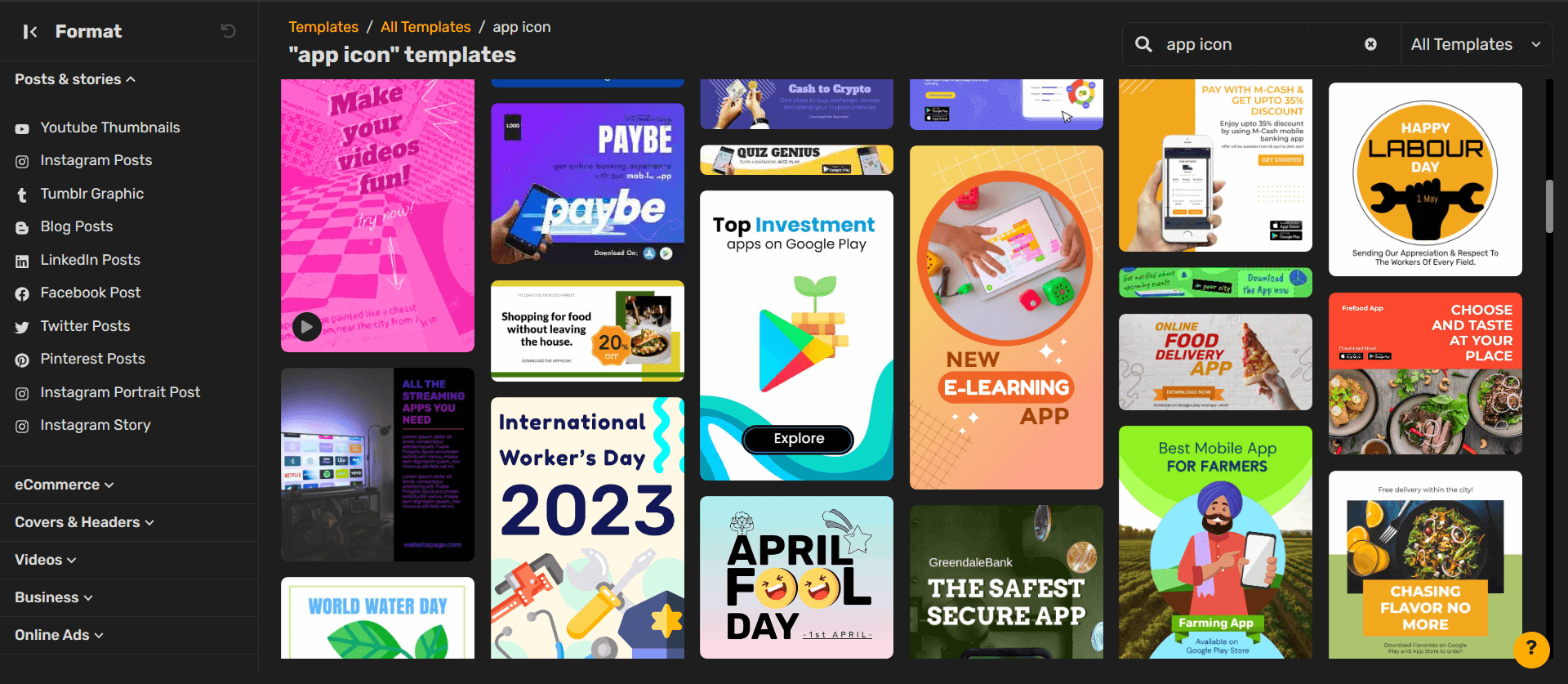
Fortunately, app icons don’t have to be permanent. If something isn’t working, you can always experiment. We suggest A/B testing your app icon to see which iterations lead to more interactions.
However, you should know that it takes 9 days for a new app design to be updated and 9 days for you to revert it to the old design. So, it’s better to be sure before you make the decision.
Designing an app icon can be tricky but with the right tool, creating designs is a breeze! This is where Simplified comes in to help you bring your ideas to life. Simplified is the no-code app to design invitations, ads, social media posts, videos, and more! Create, collaborate with your team, and publish online – all in one place.
With free graphic design tool and templates, AI text and image generator, and a premium library, you can build your brand on Simplified easily. With free design tool and templates, AI text and image generator, and a premium library, you can build your brand on Simplified easily.

![7 Best AI Image Restoration Tools to Try in 2024 [Free & Paid] 7 Best AI Image Restoration Tools to Try in 2024 [Free & Paid]](https://siteimages.simplified.com/blog/Best-Free-Paid-AI-Image-Restoration-Tools-01.png?auto=compress&fit=crop&fm=png&h=400&w=400)
![How to Use Photoshop AI Generative Fill Feature [2024] How to Use Photoshop AI Generative Fill Feature [2024]](https://siteimages.simplified.com/blog/How-to-Use-Photoshop-AI-Generative-Fill-01-1.png?auto=compress&fit=crop&fm=png&h=400&w=400)
![20 Podcast Thumbnail Ideas to Boost Your Show’s Visual Appeal + Best Practices [2024] 20 Podcast Thumbnail Ideas to Boost Your Show’s Visual Appeal + Best Practices [2024]](https://siteimages.simplified.com/blog/Podcast-Thumbnail-Ideas-to-Boost-Your-Show-02-1.png?auto=compress&fit=crop&fm=png&h=400&w=400)
