Beyond aesthetics, your choice of colors speaks volumes about your brand’s values and customer perception. Are you exclusive, accessible, friendly, cheerful, or mysterious? The colors say it all!
Dive into the captivating world of color psychology and discover how to harness its power to create compelling brand identities and brand kits. Read on to learn how you can use the power of color psychology if you are working on your own branding or brand kits.
What is Color Psychology?
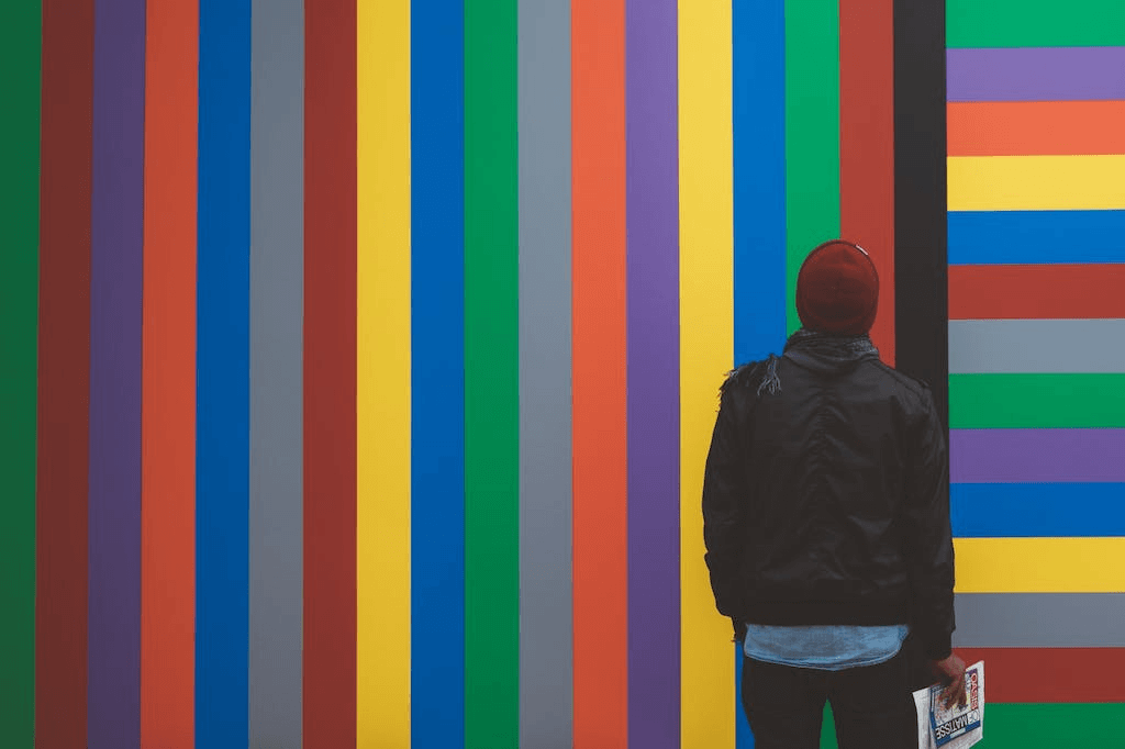
Unlike color associations, which can vary across cultures, color psychology remains remarkably consistent across genders, cultures, and locations. Color psychology is the study of how different colors can influence human emotions, behaviors, and perceptions.
It explores the psychological and emotional responses evoked by various hues, revealing their power to communicate messages, evoke specific moods, and shape brand identity.
By understanding color psychology in visual content, brands can strategically leverage colors to create impactful experiences that resonate with their target audience.
Why is Color Important in Branding and Logos?

Color holds immense significance in branding and logos due to its ability to shape brand perception and elicit emotional responses. Here are several key reasons why color is crucial in this context:
- Firstly, color enables brands to differentiate themselves from competitors by establishing a unique visual identity. Memorable and distinct colors help brands stand out in crowded markets.
- Secondly, colors evoke specific emotions and associations, allowing brands to forge emotional connections with their audience. Thoughtfully chosen colors aligned with brand personality can evoke desired emotional responses, fostering deeper connections.
- Moreover, consistent use of color aids in brand recognition and recall. When colors become strongly associated with a brand, they act as visual cues that trigger instant recognition.
- Colors also serve as a powerful means of communication, allowing brands to convey messages and values non-verbally. The right color palette effectively communicates brand characteristics such as luxury, eco-friendliness, or innovation.
It is important to consider cultural and psychological influences as well, as colors can have varying connotations across different demographics and regions. Understanding these associations ensures that colors resonate positively with the target audience.
Bonus: A Guide to Color Harmony & How to Use It
What do the colors black and yellow symbolize?
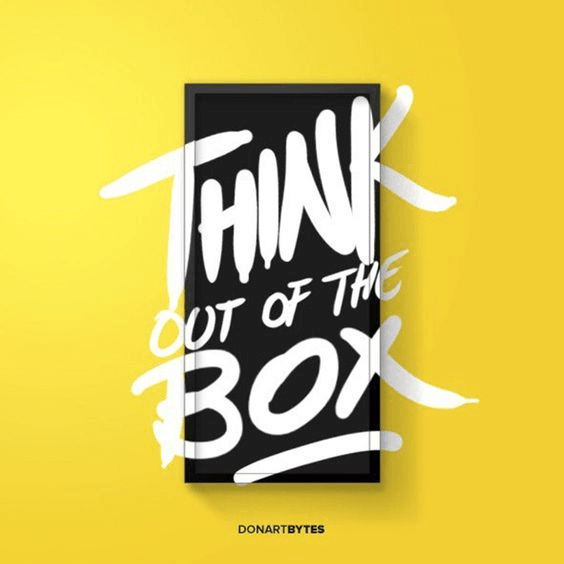
Black and yellow are popular colors in branding and logos due to their symbolism. They are also used in combination and complement each other well. In fact, there are certain emotions and feelings associated with black and yellow that can be used in branding.
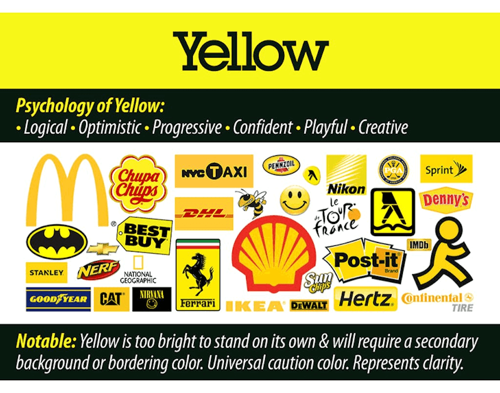
What is associated with the color yellow?
Yellow is commonly associated with happiness, positivity, optimism, and energy. It is a vibrant and attention-grabbing color that can evoke feelings of joy and warmth. Yellow is often used to convey friendliness, creativity, and enthusiasm. It can also symbolize intelligence and enlightenment. However, it is important to note that yellow can also be associated with caution or warning, as seen in traffic signs.
Positive:
- Attention-grabbing
- Joy, happiness, and excitement
- Warming and cheerful
Negative:
- Jealousy
- Aggressive
- Anxiety
What is associated with the color black?
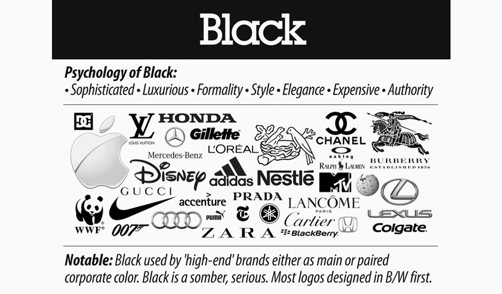
Black is often associated with sophistication, power, elegance, and authority. It can convey a sense of luxury, exclusivity, and professionalism. It is a color that exudes confidence and can create a strong impact. However, black can also be associated with mystery, darkness, or mourning, depending on the context and cultural interpretations.
Positive:
- Formality and elegance
- Sophistication and minimalism
- Authority and power
Negative:
- Grief or unhappiness
- Mystery
- Emptiness or loneliness
What do black and yellow symbolize in branding?
When used together, black and yellow can create a striking contrast that represents a combination of power, sophistication, and energetic positivity. The specific symbolism and impact of these colors can also be influenced by other factors such as cultural associations, individual preferences, and brand context.

What makes the combination of black and yellow branding great?
Using a black and yellow brand in a brand illustration means that any negative connotations of either color can be counteracted. For instance, some think that yellow is a childish color, but this is balanced out by the elegance of black.
On the other hand, black can be negatively associated with emptiness or sadness, which is balanced out by the cheer and warmth of yellow. Also, the contrast of black and yellow branding makes the logo pop and grab attention without seeming too loud or annoyingly bright.
10 Examples of Black and Yellow Branding
1. Best Buy

Best Buy’s iconic logo, popularly known as the ‘Yellow Label,’ is a great example of successful black and yellow branding. Here, the yellow signifies joy and friendliness, while the more sophisticated black signifies high quality. This combination works well for Best Buy, as they have the image of being a customer-friendly brand with well-made products that you can rely on and trust.
2. McDonald’s
McDonald’s uses black and yellow branding colors in its logo and marketing materials to convey a cheerful and happy emotion. Along with their catchphrase ‘I’m lovin’ it’ and their popular ‘Happy Meals,’ the brand has built an image of being warm and happy. Hence, the use of yellow complements this brand identity visually, with the black color making the yellow lettering pop.
Bonus: The Best Ways to Use Triadic Colors in Design
3. National Geographic
National Geographic is another brand that uses black and yellow branding and logo design. The black color used in the logo complements the minimal and elegant design. Yellow, on the other hand, provides contrast to the minimal black text to make the logo catch the eye and prevent it from being overly simple or dull.
The yellow rectangle of the National Geographic logo mimics the printed magazine’s border. It also balances the text with an attention-grabbing hue that is instantly recognizable.
Yellow Logo Templates


4. Snapchat

The popular social media platform Snapchat also uses black and yellow branding in its logo, app, and materials. Here, the yellow makes the app icon stand out on your mobile device and gives a feeling of cheer that makes sense for a social app aimed at younger people.
Meanwhile, the black shade forms the outline of the ‘ghost’ design in their logo. This stark contrast with the bright yellow draws your eye towards the icon, so you immediately know it’s Snapchat.
Bonus: Understanding Chromatic and Achromatic Colors
5. Caterpillar

Caterpillar, popularly known as CAT, uses a black and yellow brand logo that is bold and instantly recognizable. Black and yellow are used on construction equipment, sites, barriers, and tapes to cordon off areas.
This is due to the high visibility of this color combination and its attention-grabbing nature. CAT takes advantage of black and yellow’s association with construction equipment to make a recognizable logo for its own products.


6. Mailchimp
Cavendish yellow is a color associated with positivity, energy, and optimism. For the marketing automation platform, black remains the functional color consistently used on all platforms.
By incorporating yellow into its icon, Mailchimp aims to convey a sense of vibrancy, enthusiasm, and approachability. The color combination aligns with its brand identity as a user-friendly and creative platform.
Bonus: A Beginner’s Guide to Additive and Subtractive Colors
7. Stanley
Stanley, a well-known brand specializing in tools and equipment, represents itself in these colors for many reasons. The high visibility of the colors can help users quickly locate and identify Stanley products, promoting a sense of trust and reliability.
Stanley taps into the visual language of the industrial and professional sectors, reflecting its heritage and expertise in manufacturing durable and reliable tools.

8. Tour de France
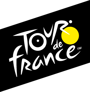
The Tour de France uses a black and yellow logo primarily because it pays homage to the origins of the race. The color combination of black and yellow is a nod to the L’Auto newspaper, the publication that originally organized the event in 1903.
The yellow color also signifies that the race happens only during the daytime. The branding resonates in the clothing of the participants as well!
Bonus: Generate a Metallic Gold Color Palette in seconds
9. Post-it Brand
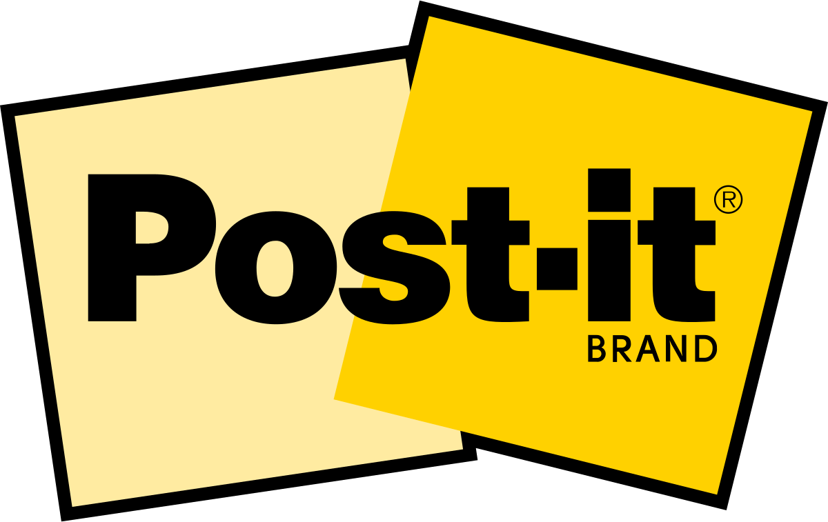
The Post-it brand uses black and yellow in its branding for a specific product line called “Post-it Notes Super Sticky.” The black and yellow color scheme serves as a visual cue to differentiate these particular notes from the traditional yellow ones.
The black band at the top of the Super Sticky notes provides a stronger contrast against the yellow color, making them more noticeable and emphasizing their enhanced adhesive properties.
10. Simplified

It’s not a mere coincidence that we have applied the famous color combination to Simplified’s branding as well. The striking color contrast makes the entire platform easier to use with strong visual cues.
Yellow signifies the fun, user-friendly aspect of the platform, while black symbolizes the reliability and accuracy of our tool.


Create Your Black & Yellow Designs With Simplified
Creating a black and yellow brand logo is super easy with Simplified’s Free Design Tool. Simply choose a template to start with, and you’re ready to get designing. Whether you want a black and yellow brand logo or something different, there are plenty of templates to choose from for all your branding and marketing efforts.
Don’t have your own branding color palette? Generate one using our FREE Color Palette Generator.
Discover More Simplified Social Media Templates



Create Ads with Simplified Templates


Once you pick a design template, you can edit the elements, colors, sizes, and all the other aspects of the logo template with ease. Add photos, change the color to suit your brand, and move things around till you are satisfied.
Check out this video on how to add brand assets to Simplified to keep your designs consistent over time.
How to upload media from your local drive
Set up your own Brand Kit on Simplified now!
When you’re happy with your logo, just hit “Export,” and you can then save and use your brand-new logo! You can also streamline the way you create content for your brand with Simplified AI Brand Kits. Have all your brand colors, fonts, and media ready to use to create cohesive branding and designs for your organization.
Unleash the Power of Colors with Simplified!
Color psychology plays a pivotal role in branding, influencing consumer perceptions, emotions, and brand associations. The strategic use of colors like black and yellow can create a powerful impact, conveying a range of qualities and eliciting specific responses from your audience.
By understanding the psychological significance behind these colors, brands can harness their potential to create compelling and effective branding experiences.
Get Access to Incredible Templates and Designs to amp up your brand kit.
Get Started For Free


