
We all know the primary colors – red, yellow, and blue. Then there are the colors that we get by mixing primary colors. For example, red and yellow make green. For successful design, it is not only important to know how colors are made, but how these colors are used and for what purpose.
The sub-discipline of Color Psychology explores the meaning of colors when used for graphic design and marketing in communicating your brand’s identity to your audience. So, what exactly are additive and subtractive colors?
Simplified Guide to Additive and Subtractive Colors
Harnessing the power of colors as a visual language when communicating with your audience gives meaning to your designs. In fact, colors can impact mood, affect decision-making behaviors, and deliver actionable results. Below, let’s take a look at how you can harness additive and subtractive colors for powerful visual communication.
Bonus: A Guide to Color Harmony & How to Use It

Bonus: The Ultimate Logo Design Checklist to Help Your Brand Stand Out
What Are Additive Colors?
The additive colors are red, green, and blue, also known as RGB. The additive color model describes how light interacts with the human eye to produce all colors of the visible spectrum. Moreover, additive color starts with black and adds red, green, and blue light to produce the visible spectrum of colors.
As more color is added, the result is lighter. When all three colors are combined equally, you get white light.

Bonus: Learn How To Create A Brand Identity Using Complementary Colors
What Are Subtractive Colors?
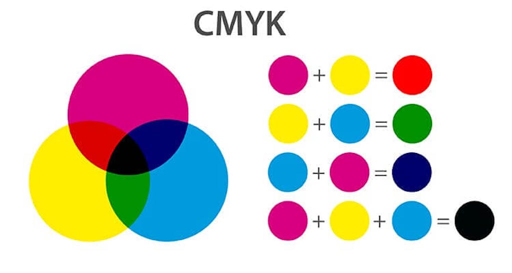
Subtractive colors are Cyan, Magenta, and Yellow, or CMY. In additive vs subtractive color, the subtractive color model begins with white and ends with black. So, what does this mean?
As you add color, the resulting color becomes darker. Hence, if you print C, M, and Y on paper, they absorb light, which means that your eyes receive no reflected light from the paper and see black.
Bonus: The Best Ways to Use Triadic Colors in Design
Additive vs Subtractive Color: Where to Use RGB vs CMY
Now that you have a skeletal understanding of what additive and subtractive colors are, let’s talk about where they’re used, and for what purpose.
Where Are Additive Colors Used?
Think about all the screens in your home – from laptops to phones to computer monitors. All of these screens use the additive color model. The three colors of a pixel on a digital device are created with electrical charges.
The red, green, and blue elements of an LCD or LED screen are each called “sub-pixels” because they create the desired hue in one pixel. The pixels are formed like mosaics to create a picture.

Bonus: Understanding Chromatic and Achromatic Colors
Where Are Subtractive Colors Used?
In the subtractive color model, pigment is added to a substrate in order to produce color using reflected light. This color model is used in printing, silk-screening and painting. For example, the magazines on your bedside or the flyers handed out to you by volunteers all use the subtractive color model for visual readability.

How Can I Use Additive and Subtractive Colors for My Business?
When you’re thinking of your brand identity and the colors that will define your brand, gauge the requirements of your marketing and design needs first.
Establishing color using the applicable knowledge of additive and subtractive colors is hugely rewarding if you’re working across different kinds of marketing collateral from print to digital.
Source: UX Design
Bonus: Generate a Metallic Gold Color Palette in seconds
1. Digital Marketing

Source: Unsplash
When it comes to digital marketing, additive colors are your go-to. This means focusing on RGB when designing anything that appears on a screen:
- Website Design: Use vibrant RGB colors to make your website pop.
- Social Media Graphics: Create eye-catching posts that look great on any device.
- Email Campaigns: Ensure your emails are visually appealing when opened on smartphones or computers.
By using the right mix of red, green, and blue, you can craft visuals that grab attention and convey your message effectively.
2. Print Materials

Source: Freepik
For print materials, subtractive colors (CMY) are essential:
- Brochures and Flyers: Make sure your printed handouts have crisp, clear colors.
- Business Cards: Stand out with a card that uses CMY colors to their full advantage.
- Product Packaging: Attract customers with packaging that uses subtractive colors for a professional look.
Incorporating CMY colors into your print designs ensures that the final product looks exactly as intended.
Bonus: Generate a Metallic Gold Color Palette in seconds
3. Brand Website

Source: Unsplash
Your brand website will likely be optimized for browsing on devices such as laptops and mobile phones.
For this reason, the illuminated media achieved through additive colors, that is, from dark to light (RGB), makes visual navigation for your customers easier.
4. Brand Catalog

Source: Unsplash
Let’s say that you want to create a product catalog for your brand so that your customers can flip through the pages and choose whether or not your brand is a good fit for them.
When using physical marketing collateral such as catalogs, it is always recommended to use subtractive colors or CMY inks, that is, from light to dark.
Don’t know where to start? We got your back. Head on over to Simplified’s blog resources to learn more about stunning graphics for print!
Bonus: 9 Best Text Animator Apps You Need For Marketing (Free Tools Included)
5. Brand Logo

Source: Unsplash
This is where the additive and subtractive colors converge for your brand! Moreover, your brand logo is the key player of your brand kit.
Not only does your brand logo communicate your mission to your audience, but the colors you choose impart meaning to the design.
- For digital marketing collateral, your logo should be optimized with additive colors.
- For print marketing collateral, your logo should be optimized with subtractive colors.
Sign into your Simplified account and start designing brand logos for free!
Bonus: Create Eye-Catching Brand Logos with Simplified Free AI Logo Generator
Tips for Color Selection
Choosing the right colors involves more than just understanding additive and subtractive color models. Consider these tips:
- Know Your Audience: Different colors evoke different emotions. Choose colors that align with your brand and resonate with your target market.
- Consistency is Key: Maintain consistent color schemes across all platforms to reinforce brand recognition.
- Test and Iterate: Always preview your designs in their final form. What looks good on screen may not translate well to print, and vice versa.
Bonus: 3 Quick And Easy Ways To Add Voiceover To Your Reels
Create Designs with Additive and Subtractive Colors for Free
Create Media with Additive Colors on Simplified:
- Google Ads
- Instagram Posts and Stories
- Zoom Virtual Backgrounds
- Email Headers
…and so much more!

Create Media with Subtractive Colors on Simplified:

- Skyscrapers
- Half Page Ads
- Billboard Ads
…and so much more!
So don’t hold off – try it out today and impress your audience with breathtaking designs.


")