Ever wondered why the first thing that comes to mind when you think about a brand is the color that represents its brand Identity? Our brain is hardwired to recall and respond to color combinations. Colors are powerful components in building a brand’s corporate identity. Using the best color palette can interest your audience in your brand design and also engage them emotionally. Therefore, your color palette should not be considered a last-minute choice as a brand.
It has the potential to elicit strong feelings, promote conversions, and even foster brand loyalty and preference when handled well. Top brands such as Starbucks, Coca-Cola, McDonald’s, Mastercard, and Nike prioritize the use of the best color combos in their designs.
This year, there is a growing need for brands to amp up their design games by using the best color palette combos in order to remain relevant in the market. In this blog, you will discover the best color palette combos to help your designs stand out.
5 Amazing Color Palette Combos to Make your Design Standout
Color palettes are essential components for creating stunning designs. One trend to watch for is the use of human-centric designs.
1. Human-Centric Designs.
Brands are increasingly focusing on emphasizing the natural beauty of people in their designs. So to achieve this, designers and illustrators are using neutral tones such as beige, brown, light pinks, and oranges to showcase the beauty of human skin tones. These colors can be paired with black or white to produce simple and calming images. Suppose, a popular trend in the cosmetic industry is the use of this color palette combination in the branding of lipsticks.

2. Pastel Color

Following the use of Wes Anderson-inspired film sets by directors and simple designs, pastel colors have regained popularity. Pastel colors are anti-modernist and contrast with bright reds, blues, and greens. They are modest, simple, and pleasing to the eye, can be paired with any color. They can serve as a focal point or work in the background.
The example below is a pastel color palette used for the identity and packaging system by the natural skincare brand Moujan Lusso.

Related: 7 Tips For Creating The Perfect Cohesive Color Palette
3. Color Burst Designs

Modern minimalistic designs have recently started cropping up in the design scene. These designs use monochrome palettes with a single burst of color. Furthermore, they usually feature blacks, grey, or white with pops of primary and secondary colors.
Some designers also include abstract shapes and objects in the background to make their designs dramatic and captivating.
Nirnita used a bespoke color burst palette for their Eyeshadow makeover product.

4. Analogous Color Palette

The analogous color combinations originated from the wildly popular color gradients. These are colors that sit to next each other on the color wheel. Analogous color palettes can be neighboring colors or shades of the same color.
These palettes remind us of how colors actually look in nature. The different shades of green in a forest perfectly depict an analogous color palette. This style of color combination is seen in information-heavy design assets. The trick is to use one color as the primary and the other two as ascents.
Mastercard is a superb example of a brand with an analogous color palette combo. Their orange and red colors complement one other nicely in terms of style, and also they also transmit concepts of a bright and energetic brand.

5. Vibrant Corals

We could all do with a little bit of cheer in our lives right now, and Pantone’s 2019 color of the year does that seamlessly! With hues of magenta, vivacious pink, and sunny oranges Corals remind us of sitting by the beach and strawberry mojitos. In web design, coral is a warm orange hue with hex code #FF7F50.
These warm tones can be paired with teal, turquoise, or white beautifully. With these juicy colors the background colors are just as important; grounding them and making them pop.
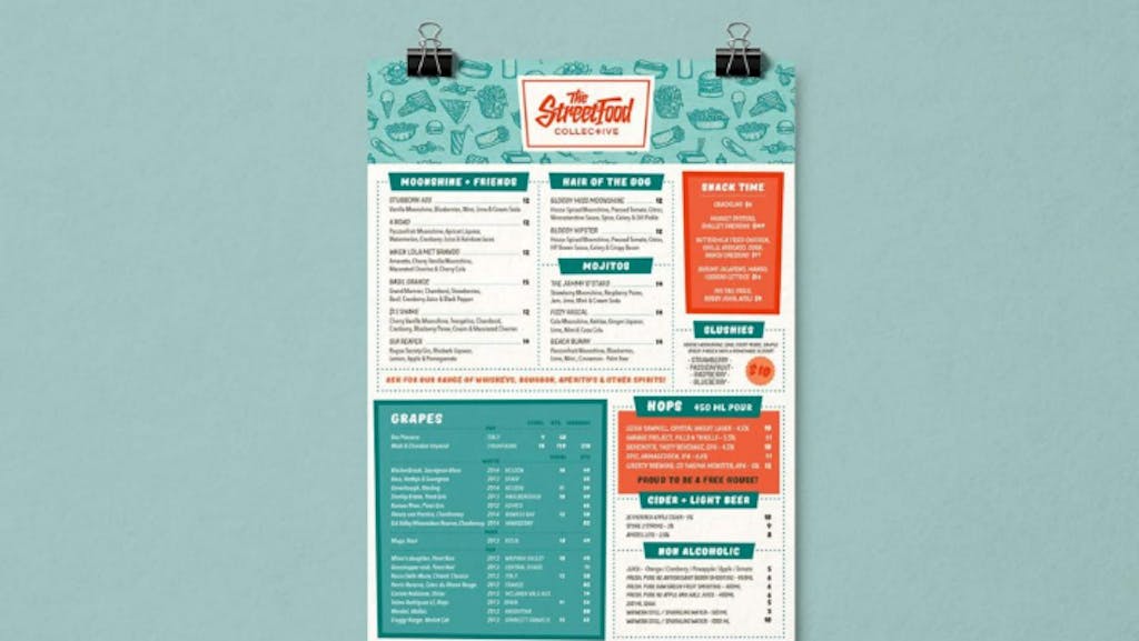
The Street Food Collective: This retro diner has a ’50s theme and uses a complementary color palette with coral, teal and white. It fits their branding to a tee.

Related: Pastel Colors: What They Are + How To Use Them
Ready To Amp up your Design Game: Use Simplified’s Color Palette Generator.
Simplified’s Color Palette Generator is the best graphic design tool every brand needs to add to their tool kits. With Simplified color palette generator, you can create amazing color schemes that can make your designs stand out. The tool also enables you to examine the color contrast ratios of all combos of your colors. More so, you can select between all the various color palette combos you want in the software.
If you are ready to ace your design game.


