Chromatics, more commonly known as colors, influence us way beyond what we realize. Did you know that color perception influences 90% of all rapid purchasing decisions? In fact, it’s important to think carefully about the colors you choose in your design layout. Although monochromatic design schemes have a reputation for being dull or too basic, when used correctly, they can have a visually striking impact leading to a strong brand identity.
With handy tips, a FREE tool, and interesting examples below, let’s get in-depth into how to effortlessly use monochromatic colors in design. So that by the end of the post, you won’t be a beginner anymore! Let’s get started.
Bonus: Discover beautiful color palettes or generate one for your next design project
What is Monochrome?


“A monochromatic artwork is one that has only one color.” – The Tate Art Museum
That makes perfect sense, particularly when you consider the word’s Greek roots:
- “Mono” means One.
- “Chrome” means Color.
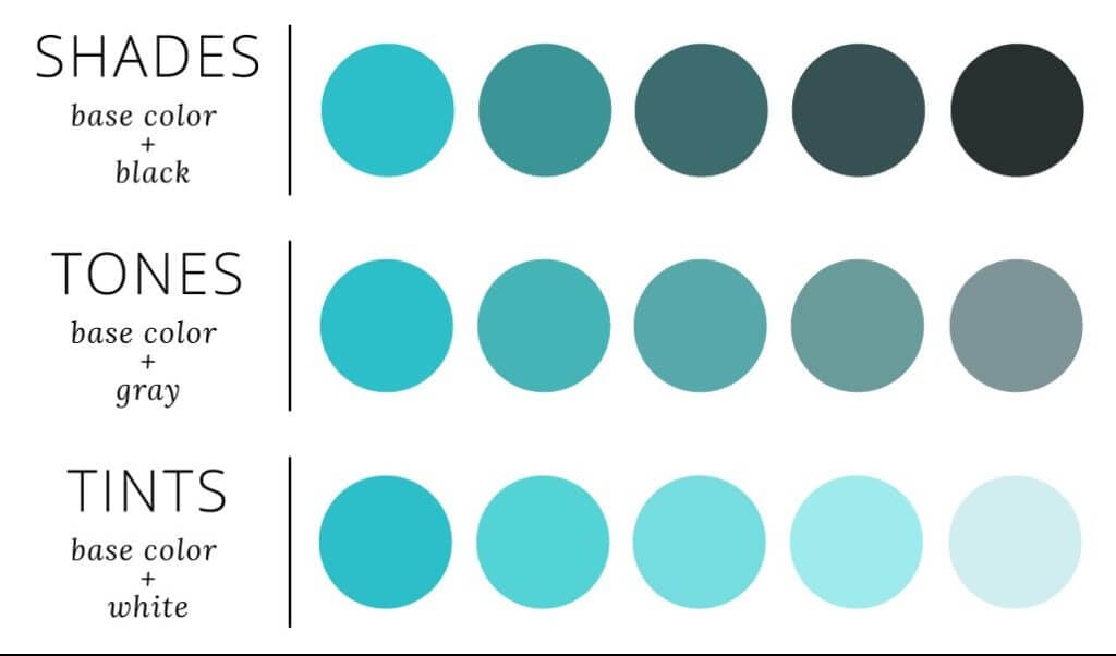
However, it isn’t as straightforward as “one color.” You’d be able to recognize the numerous variations of a single hue. Monochrome colors are all the varieties of a single hue – the tints, shades, and tones. Additionally, a monochromatic color scheme consists of brighter and darker shades of the same base color or hue. If you’re still confused, let’s brush up on our color theory first.
How Is a Monochromatic Color Scheme Created?
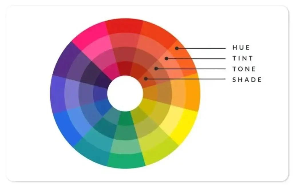
Let’s start and simplify the basics in case you need a refresher or are completely new to the color scheme.
- Hue simply means “color.“ When it comes to paint color, painters conceive of “hue” as the purest form of a pigment. So, think of it that way – a pure color before it’s affected by shade, tint, and tone.
- Tint lightens the color. Tints are made by mixing white to a color.
- Shade is the process of adding black to a color to make it darker.
- Tone is the vibrancy of a hue. They are altered by the addition of gray. A color with more gray will have a duller tone than the original hue, whereas a color with less gray will have a more saturated tone.
Bonus: 7 Tips For Creating The Perfect Cohesive Color Palette
Components of Monochromatic Schemes: Hue, Tint, Shade & Tone
Each section of the color wheel indicates a single hue’s color family. Moreover, each variant of the hue has tiny variations, all of which make up a monochromatic color palette.
Each of your elements will have a spectrum of tints, hues, and tones based on a single base color when applying this scheme for monochromatic design. Because each color has several variants, you can be creative and express yourself in any manner you choose with a monochromatic scheme, from bright and dramatic to cool and subdued.
Brands That Use Monotone Colors
1: Coca-Cola Packaging

2: PayPal Logo

3: National Geographic Website

4: Starbucks Branding

Bonus: What Is Color Harmony & Why You Need To Know About It
5: Kylie Skin Care

How To Use Monochromatic Color Scheme Ideas In Graphic Design
Use hundreds of beautiful FREE templates or start from scratch to create- content, brand assets, and videos effortlessly. Then, publish with one click to reach your customers wherever they are.




Bonus: Square Color Scheme & Everything You Need To Know About It
Tips For Working With Monochrome Color Palettes
1. Choose A Base Color

So, for your design, you’ve landed on a monochromatic color scheme. But, oh my, what color do you choose as the base? Because your color pallet will be variations of the base color, it’s critical that the hue you choose is on-brand, on-trend, or just conveys the appropriate message.
2. Work On A Color Palette
Monochromatic schemes are made up of 3 to 7 variants in your one-color palette, which are made up of deeper shades and lighter tints of the original hue. Experimentation is a fantastic approach to start any design project. In fact, digital graphic design tools like Photoshop and Simplified make it simple to explore and build a palette, making the monochromatic design process much easier.
3. Use a Bold or Intense Color in a Subdued Manner

Experimenting with different color combinations as a designer can be a lot of fun. However, strong or bright colors aren’t always ideal for a professional assignment or a commercial customer. A monochromatic palette can help you add diversity to your regular color choices while also toning down “louder” hues for a more professional appearance.
4. Forming Brand Identity
Visual cohesiveness is easily achieved with monochromatic design. When it comes to picking a color, the first step is to understand your target audience. You must select a hue that will appeal to the target demographic while also communicating the brand’s values.
Using a monochromatic color approach to brand identification is a fantastic method to establish uniformity, and it will make creating anything for the company a lot easier in the future because all of the colors have already been decided.
5. Experiment With Grayscale

Grayscale may be used in a variety of ways, both simple and elaborate. This is known as an achromatic color scheme since it is devoid of color and consists solely of shades and tones. Combining an achromatic theme with a flash of color for a unique aesthetic statement is one style you might explore.
Bonus: Hues, Tints, Tones, and Shades: What’s the Difference?
To Sum Up
Try not to underestimate the power of simplicity in your design. The use of monochromatic colors can help bring a certain aesthetic quality to your image while also highlighting the most important elements. With Simplified’s stunning templates and tons of design tools to choose from, you can effortlessly level up the aesthetics of your business. If you’re just getting started or you’re a seasoned graphic designer looking to scale your work
