For a while now, artists and interior designers have held the belief that colors can significantly impact one’s mood, emotions, and feelings. Thus, it’s crucial to carefully consider the colors used in your design layout since they can directly translate into purchase decisions. Although monochromatic colors may be a recent trend, there is a desire to experiment with various color combinations for design purposes. This is where analogous colors prove valuable.
“Colors, like features, follow the changes of the emotions,” Pablo Picasso.
With handy tips, a FREE AI tool, and interesting examples for analogous colors below, let’s get into how to create analogous harmony in design effortlessly. By the end of the post, you won’t be a beginner anymore! Let’s get started.

What Are Analogous Colors?
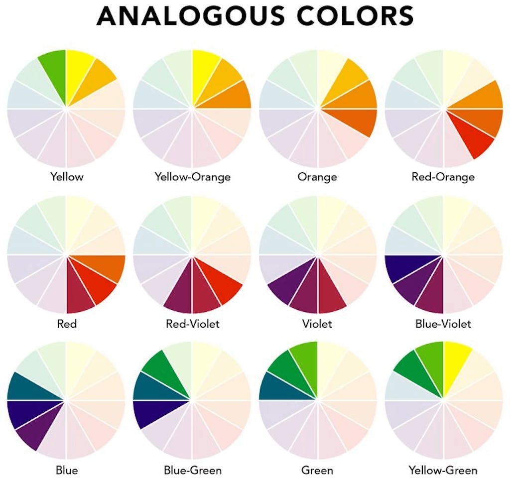
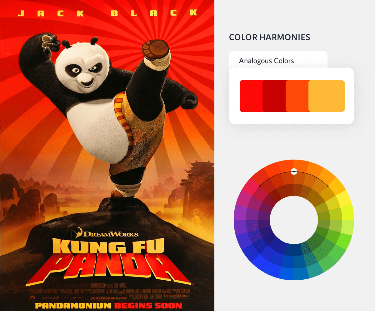
The analogous color scheme includes three colors on the color wheel that are next to each other. They consist of one dominant color (usually a primary or secondary color), a supporting color (usually a secondary or tertiary color), and a third color that is either a mix of the two first colors or a bright accent color.
Examples of analogous colors are seen in our daily lives if you observe them. In fact, a succulent- with its blue, green, and blue/green leaves and the setting sun with hues of red, orange, and yellow are interesting examples.


Creating an Analogous Color Scheme
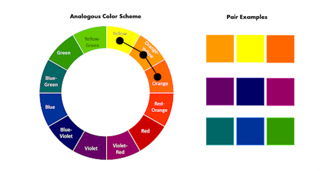
Creating an analogous color scheme involves selecting colors that are adjacent to each other on the color wheel. To simplify this process, tools like Simplified’s color palette generator can be incredibly helpful. With its intuitive interface and powerful algorithms, this tool assists designers in effortlessly generating a range of analogous colors that complement each other seamlessly. By incorporating Simplified’s color palette generator into the design process, designers can save time and effort while ensuring the creation of visually stunning analogous color schemes.
Brand Examples Using Analogous Color Harmony in Marketing and Design
Because analogous colors are especially pleasing to the eye, designers often draw inspiration from these color schemes for product designs. So, let’s look at some brand design examples featuring analogous colors!
1. Dropbox
2. Slack (Uses 4 Hues For Analogous Harmony)

4. Microsoft Edge

4. Mastercard

5. Instagram

How To Use Analogous Colors In Graphic Design
With Simplified, you can use hundreds of beautiful FREE templates or start from scratch to create- content, brand assets, and videos effortlessly. Then, publish with one click to reach your customers wherever they are.
1. Create Social Media Posts

2. Create a Social Media Banner

3. Create Social Media Stories
4. Create Facebook Ads

Tips For Working With Analogous Color Palettes
1. Choose A Primary Color (Red, Blue, & Yellow)
An analogous color palette has three colors in the most conventional sense. However, it’s possible to use up to four or five colors. Moreover, to convey a particular mood, designers may need to use an analogous palette. A warm color palette with four colors would be composed of red, red-orange, orange, and yellow-orange. A cool palette would include blue, blue-green, green, and yellow-green.
Bonus: All You Need To Know About Complementary Colors On The Color Wheel
2. Apply the 60-30-10 Rule
Many designers embrace the 60-30-10 rule to achieve a calm, visually pleasing analogous harmony. According to this rule, 60% of your design will be the base color, 30% will be your accent color, and 10% will be your pop of color. Here’s an example of using analogous colors while keeping the rule in mind to make this concept even easier to remember.
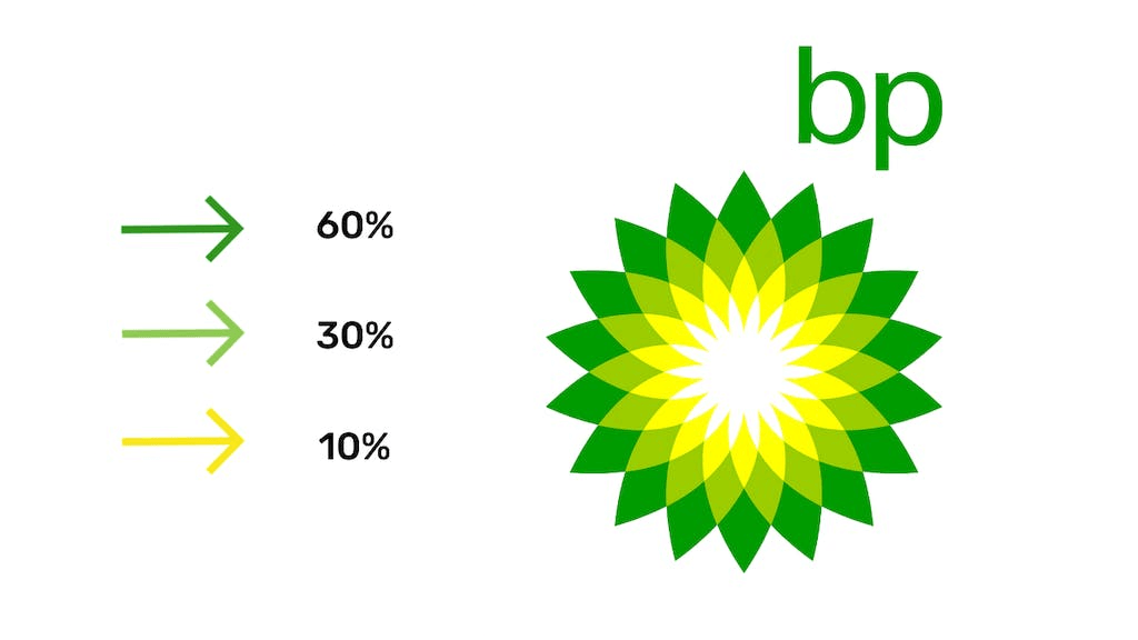
Make sure you have enough contrast when choosing an analogous color scheme. So, choose one color to dominate and a second to support. The third color is used (along with black, white, or gray) as an accent.
Bonus: New Color Pallete Combos to Make Your Designs Standout
3. Inclusivity
What is an inclusive design? It’s simple. It indicates that your product was designed to be accessible to as many people as possible. It’s essential to keep accessibility in mind while choosing an analogous palette. For example, certain color palettes may exclude those with color blindness or color vision deficiency. Whereas more than 99% of color-blind people can see the color blue, so this would be a more inclusive shade.
Bonus: Learn How To Create A Brand Identity Using Complementary Colors
To Sum Up
Choosing analogous colors is one of the easiest – and most eye-catching – ways to work color into a design. Using analogous hues as accent colors in an otherwise more neutral palette is a fantastic approach to creating a design that makes an impact! Additionally, with Simplified’s stunning templates and tons of design tools to choose from, you can effortlessly level up the aesthetics of your business. With Design + Copy AI, we are an all-in-one platform! If you’re just getting started or you’re a seasoned graphic designer looking to scale your work.
