Colors play a major role in how customers view the personality of the brand. While certain colors broadly align with specific characteristics (brown with earthiness and ruggedness), it’s more important for them to support your brand’s personality. Further, it is essential to keep what each color represents for you when selecting a color scheme for your brand. Hence, this blog has simplified how various brands have used complementary color palettes to portray their brand identity.
What are complementary colors?
“An artist finds his happiest combination in a play of complementary colors. They are direct contrasts yet do not jar; they awaken the beholder, but do not disturb him.” – Charles E. Burchfield
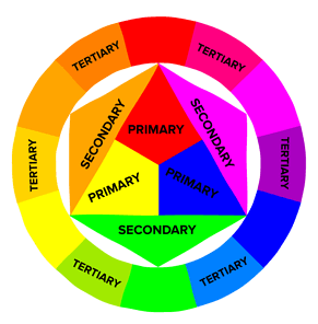
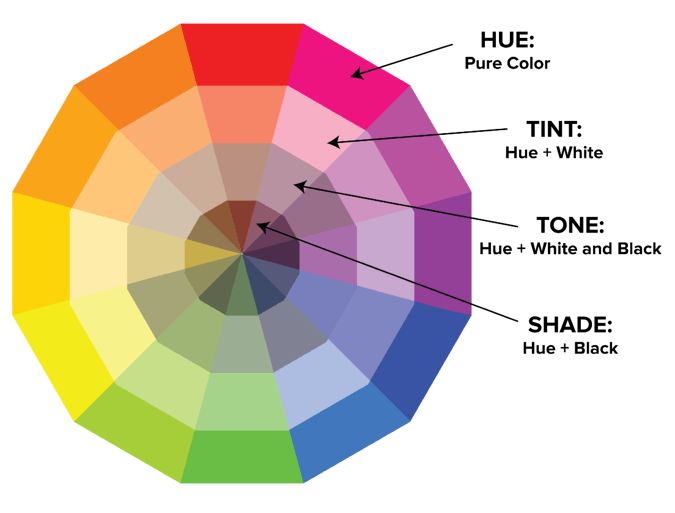
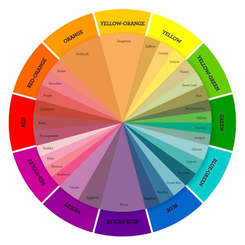
According to the color theory, complementary colors are the opposite hues on the color wheel (crafted by the Sir Isaac Newton in the late 17th century). In their most basic form, they are one primary color and the secondary color that is created by mixing the other two primaries. For instance, one of the complementary colors to yellow is purple, which is a mix of blue and red.
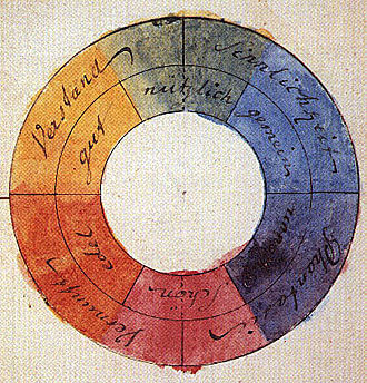
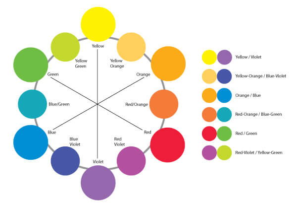
This color combination results in designs that are bright and pop. Examples of some complementary colors are:
- red and green;
- yellow and purple;
- orange and blue;
- green and magenta.
Upon adding tertiary colors into the mix, the below colors are also found to be complementary:
- yellow-orange and blue-purple (indigo)
- orange-red and blue-green (aqua)
- red-purple (pink) and green-yellow
You can further divide the color wheel to come up with more complementary colors for your brand identity.
What is a double complementary color scheme?
Similar to a complementary color scheme, a double complementary color scheme uses colors on the opposite ends. However, it uses a combination of four colors that, as the name implies, is made up of two complementary color pairs. This combination of colors is also known as rectangular colors, as illustrated in the below image.
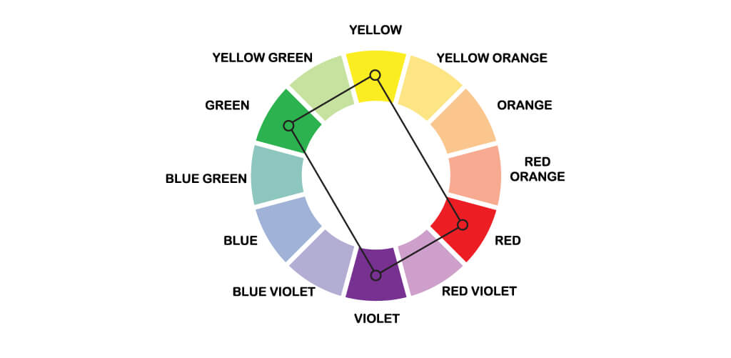
Because the four colors have to form a rectangle to fit this scheme, there are really only so many combinations that you can form. Six, to be exact:
- orange, yellow, blue, violet
- yellow-orange, yellow-green, blue-violet , red-violet
- yellow, green, violet, red
- yellow-green, blue-green, red-violet, red-orange
- green, blue, red, orange
- blue-green, blue-violet, red-orange, yellow-orange
How to Use Complementary Colors in Design?
Complementary colors are high contrast colors that will make for high-impact, memorable brand designs. At the same time, be careful not to overdo it, or else your design might be too grating. Thus, below are a few tips to help you create a complementary color palette.
Tip #1: Use one color predominantly and use the complementary color as accents in your design. The general rule of thumb is to use around 80% of one color and 20% of the other. Since if the balance is 50/50, the visual shock will be too strong and will make your graphics hard to look at.
Tip #2: Complementary color scheme usually involves a warm and a cool color. People associate cool colors like blue with peace and calm. However, warm colors like red are more energetic and associated with passion. Be sure to remember this while deciding the ratio you use the two colors in.
Tip #3: Use the Split Complementary color scheme to tone down the jarring effect. It uses one color as a base and two colors adjacent to its complement.
Tip #4: Lastly, balance the saturation and purity of the two colors.
Some Complementary Colors Examples in Marketing and Design
Research suggests people make a subconscious judgment about a product within 90 seconds, and 62% to 90% of that assessment is based on color alone, according to CCICOLOR – Institute for Color Research. Another 2011 study published in the Journal of the Academy of Marketing Science found color was an important factor in how consumers perceive brands.
So, in this section, we will dive into how designers have over the years used the color wheel complementary colors to engage the audiences.
1. Orange and Blue
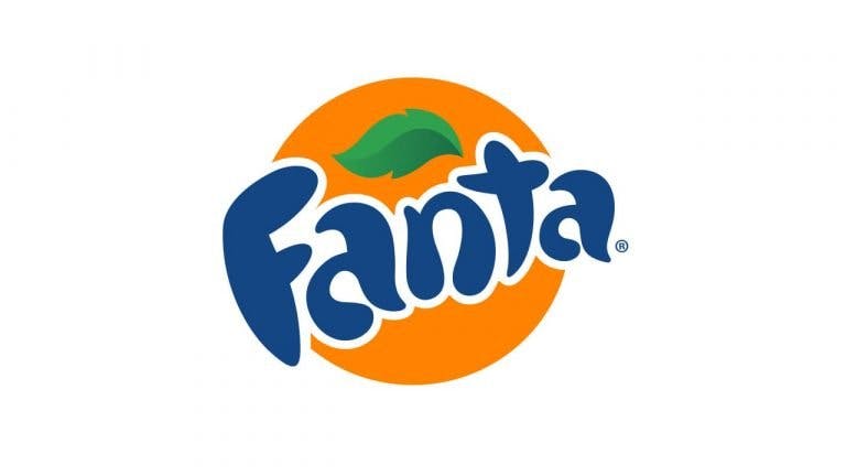
Using shades of pale blue is a sure way to induce a state of calm. Additionally, along with the blue, using orange or pinkish reds complementary colors add playfulness to the design.
Quick Tip: Use one of the colors as a call to action to attract the user’s attention.





Visme uses yellow-orange as the background and its complementary color blue for the button to draw attention to it.
Related: What Is Color Harmony & Why You Need To Know About It
2. Red and Green
We know you’re instantly reminded of Christmas but this complementary color combination has a historic significance in the food industry. Red is an appetite stimulant and green signifies freshness. However, that’s just the tip of the iceberg. Take a look at the famous restaurant and soft drinks logos and branding below, you’ll notice how the combination is able to communicate each brand’s unique identity.

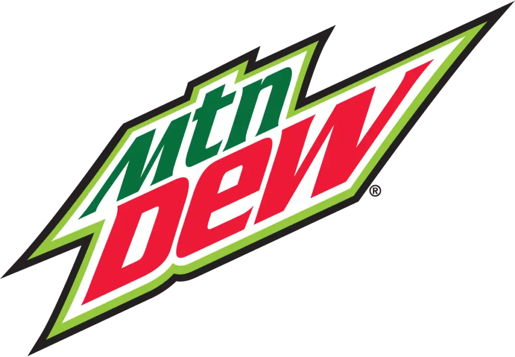
This combination can also be used for the branding of beauty and cosmetic brands.


3. Yellow and Purple
Purple and yellow together are a combination used to represent luxury. In fact, we all know that purple is known as the royal color. This is because the purple dye was always the most expensive to produce in the olden times. Over time designers have also started associating purple with luxury. This color combination also provides excellent readability and dimension to the design.

If you follow any kind of sports, you must know that a lot of teams also follow this combination in their logos. This is because purple and yellow is a combination that suggests authority and power because of their imperialistic connection. That is why this is a winning combination for a sports team, fraternity crests, or even institute logos.




Colors are not static elements. They exude an energy that humans pick up on. Therefore, colors are able to elicit an emotional response in consumers. It’s important to remember the tips we’ve shared with you while creating a complementary color scheme palette for your brand.


