Do you have a favorite color? Do you associate some colors with specific emotions? This is because colors are one of the most important elements in a design. It gives meaning to your design, which communicates your brand personality and messaging to your audience.
Do you want your audience to feel rested while they browse through your essential oil catalog? Do you want them to BUY NOW from an ongoing sale?
Say it all – and so much more with color trends!
1. Viva Magenta

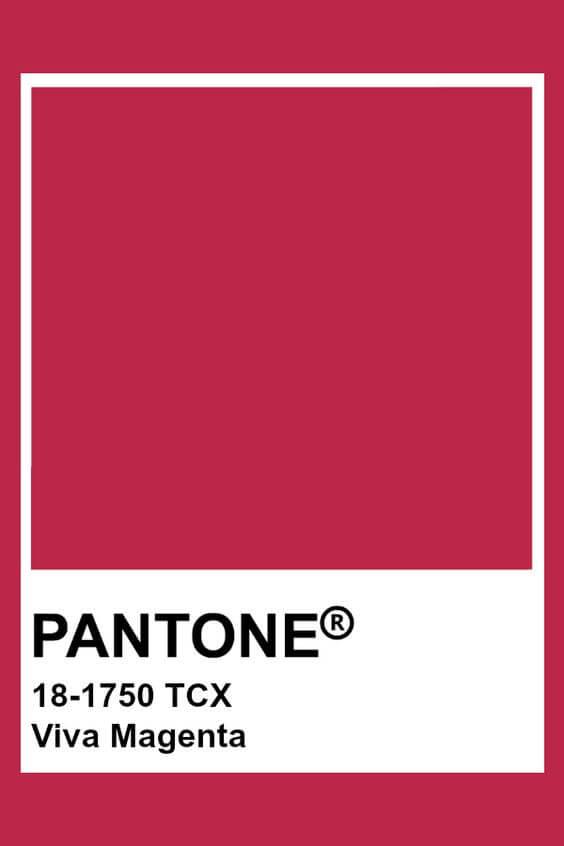
While some colors come and go with the seasons, others become Timeless treasures. The Viva Magenta is one of those colors. It’s been called the “it” color by Pantone and is predicted to be a major color trend. Graphic designers and social media influencers are already using this color to create stunning visual content.
Magenta is a bold, attention-grabbing color that is perfect for making a statement. It is also versatile enough to be used in a variety of design styles. Whether you are designing for social media or print, magenta is a great color to consider for your projects.
Color Tips: If you’re looking to use magenta in your next design or social media project, here are a few tips to help you get started:
- Use magenta as an accent color. A little goes a long way.
- Pair magenta with other colors that will help it pop, like black or white.
- Use magenta to add a bold and unexpected color to your project.
- Be careful not to use too much magenta, as it can be overwhelming.
- Use this gorgeous color palette for banners, logos, and landing page copy!
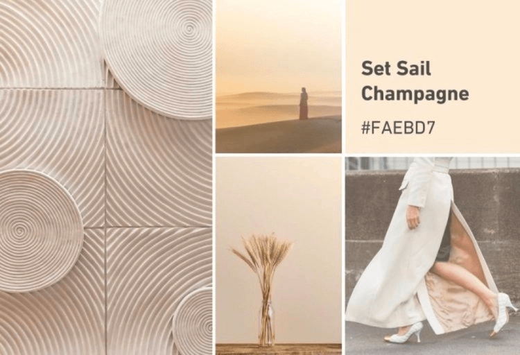
2. Set Sail Champagne #FAEBD7
Second, on our list of trending colors is #FAEBD7. It is already everywhere around us, from soft wooden chairs to historic buildings. This beautiful, neutral earthy palette is a part of Shutterstock’s predicted color trends. Set Sail Champagne invites us to reset, relax, and restore our balance with nature.
3. Rhodonite #302C4D
Rhodonite is a beautiful blue-based purple color that has been gaining popularity in the design world in recent years. This year, it is one of the top color trends in both graphic design and social media. Rhodonite can be used in a variety of ways to create stunning visual effects.
In graphic design, Rhodonite can be used to add a pop of color to websites and print materials. It pairs well with other colors in the warm color palette and can be used to create contrasts and visual interest.
On social media, Rhodonite is often used as an accent color in images and stories. It can help add brightness and warmth to your feed and make your content stand out.
Color Tips: Use Rhodonite for marketing campaigns, Instagram story ads, and headlines for your blogs.
4. Mykonos Blue #045E88
This segment of color trends makes us swoon with its imagery of calming waves at the beach, juicy blueberries, and brilliant blue skies.
We wouldn’t mind going down into a Pinterest rabbit hole with Pantone’s Mykonos Blue. Wondering how to use this as part of your color palette?
Color Tips: Use Mykonos Blue paired with a stark white. It will help increase the text visibility for headings, sub-headings, tag lines, and landing page text! So, Mykonos Blue will also look yummy and balanced with Illuminating for lively marketing campaigns.
5. Root Beer #714C44

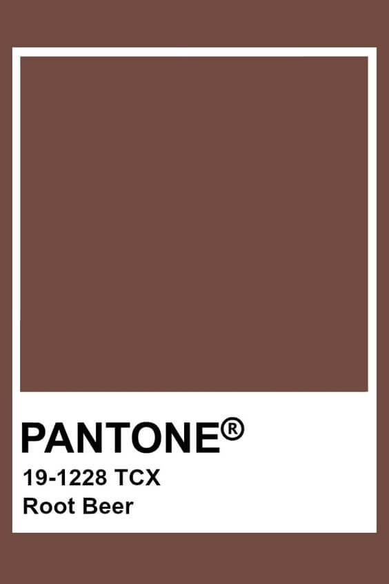
The year 2025 is expected to bring some big changes in the world of graphic design and social media. One of the biggest trends we’re predicting is a move towards warmer, more natural colors. And one of the standout colors of 2025 is Root Beer (#714C44).
Root Beer is a rich, dark brown color with hints of red and orange. It’s a warm color that evokes feelings of comfort and relaxation. And it’s versatile enough to be used in a variety of design styles, from classic and rustic to modern and minimal.
If you’re looking for a color that will make your designs stand out, Root Beer is a great choice.
`
Color Tips: Use Root Beet to emphasize natural and cruelty-free products. It helps create brands promoting sustainability, and make powerful ad headlines. You can pair the text with a solid color like white.
6. Fuchsia Fedora #CA4286

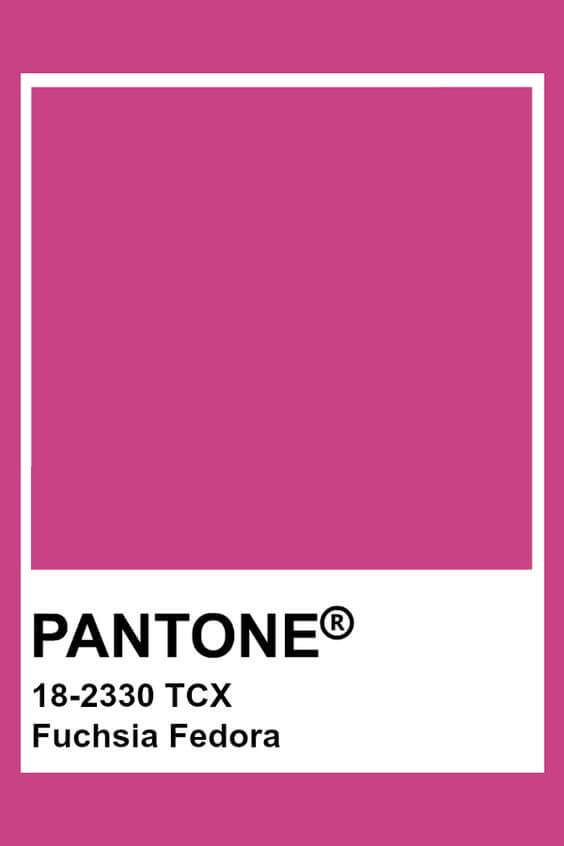
This shade is all sorts of uplifting, sitting between the sweet spot of pink and purple. So, the color is another nod to mother nature, but we also love the color for its evocation of boldness in design.
Color Tips: Use this color to signal strength and femininity. This shade will work wonders for campaigns advertising feminine hygiene products. For social media, you can pair Fuchsia Fedora with bold black and white text colors to make every word pop!

7. Fire Whirl #A73730
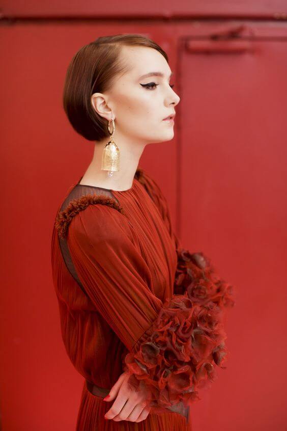
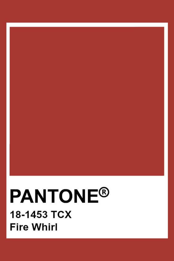
2025 is the year of the Fire Whirl, and this color is taking over the design world. From fashion to interiors, this trend is popping up everywhere. And it’s not just limited to design; social media is also going crazy for this hue.
So what is it about this color that has everyone excited? This vibrant shade is a unique blend of orange and red that recalls the energy and heat of a fire. While it may seem like an aggressive color, it actually has a surprisingly calming effect Fire Whirl is a warm, inviting color that makes a bold statement. It’s perfect for both injecting some energy into a design and also creating a feeling of calm and relaxation. Whether you’re using it in your brand identity or your website design, Fire Whirl is sure to make an impact. If you’re looking for a color that is both trend-setting and timeless, Fire Whirl is the perfect choice for you.
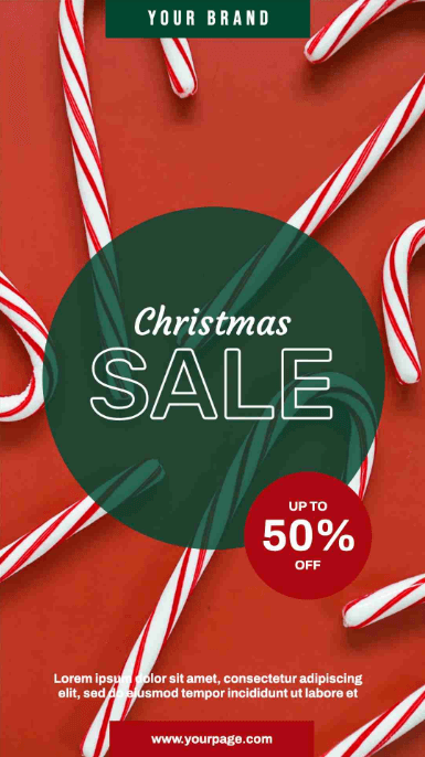
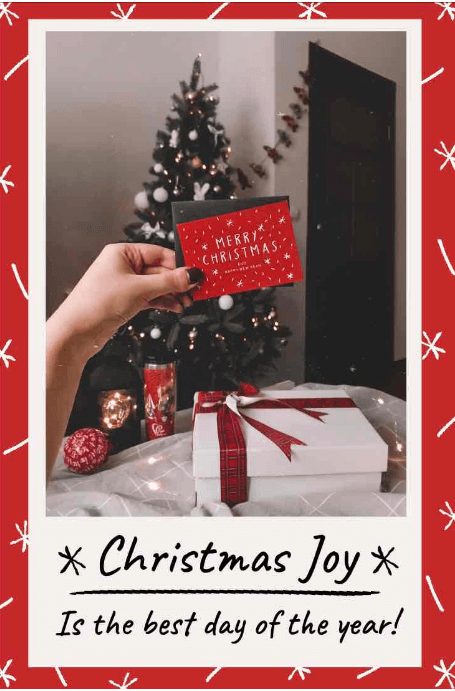
Color Tips: Use this brilliant red for your brand’s ongoing sales and promotions. Also, it will help in market-finding love, and building a deep sense of intimacy with your audience. So, what’s to say love is better than red?
8. Jade

Touches of this jewel tone are turning up in interiors across the world. Pale blues and greens inspired by the natural color of the gem are gaining popularity and can be used to create both serene and startling aesthetics, depending on how they are employed.
Jade works nicely as the primary hue in a modern bedroom or bathroom. It has a coastal-chic vibe and pairs well with neutrals and terracotta for a subtle scheme.
9. Honeyed Yellows


Yellow has long been associated with happiness, positivity, and optimistic energy. And with the world slowly recovering from a tumultuous 2020, it’s no wonder that shades of honeyed yellow are emerging as one of the top color trends.
There’s something about honeyed yellow that just feels warm and inviting, like a ray of sunlight on a cold winter day. It’s a color that encourages us to look toward the future with hope and excitement. And it’s a hue that can be used in a variety of ways, from playful and friendly to sophisticated and chic. This cheerful color is perfect for use in graphic design and social media. It is versatile and can be used in a variety of design projects. From logos to social media graphics, honeyed yellow is a trend that is here to stay.
10. Combined Green And Orange

If you’re looking for the best color trends, you can’t go wrong with green and orange. These two colors work well together and can be used in a variety of ways to create stunning designs.
Green is a refreshing and inviting color that signifies growth and new beginnings. It’s perfect for branding that is all about forward momentum. The color orange is bright, cheerful, and associated with positivity. It’s perfect for brands that want to communicate optimism and happiness.
When you use green and orange together, you create a vibrant and positive visual that is sure to stand out. This color combo is perfect for businesses that are looking to create an energetic and exciting brand identity. This cheerful color combo can be used in a variety of ways, from festive holiday graphics to summery social media posts. And it’s perfect for both personal and professional projects.
Like A Color Scheme Online? Create A Color Palette With Simplified For Free
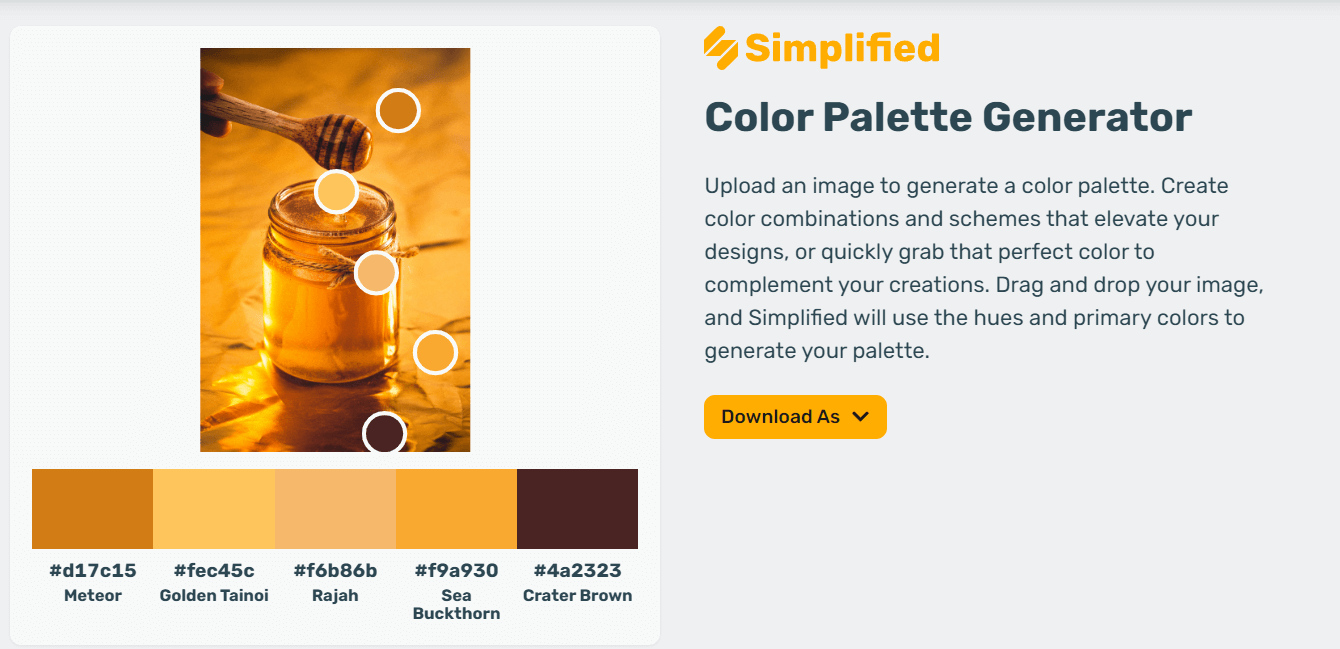
Simplified color palette generator is a great tool for graphic designers. It allows them to get creative with their designs. It helps them come up with unique color combinations that stand out.
With Simplified color palette generator, users can create color palettes. They can choose from a variety of different color schemes.
They can adjust the hue, and lightness of each color. It helps them create the perfect combination for their design. This makes it easy for users to create color palettes tailored to their needs. .
Get Creative With Simplified!
Simplified is the free design tool – made for everyone offers a multitude of graphing designing features including, Unlimited design & video projects, Millions of free stock photos & videos, Background remover, AI text-to-image generator, Multiple Brand kits, up to 30 artboards to create videos and many more.


