
There are many different ways you can use colors to represent your brand in design projects. By using color harmony, for example, you can create a cohesive aesthetic that will make your company’s logo and adverts seem more polished and professional.
As you begin to experiment with creating your own color palettes, you might find yourself wondering whether you are doing it right. Getting color harmony right is harder than it sounds, and there are some established design principles you’ll need to follow to get it on point. Luckily, Simplified’s on hand to help you with this!
In this blog, we’ll teach you everything you need to know about the concept of color harmony and provide you with some real-life color harmony examples. So, what are we waiting for? Let’s get stuck in.
Bonus: Why Are Some Colors More Effective in Increasing Sales?
What is Color Harmony?
Color harmony is the practice of combining colors in an aesthetically pleasing way. It’s an art and a science – one that can be intimidating for a new designer or artist. However, when you become familiar with this tool, you will see it’s simple and effective.
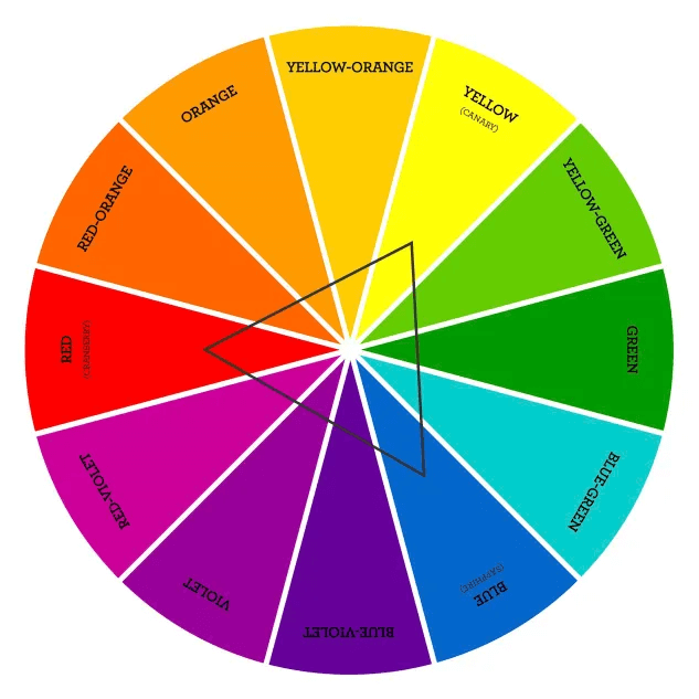
The concept of color harmony is based on the color wheel, which is a circular diagram of colors.
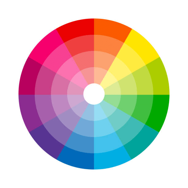
Source: iStock
The primary colors – red, yellow, and blue – are located equal distances apart on the color wheel. The secondary colors – purple, green, and orange – are set halfway between the primary colors. Remember that secondary colors are a mix of primary colors. For example, if you mix red and blue, you get purple. The other spaces are filled with tertiary colors, which are blends of one primary and one secondary color. You can include any color you can think of in a color wheel, but usually, commercial wheels only include 12 colors.
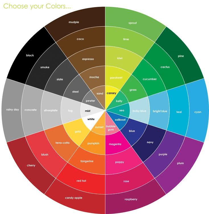
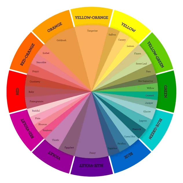
Source: Pinterest
Pay attention to the cold (also called ‘cool’) and warm colors to create color harmony. The cool colors are blue, green, and purple, while the warm colors are red, yellow, and orange. The cold colors are calm and watery, while the warm colors are energetic and intense. When you start planning your color scheme and creating harmony, think about the mood you want to set and the feelings you’d like to evoke. After that, you can choose the temperature of your colors and get creating. The last thing you need to know is that black, grey, and white are neutral colors.
Bonus: Hues, Tints, Tones, and Shades: What’s the Difference?
1. What is Monochromatic Color Harmony?
Monochromatic color harmony is a color scheme based on a single-color hue. It only uses different tints and shades of the same hue.
A hue is a color without any shades or tones. Your design would use only shades of one color created by altering the saturation and brightness of this base color. Also, you can always add black and white because they are the brightest and the darkest shades.
Tints are the lighter versions of the color, made by adding white, while the shades are the darker tones, which you get from adding black to the color.
Lastly, a tone is the vibrancy of the hue, which you can alter by adding grey. Now that we’ve discussed some basic terms of monochromatic color harmony, let’s see some examples.

Examples of Monochromatic Color Harmony
Creating a monochromatic color harmony means that there is only one color and its variations in the image. The first example is of a yellow monochromatic image.
Yellow
By using this technique you create what is called color dominance harmony. You can make this with any color you’d like, or even with cool and warm colors.

Red
The second example is a red color harmony, which you can create by adding black, white, and grey to adjust the hue.

Bonus: The Ultimate Guide To Monochromatic Colors & How To Use Them
2. What is Analogous Color Harmony?
Analogous colors are located next to each other, no matter which side of the color wheel they are on. They usually represent color harmonies in nature and are visually serene. But be careful how you use analogous colors, so you don’t end up with an image that looks like monochromatic color harmony instead.

Source: Elle Decor
You can use an analogous harmonious color palette with very similar, fewer contrast shades or a combination of high-contrast shades. Now, you’ll be able to see a few analogous color harmony examples to get a better idea of what we mean.
Analogous Color Harmony Examples
Blue-Green
This analogous color harmony works because the hues are next to each other on the color wheel. Plus, the colors give the image a serene, calm, and soothing feel; there’s nothing fierce or overly active to see here.

Source: Spring Leaf Studios
Yellow-Green

Source: Photography Icon
This image is a good example of colors that you can easily find in nature. Another reason why it works so well is because of the contrast and harmony of colors. While yellow is a warm color, green is a cool one, making the natural combination of the two a harmonious experience for the eye.

Bonus: 6 Tips For Designing Graphics That Are Colorblind Friendly
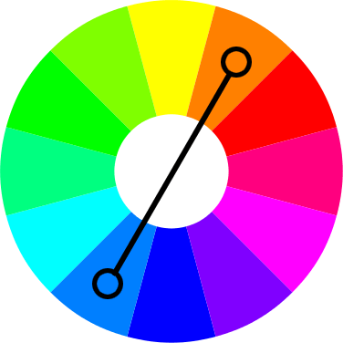
3. What is Complementary Color Harmony?
Complementary colors are the colors that sit directly opposite each other on the color wheel. Complementary colors create high contrast and visual energy.
Source: European writers
Complementary Color Harmony Examples
Red-Green
They are a high-contrast color combo that makes visually striking images.

4. What is Triadic Color Harmony?
Tridiac scheme uses three colors evenly spaced around the color wheel. It offers a vibrant and balanced color combination. Unlike analogous colors that sit close together on the color wheel, triadic colors are three colors evenly spaced apart, forming a triangle. It creates a balance between similarity and contrast.
Source: Make It from Your Heart
Triadic Color Harmony Examples
Red-Yellow-Blue
A triadic palette of red, yellow, and blue is perfect for capturing the playful and energetic spirit of a children’s book.

Bonus: The Best Ways to Use Triadic Colors in Design
5. What is Split-Complementary Color Harmony?
This scheme uses a base color and the two colors on either side of its complementary color. It offers a slightly less intense contrast than a true complementary scheme.
Source: Make It from Your Heart
Split-Complementary Color Harmony Examples
Orange- Red and Yellow-Orange
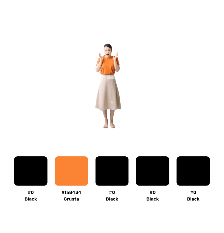
A branding design featuring teal as the base color with pops of orange-red and yellow-orange creates a unique and memorable brand identity.
Bonus: Famous Logos with 10 Color Combinations You Can Steal for Your Brand
6. What is Tetradic Color Harmony?
This scheme uses four colors evenly spaced around the color wheel. It’s a bold and complex scheme, best used with careful consideration.
They offer a rich and diverse palette, perfect for creating visually engaging designs

Source: Make It from Your Heart
Tetradic Color Harmony Examples
Orange- Yellow- Blue- Violet
A combination of orange, yellow, blue, and violet creates a dynamic and visually stimulating experience.
7. What is Square (Variant of Tetradic) Color Harmony?
This scheme uses four colors that form a square on the color wheel. It offers a vibrant and balanced color combination similar to a triadic scheme but with a slightly different feel.
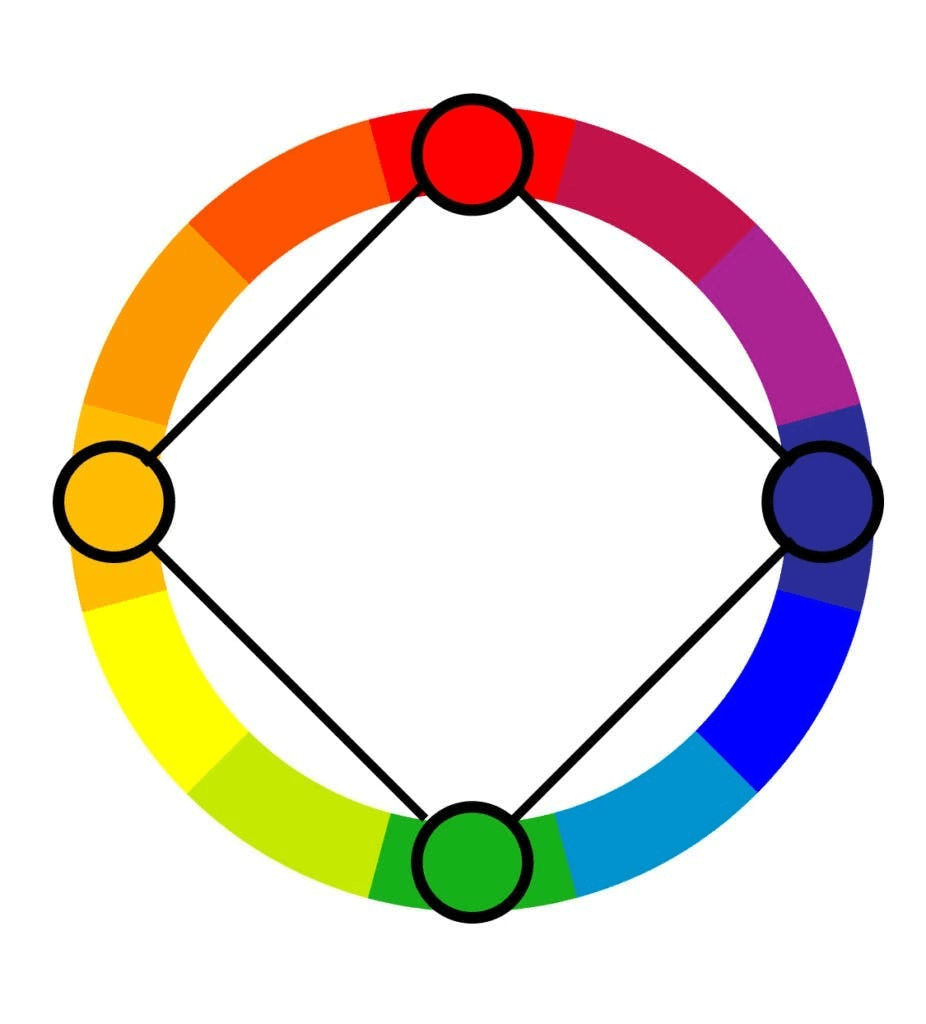
Source: Simplified
Square Color Harmony Examples
Red- Yellow- Blue- Green
A design featuring red, blue, yellow, and green represents energy, competition, and teamwork.

Bonus: The Ultimate Guide To Blue Complementary Colors: Examples, Templates & Color Palettes
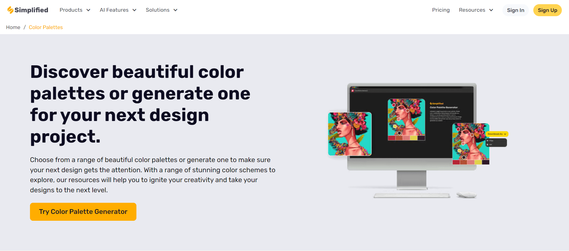
Simplified: Your Guide to Color Harmony
Simplified is your one-stop shop for mastering color harmony in your design projects.
Source: Simplified
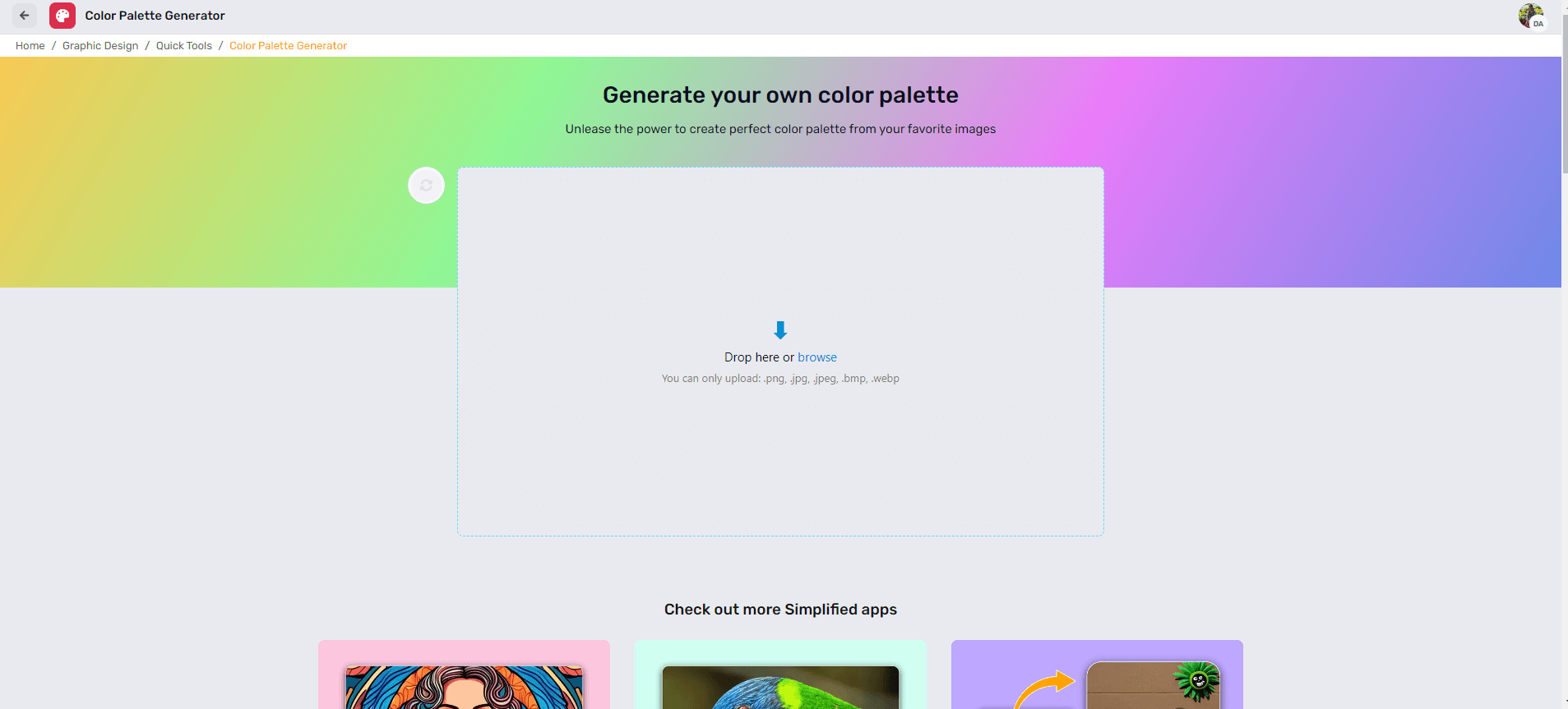
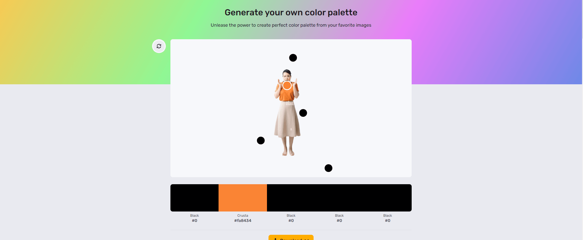
- Effortless Color Palette Creation: Our intuitive interface and advanced color palette generators allow you to create stunning color palettes from scratch or based on any image.
Source: Simplified
Source: Simplified
Generate Your Own Color Palette
Bonus: Bad Color Combinations to Avoid When Creating Your Brand Kit
- Pre-Designed Templates : Explore our vast library of pre-designed templates that utilize color harmony effectively. This lets you create high-quality designs quickly and effortlessly.


- Experimentation Made Easy: Simplified’s user-friendly features allow you to customize and experiment with different color schemes without needing extensive design knowledge.
Bottomline
Color harmony is not just a concept; it’s a skill that can elevate your designs from good to extraordinary. With Simplified by your side, mastering color harmony becomes achievable and enjoyable with every design that you create. So why settle when you can create masterpieces? Start your journey with Simplified today and get creative.
With Simplified’s powerful color palette generator and extensive template library, achieving color harmony has never been easier. Whether you’re a seasoned designer or a novice enthusiast, Simplified helps you to create visually stunning designs. So why wait? Dive into the world of color harmony with Simplified and watch your creative visions come to life.


![10 Best AI Sticker Generator Tools for Seamless Graphic Design [Free & Paid]](https://siteimages.simplified.com/blog/Must-Try-AI-Sticker-Generator-Tools-02.png?auto=compress&fit=crop&fm=png&h=400&w=400 "10 Best AI Sticker Generator Tools for Seamless Graphic Design [Free & Paid]")


