
A website is a great way for churches to attract new members and inform existing ones about online resources, events, and ways to get involved in the community.
When building or redesigning a church website, the goal is to provide an engaging and informative experience for both first-time visitors and existing members. To help you get started, we’ve identified some of the best church websites with unique and attractive designs that can inspire your own. Let’s take a look.
The list is divided into modern and simple church websites. Modern church websites have features like video backgrounds, image grids, bold text, and hover animations. Simple church websites focus on minimalism but share some of the same trends like parallax scrolling. Both types offer engaging user experiences. Let’s explore some examples.
Modern Church Websites
Modern church websites combine various design trends, including video backgrounds, image grids, bold text, and hover animations. They are highly interactive, giving users control over their experience and helping guide them to the information they seek. The result is a more engaging and memorable user experience. Let’s dive into some examples.
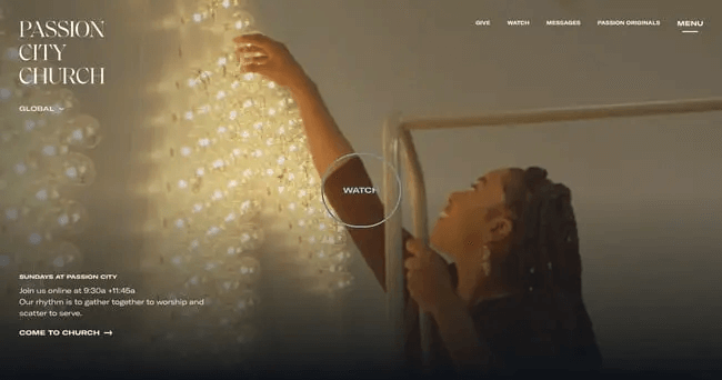
1. Passion City Church
Why this works:
Passion City Church’s website is a great example of being simple and stylish. The site has a clean and modern look with high-quality images and an easy-to-use menu. The homepage quickly grabs attention with bright pictures and short, meaningful messages about the church’s mission and values. Visitors can easily find important details like service times, locations, and upcoming events.
The use of empty space and simple colors makes the content easy to read and not too much to handle. Plus, the website works well on phones and tablets, making it user-friendly on any device. Social media links and a blog help keep the church members connected and updated.
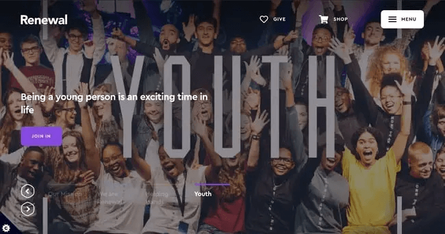
2. Renewal
Why this works:
Renewal’s website has a modern and bold look. The homepage has a large video that shows the church’s lively community. The site uses clear text and strong images to share its message.
It’s easy to navigate, with menus and buttons that guide visitors to important sections like sermons, events, and community groups. The website also has a media library where users can find past sermons, podcasts, and other content.
The focus on generating visuals and personal stories helps visitors feel connected and welcomed to the church community, even before they visit in person.
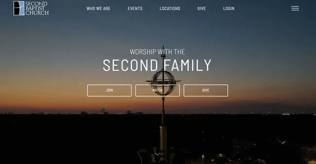
3. Second Baptist Church
Why this works:
Second Baptist Church’s website shows how a large church can have a user-friendly and interesting online presence. The site is well-organized with clear sections of information. The homepage offers quick access to important areas like ministries, events, and service opportunities.
The design is attractive, using colors, fonts, and images that match the church’s identity. The website also has an interactive map and detailed information about each campus, helping visitors find a nearby location easily.
One of the main features of Second Baptist Church’s website is its resources section. It offers various tools for spiritual growth, such as online courses, devotionals, and study guides. This focus on providing helpful content shows the church’s dedication to supporting its members’ faith journeys.
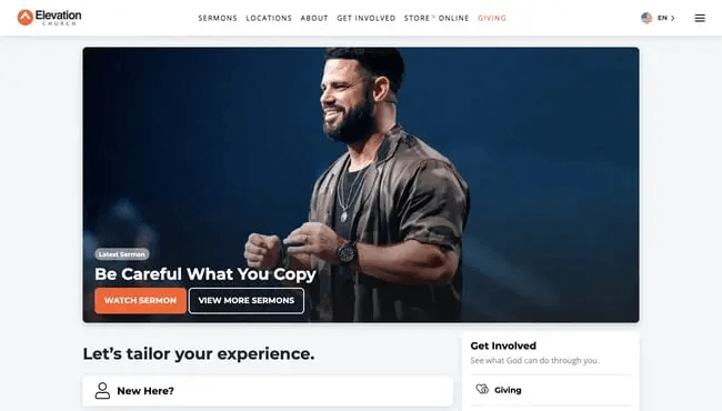
4. Elevation Church
Why this works:
Elevation Church’s website uses great pictures and interesting content. The homepage has cool videos and big, eye-catching text that grabs your attention right away. The site’s design is modern and smooth, focusing on telling stories.
It’s easy to navigate with drop-down menus, so you can quickly find information about services, events, and ministries. The website also shares personal stories and testimonials from church members, which helps create a feeling of community and connection.
One of the best parts of Elevation Church’s website is its online giving platform, which is well-integrated into the site. This makes it easy for members to contribute financially and support the church’s mission.
5. Freedom Church
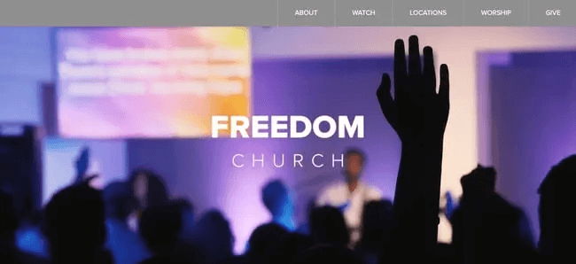
Why this works:
Freedom Church’s website is attractive and easy to use. The homepage has bright colors and interesting pictures that catch your eye. When you scroll, the background moves, which makes it fun to explore.
The information on the website is neatly organized into different sections, such as sermons, events, and ways to get involved in the community. There are also videos of sermons and other church activities that visitors can watch.
The website is designed to be accessible to everyone, with big, easy-to-read fonts and simple navigation. It also provides details about the church’s outreach programs, showing how they help the community.
6. Granger Community Church
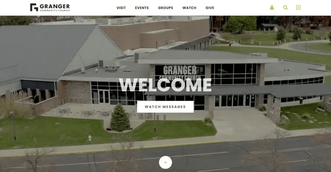
Why this works:
Granger Community Church’s website does a great job of being inviting and welcoming. The homepage uses warm colors and friendly pictures to show the church’s inclusive and supportive environment. The design is simple and not cluttered, so visitors can easily find information.
The site explains the church’s beliefs, values, and mission, helping visitors understand what the church is about. The events calendar is easy to find, making it simple for members to stay updated on upcoming activities and ways to get involved.
Granger Community Church’s website also has an online store where visitors can buy books, clothing, and other items. This not only helps the church financially but also offers useful tools for personal and spiritual growth.
7. Crossroads Community Church
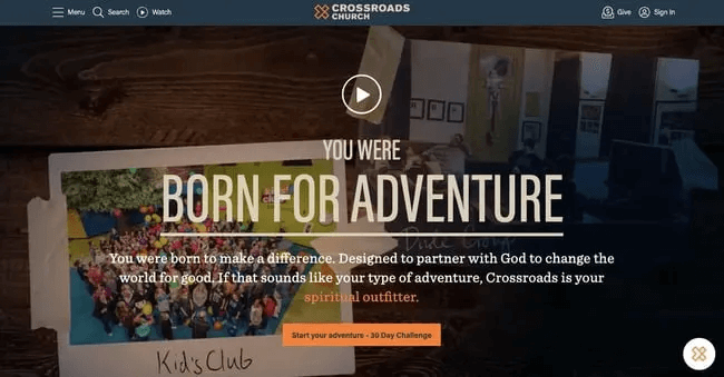
Why this works:
Crossroads Community Church’s website shows how telling stories can keep visitors interested. The homepage has interesting stories and testimonials from church members, showing how the church’s ministries and programs have helped them. This makes visitors feel connected and part of the community.
The website’s design is modern and nice to look at, with good-quality images and easy-to-read text. It’s simple to navigate, with clear menus that help visitors find important information like service times, locations, and events. A notable part of Crossroads Community Church’s website is its focus on online engagement. The site has a large media library with sermons, podcasts, and videos, as well as an active blog that gives regular updates and insights.
Crossroads Community Church has added a few elements on their website to engage with their members. They have a 30-day sign up challenge where the members get access to every day content, reading materials, videos, and other activities for 30 days if they sign up with their email address. This acts as a great marketing strategy to increase engagement with the community. Crossroads Community Church has a live chat added on their website for visitors who want to ask questions and are unable to find anything on their website.
8. Faith Community Church
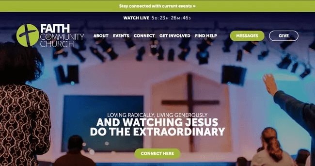
Why this works:
Faith Community Church’s website is a good example of how to use design and content to create an interesting online presence. The homepage has a simple and modern look with high-quality images and clear text. The use of empty space and a basic color scheme makes the content easy to read.
The website’s navigation is easy to use, with clearly labeled menus and buttons that guide visitors to important sections like sermons, events, and community groups. There is also a section with many resources for spiritual growth, including online courses, devotionals, and study guides.
Faith Community Church’s website also highlights community involvement, with detailed information about the church’s various outreach programs and volunteer opportunities. This focus on service and engagement shows the church’s commitment to making a positive impact in the community.
This website has a very powerful “Connect Here” CTA, that intrigues visitors to fill out the contact form. They can click the CTA or even check out the menu items on the top of the landing page to learn more about how to donate.
9. Loft City Church
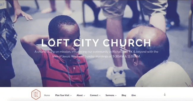
Why this works:
Loft City Church’s website shows how good design and content can make a website engaging. The homepage has a clean and modern look with nice pictures and easy-to-read writing. They use empty spaces and simple colors, so it’s not too crowded.
You can easily find your way around the website. They have clear menus and buttons that tell you where to go, like for sermons, events, and community groups. There’s also a section with lots of resources for growing spiritually, like online classes and guides.
The website also talks a lot about getting involved in the community. They give details about different ways to help out and join in, showing they really care about making a difference in the community.
10. One Church
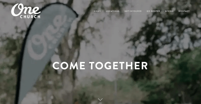
Why this works:
One Church’s website shows how to use design and content well to make an interesting online presence. The homepage looks clean and modern, with nice pictures and easy-to-read writing. They use space well and have simple colors, so it’s not too busy.
Finding your way around the website is easy. There are clear labels and buttons that help you find important parts like sermons, events, and groups. They also have lots of resources to help you grow spiritually, like classes, daily readings, and study guides.
The website also talks a lot about being part of the community. They explain their outreach programs and how you can volunteer. This shows they really care about helping their community in a good way.
11. Calvary
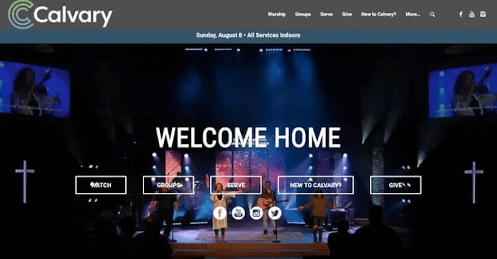
Why this works:
Calvary’s website shows how good design and content can make a website engaging. The homepage looks clean and modern, with clear pictures and easy-to-read writing. The use of space and simple colors makes sure the information is clear without being too much.
It’s easy to find your way around the website. The menus are labeled clearly, and buttons help you find important parts like sermons, events, and groups easily. They also have a lot of resources for spiritual growth, like online classes, daily readings, and study guides.
Calvary’s website also talks a lot about getting involved in the community. They share details about programs to help others and ways to volunteer. This shows they really care about making a good difference in their community.
12. Park West Church
Why this works:
Park West Church’s website shows how design and content can create a great online presence. The homepage has a clean, modern look with nice pictures and easy-to-read writing. It uses empty space and simple colors to keep things clear and not too busy.
The website is easy to use, with clear menus and buttons that tell you where to go for things like sermons, events, and groups. There’s also a lot of resources like online classes and guides to help you grow spiritually.
Park West Church’s website also talks a lot about helping the community. They have info on different ways to help out and volunteer. This shows how much they care about making things better for everyone around them.
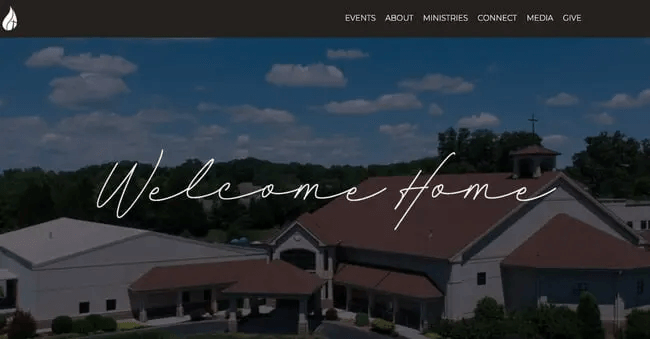
13. Lancaster County Bible Church
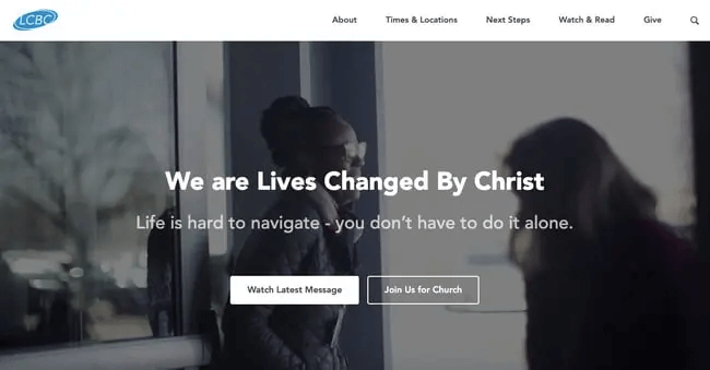
Why this works:
Park West Church exemplifies user-centric design in its website, creating an inviting and functional experience for visitors. Upon landing on the site, users are immediately welcomed with the phrase “Welcome Home,” which sets a warm tone and provides essential information about service times.
As users navigate the site, they encounter multiple calls-to-action (CTAs) that cater to their potential interests and needs. These include options to sign up for events, watch sermons online, join livestream services, donate, subscribe to the church bulletin, or contact the church. This anticipatory design helps guide users toward actions they are likely to take.
Additionally, the website features a sticky navigation menu that allows visitors to access more information easily. By hovering over this menu, users can reveal drop-down options that provide further actions and details, ensuring that even if initial searches do not yield the desired information, additional resources are readily available. This thoughtful layout enhances user engagement and satisfaction, making it easier for visitors to connect with the church and its offerings.
Conclusion
These 13 church websites show how to make a good website. They’re great at design, easy to use, have good content, and engage with their community. Churches can learn from these examples to make websites that help people learn, feel inspired, and connect with others.
A good church website is really important nowadays. It helps new people get to know the church, gives members useful information, and shows what the church believes in. Making sure the website is easy to use, has good information, and talks clearly helps the church meet its goals and reach more people.
Having a well-designed website with good information helps a church connect with people, support their faith, and reach more folks. These examples are a good starting point for making a church website that really matters.


")
")


")


