
Ever find yourself scrolling through YouTube Shorts and stopping because a thumbnail just grabs your attention? We’ve all been there. But what’s the secret? Is it just luck, or is there a formula for creating thumbnails that actually stand out? The truth is, a great thumbnail can make all the difference in whether someone watches your content or skips right by it.
In this blog, we’re breaking down exactly how you can design YouTube Shorts thumbnail that not only catch the eye but make people want to click. Whether you’re a newbie or a seasoned pro, we’ve got you covered with tips that work.
Ready to make your Shorts irresistible? Let’s dive in!🚀
Why Thumbnails are a Must-Have for YouTube Shorts
The First Impression: Why Thumbnails Matter
Think of thumbnails as the cover of a book. When you’re scrolling through YouTube Shorts, what makes you stop? It’s often that eye grabbing image that promises something interesting inside. A well-crafted thumbnail is your first chance to grab a viewer’s attention in a sea of content. It’s a visual invitation, hinting at the fun, information, or entertainment that awaits. Without a compelling thumbnail, your Short might get lost in the shuffle, no matter how great the content is.
Thumbnails and the YouTube Algorithm: Getting Discovered
YouTube’s algorithm is designed to show viewers content they’ll enjoy. Thumbnails play a role in this process. A captivating Youtube Shorts thumbnail can improve your click-through rate (CTR), which is the percentage of people who see your Short and then click to watch it. YouTube takes CTR into account when ranking videos. A higher CTR tells YouTube that your content is appealing, which can lead to your Shorts being shown to more people. So, a great thumbnail isn’t just about aesthetics; it’s about getting your content seen by a wider audience.
Keeping Viewers Hooked: The Role of Thumbnails in Viewer Retention
It’s not enough to just get someone to click on your Short; you want them to watch it, right? A good thumbnail sets expectations. It gives viewers an idea of what they’re about to watch. If your thumbnail accurately represents your content and sparks curiosity, viewers are more likely to stick around. On the other hand, a misleading or low-quality thumbnail can lead to disappointment and viewers clicking away quickly, hurting your viewer retention and overall performance.
Bonus: How AI Thumbnail Makers increase YouTube Views: A Complete Guide
Key Elements of an Irresistible YouTube Shorts Thumbnail
Color Psychology: Choosing Colors That Pop
Ever wonder why some thumbnails just grab your attention? Color plays a huge role! Think about it: bright, contrasting colors tend to stand out more against YouTube’s white background. Red and yellow are classic attention-getters, but don’t be afraid to experiment. Consider what colors align with your brand and the overall mood of your short. A cooking short might benefit from warm, inviting tones, while a tech review could use cooler, futuristic colors. Just make sure the colors you pick complement each other and don’t clash, creating a visual mess.
Text Overlays: How to Write Attention-Grabbing Titles
Your thumbnail text is like a mini-headline, so make it count! Keep it short, punchy, and intriguing. Instead of “Making Dinner,” try “Easiest Dinner EVER!” Use strong verbs and words that create curiosity. Choose a font that’s easy to read at a glance, and make sure it contrasts well with the background. A drop shadow or outline can also help the text stand out.
Remember, people are scrolling quickly, so you have to capture their attention in a split second.
Image Quality: Why High-Resolution Matters
Pixelated thumbnails are a big no-no. They look unprofessional and can deter viewers from clicking. Always use high-resolution images that are clear and crisp. If you’re using a photo, make sure it’s well-lit and in focus. Avoid blurry or grainy images at all costs. YouTube recommends a thumbnail size of 1280×720 pixels (a 16:9 aspect ratio). Starting with a high-quality source image ensures your thumbnail looks great on all devices.
Facial Expressions: Using Emotion to Draw Viewers In
Humans are naturally drawn to faces, especially those showing strong emotions. A thumbnail with an engaging facial expression can instantly create a connection with viewers. Think about the emotion you want to convey – excitement, surprise, humor, or even a bit of drama. A wide-eyed expression of shock can be perfect for a reaction video, while a confident smile might work well for a tutorial. Just be sure the expression matches the content of your short! A genuine, authentic expression is always more effective than a forced one.
Step-by-Step Guide to Designing Your Own YouTube Shorts Thumbnails
1. Go to Simplified’s AI YouTube Shorts Thumbnail Maker
Simplified is a good choice if you want quick Youtube Shorts thumbnail generation without needing advanced design skills. It’s built for creators who want speed, easy customization, and access to pre-sized formats for Shorts.
2. Customize the Content
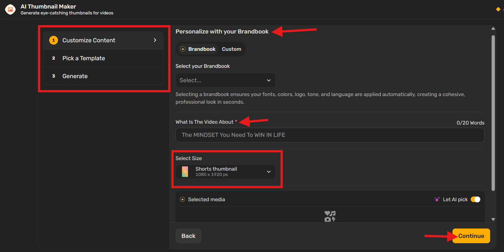
Add your own brand elements or use Simplified’s Brandbook feature if you’ve set one up. You can also manually customize colors, fonts, or layout to match your video’s tone. Make sure to choose the right size pattern for YouTube Shorts (9:16 aspect ratio).
3. Pick a Template and Generate
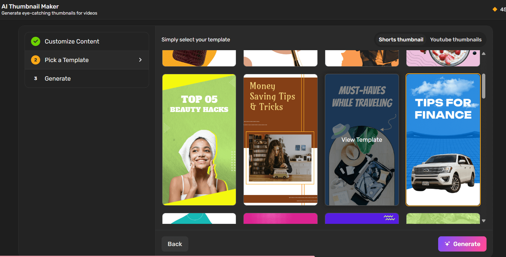
Browse through the ready-made templates built for YouTube content. Choose one that fits your video style, then click “Generate” to let the AI create your thumbnail draft.
4. Adjust If Needed
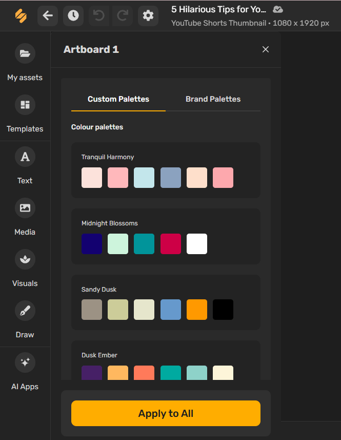
Once the thumbnail is generated, make any edits necessary. You can tweak text, swap images, or adjust colors to better fit your content before downloading.
Bonus: Why Some Vlog Thumbnails Go Viral: Unpacking the Secret Strategy
YouTube Shorts Thumbnail Sizing and Technical Tips
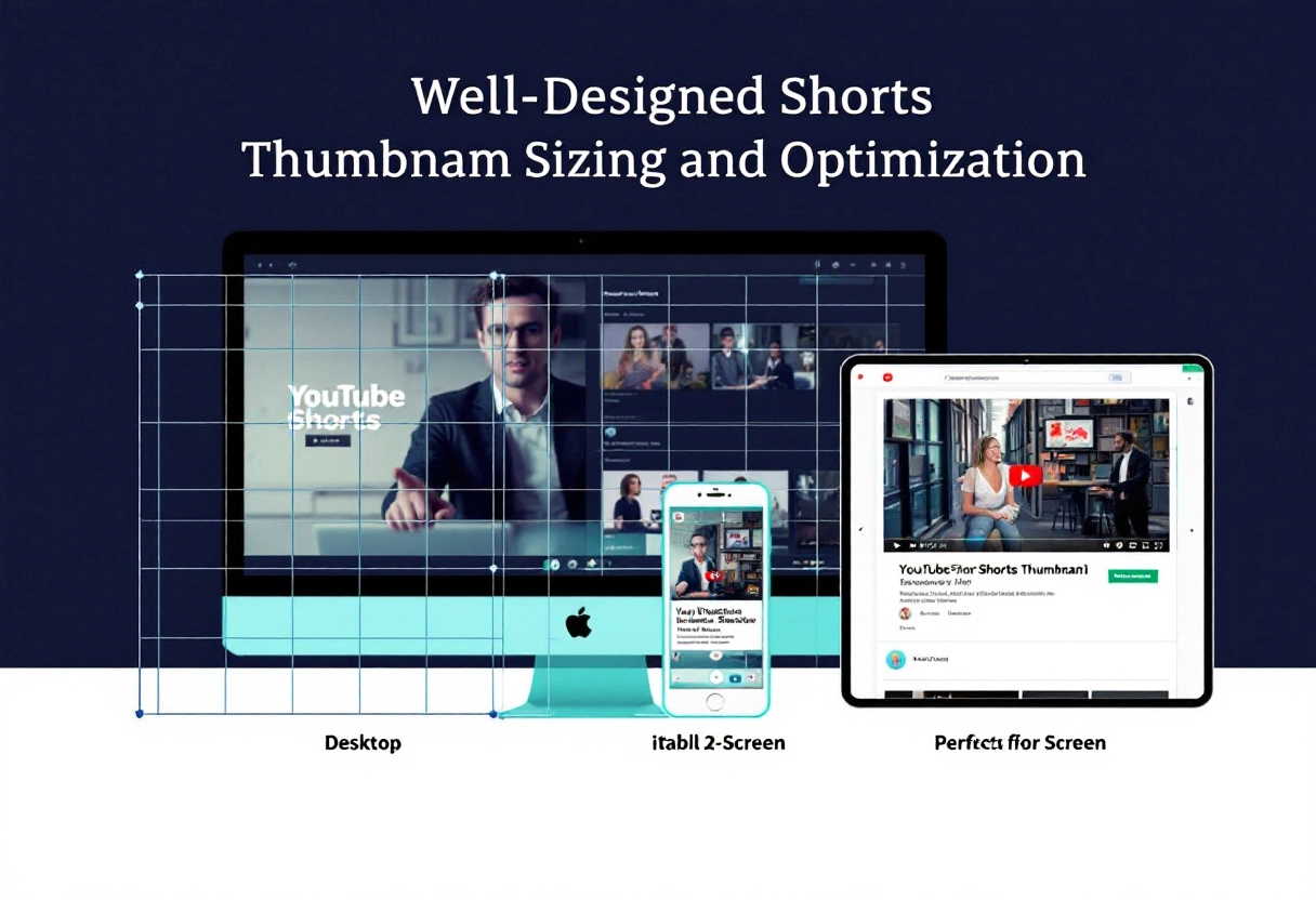
The Ideal Dimensions: Size Matters
Think of your thumbnail as a tiny billboard. It needs to grab attention quickly. That’s why getting the size right is crucial. While platforms like YouTube recommend 1280×720 pixels (with a minimum width of 640 pixels), remember that these are guidelines. The key is to ensure your thumbnail looks crisp and clear, no matter where it’s viewed. A blurry or pixelated thumbnail screams unprofessional, and viewers will scroll right past it. Consider this: your thumbnail might be viewed on a massive desktop monitor or a small smartphone screen. It needs to look good on both.
File Formats: Choosing the Right One
You’ve got your dimensions sorted, now what about the file format? JPEG, PNG, and GIF are your main options. JPEG is great for photos and images with lots of colors, offering a good balance between quality and file size. PNG is your go-to for graphics with text, logos, or transparency, as it preserves sharpness and detail. GIFs, while capable of animation, are generally not recommended for thumbnails due to their limited color palette and potential for large file sizes. Aim for the smallest file size possible (under 2MB is a good target) to ensure quick loading times, without sacrificing visual quality. Nobody wants to wait an age for your thumbnail to appear!
Optimizing for Mobile: How Thumbnails Look on Different Devices
Let’s face it: a huge chunk of your audience is probably watching on their phones. So, how do you make sure your thumbnail looks great on a small screen? The answer is all about contrast and clarity. Make sure your text is large enough to read easily, and use bold colors that stand out against the background. Avoid cluttering your thumbnail with too many elements; keep it simple and focused.
Test your thumbnails on different devices to see how they appear. What looks great on your computer might be illegible on a phone. Pay attention to how the platform crops your thumbnail, too. Important elements shouldn’t be cut off or obscured.
Avoiding Common YouTube Shorts Thumbnail Mistakes

Cluttered Designs: Less is More
Ever clicked on a video because the thumbnail looked like a vibrant explosion of information, only to find the actual content buried beneath layers of graphics and text? Yeah, we’ve all been there. A cluttered thumbnail is a fast track to losing potential viewers. Think of your thumbnail as a billboard – you’ve got a split second to grab someone’s attention as they scroll. Overloading it with too many elements makes it hard to read and understand, causing people to scroll right past.
Instead, embrace minimalism. A clean, simple design with a clear focal point is far more effective. Use negative space strategically to draw the eye to the most important elements. Limit your text to a concise, attention-grabbing phrase. Choose visuals that are easy to interpret at a glance. By prioritizing clarity and simplicity, you make it easier for viewers to understand what your video is about and why they should click.
Misleading Images: Building Trust with Viewers
Clickbait thumbnails might get you a quick surge in views, but they come at a cost: trust. If your thumbnail promises something that your video doesn’t deliver, viewers will feel deceived and are unlikely to return. This not only hurts your reputation but can also negatively impact your video’s performance in the long run, as viewers are less likely to watch it through to the end or recommend it to others.
Authenticity is key to building a loyal audience. Your thumbnail should accurately represent the content of your video. If you’re creating a tutorial, show a clear image of the finished product or the process involved. If you’re sharing a personal story, use a genuine photo of yourself. By being honest and transparent in your thumbnails, you build trust with your viewers and set the right expectations for what they’re about to watch.
Ignoring Analytics: What Your Data is Telling You
Your thumbnail creation process shouldn’t be based on guesswork. YouTube Analytics provides a wealth of data that can inform your thumbnail strategy and help you optimize your click-through rate. Pay attention to metrics like impressions, click-through rate (CTR), and watch time to see how your thumbnails are performing. Which thumbnails are driving the most clicks? Which ones are leading to longer watch times?
Use this data to identify trends and patterns. Experiment with different thumbnail styles, colors, and text to see what resonates with your audience. A/B test different versions of your thumbnails to see which performs best. By continuously analyzing your data and iterating on your designs, you can refine your thumbnail strategy and create visuals that not only grab attention but also accurately reflect your content and attract the right viewers.
Bonus: How To Make a Thumbnail That Stands Out
Testing and Refining Your YouTube Shorts Thumbnails
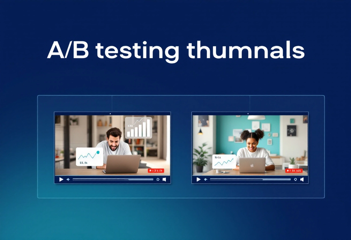
A/B Testing: Finding What Works Best
Ever wonder why some thumbnails just seem to grab your attention more than others? It’s not always about luck; often, it’s the result of careful A/B testing. This process involves creating two or more versions of a thumbnail and showing them to different segments of your audience. By tracking which version performs better, you can gain valuable insights into what resonates with your viewers. Think of it like this: you’re not just guessing what looks good; you’re letting your audience tell you what they prefer.
For example, you might test a thumbnail with a close-up of a person’s face against one with a wider shot of the scene. Or, you could compare thumbnails with different text overlays or color schemes. The key is to change only one element at a time so you can accurately attribute any performance differences to that specific change. Over time, A/B testing can significantly improve your click-through rates and help you understand your audience on a deeper level.
Analyzing Click-Through Rates: Understanding Your Audience
Click-through rate (CTR) is your thumbnail’s report card. It tells you what percentage of people who see your thumbnail actually click on it. A high CTR means your thumbnail is doing its job of grabbing attention and enticing viewers to watch your video. A low CTR, on the other hand, suggests that your thumbnail isn’t quite hitting the mark and may need some adjustments.
But CTR is more than just a number; it’s a window into your audience’s preferences. By analyzing which thumbnails get the most clicks, you can start to understand what kind of visuals, colors, and messaging appeal to your target demographic.
For instance, if you notice that thumbnails featuring bright, contrasting colors consistently outperform those with muted tones, that’s a valuable insight you can use to inform your future designs. Similarly, if thumbnails that promise specific, actionable advice generate more clicks, you might want to incorporate that element into more of your thumbnails.
Iterating on Your Designs: Continuous Improvement
Creating great thumbnails isn’t a one-and-done deal; it’s an ongoing process of learning, testing, and refining. Once you’ve gathered data from your A/B tests and analyzed your click-through rates, it’s time to put those insights into action and iterate on your designs. This means taking what you’ve learned about your audience’s preferences and using it to create even more compelling thumbnails in the future.
Don’t be afraid to experiment and try new things, but always base your decisions on data rather than gut feelings. For example, if you’ve found that thumbnails with faces tend to perform well, try experimenting with different facial expressions or camera angles. Or, if you’ve discovered that your audience responds positively to certain keywords, try incorporating them into your thumbnail text.
Bonus: 10 Proven Techniques to Improve Roblox Thumbnail Design While Following Guidelines
Final Thoughts: Create Great YouTube Shorts Thumbnails

Why You Should Start Now
Thumbnails are your video’s first impression. Think of them as tiny billboards that can make or break your viewership. A well-crafted thumbnail grabs attention and entices viewers to click, while a poorly designed one can get lost in the shuffle. Creating great thumbnails is more important than ever in today’s crowded digital space.
Create professional-looking thumbnails efficiently
You don’t need to be a design expert to make amazing thumbnails. There are plenty of user-friendly tools available that let you create professional-looking designs quickly. These tools often come with pre-made templates, graphics, and fonts, so you can focus on getting your message across without getting bogged down in complicated design processes. It’s about working smarter, not harder, to produce thumbnails that draw viewers in.
Maintain a cohesive visual brand identity
Your thumbnails are an extension of your brand. Using consistent colors, fonts, and styles across all your thumbnails helps viewers recognize your content instantly. This visual consistency builds trust and familiarity, making people more likely to click on your videos. Think of it as creating a visual signature that sets you apart from the competition.
Save time and reduce the costs of design processes.
Creating thumbnails doesn’t have to be time-consuming or expensive. By using the right tools and techniques, you can significantly cut down on design time and costs. Instead of hiring a professional designer for every thumbnail, you can learn to create them yourself or delegate the task to someone on your team. This frees up your time and resources to focus on other important aspects of your content creation strategy.


")
")


")


