
In 2025, magazine ads aren’t just surviving — they’re thriving in a digital-heavy world.
Recent studies show that 77% of readers recall a print ad brand, compared to only 46% for digital (Statista, 2024). Even more telling: printed magazines are seen as 27% more trustworthy than online media (MarketingProfs, 2024).
While online ads fight for a few seconds of attention, magazine ads offer something rare: focused time. A typical reader spends over 20 minutes with a single issue (Nielsen, 2025), giving your design more space to make an impression — without competing with endless notifications and tabs.
But standing out in print today isn’t about throwing everything on a page.
The best magazine ads in 2025 are sharp, uncluttered, and smartly creative — mixing striking visuals with a clear, single message.
In this guide, you’ll find:
- 15+ real-world magazine ad examples from late 2024 through 2025 — showing the trends that are actually working.
- A practical walkthrough on designing your own magazine ad — whether you’re starting from scratch or refreshing an old idea and tips to create best magazine ads.
If you’re serious about making an impact in print this year, you’re exactly where you need to be.
15+ Recent Magazine Ads Designs
Here are 15+ recent magazine ads examples (2024–2025) that are grabbing attention for their creativity, cultural relevance, and clever branding. These ads showcase how brands are using innovative approaches to connect with their audiences:
1. Chambord – “Because No Reason”
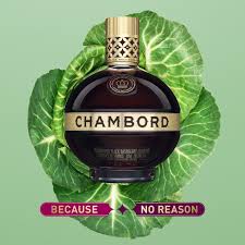
This Magazine ad campaign is a bold move that challenges societal norms and conventions, especially around how women enjoy alcohol. It shows women casually sipping Chambord liqueur in unexpected ways, like pairing it with cabbage. The ad doesn’t follow any traditional rules of alcohol marketing, and it even suggests that there’s no particular reason to enjoy Chambord the way society expects you to.
Why It Works:
It empowers the target audience by promoting individuality and rejecting stereotypes about how women should act or what they should drink. By breaking the norms and encouraging freedom of choice, the campaign resonates with women who appreciate authenticity and independence. It creates a memorable impression by daring to be different and showing that enjoying life can be unorthodox.
Bonus: How to Make a Print ad For Healthcare Sector: Effective Strategies
2. Pepsi – “We Wish You a Scary Halloween!”
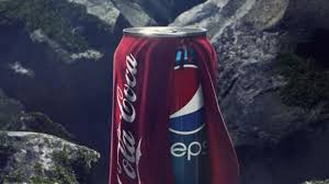
In a playful Halloween-themed commercial, Pepsi introduces a can dressed up in a Coca-Cola costume. This clever twist plays on the well-known rivalry between Pepsi and Coca-Cola, using humor to captivate viewers. The ad embraces the spirit of competition but in a lighthearted way, turning brand rivalry into an entertaining Halloween prank.
Why It Works:
Humor is an effective tool in advertising because it breaks the ice and makes the brand feel more approachable. The playful take on a holiday theme—using the iconic rivalry to spark curiosity—invites engagement while also adding a seasonal, fun twist. Viewers are more likely to remember and share something that makes them laugh, and the competitive angle keeps the rivalry fresh and top of mind.
3. McDonald’s – “Big Mac Slice”
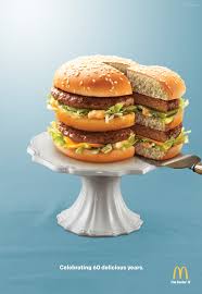
To celebrate the 60th anniversary of the Big Mac, McDonald’s launched an ad that presented the Big Mac not as a sandwich but as a slice of cake. The ad showed the Big Mac in all its iconic layers, as if it were a birthday cake, complete with candles and a celebratory vibe. This visual concept capitalized on the nostalgia and enduring appeal of the Big Mac, emphasizing its iconic structure in a fun, celebratory way.
Why It Works:
Nostalgia is a powerful tool in advertising, and McDonald’s taps into this by celebrating the Big Mac’s history. The clever visual of a sandwich as a birthday cake reinforces the iconic status of the product while connecting with customers who have grown up enjoying it. By taking a familiar product and putting a new twist on it, McDonald’s not only sparks fond memories but also reminds audiences of its place in pop culture.
4. Chupa Chups – “It’s Sugar-Free”
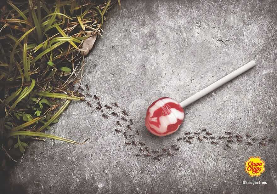
Chupa Chups created a humorous and slightly edgy ad by showing a lollipop surrounded by dead insects, implying that even bugs stay away from sugar-free candy. The message is clear: if bugs don’t want it, it must be good for you. The ad uses a striking visual contrast—bugs avoiding the candy—to communicate the product’s sugar-free nature.
Why It Works:
The ad works because it uses visual storytelling to make a simple message more engaging. By juxtaposing something lighthearted (a candy) with a humorous, slightly bizarre visual (insects avoiding it), the ad grabs attention and communicates the product’s sugar-free attribute in a memorable way. The humor and unexpected imagery make the message stick in the viewer’s mind, creating a stronger connection to the product.
5. Heinz – “Ketchup Puzzle”
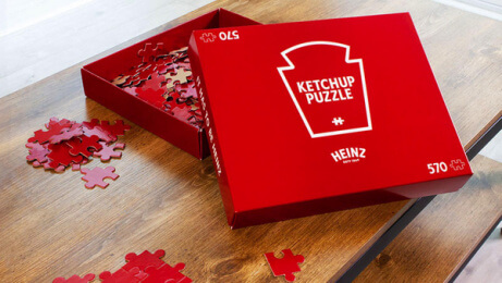
This unique ad features a 570-piece jigsaw puzzle, all in Heinz’s signature red, highlighting their well-known ketchup color. The puzzle is designed to be almost entirely one color—red—making it both challenging and visually intriguing. The ad’s purpose is to emphasize how easily recognizable Heinz’s brand is through its iconic red color.
Why It Works:
The concept works by engaging viewers in an interactive way, which immediately captures attention. People are intrigued by the idea of solving a puzzle that’s seemingly all one color. Additionally, it reinforces Heinz’s brand identity and how synonymous its color is with its product. The ad successfully taps into color psychology and brand recognition, making Heinz’s ketchup immediately identifiable to anyone familiar with the brand.
Bonus: The Biggest Ad Problem You’re Overlooking — Solved by AI Tools
6. IKEA – “Assembly Fail”
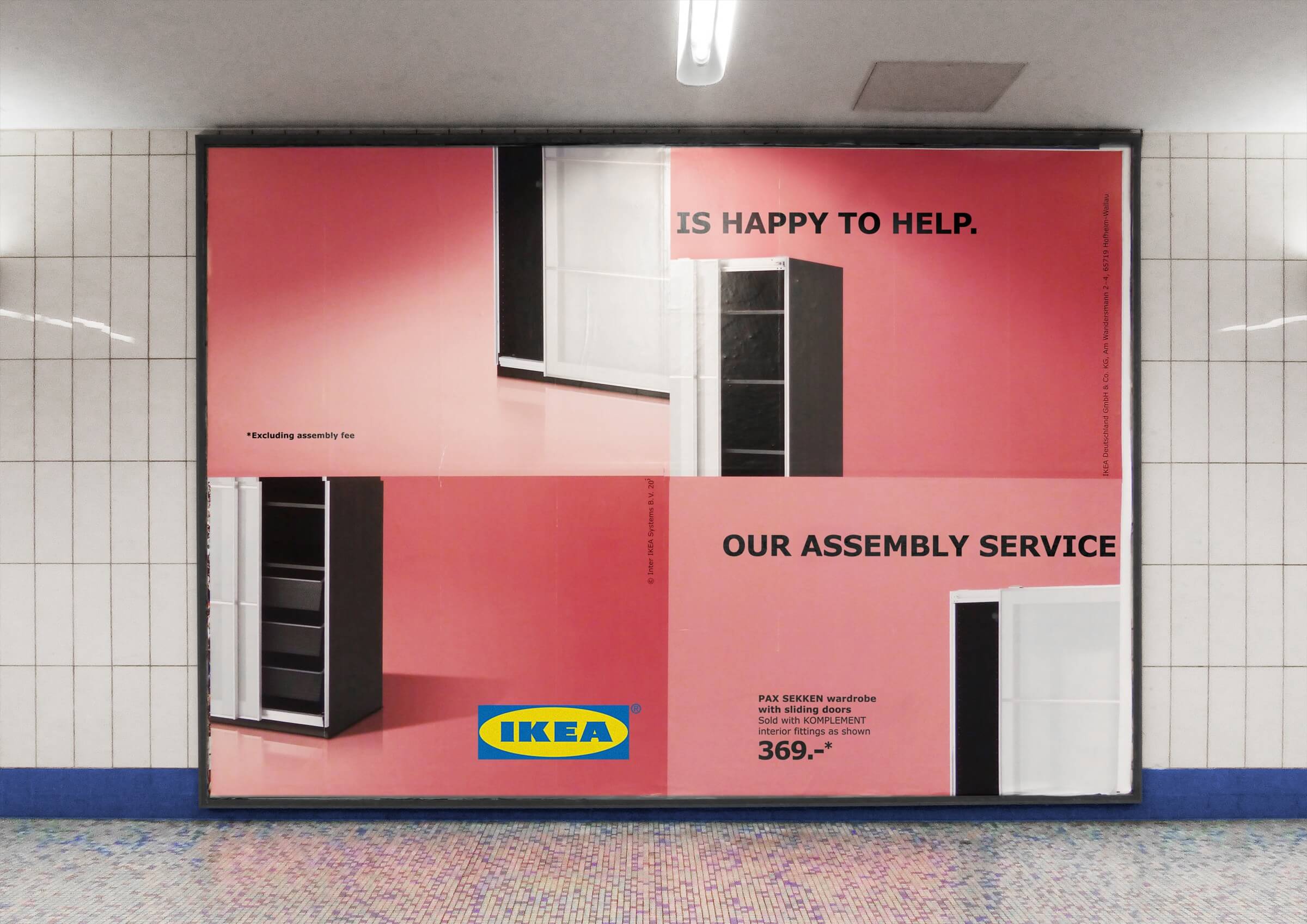
IKEA’s ad humorously showcases a piece of furniture that has been misassembled by a customer. The ad acknowledges a common frustration many customers have had—getting a piece of furniture home only to struggle with putting it together. The ad doesn’t shy away from this universal experience but instead embraces it with humor.
Why It Works:
This magazine ad works because it demonstrates brand self-awareness. IKEA taps into the shared experiences of its customers, particularly the struggle with assembly. The humor makes the ad relatable, connecting with customers who have likely faced similar issues. Rather than pretending these issues don’t exist, IKEA embraces them, which humanizes the brand and builds trust with its audience.
7. True Religion – “Own Your True”
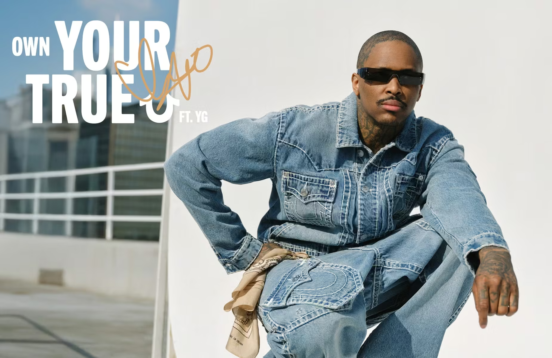
True Religion’s campaign focuses on self-expression and individuality, encouraging customers to “own” their true selves by wearing True Religion apparel. The ad showcases various people, from different walks of life, confidently wearing True Religion jeans, emphasizing the message that the brand is for everyone who wants to embrace their personal style.
Why It Works:
The ad connects with viewers by promoting a sense of empowerment. It encourages individuality and reinforces the idea that True Religion isn’t just about fashion but about self-expression. By tapping into the cultural and personal aspirations of its audience, the brand builds an emotional connection with customers. The phrase “Own Your True” also speaks to confidence and self-assurance, qualities people want to associate with.
8. Le Creuset – “Counter Couture”
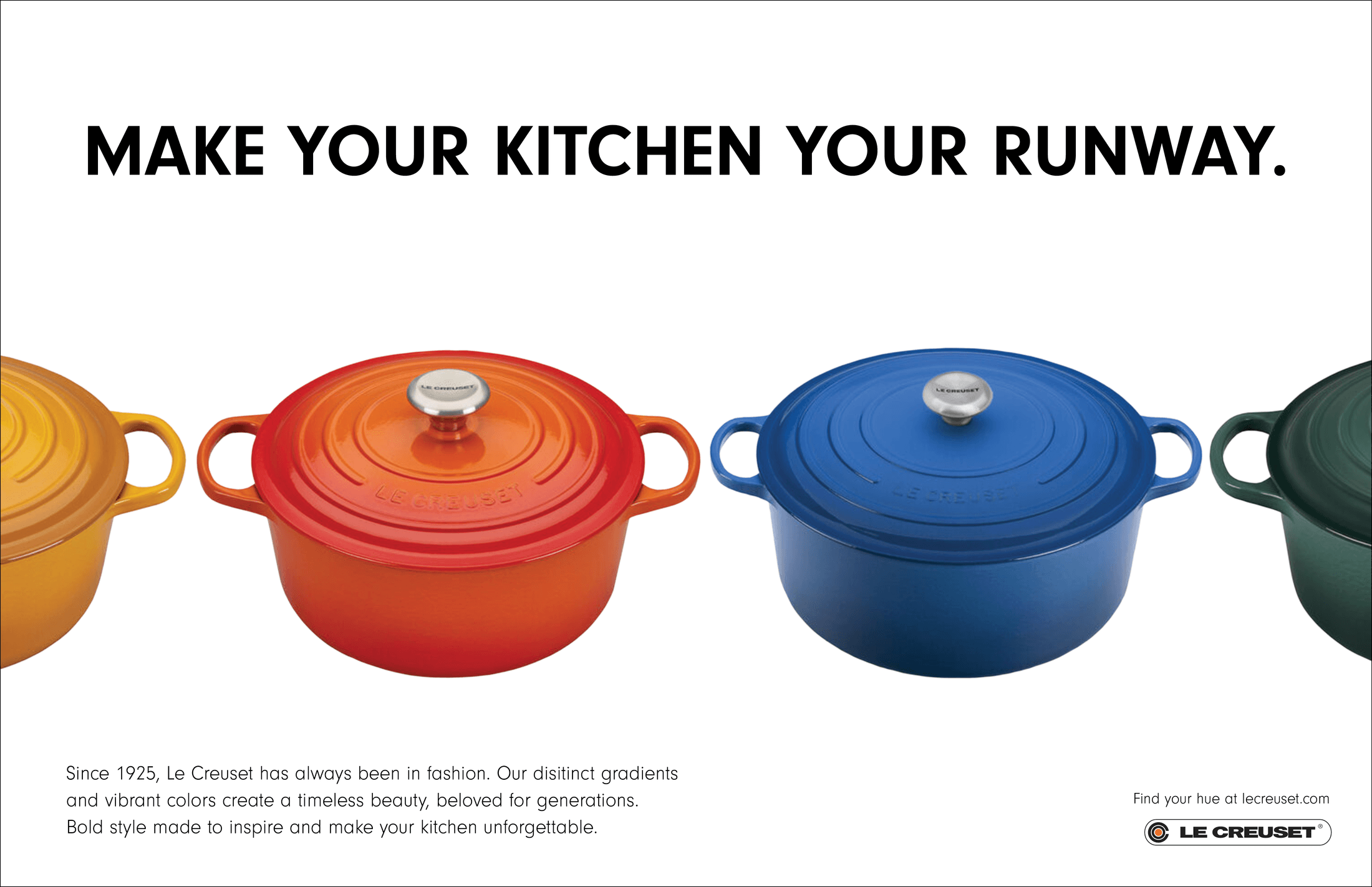
Le Creuset’s ad repositions its cookware as fashionable items, worthy of being displayed in the kitchen as a stylish centerpiece. Instead of being just practical tools, the cookware is framed as an integral part of home décor, highlighting its vibrant colors and sleek design.
Why It Works:
This concept works by appealing to consumers’ desire to elevate their lifestyle and home aesthetics. Le Creuset successfully appeals to the growing trend of “lifestyle branding,” where products are marketed not only for their functional use but also for their aesthetic value. By associating its cookware with fashion and home décor, Le Creuset taps into a luxury, aspirational market, encouraging customers to view their products as both useful and beautiful.
9. Tefal – “Pig, Goat, Chicken”
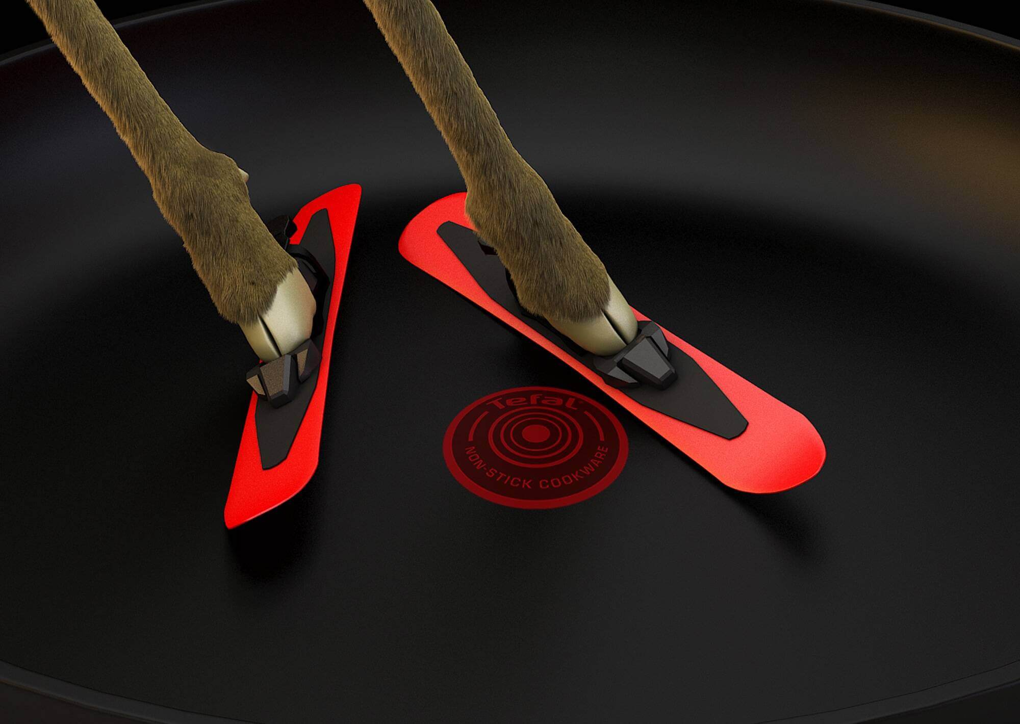
The ad features a visually striking, almost whimsical design where the main characters are animals — a pig, goat, and chicken — sliding effortlessly off the Tefal cookware. The background is often simple, with a focus on the bright red of the cookware and the animals. The design uses clean, uncluttered visuals, with just enough action to engage viewers while focusing on the key product benefit—its non-stick ability.
Why It Works:
This design works because of its playful, unexpected use of animals, which grabs attention. The minimalist approach puts the product front and center while allowing the animals’ movement to communicate the non-stick feature in a fun and memorable way.
Bonus: The Ultimate Guide To Magazine Cover Design
10. Carl’s Jr. – “Hangover Burger”
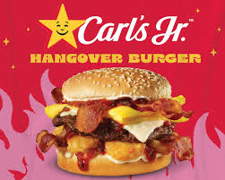
The ad combines bold visuals with a graphic and colorful design that highlights the “Hangover Burger” and the influencer Alix Earle. Carl’s Jr. often employs a minimalist approach where the burger is the centerpiece, usually with strong, bold typography. The design incorporates elements like bright colors to grab attention and an exaggerated use of scale to emphasize the burger’s size and importance
Why It Works :
This design works because of its striking visual contrast, using bold colors and large-scale visuals to draw the eye to the product. The inclusion of influencer imagery creates a modern and relatable touch. The minimalist backdrop lets the burger and the celebrity appeal take center stage, capturing attention with simple yet effective visual hierarchy.
11. Vaseline – “The Cracked Paintings”
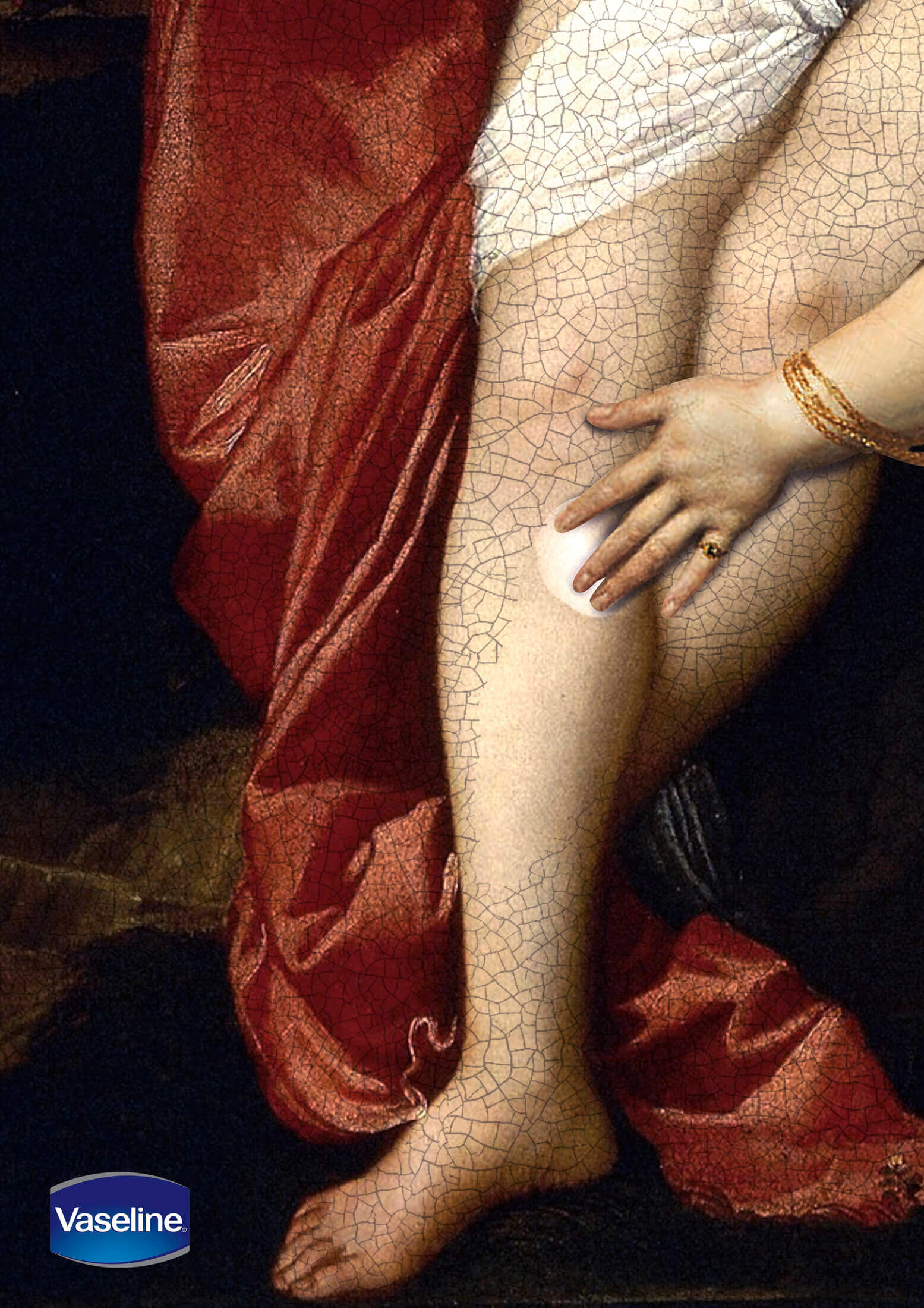
The magazine ads use classic art pieces, such as famous paintings, but with a twist: the art is cracked, symbolizing dry, damaged skin. The design is sophisticated, incorporating muted tones to evoke a sense of aging. Vaseline’s product is subtly placed in the ad, often in the foreground, with its healing properties highlighted. The ad makes use of strong contrasts—where cracked and aged areas emphasize the need for the product’s restorative properties.
Why It Works:
The design is elegant and thought-provoking, using visual storytelling to communicate the healing benefits of Vaseline. By incorporating iconic art with cracked effects, the ad visually communicates skin repair and care. The design speaks to both emotion and function, enhancing the message through visual metaphors that make the product’s promise of healing clear.
12. KFC – “Finger-Lickin’ Goodness”
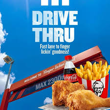
This magazine ad uses surreal imagery with everyday objects like light switches, doorknobs, and chairs that sprout mouths and lick their fingers. The design features exaggerated, cartoonish visuals with exaggerated facial expressions on the objects, creating a playful and humorous tone. The focus is on the “Finger-Lickin’ Goodness” slogan, which is enhanced by the visual of objects mimicking the eating experience.
Why It Works:
The design works because it’s highly creative and visually memorable. The quirky, unexpected idea of turning mundane objects into characters makes the ad stand out. The use of vibrant colors and surreal illustrations grabs attention and reinforces the idea of KFC’s irresistibility. It plays on humor and visual surprise, which helps consumers relate to the experience of enjoying KFC.
Bonus: YouTube Shorts Ads: Campaign Structure, Bidding & Creative Tips
13. Spotify – “Spreadbeats”
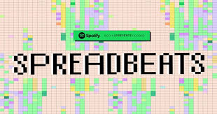
Spotify’s ad uses a mix of vivid colors and energetic visuals. It showcases diverse individuals enjoying music in various cultural settings, with the design reflecting the vibrancy and diversity of the music. The layout incorporates flowing, rhythmic shapes that symbolize sound waves and the universal appeal of music, visually connecting people across the globe.
Why It Works:
This design effectively uses color and flow to communicate the idea that music spreads joy across cultures. The diversity of the individuals depicted, combined with the use of dynamic, abstract shapes, conveys the message of unity and connection through music. The clean layout and bright tones keep the ad fresh, modern, and engaging, making it visually appealing while supporting the inclusive brand message.
14. Liquid Death – “Murder Your Thirst”
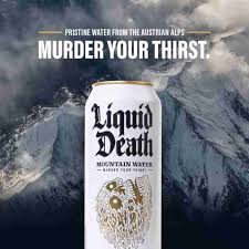
This magazine ads features bold, edgy artwork that aligns with Liquid Death’s rebellious branding. The design uses dark, gothic themes combined with high-contrast visuals to promote their canned water. The ad is loud, with graphics that resemble horror movie posters or heavy metal album covers, capturing the viewer’s attention through shocking imagery.
Why It Works:
The design works because of its shock value and unique approach to branding. The use of dark, intense visuals contrasts with the fact that it’s just water, creating an unforgettable juxtaposition that makes the product stand out. This bold design approach appeals to the brand’s target demographic—those who embrace a rebellious, edgy lifestyle—and differentiates Liquid Death from traditional, bland water advertising.
15. Pop-Tarts
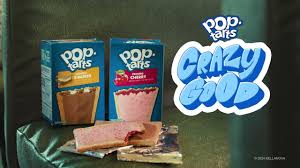
This magazine ads showcases animated Pop-Tarts characters in humorous and whimsical situations, often with exaggerated, comical expressions. The bright, playful color palette is dominant in the design, with cartoon-like visuals and exaggerated character expressions that emphasize the fun and quirky nature of the product.
Why It Works:
The design appeals to a younger audience with its playful and light-hearted tone. The use of animation and humor resonates with the fun and energetic brand personality of Pop-Tarts. The design’s bright colors and entertaining visuals make it eye-catching and memorable, positioning the product as an enjoyable, nostalgic snack that stands out in a crowded market.
16. Nike – “You Can’t Stop Us”
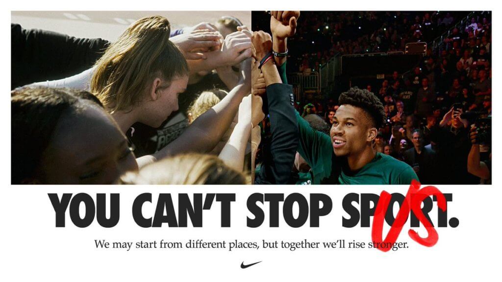
Nike’s ad features a powerful visual of athletes from various backgrounds coming together, symbolizing unity, perseverance, and the power of sport. The design uses striking imagery of athletes in motion, with minimal text and a focus on the visual strength of the diverse athletes. The design also uses a split-screen effect to emphasize unity and strength through collective effort.
Why It Works:
This design is effective because it uses inclusive representation to reflect the brand’s core values of unity and resilience. The clean design, with its dynamic shots of athletes from different sports and backgrounds, is motivational and powerful. It highlights Nike’s message of empowerment and reinforces its positioning as a brand that celebrates determination and diversity.
Bonus: LinkedIn Ad Library: A Complete Guide to Finding and Analyzing Competitor Ads
17. Levi’s x Beyoncé – “Pool Hall”
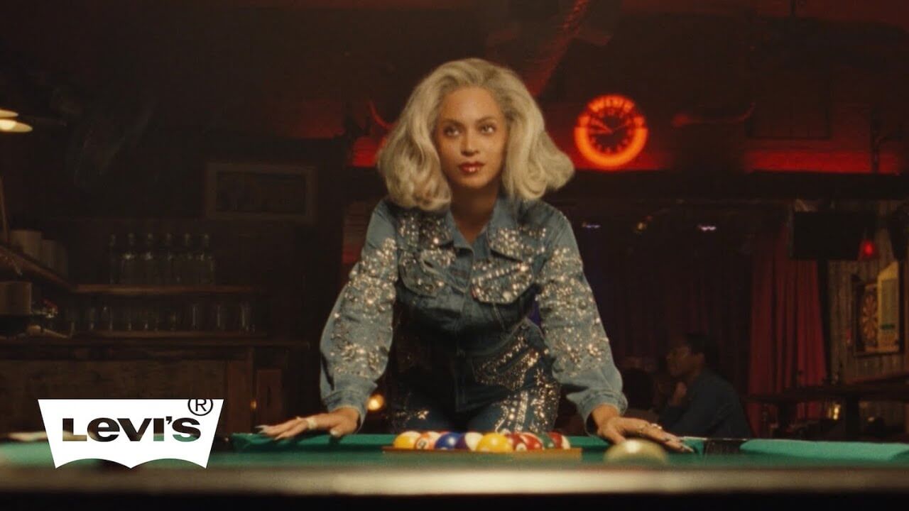
This collaboration between Levi’s and Beyoncé features a moody, atmospheric design set in a pool hall. The ad shows Beyoncé confidently playing pool while wearing the latest Levi’s collection. The design focuses on cool, dark tones with contrasting lighting that emphasizes the brand’s stylish, casual aesthetic. The image is cinematic, with a focus on Beyoncé’s strong presence and the timeless appeal of Levi’s clothing.
Why It Works:
The design works because it combines Beyoncé’s iconic persona with Levi’s classic American style, resulting in a powerful and aspirational image. The dark, moody tones contrast with the bright, bold colors of the Levi’s apparel, creating visual interest and drawing attention to the product.
How to Create a Magazine Ad (Step-by-Step)
1. Navigate to Simplified AI Magazine Ads Generator
Sign in to Simplified’s platform to access the AI Magazine Ad Generator. It’s quick and easy to get started with everything you need.
2. Add Your Inputs
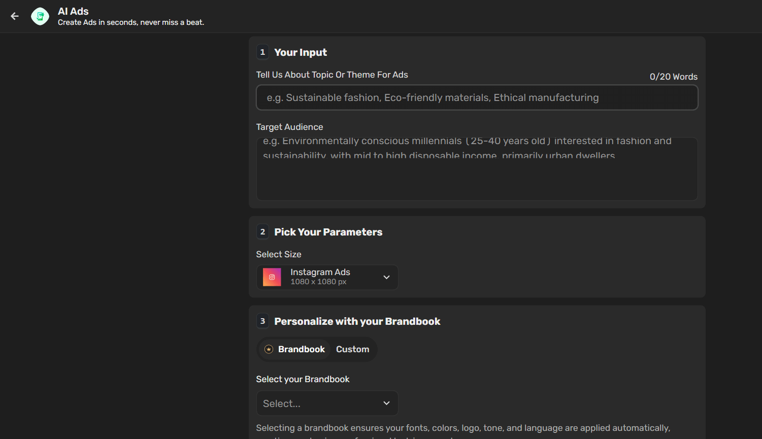
Provide essential information such as:
- Topic or Theme: Describe the focus of your magazine ad.
- Target Audience: Specify the audience you’re aiming to reach.
- Pick Your Parameters: Choose ad types like Instagram, Facebook Feed, LinkedIn, or Twitter if you plan cross-platform promotions.
You can also personalize your ad by using your Brandbook, selecting a creativity level, and setting your output language to align with your brand’s style.
3. Customize Your Ad
Once your inputs are ready, refine your ad design:
- Add or edit text for clear, strong messaging.
- Upload or select images that visually support your theme.
- Adjust background colors to match your brand or the magazine layout.
4. Download or Share
After completing your magazine ad, you can download it for print use or share it directly across your marketing channels.
Tips to Design Amazing Magazine Ads
If you want your print ad to stand out and connect with readers, following a few key practices can make a big difference. Here are five important tips to keep in mind:
Tip #1: Apply the Gestalt Principle
The Gestalt principle explains that people tend to view objects as a whole before noticing individual parts. When designing print ads, consider these five aspects:
- Similarity: Objects that look alike are seen as part of a group.
- Figure and Ground: Contrast between similar and dissimilar elements helps create a complete picture.
- Closure: The mind fills in missing information to form a recognizable pattern.
- Continuation: Guide the viewer’s eye across the design using directional cues.
- Proximity: Items placed close together are perceived as related.
Tip #2: Center Around One Core Message
An ad is most effective when it communicates a single clear message. Overloading it with multiple points makes the design cluttered and harder to read, which can cause readers to lose interest. Focusing on just one benefit or idea helps readers quickly understand and remember what you’re offering.
Tip #3: Create Visual Balance
Balanced designs feel cohesive and visually pleasing. One popular method is the rule of thirds: dividing the layout into three sections and placing focal points along these lines to create a dynamic, structured look. Using a grid can also help achieve consistency and flow in your ad design.
Tip #4: Add a Playful Twist
The human brain naturally tries to predict outcomes. If an ad is too predictable, it quickly becomes forgettable. Making readers work a little to “solve” or “figure out” the ad, much like playing a game, keeps them engaged and makes the experience more memorable.
Closing Thoughts on Designing Successful Magazine Ads
Great magazine ads do more than just catch the eye — they make readers stop, think, and remember. By focusing on a single clear message, using smart visual principles, adding a playful twist, and balancing design elements thoughtfully, you create ads that don’t just fill space but spark real connection. In a world buzzing with distractions, a well-crafted print ad still has the power to leave a mark — one clever, captivating page at a time.


")
")


")


