There are numerous techniques for making a magazine cover design. Creating a magazine cover is considered every designer’s dream and the only goal is to make the magazine jump off the shelf by revealing its content. A good cover has a lot of distinct aspects, and the trick is to make them all work together.
In this guide, you will learn about the elements, best practices, and some examples of magazine cover ideas.
Elements of a magazine cover design
Bonus: A Detailed Guide For Book Cover Dimensions
When people glance at your magazine, the cover is the first thing they see. A fantastic cover design will not only help you sell it more easily, but it will also pique readers’ interest and encourage them to go through the entire magazine. Having a good magazine cover is so important that’s why you need to have the elements in check.
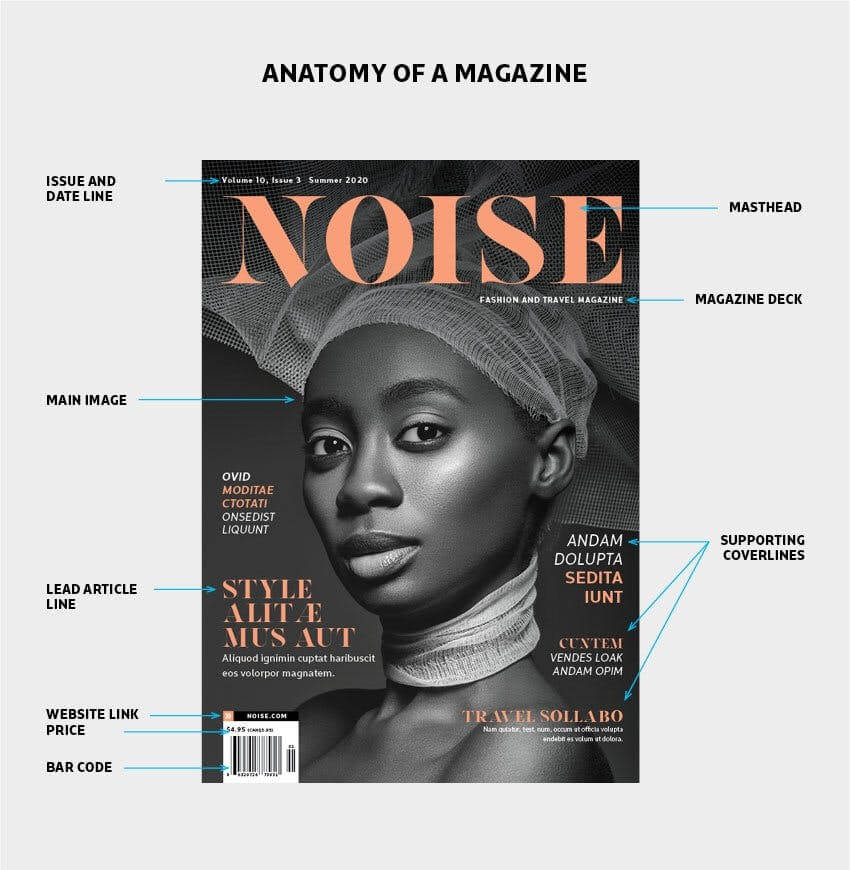
Masthead
The masthead is the most important component of any magazine cover layout because it symbolizes the publication’s name. The mast head stands out among the other features. As a result, placing it in the center and making it as large as possible is a smart idea.
For the masthead, choose a large, bold typeface. Don’t forget that the color of the masthead plays an important role in making it stand out even more. It’s a good idea to change the color of the title to match the image and theme on the front cover.
Issue and dateline
This element includes the publication’s date, month, year, and issue number. Because certain magazines only print one issue every month, they only include the month and year. Some magazines also include the price in this portion.
Main image
The main image on a magazine cover layout is usually a representation of the information inside the magazine. It should accurately reflect the topic at hand. Large publications frequently include a well-known celebrity or a visually appealing photograph that elicits an emotional response.
When creating your own magazine cover, one thing to keep in mind is to select professional photos. You increase your chances of selling more by investing in high-quality images and having a cover image that stands out among the others. Invest in professional photography because it is one of the most crucial aspects of a magazine.
Lead article
A magazine’s main issue is reflected in the lead article. A good idea is an interview with an artist or a subject expert, and other main topics you want to be featured. It’s best to use a distinct font for the lead article to communicate the magazine issue’s topic and major narrative to the readers.
Supporting cover lines
Topics for the supporting cover lines can center around the same theme or be altogether separate ones. The key to placing them on the cover of the magazine is balance. Make them as clear, brief, and simple as possible. To prevent diverting the reader from the major attractions, choose a more delicate typeface and a smaller size.
Bar code
The bar code section is usually created by the printing firm with which you collaborate, but it’s a good idea to plan for it and keep it in mind while creating the cover. In a portion of the corner area, try to allow a small space for the bar code. You may have also observed that some magazines include the price above the bar code. You can choose what works best for your cover and even move it around in subsequent issues.
Some best practices and tips
➝ Make the magazine’s name stand out the most.
➝ For all magazine issues, use the same cover template.
➝ Practice working with grids and layouts.
➝ Pick a focal point and develop your entire design around it.
➝ Experiment with different font styles.
➝ Emphasize strong words.
➝ Incorporate a good dose of color and contrast into your magazine cover design.
➝ Put a portrait on the front cover.
➝ Avoid cluttered backgrounds.
➝ Dare to take risks and consider illustrations.
Some iconic magazine cover ideas
TIME Magazine
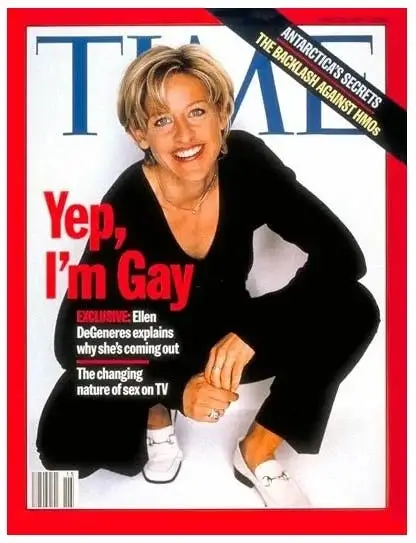
On April 14, 1997, Ellen DeGeneres graced the cover of Time Magazine, with the cover line “Yep, I’m Gay,” which was controversial at the time. She became a pioneer in the struggle for LGBTQ rights with this cover, and she is today one of the most well-known advocates. This magazine cover design is basic and clean, with colors that resemble the American flag, as this was a significant stride forward for society as a whole.
Vogue
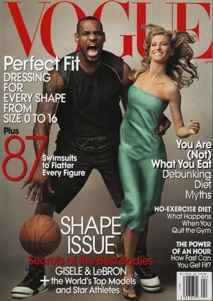
In April 2008, Vogue featured LeBron James and Gisele Bundchen. The cover was initially viewed as a victory, with LeBron James being the first African-American man to be featured on Vogue in the United States. This became controversial as some people interpreted his aggressive stance, face, and gripping of Gisele as a crude, racist analogy to King Kong.
National Geographic
Bonus: The Dos and Don’ts of Writing a Cover Letter For a Job Application
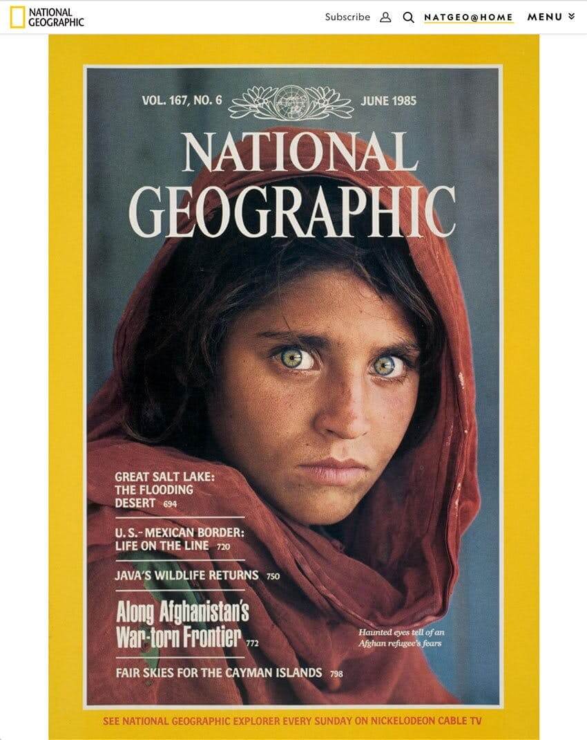
In June 1985, the cover of National Geographic’s issue became the most renowned in the world. It includes a shot of Sharbat Gula, an Afghan refugee residing in a camp near Pakistan’s border. She had been hiking for weeks before arriving at the camp, and her gaze is eerie. Eye contact is vital in any cover that depicts a person since it allows the audience to connect with the subject more easily and deeply.
Final Thoughts
While all of the tips and strategies mentioned allow a designer to be creative, it’s crucial to remember that every regular magazine requires some level of consistency from issue to issue in order to maintain its branding. It means that the overall layout and feel of the magazine cover design should stay consistent.
There is a variety of magazine cover design templates to choose from and you get to work with an AI assistant that helps you with all your design needs. Create your own magazine cover for free! Check it out ! Design a magazine cover for free.

![10 Best AI Image Restoration Tools to Try in 2025 [Free & Paid] 10 Best AI Image Restoration Tools to Try in 2025 [Free & Paid]](https://siteimages.simplified.com/blog/Best-AI-Image-Restoration-Tools-01.png?auto=compress&fit=crop&fm=png&h=400&w=400)
![How to Use Photoshop AI Generative Fill Feature [2025] How to Use Photoshop AI Generative Fill Feature [2025]](https://siteimages.simplified.com/blog/How-to-Use-Photoshop-AI-Generative-Fill-01-1.png?auto=compress&fit=crop&fm=png&h=400&w=400)
![20 Podcast Thumbnail Ideas to Boost Your Show’s Visual Appeal + Best Practices [2025] 20 Podcast Thumbnail Ideas to Boost Your Show’s Visual Appeal + Best Practices [2025]](https://siteimages.simplified.com/blog/Podcast-Thumbnail-Ideas-to-Boost-Your-Show-02-1.png?auto=compress&fit=crop&fm=png&h=400&w=400)
