![20 Podcast Thumbnail Ideas to Boost Your Show’s Visual Appeal + Best Practices [2025] 20 Podcast Thumbnail Ideas to Boost Your Show’s Visual Appeal + Best Practices [2025]](https://siteimages.simplified.com/blog/Podcast-Thumbnail-Ideas-to-Boost-Your-Show-02-1.png?auto=compress&fit=crop&fm=png&h=400&w=800)
Podcasts are a great way to share your knowledge and expertise. But with so many podcasts, it is tough to stand out. A great thumbnail makes your podcast more visually appealing.
Your podcast thumbnail is the first visual impression your audience gets, and it can make the crucial difference between someone scrolling past or hitting that play button.

Source: Freepik
A good podcast thumbnail design is eye-catching, informative, and relevant to your show. It should also be consistent with your podcast’s branding.
If you’re unsure where to start, here are 20 podcast thumbnail ideas to help you get inspired.
The Importance of a Captivating Podcast Thumbnail
What makes a Good Podcast Thumbnail?
A good podcast thumbnail is visually striking, relevant to the content, and easily recognizable, even in a small size. It should convey the essence of your podcast and evoke curiosity.

Source: Unsplash
Why is a Thumbnail Important?
- First Impressions Matter: Your thumbnail is the face of your podcast. Make it memorable.
- Increased Visibility: Eye-catching thumbnails stand out in crowded podcast directories.
- Reflects Brand Identity: Consistent podcast design builds brand recognition.
- Click-Worthy: Encourages potential listeners to click and explore.
Let’s dive into the best podcast thumbnail ideas you could use.
Related: 9 Powerful Tips That Will Make Your YouTube Thumbnail Stand Out
20 Podcast Thumbnail Ideas to Ignite Your Creativity
1. Use a Close-Up Photo of Yourself or Your Co-Hosts
It is a classic podcast thumbnail idea for a reason. People are drawn to faces, so using a close-up photo of yourself or your co-hosts is a great way to grab attention. Just make sure the photo is high-quality and well-lit.

Source: Freepik
2. Use a Photo of a Relevant Object or Scene
If your podcast is about a specific topic, you can use a photo of a relevant object or scene to create a visually appealing thumbnail. For example, if your podcast is about cooking, you could use a photo of a delicious-looking dish. Or, if your podcast is about travel, you could use a photo of a beautiful landscape.

Source: Freepik
3. Use Bold Colors and Fonts
Don’t be afraid to use bold colors and fonts in your podcast design. It will help to make your thumbnails stand out from the competition. Just make sure the colors and fonts are complementary and easy to read.

Source: Freepik
Related: How to Change a TikTok Thumbnail: A Step-by-Step Guide for A Stunning Feed
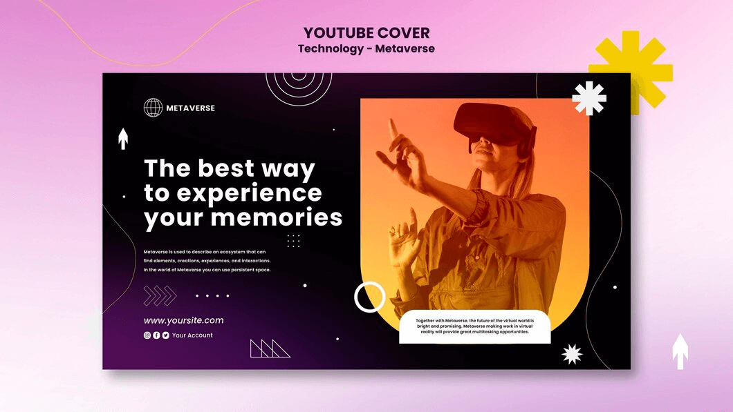
4. Add Text to Your Thumbnails
Adding text to your thumbnails is a great way to provide viewers with more information about your podcast. For example, you could include the title of your episode, the names of your guests, or a brief description of the episode.
Source: Freepik
5. Use Borders and Frames
Borders and frames can add a touch of professionalism to your podcast design. They can also help to make your thumbnails more visually appealing.
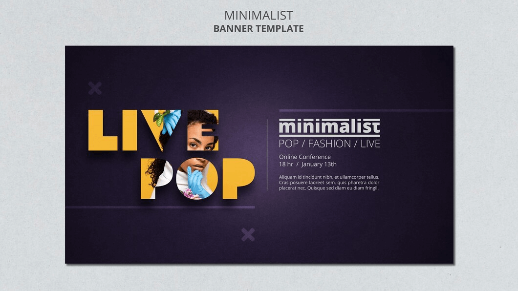
6. Use Filters and Effects
To enhance the look of your podcast thumbnails, use filters and effects. Just be careful not to overdo it, as you don’t want your thumbnails to look too artificial.
Source: Freepik
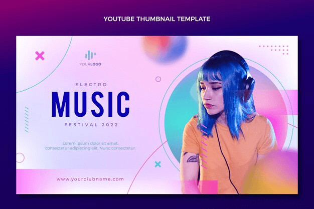
7. Use Templates
You can use templates to create podcast thumbnails if you’re unaware of how to create them. There are many free and paid templates available online.
Source: Freepik
8. Use a Consistent Style
Your podcast thumbnails should have a consistent style. It means using the same colors, fonts, and overall design for all your thumbnails. It will help to create a cohesive look for your podcast.
9. Use High-Quality Images
Make sure to use high-quality images in your podcast graphic. Blurry or pixelated images will make your thumbnails look unprofessional.
10. Use a Consistent size
Podcast graphics should be a consistent size. It will ensure that they look good on all devices.
Related: 5 Tips for Writing a Killer Podcast Description
11. Use Whitespace
Don’t be afraid to use whitespace in your podcast thumbnails. Whitespace can help to make your thumbnails look more organized and less cluttered.

Source: Freepik
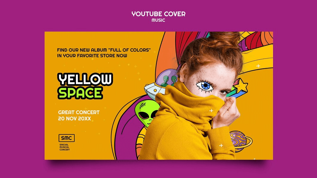
12. Use Humor
If you have a sense of humor, you can use it to create funny and eye-catching podcast graphics. Just make sure the humor is relevant to your podcast and target audience.
Source: Freepik
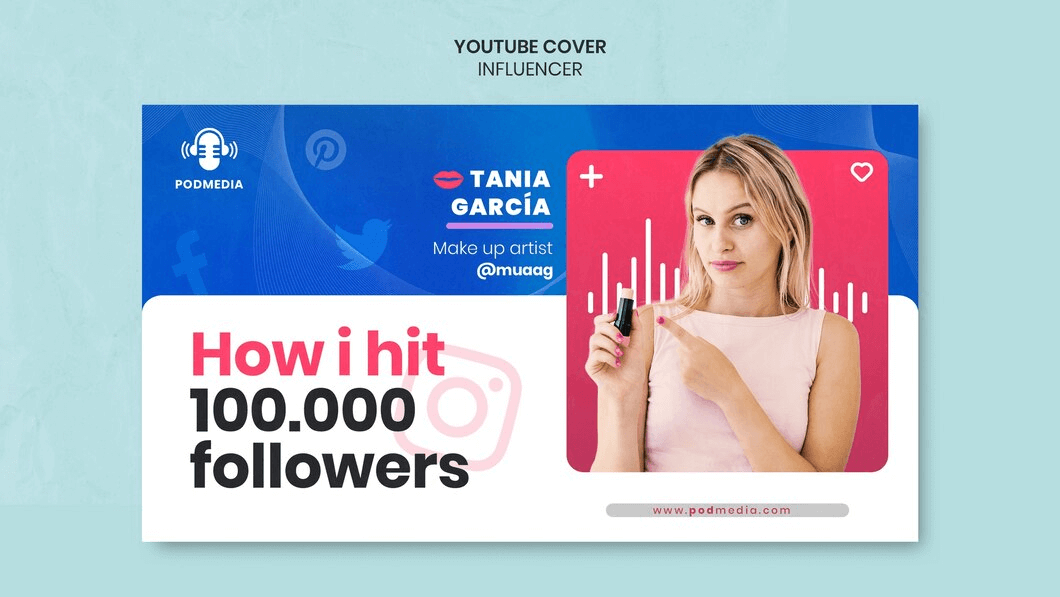
13. Use Social Proof
If you have a lot of listeners or subscribers, you can use social proof in your podcast graphic. For example, you could include a text overlay that says “Over 10,000 downloads!” or “100,000+ subscribers!”
Source: Freepik
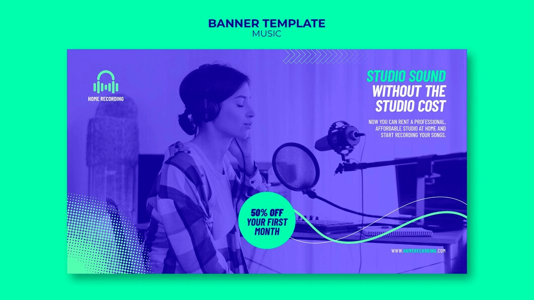
14. Use Urgency
You can use urgency in your podcast thumbnails to encourage people to listen to your show. For example, you could include a text overlay that says, “New episode available now!” or “Limited time offer: Free subscription!”
Source: Freepik
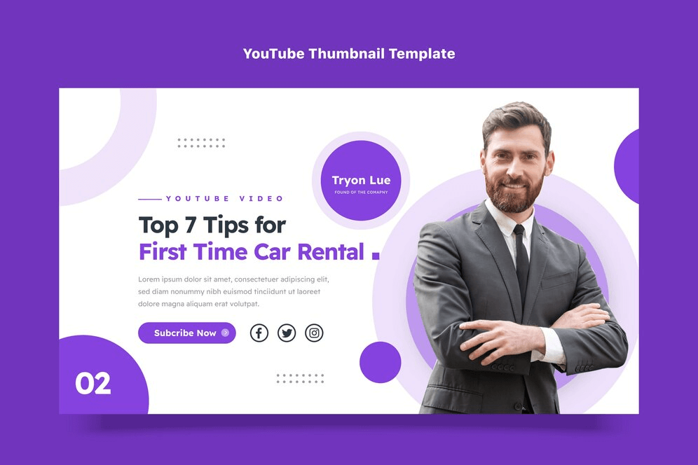
15. Use a Call To Action
Include a call to action in your podcast thumbnails to tell people what you want them to do. For example, you could say, “Subscribe now!” or “Listen to the latest episode!”
Source: Freepik
16. Use a Countdown Timer
If you’re releasing a new episode of your podcast soon, you can use a countdown timer in your thumbnail to create excitement and anticipation.
Related: 100+ Captivating Podcast Name Ideas to Inspire Your Next Show
17. Use a Before and After Photo
If your podcast is about helping people achieve their goals, you can use a before and after photo in your podcast graphic to show the results people can achieve.

Source: Freepik
18. Use a Testimonial
Include a testimonial from a satisfied listener in your thumbnail to build trust and credibility.

Source: Freepik
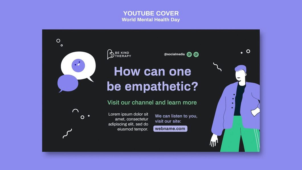
19. Use a Question
Ask a question in your thumbnail to engage viewers and make them want to learn more.
Source: Freepik
20. Use a GIF
GIFs are a great way to add movement and interest to your podcast thumbnails. Just make sure the GIF is relevant to your podcast and doesn’t distract from the text.
These podcast thumbnail ideas give you a clear roadmap to craft a stunning thumbnail.
Related: How to Add Text to a GIF with Simplified: A Comprehensive Guide
Best Practices for Crafting a Captivating Podcast Thumbnail
- Keep it Simple: Avoid clutter. A clean design is more likely to catch the eye.
- Maintain Consistency: Stick to a cohesive style and color scheme for brand recognition.
- Optimize for Size: Ensure your thumbnail looks good in various sizes, especially in podcast directories.
- Relevance is Key: Your thumbnail should accurately represent the content of your episode.
- Readable Typography: Use easily readable fonts, even in small sizes.
- Test and Tweak: Experiment with different designs and gather feedback to refine your approach.

Source: Unsplash
Related: Using Typography In Your Digital Designs Re-Edits in 2023
Simplified: A Great Tool for Designing Creative Podcast Thumbnails
Simplified is a great tool for designing creative podcast thumbnails. It offers a variety of unique and customizable templates that you can use to create eye-catching and informative thumbnails.
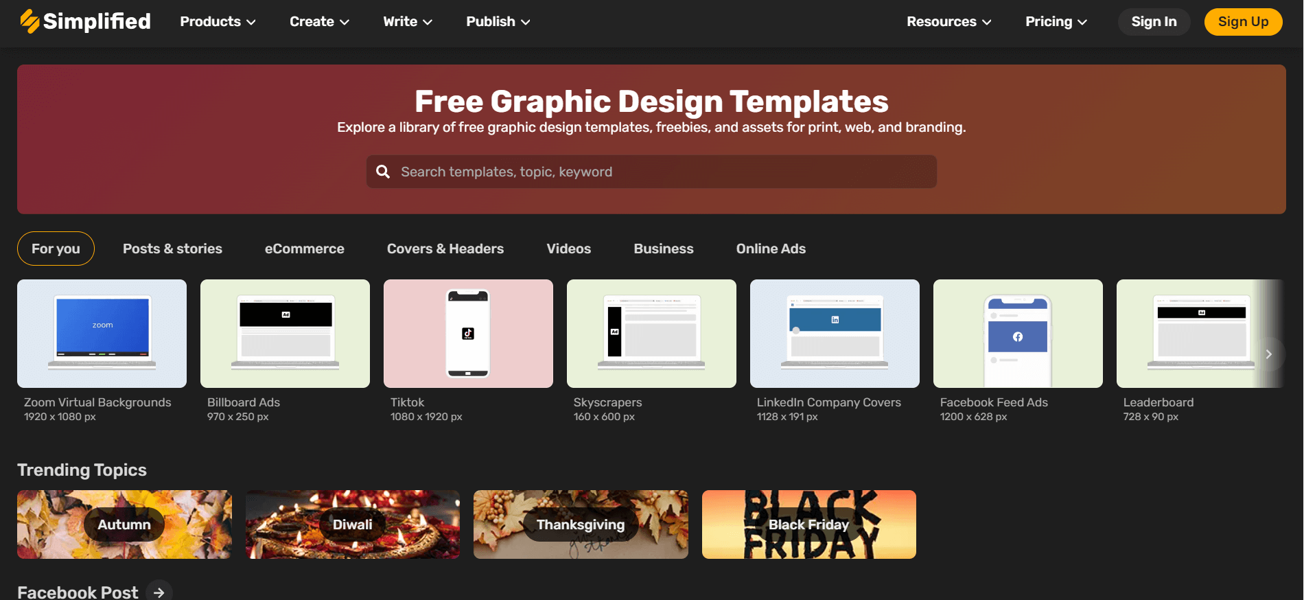
Source: Simplified
Here are a few of the features that make Simplified a great tool for designing podcast thumbnails:
- Easy to use: Simplified is very easy to use. You can create a professional-looking podcast thumbnail in minutes, even if you have no design experience.
- Variety of templates: Simplified offers a variety of unique and customizable templates that you can use to create podcast thumbnails. You can also upload your images and fonts.


- High-quality images: Simplified uses high-quality images in all of its templates. It ensures that your podcast thumbnails will look great on all devices.
- Affordable: Simplified is an affordable tool for designing podcast thumbnails. You can get started for free, and there are no long-term contracts.


And that’s not all. Simplified provides you with a 360-degree solution for all your content needs. You can plan, write, and design visually stunning posts, edit videos, schedule posts, manage multiple accounts from a single platform, and whatnot! Simplified offers a user-friendly experience to bring your creative vision to life.
Related: The 10 Best AI Graphic Design Tools You Need To Know About
Frequently Asked Questions
1. What is a thumbnail on a podcast?
A podcast thumbnail is a small, visual representation of your podcast episode. It serves as the cover art and is visible in podcast directories.
2. How do I make a podcast cover photo?
Use design tools like Simplified to create a podcast cover art. Consider the visual style, color scheme, and relevance to your content.
3. What size is a podcast thumbnail for YouTube?
YouTube podcast thumbnails should ideally be 1280 x 720 pixels for optimal display.
4. How can I increase my podcast views?
An eye-catching thumbnail, consistent branding, and compelling content are key to increasing podcast views.
5. What is the best color for a podcast?
Choose colors that reflect your brand and resonate with your podcast’s mood or theme.
6. How do I make my podcast unique?
Focus on your niche, create engaging content, and design unique, eye-catching thumbnails that stand out.
7. What is the best font for a podcast?
Select readable fonts that align with your brand. Bold and clear typography works well for podcast thumbnails.
8. What should a podcast logo look like?
A podcast logo should be simple, memorable, and reflective of your podcast’s identity.
Related: Discover The Best Social Media Quotes That Will Inspire You In 2023!
Bottomline
A compelling podcast thumbnail is your gateway to attracting more listeners. Experiment with these 20 podcast thumbnail ideas, adhere to best practices, and leverage Simplified’s design features to make your podcast design stand out in the crowded world of audio content. Elevate your podcasting journey with visually stunning thumbnails that captivate and convert.

![10 Best AI Image Restoration Tools to Try in 2025 [Free & Paid] 10 Best AI Image Restoration Tools to Try in 2025 [Free & Paid]](https://siteimages.simplified.com/blog/Best-AI-Image-Restoration-Tools-01.png?auto=compress&fit=crop&fm=png&h=400&w=400)
![How to Use Photoshop AI Generative Fill Feature [2025] How to Use Photoshop AI Generative Fill Feature [2025]](https://siteimages.simplified.com/blog/How-to-Use-Photoshop-AI-Generative-Fill-01-1.png?auto=compress&fit=crop&fm=png&h=400&w=400)


