What sets apart a good design from a great one? The details!
As with any other skill, like driving or cooking, for example, it’s important to master the basics first. You wouldn’t drive into heavy traffic on your first time behind the wheel, right? Similarly, when we talk about graphic design, the foundations of the trade are composition and layout.
As a graphic designer, understanding the principles of composition and layout is crucial for creating visually stunning and effective designs. The world of design continues to evolve, and mastering the art of composition and layout becomes even more essential.
In this article, we will explore 12 basic principles of layout and composition in design that will empower graphic designers to create captivating and harmonious visual compositions.
Whether you’re into print or digital media, these rules of design will serve as your guide to achieving balance, harmony, and impact in your designs.
Graphic Design Basics: Layout and Composition
Before we dive in, let’s take a quick look at what layout and composition in design mean:
1. Composition
Composition in design means “putting together”. In graphic design, a successful composition is where all the separate elements come together to form a whole design.
2. Layout
A layout refers to the arrangement of elements on a page. The practice of arranging these elements is called “layout design”.
Why are Graphic Design Compositions and Layout Important?
Whether you’re designing a book cover or an Instagram story, it’s not enough to have a great idea. Humans are visual creatures. We make immediate connections and assign meaning to visual information. If what we’re looking at doesn’t hold our attention, we lose the plot – literally.
The Science Behind Visual Connections
- At least 65% of people, if not more, are “visual learners”.
- Our brains can identify images seen for as little as 13 milliseconds.
- Half of the human brain is directly or indirectly dedicated to processing visual information.
Why do the Layout and Composition of a Design Matter?
- A well-composed design tells a story and sets the tone of your project.
- A strong composition in design will not only attract eyeballs but also hold attention. Your audience will linger on your page, learn more about your product, and you’ll potentially make a sale.
- A powerful layout design delivers your brand’s message with confidence.

For instance, in the image above, notice how Apple communicates its product’s story through design.
12 Basic Principles Of Layout and Composition In Design
If you’re a newbie in the world of design, these rules of composition in design will serve you well in creating stunning visuals. If you’re already a maestro, use them to brush up on your knowledge of composition graphic design basics.
1. Alignment
Alignment is the position of a design’s individual elements in relation to each other. It also refers to the placement of design elements along the top, bottom, sides or middle of a page. The way you choose to align your elements determines the success of your design’s composition.
For example, take a cue from the world-renowned fashion magazine Vogue.
The small text is justified to the left and right side, leaving just enough room for Zendaya’s cover picture to create an impact.
Notice how the composition in design uses simple, solid colors mirroring the model’s outfit.

Here are some great free alignment design templates offered by Simplified:


2. Focal Point
This section of graphic design basics takes its inspiration from photography. For instance, if you’re composing an online ad for pet food, the focal point will be your product. You’ll also want to add something that communicates your brand’s message as per the rules of design.
The focal point rule of composition in design also called the emphasis, is strongly intertwined with visual hierarchy. When designing, ask yourself this – where do I want my audience to look first?

Here are some great free focal point design templates offered by Simplified:


3. Visual Hierarchy
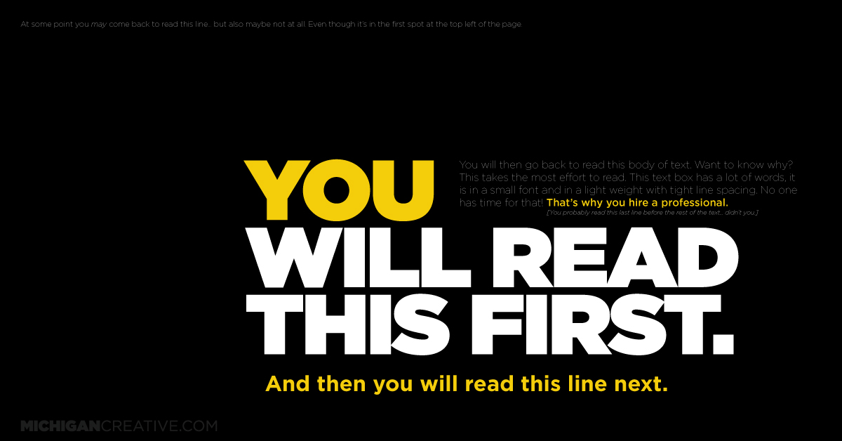
Visual hierarchy in design refers to arranging elements from most important to least important. The most important element in your design will instantly grab your audience’s attention. For instance, an end-of-year sale in big, red block letters.
Then, your design should help them visually navigate the other elements in decreasing importance. For this reason, elements can gain or lose emphasis through subtle but effective design tweaks. These include, but are not limited to:
- Changing text and media sizes
- Altering color contrasts
- Placement on the page
- Changing the relationship to other elements in the design
For example, Michigan Creative has created a wonderful tell-all design to advertise their services:

Here’s another example of using visual hierarchy in graphic design compositions.

Here are some great free visual hierarchy design templates offered by Simplified:


4. Balance and Symmetry
When it comes to layout and composition in design, you’ll never strike out after reading this. Did you know that not only are we visual creatures, but our DNA craves balance?
We are hard-wired to find symmetry because it exists in the natural world.
For instance, a snail’s shell is a self-similar object, repeating itself, smaller and smaller, and at all scales. This is commonly known as the golden ratio, the proportions of which are found in the Mona Lisa and the Pyramids of Giza.

We need balance and symmetry in design because it calms our tensions about visual chaos. Furthermore, if you want your graphic design compositions to communicate power and strength, achieving the right balance in design is paramount.
Twitter’s logo is a good example of a design that conforms to the proportions of the golden ratio:

Here are some great free balance and symmetry design templates offered by Simplified:


5. Negative Space
Also called “white space,” negative space doesn’t necessarily imply colorlessness or emptiness. In fact, negative space adds to your design by subtracting from it. What does this mean?
For one, the empty areas of your design can give your composition space to breathe. This means that you can avoid visual chaos and clutter by purposefully leaving blank spaces.
For example, look at Batman’s eyes under the M. The negative space below the letters also serves as the top part of his suit. Pretty neat, right?

Here’s another example showcasing the use of negative space in design.

Here are some great free negative balance design templates offered by Simplified:
6. Color Contrast
The contrast panel is a graphic designer’s best friend. By boosting or reducing the color contrast of your elements, you can either highlight or hide them. The best way to do this is to take a step back and look at your work as a whole.
Ask yourself what you want the viewer’s eye to focus on. Once you know that, simply increase or decrease the contrast between that element in relation to the design. This is especially important to make designs that are colorblind-friendly.

Related: The Ultimate Guide to Crafting a Perfect Graphic Design Resume + Examples
Here are examples of using color contrast in designing.


Here are some great color contrast design templates offered by Simplified:


7. Complementary Design Elements
This may not come as a surprise, but not all your favorite elements will work together as a cohesive composition. When choosing elements for your design project at hand, carefully pick each one. There are several ways to choose complementary design elements:
- If you’re using photographs, make sure they’re all shot in similar ways.
- Tweak the colors of your elements so that they’re in sync with each other.
- If your design has text, take some time to choose fonts that complement the images.
Take a cue from LUSH UK below, and notice the beautifully shot photographs in the same color palette.

Here’s another example.

Here are some great templates with complementary design elements offered by Simplified:
8. Simplicity Is The Key
Simplicity refers to the idea of keeping the design clean, uncluttered, and focused. By removing unnecessary elements, you can avoid design mistakes and can, achieve clarity and allow important elements to stand out.
For example, a minimalist poster with a single central image, minimal text, and ample white space can create a powerful and impactful design.
Here are a few examples of using simplicity in design layout composition.


Here are some great templates with simple designs offered by Simplified:
9. Repeat Elements
Repetition involves using consistent visual elements throughout a design to create unity and reinforce the design’s theme. This can be done through repeated use of colors, shapes, geometric patterns, or other design elements.
For instance, in a brochure design, using a consistent color palette and repeating a specific pattern or graphic element across different pages helps to create a cohesive and visually appealing layout.
Here are a few examples of using elements repeatedly in the composition of a design.


Here are some great templates with repeat elements offered by Simplified:


Creating a sense of depth and layering adds visual interest and dimension to a design. Techniques like overlapping elements, using drop shadows, or applying gradients can give the illusion of depth.
10. Depth and Layering
For example, in a design, layering images with varying opacities can create depth and visual interest, providing a more dynamic and immersive experience for viewers.
Here are a few examples of using depth and layering in design.


Here are some great templates with depth and layering offered by Simplified:
11. Rhythm
Rhythm in design refers to the repetition or alternation of elements to create a sense of movement and flow. It can be achieved through patterns, lines, shapes, or even the placement of elements.
For instance, in a poster layout, alternating the position of text and images in a consistent pattern can establish a rhythmic flow, guiding the reader’s eye from one section to another.
Here are a few examples of using rhythm in your composition.

Here are some great templates with rhythm offered by Simplified:


12. Rule of Thirds
The Rule of Thirds is a composition guideline that involves dividing the design space into a grid of nine equal parts by drawing two horizontal lines and two vertical lines. The intersections of these lines are strategic points for placing key elements.
For example, in photography composition, placing the subject at one of the intersection points rather than in the center can create a more dynamic and visually appealing image.
Here are a few examples of using the rule of thirds in layout composition.
.png)
Here are some great templates featuring the rule of thirds:


Related: How Good Storytelling Can Help You Design Great Products
Want to Create Captivating Designs? Try Simplified!
If you want to apply these 12 basic principles of layout and composition in design effectively, Simplified can help. Simplified is an all-in-one graphic design platform that you can use to create the perfect composition and layout to make your designs better than ever!
With Simplified, you can:
- Design invitations, ads, logos, banners, posters, social media posts, videos, etc.
- Choose from thousands of customizable design templates
- Access millions of photos, videos, and GIFs
- Get a full range of editing tools (resize, crop, remove background, animate elements, etc.)
- Apply filters and tweak colors
- Use custom fonts and gradients
- Get access to graphic design tools
- Create designs using AI text to image generator
- Collaborate with your team and clients in real-time
- Color Palette generator to create designs that are in line with your brand kit
All these features are available for free! So, what are you waiting for? Unleash your inner graphic designer and make your designs stand out using Simplified!


![10 Best AI Image Restoration Tools to Try in 2025 [Free & Paid] 10 Best AI Image Restoration Tools to Try in 2025 [Free & Paid]](https://siteimages.simplified.com/blog/Best-AI-Image-Restoration-Tools-01.png?auto=compress&fit=crop&fm=png&h=400&w=400)
![How to Use Photoshop AI Generative Fill Feature [2025] How to Use Photoshop AI Generative Fill Feature [2025]](https://siteimages.simplified.com/blog/How-to-Use-Photoshop-AI-Generative-Fill-01-1.png?auto=compress&fit=crop&fm=png&h=400&w=400)
![20 Podcast Thumbnail Ideas to Boost Your Show’s Visual Appeal + Best Practices [2025] 20 Podcast Thumbnail Ideas to Boost Your Show’s Visual Appeal + Best Practices [2025]](https://siteimages.simplified.com/blog/Podcast-Thumbnail-Ideas-to-Boost-Your-Show-02-1.png?auto=compress&fit=crop&fm=png&h=400&w=400)


