Negative space is also called white space in graphic design, and refers to the empty spaces on your artboard. Negative space in graphic design does not mean emptiness or colorlessness, in fact, negative space leaves room for your design to breathe on its own. Moreover, the “blank” spaces between the different elements of your design allow for enhanced visual navigability.
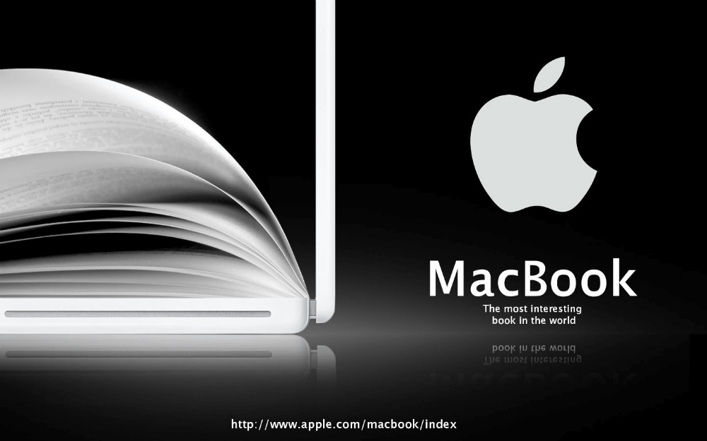
For example, ever notice how all Apple Inc. marketing materials are clean, and contain solid colors with minimal shapes? The negative space here is seen in the balance between the brand logo and the product image, as well as the heading and subheading. Furthermore, this balance makes sure that the design is perceived by the audience as a holistic composition.
Why is it Called “Negative Space”?
The terminology comes from photography. “Positive Space” refers to the objects that attract immediate attention in the shot, and “negative space” is the background. Negative space is not always a plain white background. Negative space is also any pattern, solid color, or texture that highlights the focal point of the design.
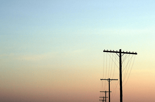
Can you identify the positive and negative space in the image above?
The power lines are the focal point, or the positive space, while the sky forms the negative space in the photograph.
Why is Negative Space in Graphic Design Important?
Graphic design surrounds in our everyday life. The deliberate insertion of negative space is a powerful and invisible design tool!
1. Frame Images
Negative space highlights the focal object so that the other elements of your design do not suffocate it. The effective use of negative space ensures that your viewer’s eye rest on the focal point of your design.
2. Simplicity and Deception
On the whole, harnessing the power of negative space in design makes for compelling visual content that combines minimal shapes with simple iconography. This is especially useful if you want your audience to linger on your designs – in sum, it will help hold their attention for longer than just their first glance.
3. Balance Layout
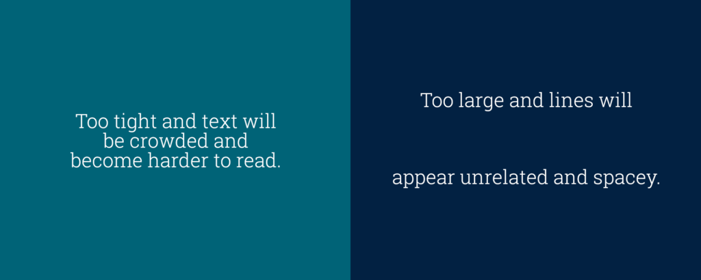
Graphic design is a visual language. To allow your viewers to absorb the language of information through media and type, designers must create graphics that do not turn viewers away. Moreover, spacing elements is important so that the design is not overly complicated. Negative space brings into focus the important and subtle messages that can get lost in the elements of your design. This can happen if your design elements are overwhelmingly close together or too busy with multiple photographs or even complex color schemes.
How To Use Negative Space in Graphic Design
Sometimes ‘less is more’, and this is certainly true for brands like FedEx that use negative space successfully – enough to become one of the most recognizable brand logos anywhere in the world! Simplified’s short guide on how to start using negative space more effectively for better visibility in design is here to help you out.
FedEx’s brand logo exemplifies simplicity and clever deception – look for the arrow between the letters E and X!
Bonus: 7 Basic Principles of Graphic Design Foundations: Composition and Layout
1. Negative Space and Type
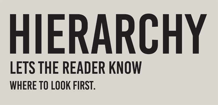
Creating meaningful visual hierarchies is essential in graphic design to make sure your viewers read the most important information first. This will be your heading or tagline, then the subheading, and then the small print. How can you achieve this? You guessed right! By inserting blank spaces between blocks of text known as negative space, you provide your viewers with legible text and readable designs.
Example of Good Use of Negative Space and Type:
Example of Bad Use of Negative Space and Type:
2. Negative Spacing and Brand Logos
Do you want to start designing a visually attractive logo for your brand? Are you looking to rebrand your company logo? Wondering how negative space plays into the designing of brand logos? Simplicity is key! When designing logos, the effective use of negative space will allow for your design to remain compact, clever, and clean!
Example of Good Use of Negative Space in Brand Logo:

World Wildlife Fund (WWF) has created the most adorable logo using negative space!
Example of Bad Use of Negative Space in Brand Logo:
Looking closely, the space between the two icons denoting people intends to highlight a house and road. Don’t see it? Many design critics didn’t either!
3. Negative Space and Photographs in Design
Not all designs use the elements of type, shapes, and iconography. Many effective graphics include photographs as focal points! Balancing photographs with the other elements of your design using negative space is important to make sure that the elements don’t appear to crowd one another.
Example of Good Use of Negative Space and Media:

The photgraph is in clear view, and the text is literally placed within the shot! This allows viewers to rest their eyes as they move from one element to the next.
Example of Bad Use of Negative Space and Media:
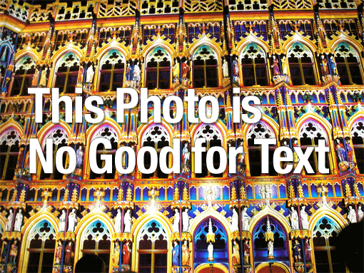
In choosing to use this photograph, there is no breathing room for any other element in the design.
In Summary
To conclude, increasing or decreasing negative space in graphic design changes how we perceive the design as a whole. Negative space is instrumental in creating compositions that are visually balanced and unified.


![10 Best AI Image Restoration Tools to Try in 2025 [Free & Paid]](https://siteimages.simplified.com/blog/Best-AI-Image-Restoration-Tools-01.png?auto=compress&fit=crop&fm=png&h=400&w=400 "10 Best AI Image Restoration Tools to Try in 2025 [Free & Paid]")
![How to Use Photoshop AI Generative Fill Feature [2025]](https://siteimages.simplified.com/blog/How-to-Use-Photoshop-AI-Generative-Fill-01-1.png?auto=compress&fit=crop&fm=png&h=400&w=400 "How to Use Photoshop AI Generative Fill Feature [2025]")
![20 Podcast Thumbnail Ideas to Boost Your Show’s Visual Appeal + Best Practices [2025]](https://siteimages.simplified.com/blog/Podcast-Thumbnail-Ideas-to-Boost-Your-Show-02-1.png?auto=compress&fit=crop&fm=png&h=400&w=400 "20 Podcast Thumbnail Ideas to Boost Your Show’s Visual Appeal + Best Practices [2025]")


