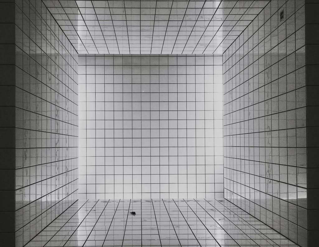
Let’s say you start writing in two notebooks at once – one of them has lines, and the other one is blank. After you’ve filled out an entire page, take a closer look at how your handwriting moves on a line as opposed to on a blank sheet of paper. You’ll come to notice that your writing is clearer in terms of spacing and alignment on lined sheets. Now, applying the same principle to design, a skeletal reference of lines is much easier to navigate than a blank canvas. In this guide, we’ll walk you through what grids in graphic design are, the different types of grids, and five tips on getting started. Let’s begin!
What Are Grids in Graphic Design?
A grid is a system of layout organization. Whether for screen or in print, layout in graphic design is a designer’s best friend. Grids are invisible, powerful tools used in the layout of magazines, books, and brochures. For screens, grids are used in webpages, apps, and other user interfaces.
Why are Grids in Graphic Design Important?
Let’s assume that you have to create a corporate report. You’ll first research numbers, find relevant references, and compile infographics. However, how do you begin organizing this information? The best practice would be to create an outline with clear headings and subheadings. Similarly, think of grids in graphic design as outlines or skeletons of your final project. Why are grids one of the most important principles of graphic design?
1. Formatting Digital Content
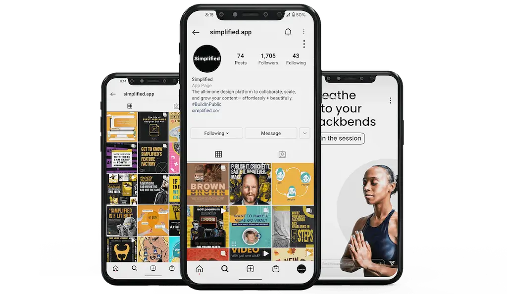
Over the years, grids have become a significant part of the digital world. For instance, Instagram organizes your brand’s posts in a square feed for easier navigability. The relevance of grids is especially important because of the rise in responsive design. Responsive design refers to the process of creating websites and apps that can resize and reform themselves to accommodate whatever device they are being used on. These devices can range from massive TVs to smartphones to tiny watches.
2. Grids Make Designing Easier and Faster
When you start designing, a blank canvas is overwhelming. You might wonder about where all the parts go. A grid provides with you a blueprint of what elements go where – whether it’s text, shapes, or photographs. Grids save you time by allowing you to imagine the bare bones of your design. Once you know and understand the layout, then your design process picks up speed!
3. Constraints Boost Creativity
We’ve been living indoors for the better part of two years. So, it’s no surprise that digital content consumption has skyrocketed. We all know the hopeless feeling of staring at a blank page with a deadline looming over us. In this context, constraints are valuable for creativity. They give you a starting point when you feel directionless.

4 Types of Grids in Graphic Design
Broadly speaking, there are 4 different types of grids in graphic design:
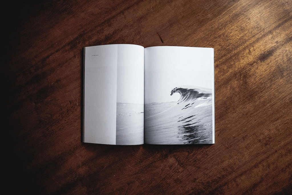
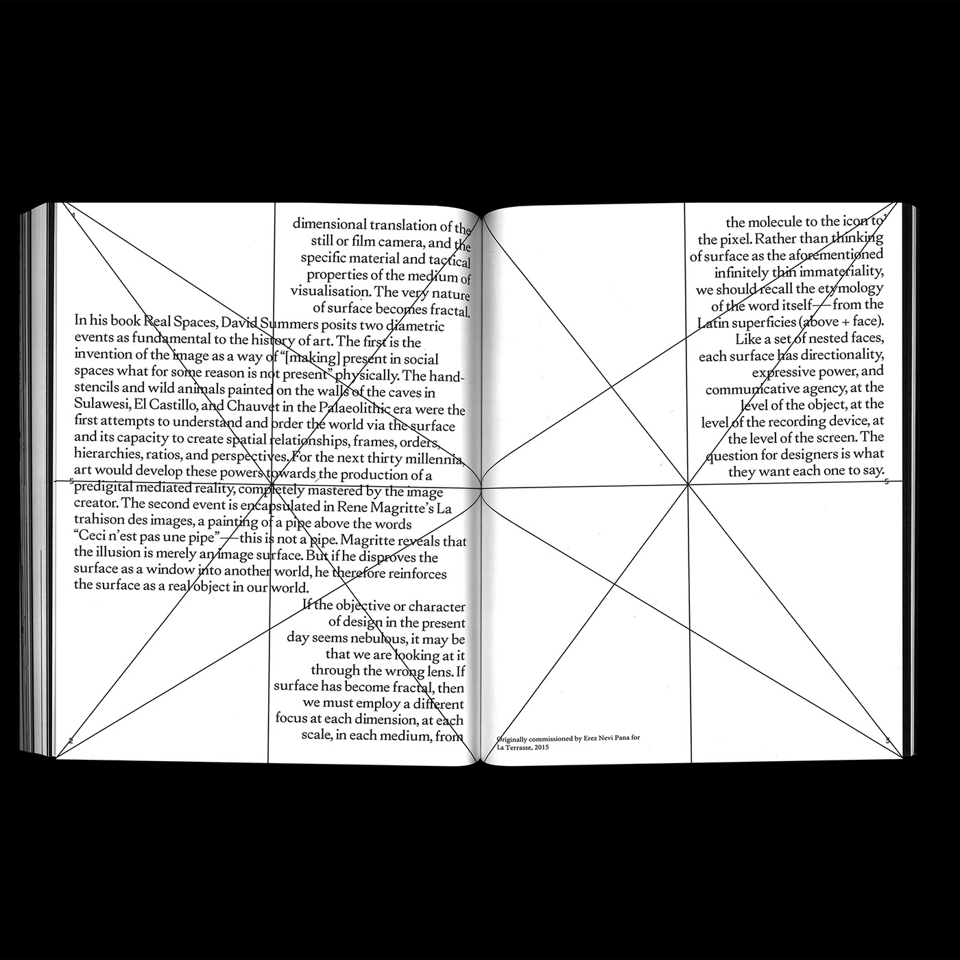
1. Manuscript Grids
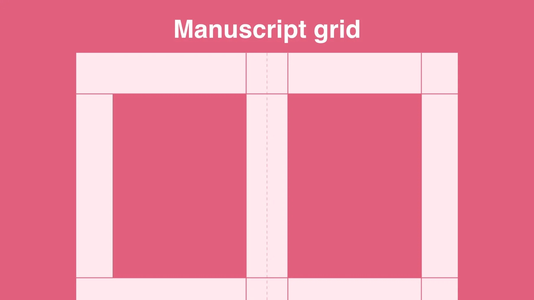
A manuscript grid is a one-column grid that determines where the text will sit on the page. In “classic” book layouts, facing pages mirror each other.
Where To Use Them: Books, long essays, blog posts.
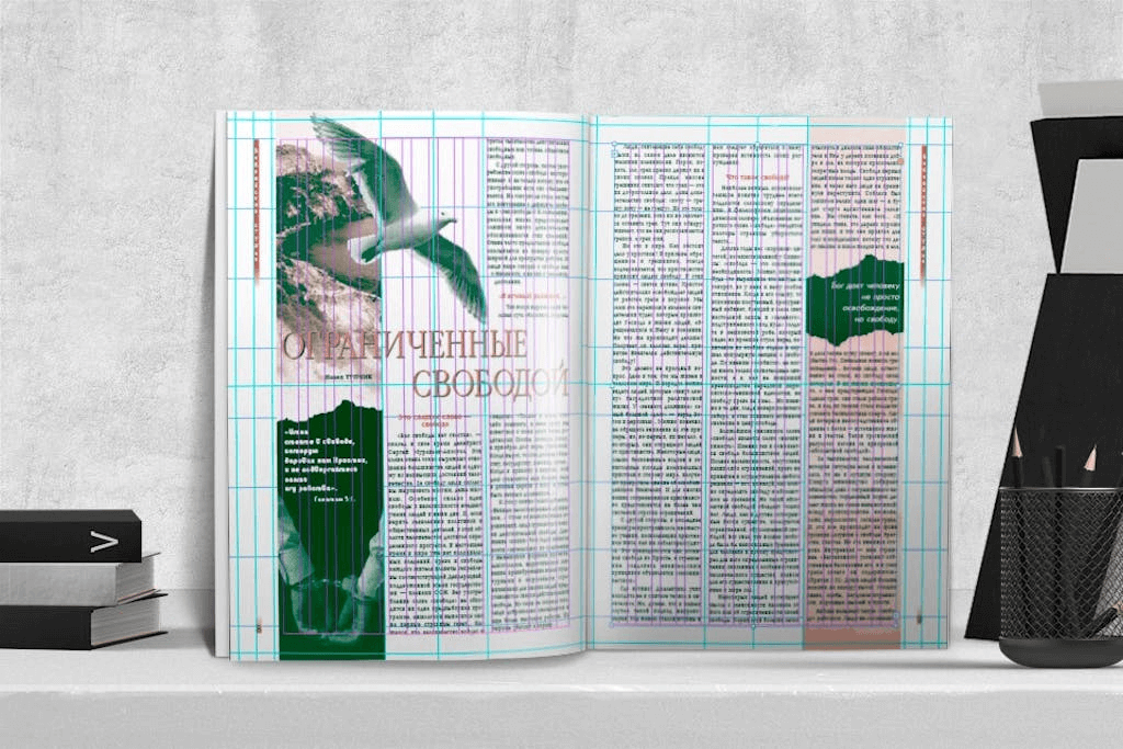
2. Column Grids
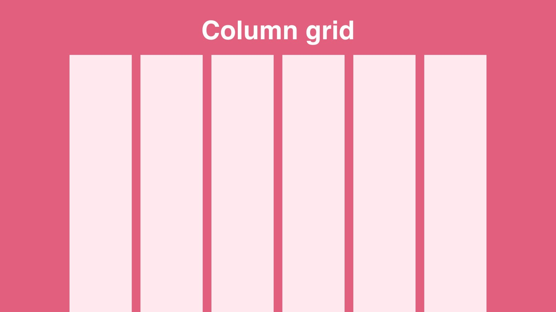
A column grid is the most common type of grid used in graphic and web design. This type of grid involves splitting a page into multiple vertical columns. The objects are then aligned to these columns.
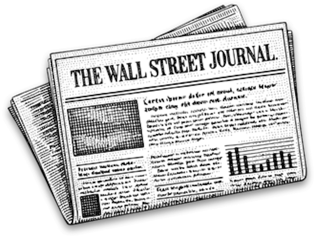
Where To Use Them: Newspapers, magazines.
3. Modular Grids
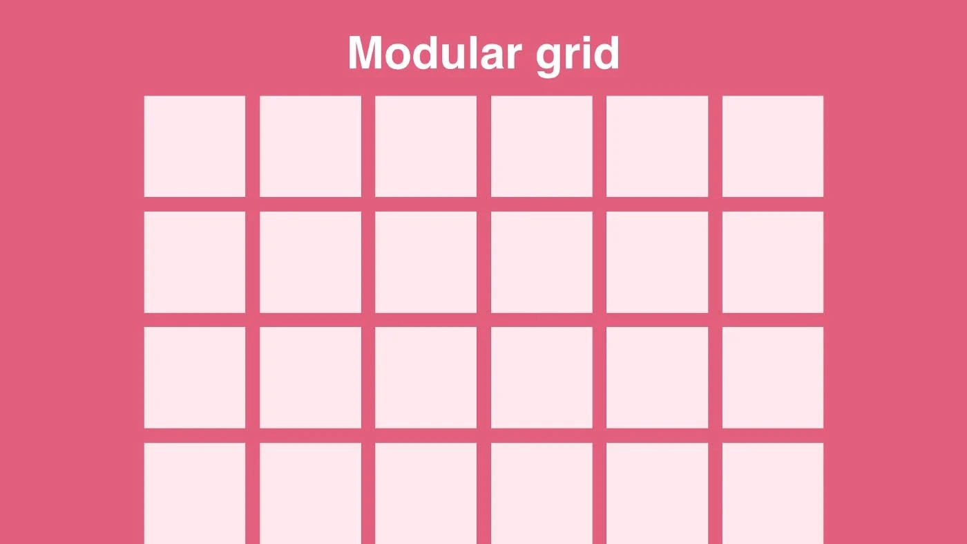
A modular grid involves taking a column grid and adding rows to it. The intersecting rows and columns create “modules” that are useful in making layout decisions. They are like a checkerboard, displaying several objects for easy access.
Where To Use Them: Magazines, corporate reports.
4. Hierarchical Grids
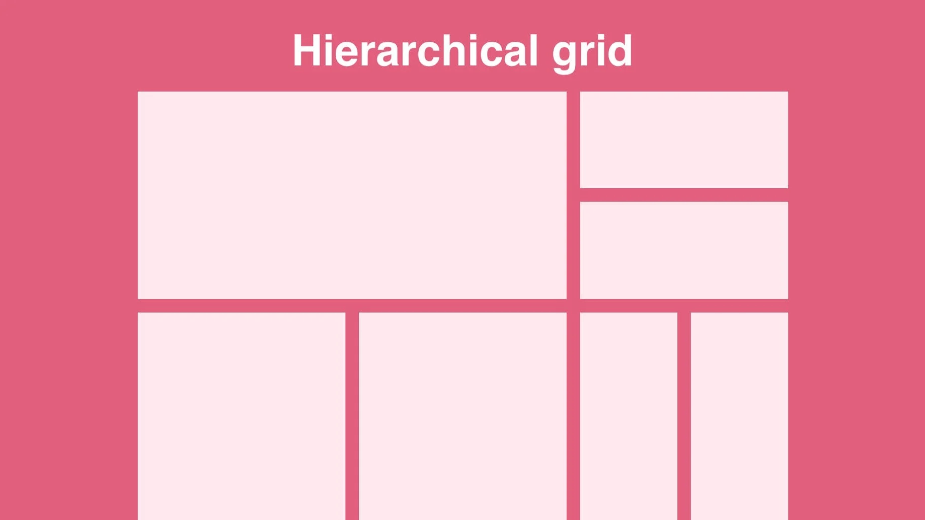
A hierarchical grid is based on the designer’s intuition, which still follows the information needs. Design elements are spontaneously placed, and later, a more structured approach is taken to coordinate them.
Where To Use Them: Websites.
5. Baseline Grids
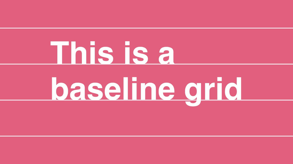
Baseline grids serve to provide a harmonious rhythm to your text, making them invaluable for compositions that rely heavily on written content. A baseline represents the resting line for text while typing, and leading denotes the space between two consecutive baselines.
Where To Use Them: For text
5 Best Practices of Grid Layout in Design + FREE Tool!
1. Assess your Design Requirements
First, you must identify the scope of your design project. Are you designing a website page? Are you creating an e-book? Assessing your design requirements helps you decide what type of grid you’ll be using for your project. If you’ve decided already, log into Simplified and work your magic!
Bonus: 12 Basic Principles of Layout and Composition In Design (2024)
2. Functional and Aesthetic Grid Layout
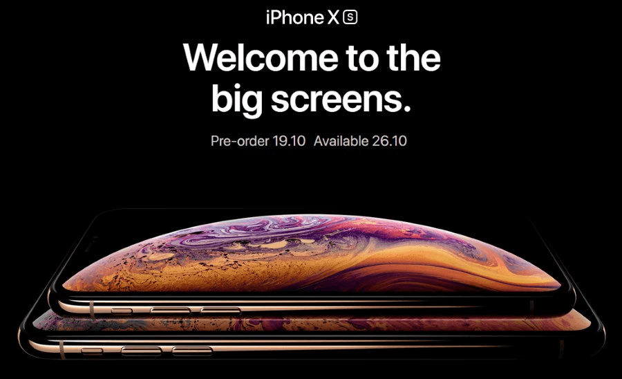
A grid’s position within the page affects how it performs. For example, a grid positioned on a page without margins might be challenging to read. Furthermore, the aesthetics of the design might suffer.
Here, designers must take a cue from Apple’s stunning web design. The example below is a masterclass in functionality and visual appeal, neatly organized and instantly attractive.
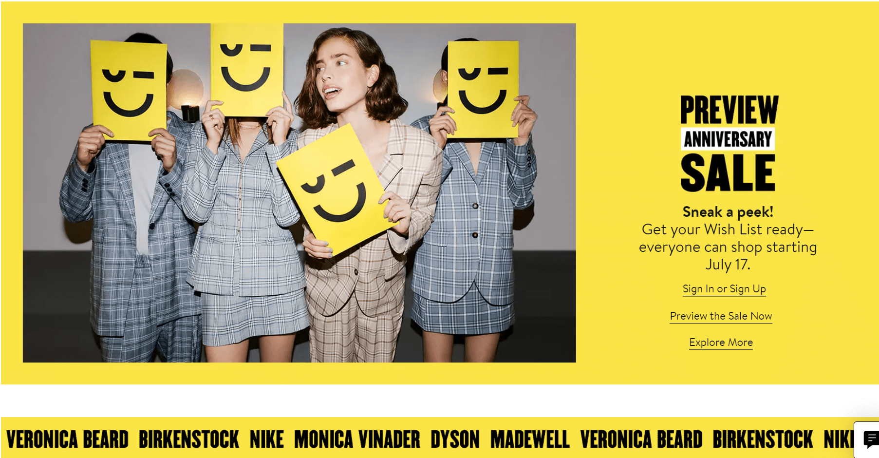
3. Make White Space Meaningful
White space, or “negative space,” is one of the most important principles of graphic design. Instead of referring to colorlessness or emptiness, white space is the area left purposefully blank for the design to breathe. Therefore, elements can have their individual visual focus.
When using grids in graphic design, divide your design into the desired number of columns and rows. Then, place the necessary elements, but leave some grids empty.
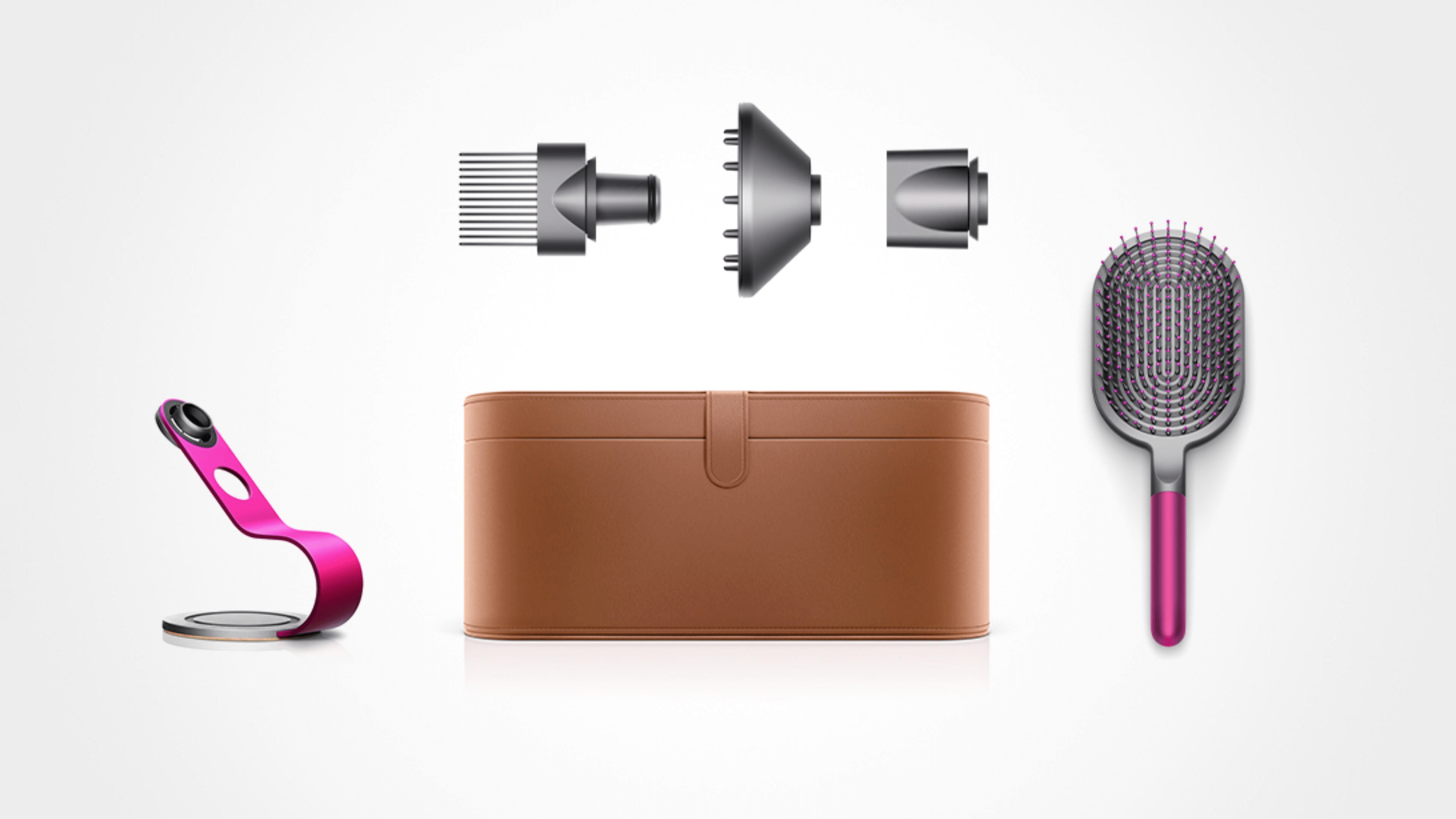
Dyson, above, features its products as the stars of the design, leaving literal white space for emphasis!
4. Emphasize Visual Hierarchy
Visual hierarchy in design refers to the organization of elements according to their importance. The goal is to visually prioritize your design to direct your audience’s attention from the most to the least important elements.
A grid accelerates this process and successfully communicates hierarchy in design! This is done by stretching the most important featured information across more than one column or row. For example, The Body Shop’s poster below perfectly illustrates hierarchy in design through varying text sizes.

5. Balance Designs
Did you know that we are evolutionarily hard-wired to seek out balance? This is because balance and symmetry exist within us and around us abundantly in nature. The shape of our skulls, the hard shell of a snail, and the Pyramids of Giza have one thing in common – perfect symmetry.
Grids balance the amount of content and images on a page. When designing with text and images, use grids to guide you on what looks good in relation to the whole design. How, you ask? Take the first step by exploring Simplified’s online image editor tool!
6. Choose A Focal Point
To create a visual hierarchy in design, one element must stand out while another serves as the background. The focal point, with the highest visual weight, captures the viewer’s attention and initiates their visual journey through the layout. Typically achieved through a large image or typography, the focal point marks the beginning of the story being conveyed.
Wrapping Up
Grids are one of the most important principles of graphic design. They create stability, consistency, and an orderly look for your compositions. Are you ready to explore the power of graphic design?


![10 Best AI Image Restoration Tools to Try in 2025 [Free & Paid]](https://siteimages.simplified.com/blog/Best-AI-Image-Restoration-Tools-01.png?auto=compress&fit=crop&fm=png&h=400&w=400 "10 Best AI Image Restoration Tools to Try in 2025 [Free & Paid]")
![How to Use Photoshop AI Generative Fill Feature [2025]](https://siteimages.simplified.com/blog/How-to-Use-Photoshop-AI-Generative-Fill-01-1.png?auto=compress&fit=crop&fm=png&h=400&w=400 "How to Use Photoshop AI Generative Fill Feature [2025]")
![20 Podcast Thumbnail Ideas to Boost Your Show’s Visual Appeal + Best Practices [2025]](https://siteimages.simplified.com/blog/Podcast-Thumbnail-Ideas-to-Boost-Your-Show-02-1.png?auto=compress&fit=crop&fm=png&h=400&w=400 "20 Podcast Thumbnail Ideas to Boost Your Show’s Visual Appeal + Best Practices [2025]")


