
A visually aesthetic design is never created randomly. A successful design is created using logic, reason, and conscious effort. There is almost always a layout or a planned process behind every design we find appealing.
The four main principles of design are rhythm, balance, proportion, and emphasis. This blog will break down the different types of balance in graphic design and why achieving it is so vital. We’ll then cover how you, as a designer, can produce a perfectly balanced visual asset. Read on to learn more!
What is balance in graphic design?
Balance refers to the visual weight of the elements involved in a design. Balance, in graphic design, can be seen as the compatibility between positive and negative spaces. Not only is it appealing, but achieving perfect visual balance also allows the viewer to focus more clearly on a design. The two broad classifications of balance in graphic design are symmetry vs asymmetry.
Symmetrical balance
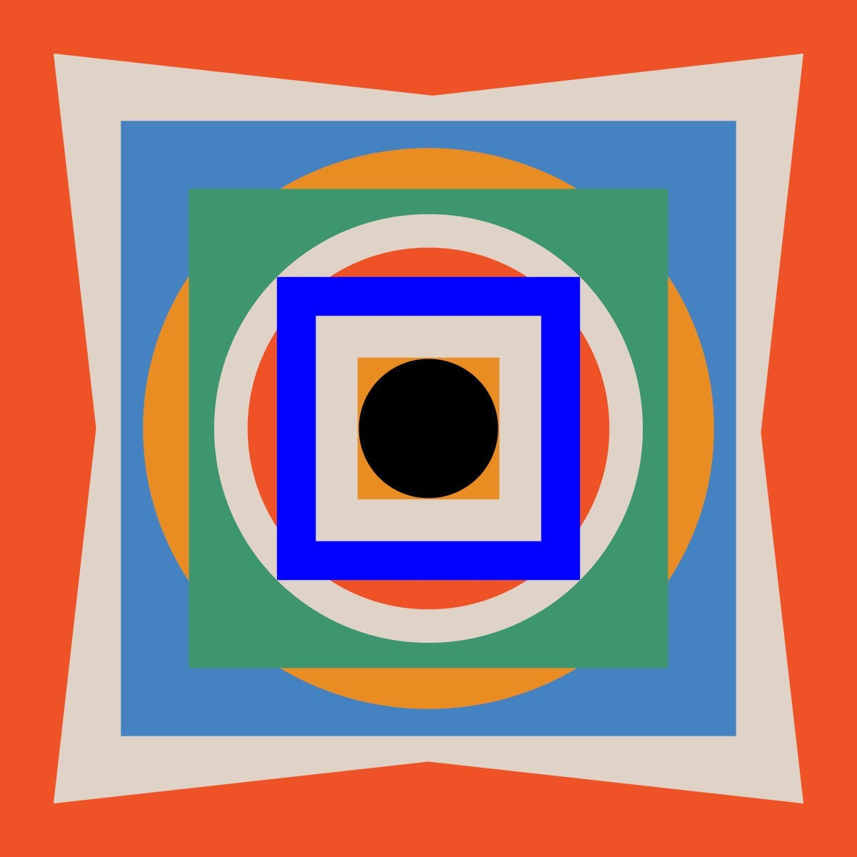
Symmetrical balance is achieved when the visual weight of a design’s elements is evenly distributed on both sides of its axis.
The images above are great examples of symmetrical balance. Whichever way you divide them, they hold the same visual weight. Symmetrical balance is simple to create and always pleasing to the eye, giving the viewers a sense of ease. You can’t go wrong with symmetrically balanced designs, provided the other principles of design are also kept in mind.
Below are some of the different types of symmetrical balance that you may come across.
Reflectional symmetry
Also known as bilateral symmetry, this is when both sides of a design are mirror images of each other when struck down the center. The axis can be horizontal, vertical, or diagonal, with two identical halves on either side.
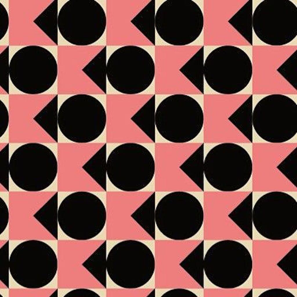
Translational Symmetry
This kind of symmetry occurs when visual elements repeat themselves across a space multiple times. Honeycomb and chessboards are great examples of this.
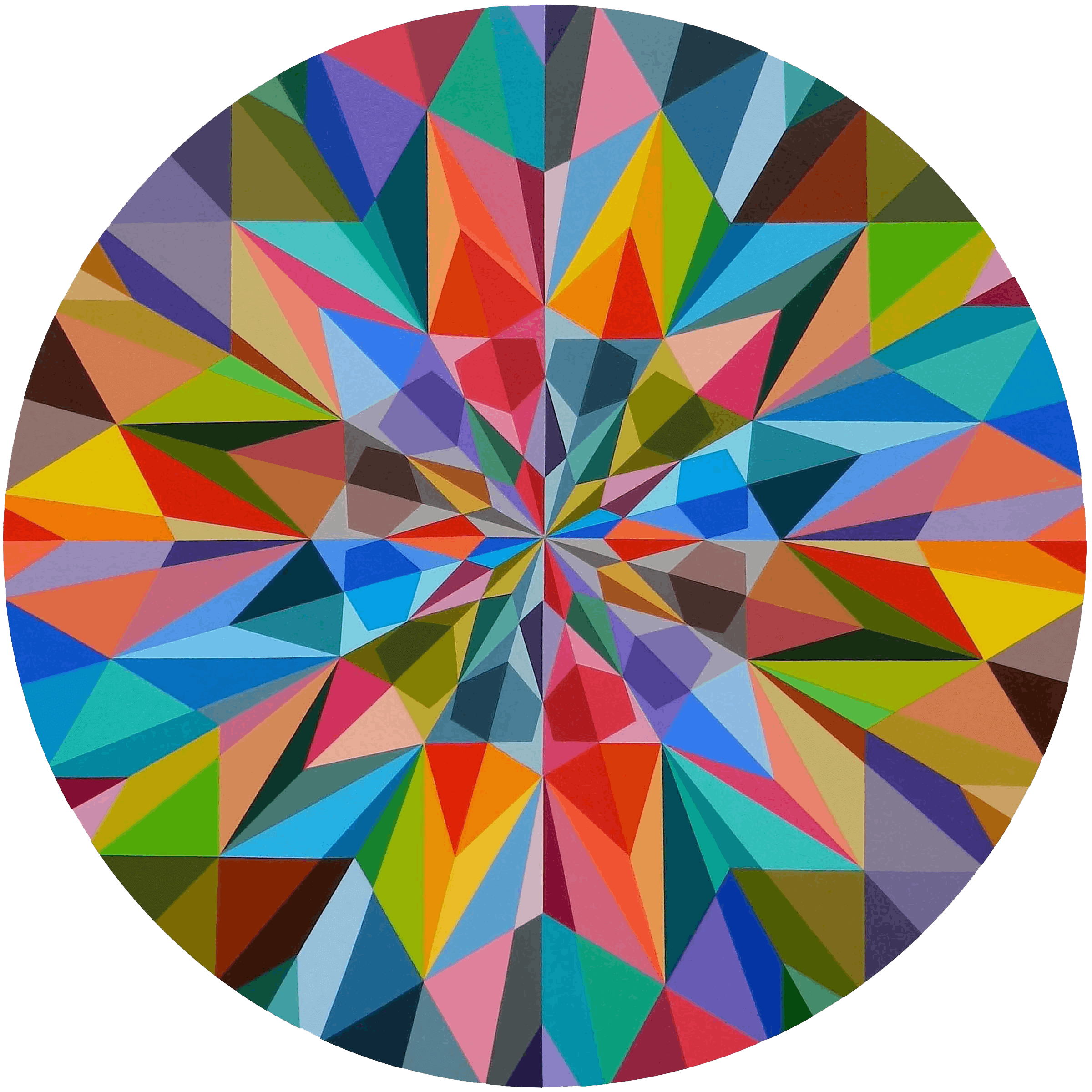
Rotational Symmetry
Imagine a rotating wheel. No matter how much you rotate it, its pattern remains the same. Rotational symmetry depicts all the visual elements rotating around the center of a design, stemming from the central point. It can simulate movement in an otherwise static design.
Visuals containing symmetrical balance are, indeed, pleasing to the eye. However, there’s not much room for innovation with symmetry. This is because there’s not a lot of variety when it comes to creating symmetrical balance.
Playing around with the elements of a symmetrical design can easily shift its balance. It could either remain symmetrical or become asymmetrical, if you prefer.
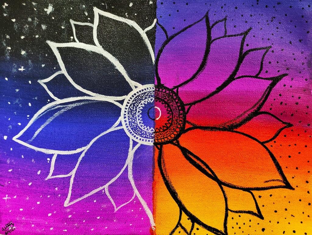
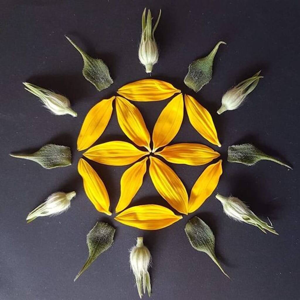
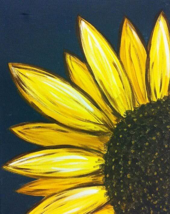
The above design can be used as one such example. While it would have been visually appealing if both sides of the flower were aligned, the design would have been pretty ordinary. However, because the right-side half of the flower is slightly lower than the left, it generates a sense of curiosity in the viewer. The different, yet complementary colors, also add to the effect. Because of this, the audience will feel compelled to study the design for longer.
Despite its irregular alignment, the design still appears to be balanced. This is what we classify as asymmetry.
Asymmetrical Balance
Where there is no axis of symmetry but a design still has an even visual weight, it is asymmetrically balanced. No one side is a perfect mirror image of the other. In fact, there’s usually one large focal point on one side and several smaller ones on the other.
Asymmetry is generally preferred over symmetrical designs. While symmetrical balance is somewhat predictable, asymmetrical designs give the viewer a different treat each time.
However, as interesting as they are, asymmetrically balanced designs can be difficult to achieve. And this is even more true if you’re a beginner in design. You have to take care with the elements you choose and how they are used in the design. Experimenting with different elements and patterns until you feel your design is well-balanced, is often the best approach.
Related: 7 Basic Principles of Graphic Design Foundations: Composition and Layout
Other types of balance in graphic design
While symmetry and asymmetry are the two main types of balance used in design, there are a couple more. Let’s take a look at some of the less common forms of balance you can use in your compositions below.
Mosaic balance
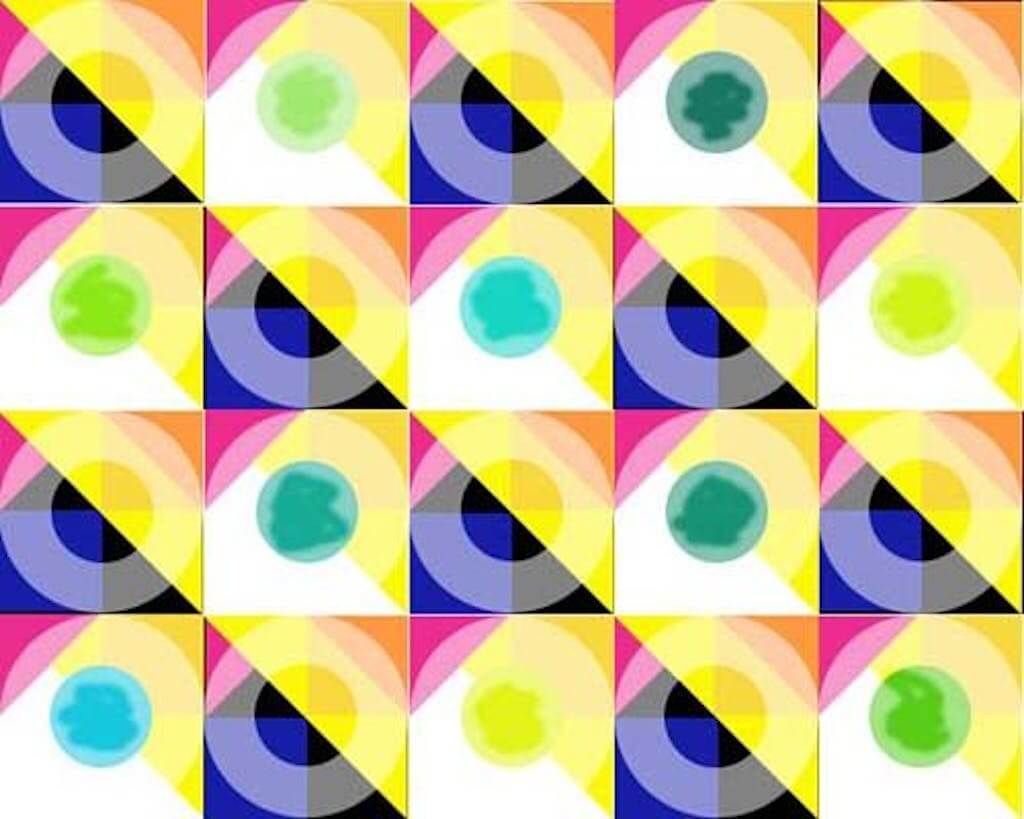
Crystallographic, or mosaic balance, occurs when a design doesn’t have one specific focus point. These designs may initially seem chaotic but they’re more appealing once all the elements come together. True to their name, designs created using this technique look like a mosaic.
Since there is no one element that stands out in these designs, we can say that they lack a focal point. Adding something bold over this, like text or an image, makes the original elements blend into each other. These designs, therefore, work well as backgrounds, as whatever you lay over them instantly becomes the focus.
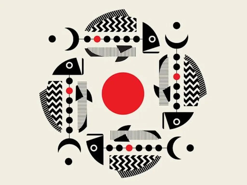
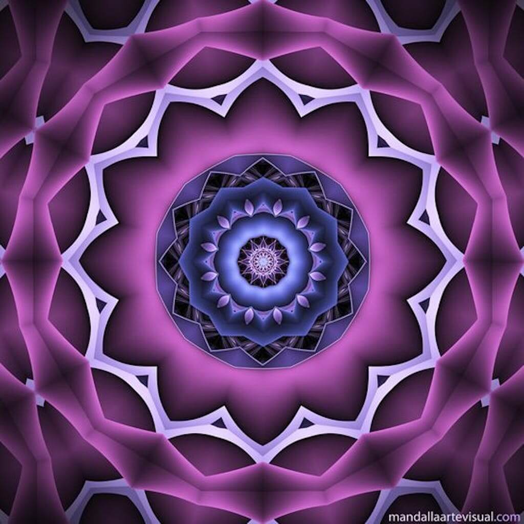
Radial balance
Radial balance may be confused with rotational symmetry, but there is a slight difference between the two. In rotational symmetry, you can spot the symmetry no matter how many times you rotate the design. However, for radial balance, an object doesn’t have to move to look balanced and symmetrical. Like when a pizza is divided into slices, we know that each one is more or less identical. Radial balance is similar in the sense that however an object may be divided, all its parts look identical.
Why is it important to have balance in graphic design?
Creating visual balance in a graphic design gives it an aesthetic appeal and keeps the viewer engaged. If a design doesn’t have balance, your viewers may not know where to look and it may feel unstable. Because of this, less interesting areas can go completely unnoticed.
Having balance in graphic design is therefore vital because, without it, you may fail to get your message across. This would then defeat the purpose of creating the design in the first place.
How to make sure your designs are balanced
Symmetry vs asymmetry isn’t the only way you can have balance in your designs. Some other factors you can use to balance the visual scale in your designs are:
Positive and negative space
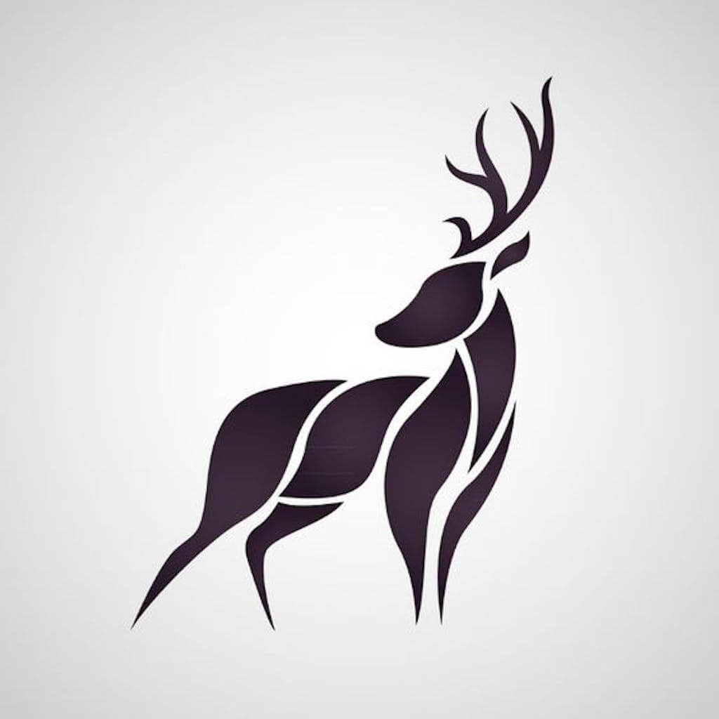
Designs contain both positive and negative spaces. In the given image, the black part which forms the deer is positive space while the remaining white part is negative space.
For a balanced design, you need to create harmony between the two spaces. Ensure they each have a similar amount of visual weight and avoid using up too much positive space.
Color
Use colors that either complement or contrast with each other. Make sure to do only one of the two, otherwise, it can get chaotic. It’s also important to check if all the colors used have a similar visual weight so that they don’t overpower each other.

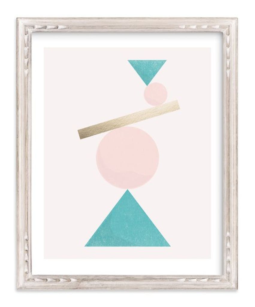
Shapes
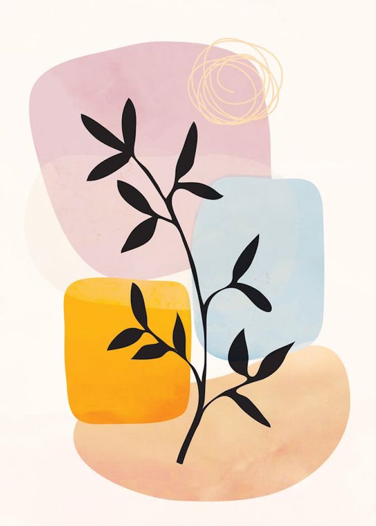
You can use different shapes to balance out the design, like the ones used in the image. Had there only been the plant, it would have been imbalanced, as it’s leaning over to the left. To balance it out, the designer has added some more objects behind it, which provide support to the irregular shape.
Pattern
Repeating an element creates a patterned design. This gives the viewer a sense of stability and satisfaction, as the design doesn’t have any surprise elements. Patterns are also often used in a design to give it a definitive structure and rhythm.
Understanding the different types of balance in graphic design is crucial for creating eye-catching visuals. Whether you’re a beginner or a professional graphic designer. Browse hundreds of beautiful templates or start from scratch to create brand assets and videos effortlessly. Then, publish with one click to reach your customers wherever they are!


![10 Best AI Image Restoration Tools to Try in 2025 [Free & Paid]](https://siteimages.simplified.com/blog/Best-AI-Image-Restoration-Tools-01.png?auto=compress&fit=crop&fm=png&h=400&w=400 "10 Best AI Image Restoration Tools to Try in 2025 [Free & Paid]")
![How to Use Photoshop AI Generative Fill Feature [2025]](https://siteimages.simplified.com/blog/How-to-Use-Photoshop-AI-Generative-Fill-01-1.png?auto=compress&fit=crop&fm=png&h=400&w=400 "How to Use Photoshop AI Generative Fill Feature [2025]")
![20 Podcast Thumbnail Ideas to Boost Your Show’s Visual Appeal + Best Practices [2025]](https://siteimages.simplified.com/blog/Podcast-Thumbnail-Ideas-to-Boost-Your-Show-02-1.png?auto=compress&fit=crop&fm=png&h=400&w=400 "20 Podcast Thumbnail Ideas to Boost Your Show’s Visual Appeal + Best Practices [2025]")


