
For any cinematographer, bringing the focus of attention to your subject can set a professional apart from an amateur. However, achieving such a dynamic final product is not as easy as a front-facing design. This is precisely where the rule of thirds can come in to save the day! From the genius angles of a Wes Anderson film to the aesthetic grid on an Instagram feed- this geometric concept is just everywhere.
So, where does this technique fit in the world of graphic design? Moreover, how can you use it to bring out the magic of your projects? In this Simplified blog, we’ll cover the fundamentals you need to know and give you the best examples to get started!
A Brief History of the Rule of Thirds
Art and Design Composition

The ‘Rule of Thirds,’ originated in the 18th century. It is a principle of composition guiding artists to construct and design their paintings. In Simplified terms, it is a rough guide or rule to help you compose an image while also drawing attention to a subject’s focal point or chief point of interest. You can visualize this by dividing the painting through two horizontal lines and two vertical lines equally spaced apart on the canvas.
According to the theory, any marked horizontal or vertical features in your scene should follow one of the lines on the grid. It is done instead of placing the desired object explicitly in the middle of the page. The final result? A perfect blend of geometry and aesthetics in the way you execute your artistic vision!
Photography
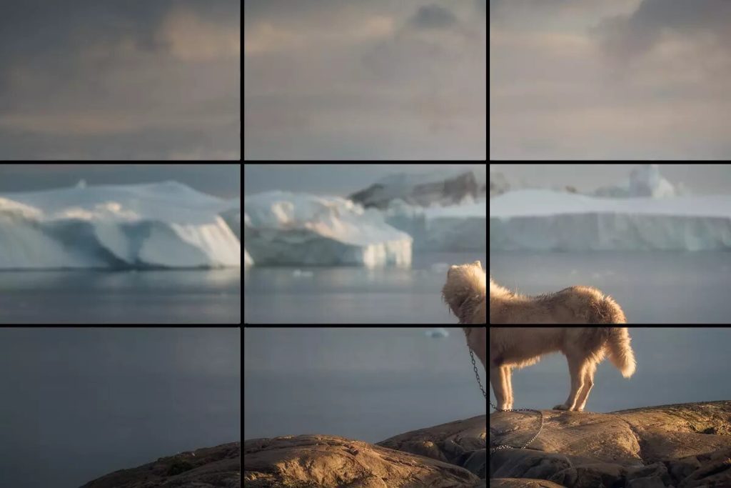
In the realm of photography, any subject in the camera frame is positioned in the left or third right of an image, leaving the other two-thirds more open. Most smartphones today come with a similar viewfinder feature shaped like a rule of thirds grid which helps you envision your final capture according to the lines on the screen.
Ideally, this should be adjacent to one of the nine intersection points of the nine boxes on the grid. The final result? Effortless inclusion of negative space in your shot to nail your photographic composition for the viewers’ eyes!
Why Do We Use the Rule of Thirds?
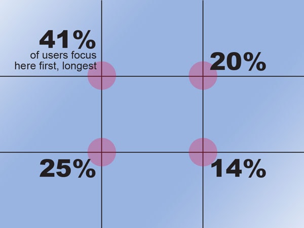
Using the rule of thirds grid is much more than just dividing your canvas into 3×3 equal-sized rectangles. The whole point of this design guideline is to help you create an alignment that complements your artistic intent. In other words, the way you strategize the negative space around your subject using the intersection points benefits your overall structure.
For example,
- Just the subject and nowhere for the viewer’s eyes to go = not much communication or thought.
- Space above the subject = there’s more room to think.
- Space below the subject = there’s less room to think above but more to analyze down below.
How is the Rule of Thirds Used in Design?
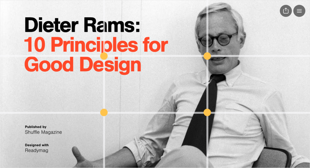
Balance, composition, and alignment are three of the most well-known terms for any designer to keep in mind for an effective final product. And with the use of the rule of thirds in graphic design, finding appropriate points of interest for the viewer to scan at their first glance becomes much smoother and convenient. In most cases, elements like necessary typography or branding illustrations lay at the top thirds of the grid overlay.
Once you’re sure of where you want to direct attention, arrange your design according to a visual hierarchy based on what’s crucial for your storytelling. On the contrary, you can also invert your image horizontally (a mirror-image flip) to align with the boxes on the grid!
Examples of Using the Rule of Thirds in Graphic Design
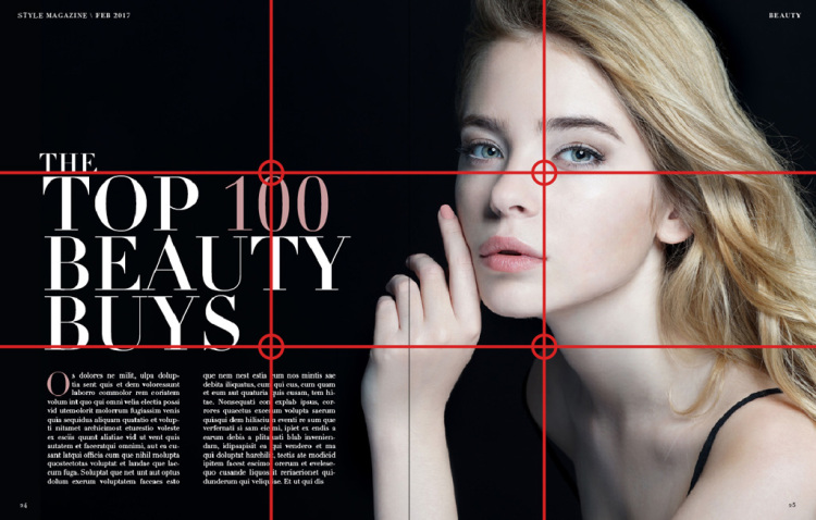
1. Marketing Assets
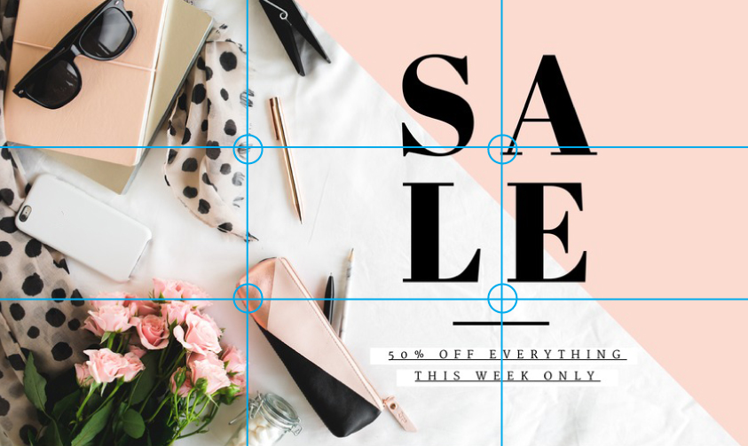
Whether it’s an ad for your upcoming sale or a poster for your new launches- the rule of thirds in graphic design is perfect for effective alignment. In the example above, the typography is minimal and positioned at the two intersection points on the right for the eyes to naturally land. On the left, the primary product image takes up most space in the overall design with the first two focus points
2. Print Design
Graphic designers in print advertising and magazine publishers abide by the rule of thirds while structuring their layout. Moreover, placing your brand copy on one side of the grid lines and imagery on the other focal points can reliably come in handy with split pages!
3. Web Design
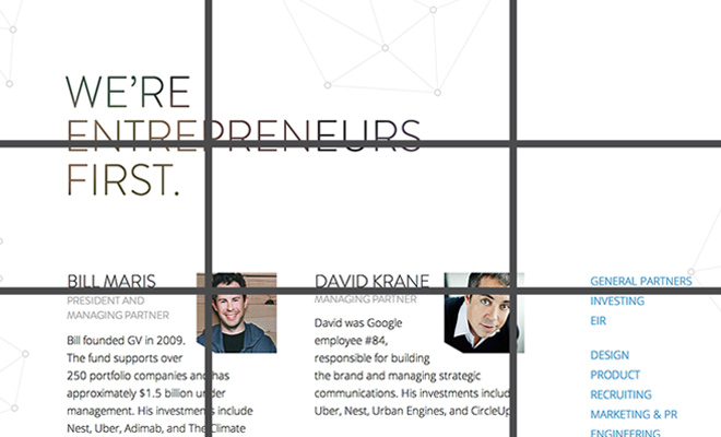
For any tactful web designer, placing more spacious and relevant elements on the top half of any website page can be a great strategy to swear by. According to the rule of thirds in graphic design, you want the audience browsing the link to find all high-priority objects without having to scroll on their devices.
Simplified Design Tip: Did you know you can create your very own rule of thirds grid-inspired marketing asset in just minutes? Simplified offers tons of stunning templates and design tools for you to choose from. So get started now!


![10 Best AI Image Restoration Tools to Try in 2025 [Free & Paid]](https://siteimages.simplified.com/blog/Best-AI-Image-Restoration-Tools-01.png?auto=compress&fit=crop&fm=png&h=400&w=400 "10 Best AI Image Restoration Tools to Try in 2025 [Free & Paid]")
![How to Use Photoshop AI Generative Fill Feature [2025]](https://siteimages.simplified.com/blog/How-to-Use-Photoshop-AI-Generative-Fill-01-1.png?auto=compress&fit=crop&fm=png&h=400&w=400 "How to Use Photoshop AI Generative Fill Feature [2025]")
![20 Podcast Thumbnail Ideas to Boost Your Show’s Visual Appeal + Best Practices [2025]](https://siteimages.simplified.com/blog/Podcast-Thumbnail-Ideas-to-Boost-Your-Show-02-1.png?auto=compress&fit=crop&fm=png&h=400&w=400 "20 Podcast Thumbnail Ideas to Boost Your Show’s Visual Appeal + Best Practices [2025]")


