
Think of your Instagram thumbnail as the cover of a book. In a sea of content, it’s the first thing people see, and it determines whether they’ll stop scrolling and give your post a chance. It’s a small detail, but it holds immense power.
Why Thumbnails Are Your Instagram’s First Impression
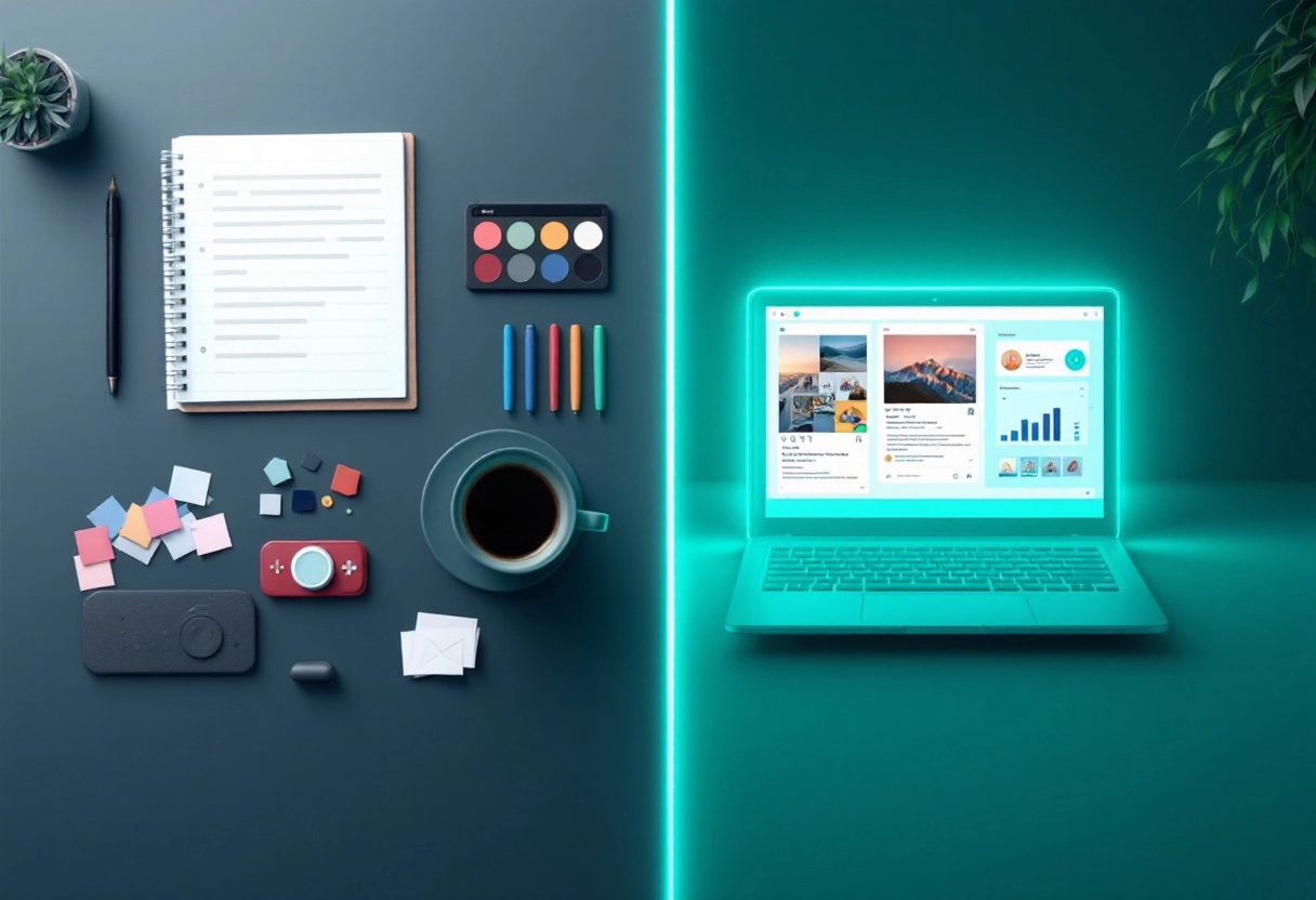
On Instagram, where visuals reign supreme, your thumbnail is your digital handshake. It’s a quick introduction to your content, conveying the essence of your video or image in a single, captivating frame. It’s your chance to grab attention, spark curiosity, and invite viewers to delve deeper.
The Cost of a Missed Opportunity: Losing Views and Followers
A poorly designed or neglected thumbnail can be a silent killer of your content’s potential. Imagine creating an amazing video, but using a blurry or uninteresting thumbnail. People are likely to scroll right past, meaning you’re losing out on views, likes, comments, and potential new followers. It’s like having a great product hidden behind a bad label.
This Blog’s Promise: Practical Tips for Remarkable Thumbnails
This isn’t just another article filled with vague advice. We’re diving deep into the world of Instagram thumbnails, providing you with actionable tips and strategies you can implement right away. Our goal is to equip you with the knowledge and tools to create thumbnails that not only grab attention but also accurately represent your brand and content, ultimately helping you grow your Instagram presence.
Identifying the Culprits: Common Thumbnail Mistakes to Avoid
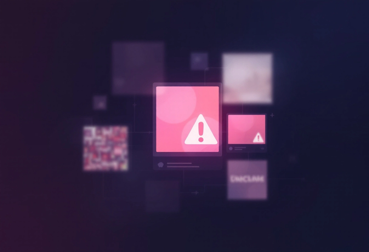
Muddied Lighting and Grainy Images: The Quickest Way to Lose Viewers
Think of your thumbnail as the storefront of your video. Would you walk into a store with a dark, blurry window display? Probably not. Poor lighting and grainy images make your thumbnail look unprofessional and uninviting. Viewers will often scroll right past, assuming the video quality matches the thumbnail. Make sure your thumbnail is well-lit and crystal clear. Use natural light when possible, or invest in some basic lighting equipment. High-resolution images are a must – avoid pixelation at all costs!
Bonus: Why Some Vlog Thumbnails Go Viral: Unpacking the Secret Strategy
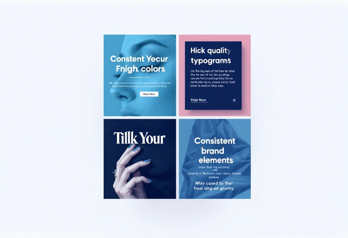
Text Overload and Unreadable Fonts: Keep It Concise and Clear
While text can be a great addition to your Instagram thumbnail, less is definitely more. Cramming too much text onto a small image makes it look cluttered and confusing. Choose a font that is easy to read at a glance, and use contrasting colors to make the text stand out against the background. A few well-chosen words that highlight the video’s main topic are much more effective than a paragraph of tiny, illegible text. Aim for clarity and impact.
Lack of Branding Consistency: Are You Instantly Recognizable?
Your thumbnails are a key part of your brand identity. If they look completely different from one video to the next, viewers won’t be able to easily recognize your content. Develop a consistent style – this could include using the same color palette, font, or logo placement. When people see your thumbnail, they should instantly know it’s from you. This builds trust and encourages viewers to click, knowing they can expect a certain level of quality and content.
Ignoring Mobile Optimization: A Big No-No in Today’s World
A huge percentage of video views happen on mobile devices. If your thumbnail looks great on a desktop but is a blurry, unreadable mess on a phone, you’re missing out on a lot of potential viewers. Always check how your thumbnails look on mobile screens. Make sure the text is still legible and the key visual elements are still clear. Consider using larger, bolder text and simpler designs that translate well to smaller screens.
Bonus: How to Create Irresistible YouTube Shorts Thumbnails: Here’s How It Actually Works
Bold Moves: Designing Thumbnails That Grab Attention
The Psychology of Color: Using Vibrant Hues to Draw the Eye
Ever wonder why some instagram thumbnails just seem to pop off the screen? Color plays a massive role. Think of it this way: your thumbnail is competing with countless others for attention. Using vibrant hues can be like shouting in a crowded room – but in a good way! Colors evoke emotions and can quickly communicate the tone of your video.
For instance, red often signals excitement or urgency, while blue can convey trust and calmness. Experiment with color combinations that not only stand out but also align with your brand and the content of your video. A cooking tutorial might benefit from warm, inviting colors like orange or yellow, while a tech review could use cooler, more modern tones like blue or green.
Image Quality is Non-Negotiable: Sharp, Clear, and Professional
In the world of online video, first impressions are everything. A blurry or pixelated thumbnail screams unprofessionalism and can deter viewers before they even know what your video is about. Make sure your thumbnail image is crisp, clear, and high-resolution. Avoid using images that look stretched or distorted. If you’re using text, ensure it’s legible even at a small size.
Think of your thumbnail as the cover of a book – it needs to be visually appealing and give a sense of the quality of the content inside. Using professional-looking images instantly builds trust and encourages clicks.
Font Psychology: Choosing Text That Pops and Persuades
The font you choose for your thumbnail text can have a surprising impact on how viewers perceive your video. Just like colors, different fonts evoke different emotions and associations. A bold, sans-serif font can convey confidence and modernity, while a script font might suggest elegance or creativity. The key is to choose a font that not only complements your image but also reinforces the message you’re trying to communicate. Make sure the font is easy to read at a glance, and use contrasting colors to make the text stand out against the background. A well-chosen font can be the difference between a scroll-past and a click.
Applying Facial Expressions: The Power of Human Connection
Humans are naturally drawn to faces, and incorporating facial expressions into your thumbnails can be a powerful way to connect with potential viewers. A genuine smile can convey warmth and approachability, while a look of surprise or excitement can pique curiosity. Experiment with different expressions to see what resonates best with your audience.
If you’re camera-shy, consider using close-up shots of expressive eyes or interesting details that convey emotion. The goal is to create a thumbnail that feels relatable and invites viewers to learn more about you and your content. After all, people connect with people, and a compelling facial expression can be the key to unlocking that connection.
Bonus: Top Roblox Thumbnail Trends: Attracting Players
Branding is Key: Maintaining a Consistent Visual Identity
Color Palette Consistency: Build a Recognizable Brand Aesthetic
Think of your brand’s color palette as its signature. Just like a painter uses a set of colors to create a distinctive style, your brand needs a consistent color scheme to become instantly recognizable. This isn’t just about picking pretty colors; it’s about choosing colors that represent your brand’s personality and values.
Are you aiming for a feeling of trustworthiness and stability? Blues and greens might be your go-to. Want to convey energy and excitement? Oranges and yellows could be the answer. Once you’ve chosen your colors, stick to them across all your marketing materials, website, and social media. This repetition helps customers quickly identify and remember your brand.
Font Choices: Select Fonts That Reflect Your Brand’s Personality
Fonts have personalities too! The fonts you use can say a lot about your brand, even before someone reads the actual words. A playful, rounded font might be perfect for a children’s brand, but it would feel out of place for a financial institution. A classic serif font can convey tradition and authority, while a modern sans-serif font can suggest innovation and simplicity.
The key is to choose fonts that align with your brand’s voice and target audience. And just like with colors, consistency is crucial. Limit yourself to a small selection of fonts (usually two or three) and use them consistently across all your communications to create a unified and professional look.
Logo Placement: Subtly Reinforce Your Brand Identity
Your logo is the visual cornerstone of your brand, and where you place it matters. Think of it as a subtle reminder of who you are. Whether it’s on your website, business cards, or product packaging, consistent logo placement helps build brand recognition. The goal is not to be overly flashy or distracting, but rather to integrate your logo in a way that feels natural and reinforces your brand identity. Consider the size, position, and surrounding elements to ensure your logo always looks its best and contributes to a cohesive brand experience.
The Benefits of a Cohesive Look: Building Trust and Recognition
When your brand has a cohesive visual identity, it sends a message of professionalism and attention to detail. This, in turn, builds trust with your audience. People are more likely to do business with a brand that looks polished and consistent. A cohesive look also makes your brand more memorable. When your colors, fonts, and logo are always used in the same way, customers start to associate those elements with your brand, making it easier for them to recognize you in a crowded marketplace. In short, a consistent visual identity is a powerful tool for building brand recognition, fostering trust, and ultimately, driving business growth.
Bonus: How AI Thumbnail Makers increase YouTube Views: A Complete Guide
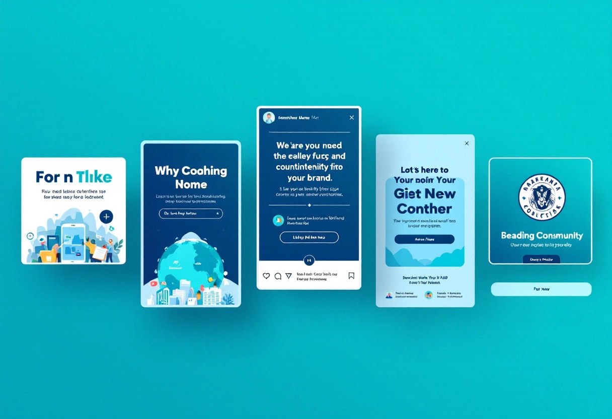
Mobile-First Mindset: Optimizing Thumbnails for Small Screens
The Reality of Mobile Viewing: Most Users Browse on Their Phones
Let’s face it, most people are glued to their phones. This means your thumbnails are often viewed on a screen that’s just a few inches wide. It’s crucial to consider this when designing them. Think about it – are you designing for a billboard or a postage stamp? Your approach needs to reflect the reality of mobile viewing.
Simplicity Rules: Avoid Clutter and Complexity
On a small screen, less is definitely more. Avoid cramming too much information into your thumbnail. A cluttered thumbnail is a confusing thumbnail, and a confusing thumbnail is one that gets ignored. Focus on a single, clear message or image. Think about using negative space to make the key elements stand out.
Text Size Matters: Ensure Readability on Small Screens
If your thumbnail includes text (and often it should), make sure it’s large enough to read easily on a mobile device. Tiny, illegible text is a surefire way to lose viewers. Choose a font that’s clear and easy to read, and don’t be afraid to make it big! Consider the contrast between the text and the background, too. High contrast will improve readability.
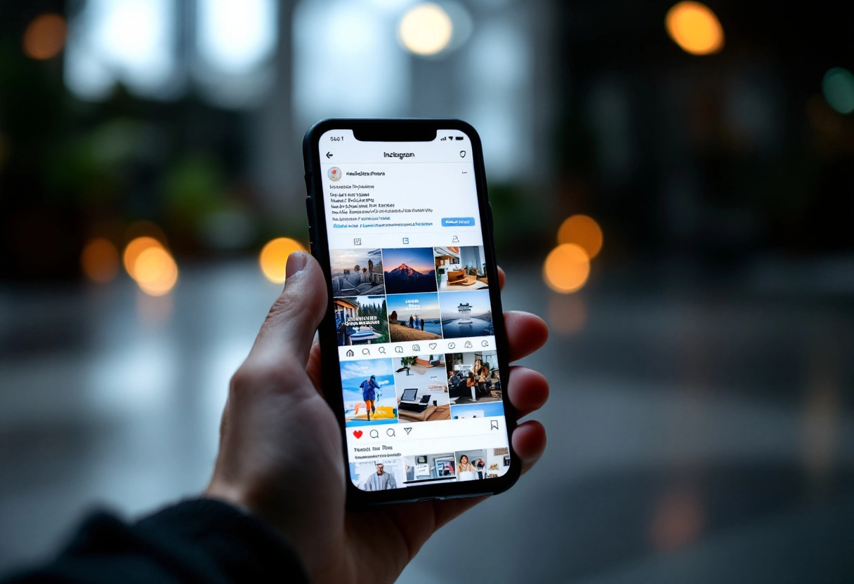
Testing on Mobile Devices: Always Preview Your Thumbnails
The best way to ensure your thumbnails look good on mobile is to actually view them on mobile devices. Don’t just rely on how they look on your computer screen. Preview your thumbnails on different phones and tablets to see how they appear to real users. Make adjustments as needed. This simple step can make a huge difference in the effectiveness of your thumbnails.
Bonus: What Makes a Fortnite Thumbnail Impossible to Ignore? Let’s Spill the Secrets!
Tools and Techniques: Making the Thumbnail Creation Process Easier
Using AI: How AI Thumbnail Makers Can Help
Creating catchy thumbnails doesn’t have to be a chore. AI thumbnail makers are here to assist, offering a range of features that can speed up the design process. These tools often come with pre-designed templates, image optimization, and automatic resizing, allowing you to create professional-looking thumbnails without needing extensive design skills.
For example, you can input your video title and the AI will suggest relevant images and layouts, saving you time and providing inspiration.
Free Design Resources: Accessible Options for Beginners
If you’re just starting out or working with a limited budget, there are plenty of free design resources available. Websites like Simplified and Pixabay offer a wealth of free images, templates, and design elements that you can use to create your thumbnails. These resources provide a great starting point for beginners, allowing you to experiment with different styles and find what works best for your content.
Many of these platforms also have tutorials and guides to help you learn the basics of graphic design.
Batch Creation: Save Time by Designing Multiple Thumbnails at Once
For content creators who produce videos regularly, batch creation can be a huge time-saver. Some design tools allow you to create multiple thumbnails at once by duplicating and modifying existing designs. This is particularly useful if you have a series of videos with a similar theme or style. By creating a template and then making small adjustments for each video, you can maintain consistency and reduce the amount of time spent on each thumbnail.
A/B Testing: Discover What Resonates with Your Audience
Once you’ve created a few thumbnails, it’s important to test them to see which ones perform best. A/B testing involves creating two or more different versions of a thumbnail and showing them to different segments of your audience. By tracking metrics like click-through rate (CTR), you can determine which thumbnail is most effective at attracting viewers. This data-driven approach allows you to refine your design strategy and create thumbnails that are more likely to get clicks.
For instance, you might test two thumbnails with different color schemes or text overlays to see which one resonates more with your audience.
Conclusion: Turn Viewers into Followers, One Thumbnail at a Time
Let’s quickly go over what we’ve learned. Creating great thumbnails isn’t just about slapping an image together; it’s a thoughtful process. Remember to keep these points in mind:
- Know Your Audience: What kind of visuals grab their attention?
- Keep it Simple: Avoid clutter. A clear message is key.
- Use High-Quality Images: Blurry is bad. Crisp and clear is the way to go.
- Choose Readable Fonts: Make sure your text is easy to read at a glance.
- Maintain Consistency: Develop a style that viewers can recognize.
- A/B Test: See what works and what doesn’t. Data is your friend.
By focusing on these core principles, you’ll be well on your way to creating thumbnails that not only look great but also drive clicks and views.
The Ongoing Journey: Continuously Refining Your Thumbnail Strategy
Creating amazing thumbnails isn’t a one-time thing; it’s an ongoing process. The YouTube landscape is constantly changing, so you need to be ready to adapt. Stay updated with current trends, pay attention to what your competitors are doing, and never stop experimenting. Your initial thumbnail strategy is just a starting point.
Use analytics to track performance, gather feedback from your audience, and make changes accordingly. Think of each thumbnail as a learning opportunity. The more you practice and refine your approach, the better you’ll become at creating thumbnails that resonate with your target audience.


")
")

")


