
Roblox is packed with games, and let’s be honest—if yours doesn’t catch the eye, it might get lost in the shuffle. That tiny thumbnail? It’s doing a lot of heavy lifting. Think of it like a storefront sign in a busy city. Players are scrolling fast, and your thumbnail is what makes them pause. That’s where understanding current Roblox thumbnail trends really matters. If it’s bland or confusing, they’ll likely keep going. But if it’s bold, clear, and reflects what your game is about—it can be the difference between one click and a hundred.
Why Thumbnails Are More Important Than Ever on Roblox
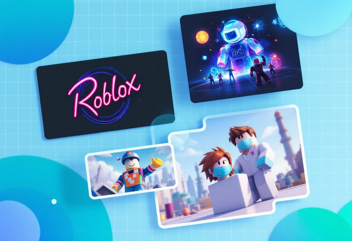
As Roblox continues to grow, the platform becomes more competitive. More games mean more choices for players. This increased competition makes a compelling thumbnail even more critical. It’s not just about attracting attention; it’s about making a memorable first impression that sticks with players as they scroll through countless options.
What This Guide Will Cover: Modern Styles and Design Tips
This isn’t your average guide to slapping text on an image. We’re diving deep into what makes a Roblox thumbnail truly shine in 2025. Here’s what you can expect:
- Understanding the Modern Roblox Aesthetic: What styles are trending, and how can you adapt them to your game?
- Practical Design Tips: Learn about composition, color theory, and typography to create visually appealing thumbnails.
- Tools and Techniques: Discover the best software and methods for creating high-quality thumbnails.
- Staying Ahead of the Curve: Get insights into future trends and how to prepare your thumbnails for what’s next.
By the end of this guide, you’ll have the knowledge and skills to create Roblox thumbnails that not only grab attention but also accurately represent your game and attract the right players. Let’s get started!
Top Visual Themes Behind 2025’s Roblox Thumbnail Trends
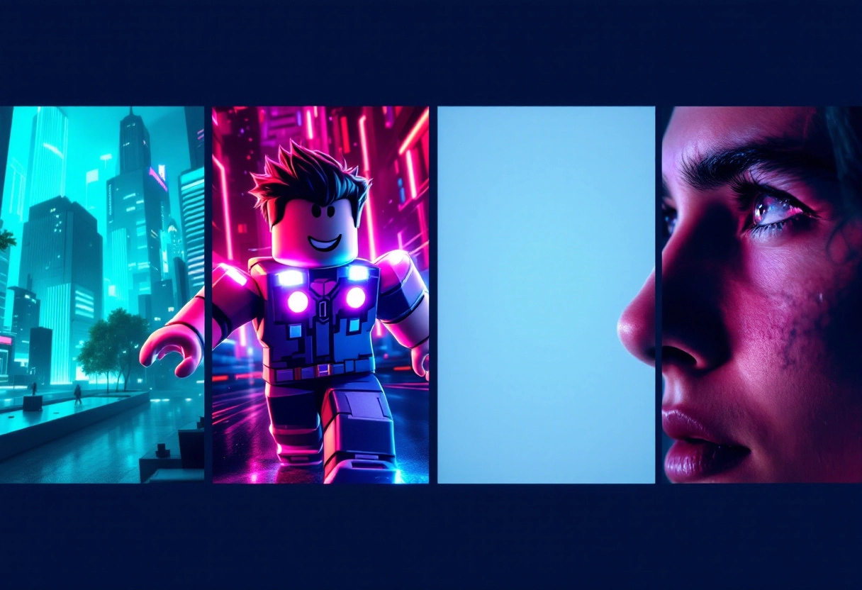
Neon Color Schemes
Neon colors are like the attention-grabbers of the visual world. Think vibrant pinks, electric blues, and glowing greens. When used well in a Roblox thumbnail, they can instantly make your content pop. The key is to use them strategically. Don’t just splash neon everywhere; instead, use these colors to highlight key elements, like characters or important objects.
For example, a neon outline around a character can make them stand out against a darker background, or a brightly colored title text can draw the eye.
Bonus: 10 Proven Techniques to Improve Roblox Thumbnail Design While Following Guidelines
Cinematic Angles and Dynamic Poses
Ever notice how movie posters often use dramatic angles and action-packed poses? The same principle applies to Roblox thumbnails. Instead of a static, straight-on shot, try capturing your characters in the middle of some exciting action.
Maybe they’re jumping, fighting, or casting a spell. Use camera angles that add to the drama – an upward angle can make a character look powerful, while a downward angle can create a sense of vulnerability. These dynamic perspectives instantly inject energy into your thumbnail, making viewers curious about what’s happening in the game.
Minimalism and Clean Design
In a sea of busy, cluttered thumbnails, sometimes less is more. Minimalism focuses on clean lines, simple shapes, and a limited color palette. A well-executed minimalist thumbnail can stand out precisely because it’s so different. Think of it as a breath of fresh air for the eyes.
This approach often involves using a single, strong visual element against a plain background, with text that’s easy to read at a glance. It’s all about conveying the essence of your video in the most direct and uncluttered way possible.
Character Close-Ups
Humans are naturally drawn to faces. A close-up of a character’s face, especially one that conveys a strong emotion, can be incredibly effective in a thumbnail. Are they surprised? Excited? Determined? Showing that emotion can create an instant connection with viewers, making them want to know more about the story behind the expression.
The key is to make sure the expression is clear and relatable, and that the lighting and composition highlight the character’s features.
Emerging Layout Patterns for Roblox Thumbnails
Roblox thumbnails are evolving, and certain layout patterns are becoming more prominent. Understanding these can seriously improve how your games stand out. Let’s explore some key trends.
Centered Text and Titles: Why central alignment can improve readability and focus.
Think about it: where does your eye naturally go on a page? Often, it’s right to the center. Centering your text and titles in a Roblox thumbnail can really grab attention. It creates a sense of balance and makes the core message immediately clear. Plus, it’s super readable, especially on smaller screens where thumbnails appear.
Blurred Backgrounds: Creating depth and emphasizing foreground elements.
Blurred backgrounds are all about creating depth. By blurring what’s behind the main subject, you force the viewer to focus on what’s in the foreground. This technique is fantastic for highlighting characters, items, or key actions in your Roblox game thumbnail. It adds a professional touch and prevents the thumbnail from feeling cluttered.
Bonus: 80 Roblox Bio Ideas to Level Up Your Profile Game
Branded Overlays and Consistent Elements: Building recognition through visual consistency.
Branding is key, even in thumbnails. Using consistent visual elements like logos, color schemes, or specific fonts helps players instantly recognize your games. Branded overlays can be subtle—a small logo in the corner, a recurring graphic element—but they build familiarity and trust over time. Think of it as your visual signature in the Roblox world.
Use of Visual Hierarchy: Directing the viewer’s eye with size, color, and placement.
Visual hierarchy is all about guiding the viewer’s eye. You can control where people look first by adjusting the size, color, and placement of elements.
For example, a large, brightly colored character will naturally draw more attention than smaller, muted background details. Strategic placement of text and key objects ensures that the most important information is seen first, making your thumbnail more effective at communicating what your game is about.
Case Studies: Analyzing Trending Roblox Games and Their Thumbnails
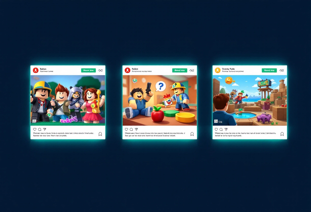
Game 1: Adopt Me!: Deconstructing the thumbnail’s success.
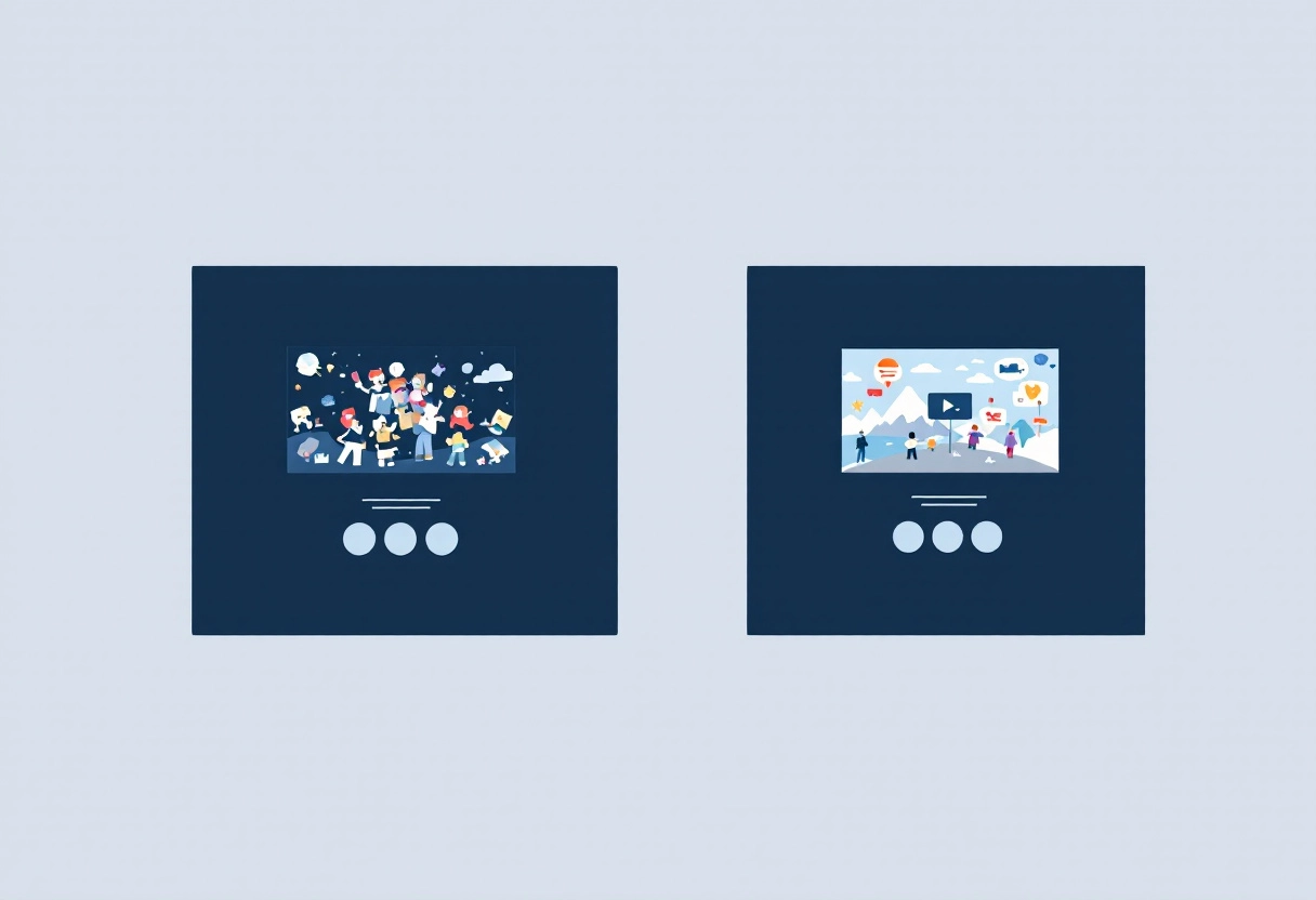
Let’s dive into a specific example. Think about a popular Roblox game like “Adopt Me!” Its thumbnails often feature bright colors, cute animals, and sometimes even a glimpse of a rare or highly sought-after pet. The success here isn’t random. The bright colors immediately grab attention in the crowded Roblox game library. The cute animals appeal to the game’s target audience. And that hint of rarity? That creates a sense of excitement and encourages clicks. Consider how these elements work together to create a compelling visual story, even before someone reads the game’s title.
Game 2: Brookhaven RP: Identifying key elements that drive clicks.
Now, let’s look at another trending game, maybe something like “Brookhaven RP.” What makes its thumbnails work? Often, you’ll see snapshots of exciting scenes – a cool car chase, a party, or a group of friends hanging out. These thumbnails are all about showcasing the role-playing possibilities within the game. They highlight the social aspect and the potential for creating your own stories. The key elements here are relatable scenarios and a sense of community. By presenting these visuals, the thumbnail communicates what makes the game engaging.
Comparative Analysis: What common threads run through successful thumbnails?
Okay, so we’ve looked at a couple of examples. What are the common threads that link successful Roblox thumbnails? Here are a few to consider:
- Color: Bright colors are almost always a must. Think about what colors stand out against the Roblox interface.
- Characters/Avatars: Showcasing interesting or appealing characters is a great way to connect with potential players.
- Action or Emotion: Thumbnails that convey a sense of action, excitement, or fun are more likely to grab attention.
- Intrigue: A hint of mystery or a sneak peek at something special can pique curiosity and drive clicks.
- Relevance: The thumbnail should accurately represent the game’s content and appeal to its target audience.
Ultimately, a successful Roblox thumbnail is a mini-advertisement. It needs to quickly and effectively communicate what the game is about and why someone should play it.
Bonus: 10 Best AI Thumbnail Makers for YouTube and Social Media
Elements That Are Becoming Outdated in Roblox Thumbnails
Overly Cluttered Designs: Why simplicity is winning.
Ever feel like a Roblox thumbnail is screaming at you with too much going on? You’re not alone. Overly cluttered designs, packed with text, characters, and effects, are quickly becoming a thing of the past. Why? Because in today’s fast-paced world, attention spans are short. A clean, simple thumbnail communicates the essence of your game or video instantly. Think about it: when scrolling through a sea of thumbnails, which ones grab your attention? It’s usually the ones that are easy to understand at a glance. Simplicity is winning because it respects the viewer’s time and gets the message across without the visual noise.
Low-Resolution Assets: The importance of crisp, clear visuals.
In the age of high-definition screens, low-resolution assets in your Roblox thumbnails are a big no-no. Pixelated images and blurry text scream “amateur” and can turn potential viewers away. Crisp, clear visuals are essential for making a good first impression. They convey professionalism and attention to detail. Think of your thumbnail as a storefront window – you want it to be inviting and appealing. Using high-quality assets ensures that your thumbnail looks sharp and engaging, no matter what device it’s viewed on. It’s a small investment that can make a huge difference in attracting clicks.
Generic or Uninspired Imagery: Standing out from the crowd with originality.
Let’s face it: the Roblox world is brimming with content. Using generic or uninspired imagery in your thumbnails is like trying to find a needle in a haystack. To stand out, you need originality. Avoid using the same stock images or overused poses that everyone else is using. Instead, think about what makes your game or video unique and try to capture that essence in your thumbnail. This could involve creating custom artwork, using unique character designs, or staging dynamic scenes that hint at the gameplay experience. The goal is to pique curiosity and make viewers want to learn more.
Inconsistent Branding: The risks of a disjointed visual identity.
Imagine your favorite brand suddenly changing its logo and color scheme every week. Confusing, right? The same principle applies to your Roblox thumbnails. Inconsistent branding creates a disjointed visual identity, making it harder for viewers to recognize your content. Consistency is key to building brand recognition and loyalty.
Use a consistent color palette, font style, and overall design aesthetic across all your thumbnails. This helps viewers instantly identify your content and associate it with a certain level of quality. Think of it as building a visual signature that sets you apart from the crowd and reinforces your brand identity.
Bonus: Why Some Vlog Thumbnails Go Viral: Unpacking the Secret Strategy
Creating Thumbnails That Attract: Practical Tips for Developers
Understanding Your Target Audience: Tailoring your thumbnails to appeal to specific players.
Think about who you’re trying to reach. A visually appealing thumbnail for a puzzle game will look very different from one for a fast-paced action title. Consider the age, interests, and platform preferences of your ideal player. What kind of imagery, colors, and fonts resonate with them? Research popular games in your genre and analyze their thumbnails. What common threads do you see? Use this information to guide your design choices.
A/B Testing Different Designs: Validating your choices with data.
Don’t rely on guesswork! A/B testing allows you to compare different thumbnail designs and see which performs best. Platforms like the Google Play Store and Steam allow you to test different versions. Create two or more variations of your thumbnail, each with a slightly different element (e.g., a different character pose, background color, or text).
Then, track which version leads to more clicks and installs. Over time, A/B testing will give you valuable data to optimize your thumbnails and increase your conversion rates.
Using AI Thumbnail Maker for quick thumbnail creation.
No design skills? No problem! AI thumbnail maker can help you generate eye-catching visuals quickly and easily. These tools often provide pre-designed templates, image libraries, and font options. Simply upload a screenshot from your game, customize the text and graphics, and let the AI do its magic. While AI tools can be a great starting point, remember to add your personal touch to make your thumbnails stand out from the crowd.
Maintaining Brand Consistency Across All Visuals: Building a recognizable identity.
Your thumbnails are an extension of your game’s brand. Use consistent colors, fonts, and visual styles across all your marketing materials, including your thumbnails, app icon, and website. This helps players instantly recognize your game and builds a strong brand identity. If your game features a particular character or art style, showcase it prominently in your thumbnails. A consistent visual language will make your game more memorable and trustworthy.
Bonus: How AI Thumbnail Makers increase YouTube Views: A Complete Guide
Conclusion: Staying Ahead of the Curve in Roblox Thumbnail Design
Alright, let’s quickly go over what we’ve learned. We’ve seen how crucial vibrant colors are for grabbing attention, and how important it is to feature your game’s characters or unique elements. Keeping your thumbnails clean and easy to understand at a glance is still a golden rule. And of course, remember the power of incorporating user-generated content to build trust and excitement.
The Importance of Continuous Adaptation: Why staying updated is essential.
The world of Roblox is always changing. What works today might not be as effective tomorrow. That’s why it’s super important to keep an eye on what’s trending, what other successful games are doing, and how players are reacting to different styles of thumbnails. Think of it like this: if you’re not moving forward, you’re falling behind. So, stay curious, keep learning, and don’t be afraid to try new things!
Final Thoughts: Encouraging developers to experiment and innovate.
Ultimately, the best Roblox thumbnails are the ones that stand out and truly represent your game. Don’t be afraid to break the mold and experiment with different styles, colors, and compositions. Get feedback from your players, analyze your results, and keep iterating. Your thumbnail is often the first impression players have of your game, so make it count! Now go out there and create some awesome thumbnails!


")
")


")


