
Ever scrolled through Roblox and felt overwhelmed by the sheer number of games? You’re not alone. With countless experiences vying for attention, how do you make yours stand out? The answer lies in a single, powerful image: your Roblox thumbnail.
The First Impression: Thumbnails as Gatekeepers
Think of your thumbnail as the cover of a book. It’s the first thing players see, and it determines whether they’ll click to learn more or scroll on by. In the crowded Roblox marketplace, a compelling thumbnail acts as a gatekeeper, inviting players into your world. A blurry, generic, or uninspired thumbnail sends the opposite message, suggesting a lack of quality or effort.
The Impact of a Great Thumbnail on Click-Through Rate
Click-through rate (CTR) is the percentage of people who see your game and then click on it. A higher CTR means more players checking out your creation. A well-designed thumbnail directly influences your CTR. It communicates the essence of your game, grabs attention, and entices players to explore further. Imagine two identical games; the one with the more eye-catching thumbnail will invariably attract more players.
What This Guide Covers: A Practical Approach
This isn’t just another article filled with abstract advice. We’re diving deep into the practical aspects of Roblox thumbnail design. We’ll explore the key elements of an effective thumbnail, provide actionable tips for creating visually appealing graphics, and guide you through the technical aspects of uploading and optimizing your thumbnail for maximum impact. By the end of this guide, you’ll have the knowledge and tools to craft thumbnails that not only look great but also drive more players to your Roblox game.
Bonus: 80 Roblox Bio Ideas to Level Up Your Profile Game
Understanding Roblox’s Thumbnail Guidelines
Key Rules and Restrictions to Keep in Mind
Creating thumbnails for your Roblox experiences can be exciting, but it’s important to play by the rules. Roblox has specific guidelines to ensure a safe and appropriate environment for all users. Think of your thumbnail as the first impression – you want it to be eye-catching but also representative of your game and respectful of the platform’s standards.
Here’s a breakdown of some key things to avoid:
- Inappropriate Content: This includes anything sexually suggestive, graphically violent, or that promotes illegal activities. Keep it clean and family-friendly!
- Misleading Information: Don’t use thumbnails that falsely advertise your game or trick users into clicking. Be honest about what your experience offers.
- Copyrighted Material:Using images or characters that you don’t have the rights to can get you into trouble. Stick to original content or assets you’re licensed to use.
- Hate Speech or Discrimination: Any content that promotes hatred, discrimination, or violence against individuals or groups is strictly prohibited.
- Personal Information: Avoid including real-life personal information in your thumbnails, such as names, addresses, or phone numbers.
- Roblox Thumbnail Size and Dimensions: Outline Roblox’s official guidelines for thumbnail size (1920 x 1080 pixels).
Consequences of Non-Compliance: Avoid Penalties
Ignoring Roblox’s thumbnail guidelines can lead to some unpleasant consequences. Roblox takes these rules seriously to maintain a positive environment for its community. So, what could happen if you don’t comply?
- Thumbnail Removal: The most immediate consequence is that your offending thumbnail will be removed. This means your game’s visibility could suffer.
- Account Warning: You might receive a warning on your Roblox account, which can impact your standing within the community.
- Content Moderation: Roblox might review other content you’ve created to ensure it complies with their guidelines.
- Account Suspension or Termination: In severe or repeated cases, your account could be suspended or even terminated. This means you’d lose access to your games, Robux, and everything associated with your account.
The best way to avoid these penalties is to familiarize yourself with the guidelines and always err on the side of caution. When in doubt, it’s better to choose a more conservative thumbnail that you know is compliant.
Technique 1: Mastering Composition for Maximum Impact
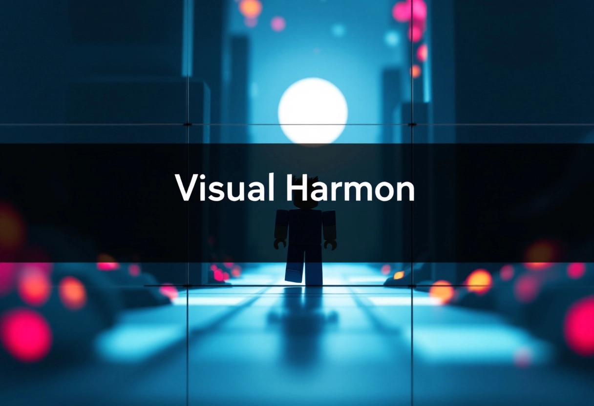
The Rule of Thirds: A Simple Guide to Visual Balance
Imagine your image divided into nine equal parts by two horizontal and two vertical lines. The rule of thirds suggests placing key elements of your composition along these lines or at the points where they intersect. Why? Because this creates more tension, energy, and interest in the composition than simply centering the subject. It’s a tried-and-true method for achieving visual balance and drawing the viewer’s eye to the most important parts of your image. Think of it as a roadmap for where to place your focal points.
Leading Lines: Guiding the Viewer’s Eye
Leading lines are exactly what they sound like: lines within your image that lead the viewer’s eye from one point to another. These lines can be roads, rivers, fences, or even just implied lines created by the arrangement of objects. The key is to use them intentionally to guide the viewer through your composition and towards your subject. A well-placed leading line can add depth, create a sense of movement, and make your image more engaging. Consider how a winding path can draw the viewer deeper into a landscape, or how a series of parallel lines can emphasize the distance between objects.
Creating Depth: Using Layers and Perspective
Depth is what separates a flat, uninteresting image from one that feels immersive and real. There are several ways to create depth in your compositions. One is by using layers – placing objects in the foreground, middle ground, and background to give the viewer a sense of distance. Overlapping elements can also contribute to the illusion of depth. Perspective, both linear and atmospheric, is another powerful tool. Linear perspective uses converging lines to create the illusion of distance, while atmospheric perspective uses changes in color and clarity to suggest depth. By mastering these techniques, you can transform your images from two-dimensional representations into three-dimensional experiences.
Bonus: 10 Best AI Thumbnail Makers for YouTube and Social Media
Technique 2: Color Psychology and Contrast
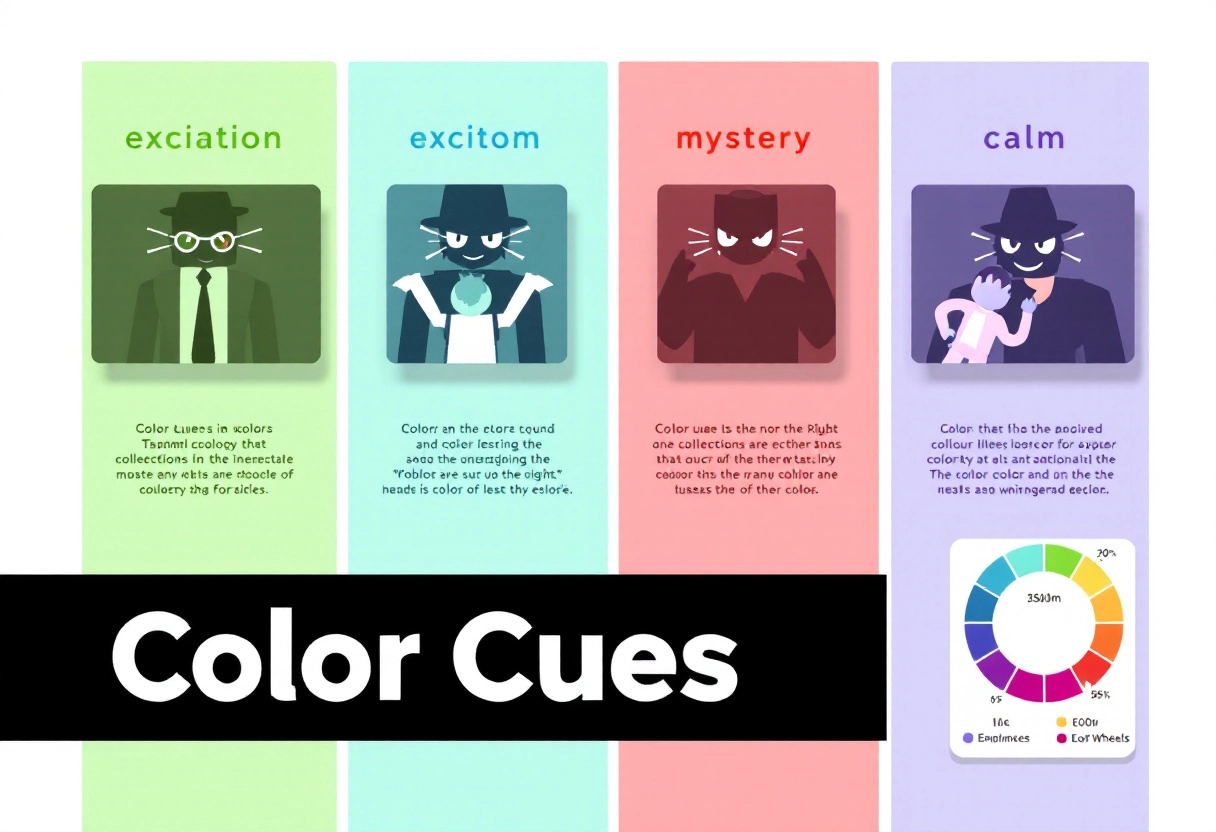
Choosing the Right Color Palette: Evoking Emotion
Ever stopped to think about why certain colors grab your attention more than others? It’s not just random preference – color psychology plays a huge role! Colors have the power to evoke specific emotions and associations.
For instance, red often signals excitement or urgency, while blue tends to convey trust and calmness. Think about your video’s theme and the emotion you want viewers to feel. A vibrant, energetic vlog might benefit from a color palette with yellows and oranges, while a calming meditation video could thrive with blues and greens. The key is to choose colors that align with your content and resonate with your target audience.
Using Contrast to Make Your Thumbnail Pop
Contrast is your best friend when it comes to making a thumbnail that stands out. Imagine a sea of thumbnails, all vying for attention. How do you make yours the one people click on? Contrast! By pairing contrasting colors – like a bright yellow against a deep blue – you create visual tension that immediately grabs the eye. Think about the colors already prevalent on YouTube’s interface (lots of white and red). Using colors that strongly contrast with these will help your thumbnail cut through the noise. Just be sure the contrast is intentional and supports your message, not distracts from it.
Avoiding Color Clashes: Maintaining Visual Harmony
While contrast is great, you want to avoid creating a visual mess. Color clashes can be jarring and make your thumbnail look unprofessional, ultimately deterring viewers. How do you avoid this? A basic understanding of color theory helps! Using a color wheel, you can identify complementary colors (opposite each other on the wheel, like red and green) that create strong contrast without clashing. Analogous colors (next to each other on the wheel, like blue and green) offer a more harmonious and subtle look. There are also plenty of online tools that can help you generate color palettes that are visually appealing and work well together. Remember, a harmonious color scheme is easier on the eyes and makes your thumbnail look polished and professional.
Technique 3: Typography Tips for Readability
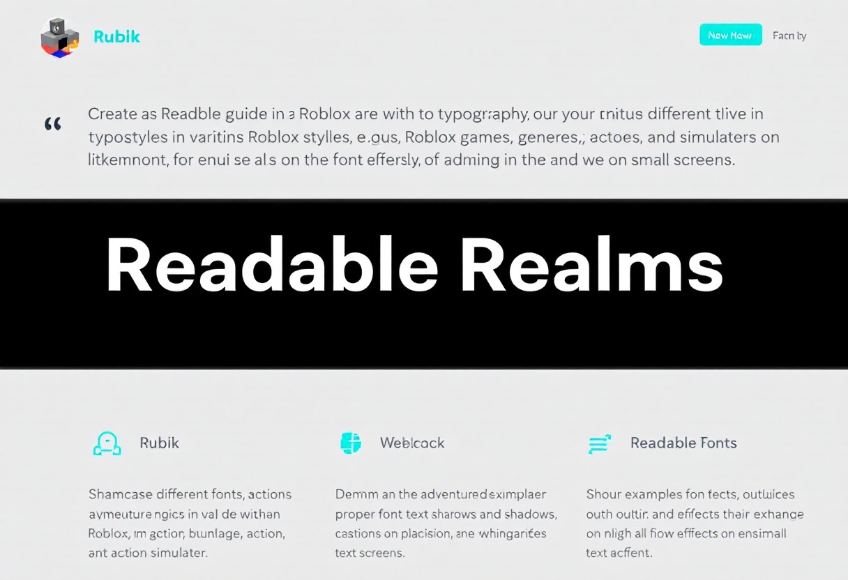
Choosing the Right Font: Matching Your Game’s Style
Choosing the right font is more than just picking something that looks good; it’s about finding a typeface that complements your game’s overall aesthetic and enhances the player experience. Think about the kind of world you’re building. Is it a gritty, post-apocalyptic landscape? A clean, futuristic cityscape? Or a whimsical fantasy realm? Your font should reflect that.
For example, a fantasy game might benefit from a decorative, slightly medieval-looking font, while a sci-fi game might call for something sleek and modern.
Consider these factors when selecting your font:
- Genre: Does the font fit the game’s genre?
- Theme: Does it align with the game’s overall theme and mood?
- Readability: Is it easy to read at various sizes and distances?
Don’t be afraid to experiment with different fonts and see how they look in the actual game environment. Get feedback from others to see what resonates with them.
Font Size and Placement: Ensuring Legibility
Even the most beautiful font is useless if players can’t read it. Font size and placement are critical for ensuring legibility. You need to consider the resolution of the screens players will be using, the distance they’ll be sitting from the screen, and the amount of visual clutter in the game environment.
Here are some guidelines to follow:
- Sufficient Size: Make sure the font is large enough to be easily read without straining the eyes. Test different sizes on various devices.
- Clear Placement: Position text in areas with good contrast and minimal background distraction. Avoid placing text over busy or constantly changing visuals.
- Consistent Spacing: Use appropriate letter-spacing and line-height to prevent letters from crowding together and becoming difficult to distinguish.
Pro Tip: Allow players to adjust the font size in the game settings. This is especially helpful for players with visual impairments or those playing on smaller screens.
Bonus: Why Some Vlog Thumbnails Go Viral: Unpacking the Secret Strategy
Using Text Effects: Shadows, Outlines, and Glows
Text effects can be a powerful tool for improving readability and adding visual flair, but they should be used judiciously. Shadows, outlines, and glows can help text stand out from the background, but too much of these effects can make the text look cluttered and difficult to read.
Here’s how to use text effects effectively:
- Shadows: Use subtle shadows to create contrast and depth. Avoid overly dark or blurry shadows that can obscure the text.
- Outlines: Outlines can be particularly useful for making text stand out against busy backgrounds. Choose an outline color that contrasts well with both the text and the background.
- Glows: Glows can add a nice visual touch, but they can also be distracting. Use them sparingly and make sure the glow color complements the overall color scheme.
Remember, the goal is to improve readability, not to create a visual spectacle. Always prioritize clarity over flashy effects.
Technique 4: Character and Asset Presentation
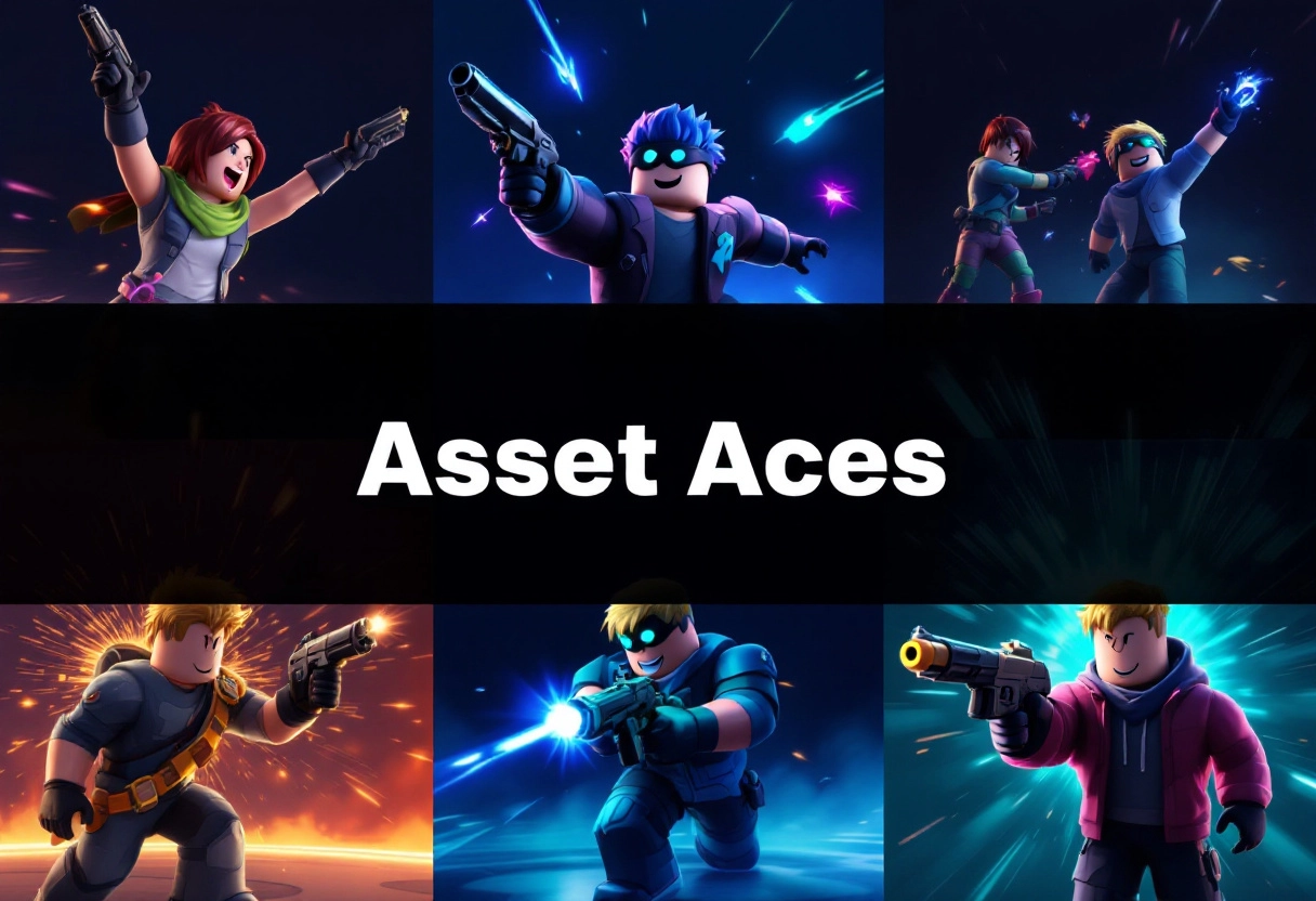
Posing Characters: Showcasing Personality
The way you pose your characters speaks volumes. Think about what you want to communicate about them. Are they confident and powerful? Perhaps a strong, upright stance with hands on their hips would work. Are they sneaky and cunning? A crouched pose, eyes darting around, could convey that. Consider the character’s backstory, their motivations, and their current emotional state. Let these factors guide your posing choices. Don’t just stick to static, neutral poses. Inject life and personality into your characters through dynamic and expressive positioning.
Highlighting Key Assets: Weapons, Vehicles, and More
Your characters often have signature items or tools that define them. Make sure these assets get the attention they deserve! If a character is known for their massive sword, show them wielding it in a way that emphasizes its size and power. If they’re inseparable from their trusty vehicle, pose them interacting with it – perhaps leaning against it confidently or making repairs with a focused expression. The key is to integrate these assets naturally into the character’s pose and overall presentation, making them an integral part of the story you’re telling visually.
Creating Dynamic Scenes: Action and Excitement
Static scenes are boring scenes. Introduce movement and energy into your presentations. Show characters in the middle of an action – leaping, swinging, firing a weapon, or even just reacting to something happening around them. Use camera angles to enhance the sense of dynamism. A low angle can make a character look more imposing, while a high angle can emphasize their vulnerability. Experiment with motion blur effects to suggest speed and intensity. The goal is to create a visual narrative that grabs the viewer’s attention and keeps them engaged.
Bonus: How AI Thumbnail Makers increase YouTube Views: A Complete Guide
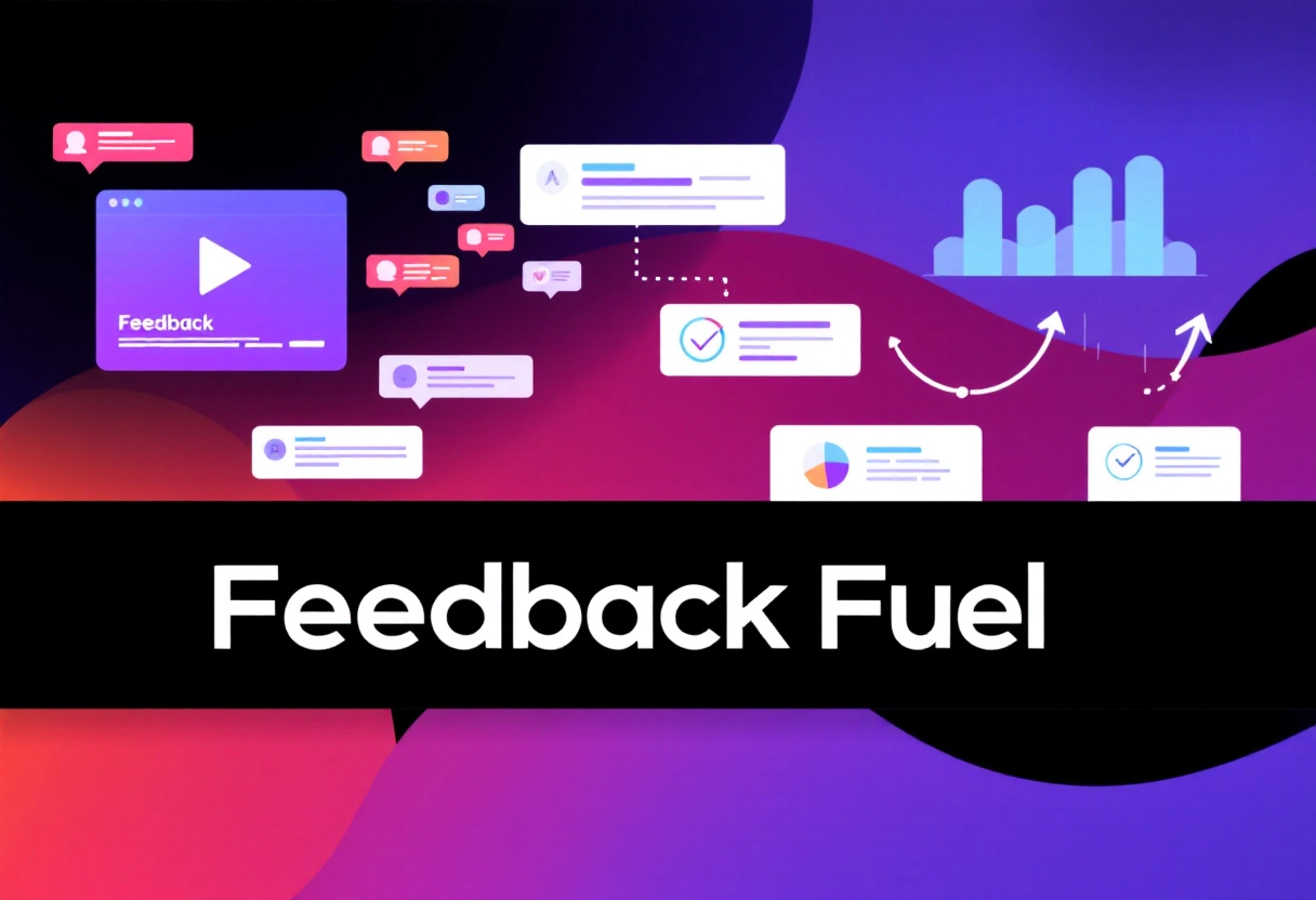
Technique 5: A/B Testing Your Thumbnails
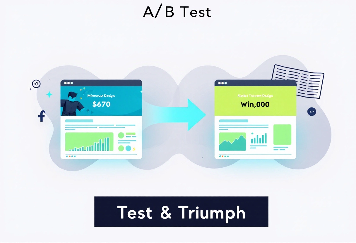
Why A/B Testing Is Crucial for Optimization
Think of your thumbnails as tiny billboards. They’re your first, and sometimes only, chance to grab a player’s attention. But how do you know which billboard design works best? That’s where A/B testing comes in. It’s a simple concept: you create two different versions of your thumbnail and show them to different groups of players. By tracking which version performs better (more clicks, more plays), you can make data-driven decisions about which thumbnails to use.
Without A/B testing, you’re just guessing. You might think a certain color scheme or character pose is appealing, but your audience might disagree. A/B testing removes the guesswork and helps you understand what truly resonates with players.
Setting Up Your First A/B Test on Roblox
Roblox doesn’t have a built-in A/B testing feature for thumbnails, so you’ll need to get a little creative. Here’s how you can set up a test:
- Create Two Thumbnails: Design two distinct thumbnails for your game. Change only one element at a time (e.g., background color, character expression, text). This makes it easier to identify what caused the difference in performance.
- Alternate Thumbnails: Manually switch between the two thumbnails every few days or weeks. This isn’t ideal, as external factors (like weekends or holidays) can skew the results.
- Track Impressions and Click-Through Rate (CTR): Monitor your game’s analytics in the Roblox Creator Dashboard. Pay close attention to the number of impressions (how many times your thumbnail was shown) and the click-through rate (the percentage of impressions that resulted in a game visit).
- Use External Tools (Optional): For more sophisticated testing, you could use external analytics platforms or ad services that allow for A/B testing. However, this usually requires more technical expertise.
Example:
Let’s say you have a simulator game. Thumbnail A features a character smiling and holding a stack of coins. Thumbnail B shows the same character with a determined expression, looking at a towering skyscraper. Run the test for a week, alternating between the two. Track the impressions and CTR for each thumbnail.
Analyzing Results and Iterating on Your Designs
After running your A/B test for a reasonable period (at least a week), it’s time to analyze the data. Which thumbnail had a higher CTR? A statistically significant difference (meaning it’s unlikely due to random chance) suggests that one thumbnail is indeed more effective than the other.
Don’t just stop there! A/B testing is an iterative process. Take what you learned from your first test and apply it to new thumbnail designs. For example, if the determined expression performed better, try other thumbnails that convey a sense of challenge or progression. Keep testing, keep learning, and keep optimizing!
Important Considerations:
- Test One Variable at a Time:Changing multiple elements simultaneously makes it impossible to know which change caused the improvement (or decline).
- Consider Your Target Audience:What appeals to one group of players might not appeal to another. Tailor your thumbnails to your game’s specific audience.
- Don’t Be Afraid to Experiment:Try unconventional designs! You might be surprised by what resonates with players.
Technique 6: Staying Updated with Trends
In Roblox, staying current with the latest trends is crucial for keeping your creations fresh and engaging. It’s not just about knowing what’s popular; it’s about understanding why and figuring out how you can put your own spin on it.
Following Popular Roblox Games and Styles
One of the most direct ways to spot trends is by keeping a close eye on the popular games within Roblox. What genres are dominating the charts? What art styles are attracting players? Pay attention to the mechanics that are keeping users hooked.
For instance, if obbys with unique themes are trending, consider how you could design an obby that stands out with an original concept or innovative challenges. Or, if a particular building style is gaining traction, experiment with incorporating those elements into your own builds. Remember, the goal is to learn and adapt, not to directly copy.
Using Social Media and Forums for Inspiration
Social media platforms and Roblox-centric forums are goldmines for identifying emerging trends. Platforms like Twitter, YouTube, and TikTok often showcase the latest Roblox crazes, from popular dances and memes to up-and-coming games. Forums and communities provide spaces where players discuss their favorite experiences and share ideas. By actively participating in these online spaces, you can gain insights into what players are currently excited about and what they anticipate in the future. This knowledge can be invaluable in guiding your creative decisions.
Adapting Trends to Fit Your Unique Brand
The real magic happens when you take a trend and make it your own. Don’t just blindly follow what’s popular; think about how you can adapt it to align with your personal style and the unique identity of your game or creations.
For example, if a certain type of character customization is trending, consider how you could introduce a similar feature but with a twist that reflects your game’s theme or lore. Or, if a particular game mechanic is gaining popularity, think about how you could reimagine it in a way that complements your game’s existing gameplay. By creatively adapting trends, you can stay relevant while still maintaining your originality and distinctiveness.
Technique 7: Utilizing Software and Tools
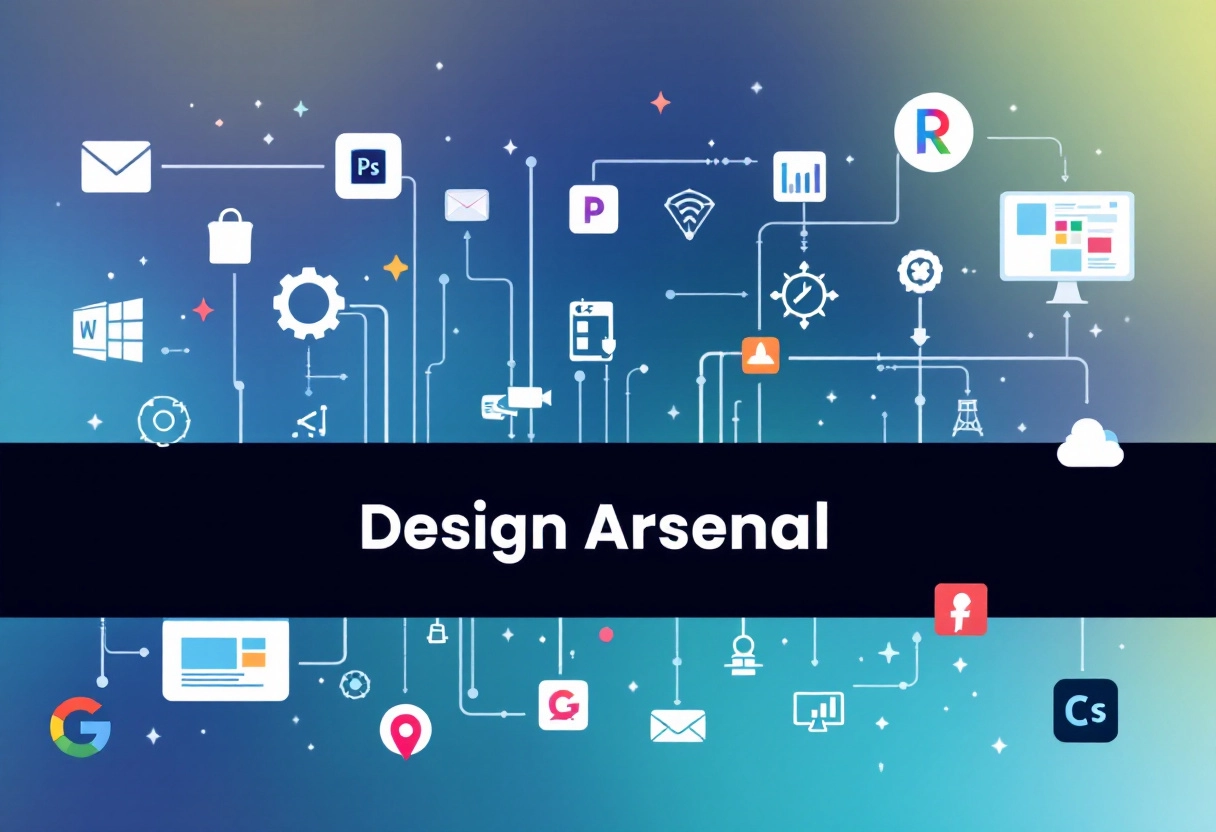
Free and Paid Software Options for Thumbnail Creation
Creating thumbnails doesn’t have to cost a lot. There are plenty of tools out there for different skill levels and budgets. Free options like Simplified and GIMP are great for getting started—Simplified is simple to use with drag-and-drop features and templates, while GIMP offers more control for those comfortable with image editing.
If you need more advanced features, paid tools like Adobe Photoshop and CorelDRAW offer more flexibility and detailed editing options. For something quicker, AI-based tools such as Simplified can help create thumbnails with minimal effort by using design suggestions that fit your content style. Whether you go for a free editor, paid software, or AI assistance really depends on how much control you want and how much time you’re willing to spend.
Online Resources and Templates
The internet is a treasure trove of resources for thumbnail creation. Numerous websites offer free templates, stock photos, and design assets that can significantly speed up your workflow. Platforms like Unsplash and Pexels provide high-quality, royalty-free images that you can use as backgrounds or elements in your thumbnails. Many design blogs and tutorials also offer tips and tricks for creating visually appealing thumbnails.
Templates can be a great starting point, especially if you’re short on time or design experience. Sites like Canva and Adobe Spark offer a wide variety of customizable templates that you can adapt to your specific needs. Remember, though, that using templates doesn’t mean your thumbnails have to look generic. Customize them with your own branding, colors, and fonts to make them unique and recognizable.
Automating Your Workflow
To truly maximize your efficiency, consider automating parts of your thumbnail creation process. Batch editing tools, for example, can help you apply the same adjustments or effects to multiple thumbnails at once. If you regularly create thumbnails for similar types of content, consider creating a master template that you can easily adapt for each new video or post.
Some software also offers features like automated resizing and optimization, which can save you time and ensure that your thumbnails look great on different devices and platforms. By automating repetitive tasks, you can free up more time to focus on the creative aspects of thumbnail design and creating content that resonates with your audience. This, in turn, can lead to increased engagement and growth for your channel or brand.
Bonus: How To Make a Thumbnail That Stands Out
Technique 8: Mobile Optimization
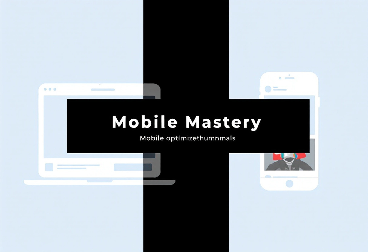
Designing for Smaller Screens
Let’s face it, most people are glued to their phones. Designing for smaller screens isn’t just about shrinking your desktop site; it’s about rethinking the user experience. Consider a mobile-first approach, where you design for the smallest screen first and then scale up for larger devices. This ensures a clean, focused experience for your mobile users.
Testing on Multiple Devices
You might think your website looks great on your phone, but what about older models or different operating systems? Testing on a variety of devices is crucial to ensure a consistent experience for everyone. Use browser developer tools to simulate different screen sizes, or better yet, borrow a few phones from friends and family. Pay attention to how your website loads, how the content reflows, and whether all the features work as expected.
Ensuring Readability on Mobile
Tiny text on a phone screen is a recipe for frustration. Make sure your font sizes are large enough to read comfortably without zooming. Aim for a minimum font size of 16px for body text. Also, pay attention to line height and letter spacing. Adequate white space around text and images can also improve readability and make your site more visually appealing on smaller screens. A comfortable reading experience keeps visitors engaged.
Technique 9: Consistency is Key
Maintaining a Consistent Brand Identity
Think of your YouTube channel as a TV show. People tune in because they know what to expect. Your thumbnails are like the show’s poster – they need to instantly tell viewers, “Hey, this is from the channel you love!” Consistency in your thumbnails builds brand recognition. Use the same fonts, color palettes, and general layout so viewers can immediately identify your content, even before they read the title.
Using Templates for Faster Creation
Creating thumbnails from scratch every single time can be a real time-drain. Templates are your friend! Design a few base templates that reflect your brand’s visual style. These templates can include placeholders for your images, text, and any recurring design elements. When you’re ready to make a new thumbnail, simply swap out the content while maintaining the overall structure. This not only saves time but also ensures a consistent look across all your videos.
Creating a Style Guide for Your Thumbnails
A style guide isn’t just for big corporations; it’s a valuable tool for any content creator. A thumbnail style guide outlines the specific visual elements that define your brand’s look on YouTube. This includes:
- Color Palette:Choose a set of primary and secondary colors that represent your brand.
- Typography:Select one or two fonts for your titles and text overlays.
- Image Style:Decide on the type of imagery you’ll use (e.g., realistic photos, illustrations, or a mix of both).
- Layout:Define the general arrangement of elements in your thumbnails.
Having a style guide keeps your thumbnails consistent and makes the creation process much smoother. It’s like having a recipe for visual success!
Technique 10: Seeking Feedback and Improving
Asking for Feedback from Other Creators
Feedback is a gift, even if it doesn’t always feel like it! One of the best ways to improve your designs is to actively seek feedback from other creators. They can offer fresh perspectives and spot things you might have missed. When asking for feedback, be specific about what you’re looking for.
Are you unsure about the color palette? The layout? The overall message? The more specific you are, the more helpful the feedback will be. Also, be open to criticism. It’s not always easy to hear, but it’s essential for growth. Remember, the goal is to make your designs better.
Using Analytics to Track Performance
Data doesn’t lie! Analytics can be a goldmine of information about how your designs are performing. Pay attention to metrics like views, shares, and click-through rates. These numbers can tell you what’s resonating with your audience and what’s not.
For example, if you notice that a particular design is getting a lot of shares but very few clicks, it might mean the visual is appealing, but the call to action isn’t clear enough. Use this data to inform your future designs. Experiment with different elements and track the results. Over time, you’ll start to develop a better understanding of what works and what doesn’t.
Continuously Refining Your Designs
Design is an iterative process. It’s rare to create a perfect design on the first try. That’s why it’s important to continuously refine your work. Take the feedback you’ve received and the data you’ve collected and use it to make improvements. Don’t be afraid to experiment with different approaches. Maybe try a new font, a different layout, or a bolder color scheme. The key is to keep learning and growing. The more you practice and refine your designs, the better you’ll become. And remember, even the most experienced designers are constantly learning and improving.
Conclusion: Attract More Players to Your Roblox Game
Alright, let’s bring it all together. We’ve covered a lot about what makes a great Roblox thumbnail and how it can seriously impact the number of players your game attracts. Think of your thumbnail as the first handshake with a potential player. It needs to be inviting, clear, and a true representation of the awesome experience that awaits them.
Recap of Key Techniques
Remember those key ingredients we talked about? High-quality visuals are non-negotiable – avoid blurry or stretched images at all costs. Compelling characters draw the eye and create an instant connection. Text should be readable at a glance, highlighting the most exciting aspects of your game. And don’t forget consistency! A recognizable style builds your brand and keeps players coming back for more.
Final Thoughts on Thumbnail Design
Designing a great thumbnail isn’t about ticking boxes; it’s about telling a story. It’s about capturing the essence of your game and communicating it visually in a way that sparks curiosity and excitement. Don’t be afraid to experiment, try different approaches, and see what resonates with your audience. The more you iterate, the better you’ll get at crafting thumbnails that truly shine.
So, what are you waiting for? It’s time to put these techniques into action and start designing thumbnails that grab attention and get clicks. Your Roblox game has the potential to reach a massive audience, and a well-crafted thumbnail is your ticket to getting noticed. Go ahead, get creative, and watch those player numbers climb!


")
")


")


