
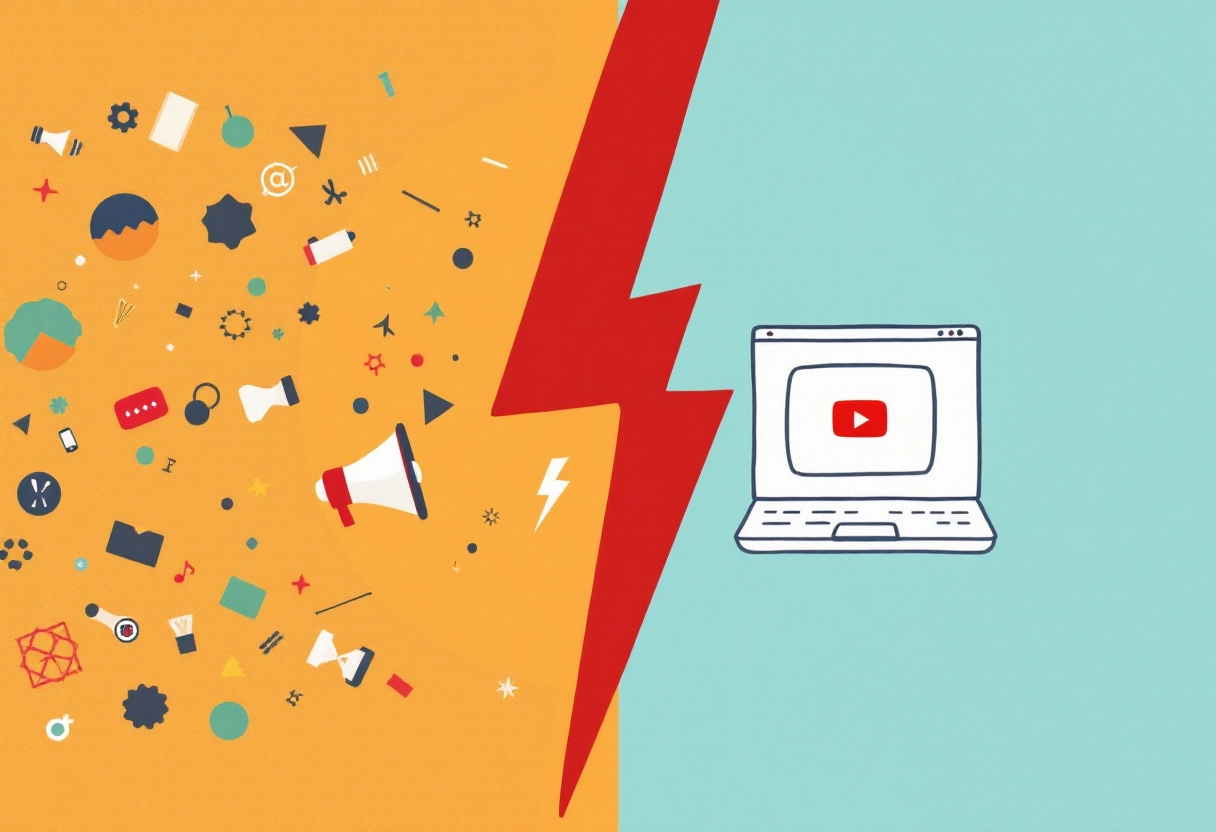
Before anyone hits play, they click. And what they click on—more often than not—is decided by one thing: the thumbnail.
When you’re creating vlogs, that thumbnail becomes even more important. Vlog thumbnails are more than just snapshots—they give viewers a quick sense of what your video is about and why it’s worth their time. With over 500 hours of video uploaded to YouTube every minute, standing out takes more than just good content.
A well-designed thumbnail doesn’t just attract clicks—it builds curiosity. According to YouTube Creator Academy, 90% of the best-performing videos have custom thumbnails. That stat alone should tell you just how vital this little image really is. Whether you’re vlogging about travel, tech, or tutorials, thumbnails are your channel’s first handshake with a potential viewer.
Want your content to get noticed? Start with what your audience sees first.
The Power of a First Impression: Why Vlog Thumbnails Matter
The Thumbnail’s Role in the Viewer Journey
Think of your vlog thumbnail as the cover of a book. It’s the first thing potential viewers see, and it plays a huge role in whether they decide to click and watch your video. It’s not just about looking good; it’s about grabbing attention and communicating what your video is all about. In a sea of content, your thumbnail is your initial chance to stand out.
Click-Through Rate (CTR) and Its Impact on Vlog Success
CTR, or click-through rate, is the percentage of people who see your thumbnail and actually click to watch your video. A higher CTR means more people are interested in your content, which can lead to more views, subscribers, and overall success for your vlog. YouTube’s algorithm also favors videos with higher CTRs, so a compelling thumbnail can directly impact your video’s visibility.
For example, let’s say you have two videos on similar topics. Video A has a thumbnail that’s a bit bland, and it gets a CTR of 2%. Video B has an eye-catching thumbnail that clearly conveys the video’s topic, and it gets a CTR of 7%. That means Video B is getting significantly more views simply because its thumbnail is more appealing.
Beyond Aesthetics: Thumbnails as a Branding Opportunity
Thumbnails aren’t just about attracting clicks; they’re also a great way to build your brand. By using consistent colors, fonts, and imagery in your thumbnails, you can create a recognizable visual style that helps viewers instantly identify your videos. This consistency can build trust and familiarity with your audience, making them more likely to watch your content in the future.
Consider incorporating your logo or a recurring visual element into your thumbnails. Over time, viewers will start to associate that element with your brand, making it easier for them to find and recognize your videos.
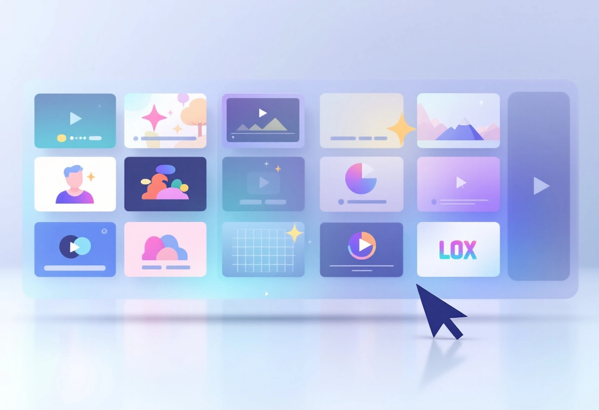
Bonus: 9 Powerful Tips That Will Make Your YouTube Thumbnail Stand Out
The Psychology Behind Click-Worthy Vlog Thumbnails
A thumbnail isn’t just an image—it’s a psychological trigger. What makes someone stop mid-scroll and click? Often, it comes down to emotion, familiarity, and visual intrigue.
📌 Emotions Drive Action
Humans are wired to respond to emotional cues. Thumbnails that show clear facial expressions—shock, excitement, confusion, joy—tend to outperform those that don’t. Why? Because we instinctively mirror and respond to those emotions. A study published in the Journal of Consumer Psychology found that emotionally charged visuals can increase viewer engagement by up to 40%.
🎨 Color Psychology Matters
Colors influence how we feel. Bright hues like red and yellow create urgency and excitement, while blues and greens evoke trust and calm. The right color palette can guide viewer perception before they even process what the content is about.
👁️ The Allure of Human Faces: Expressions and Eye Contact
Ever wonder why you’re drawn to certain images or videos? Often, it’s the presence of a human face. We’re naturally wired to respond to faces, especially when they display emotions or make eye contact. A smiling face can instantly create a connection, while a look of concern might pique our curiosity. Think about it: a video thumbnail with someone looking directly at the viewer often performs better than one without. It’s all about that immediate, human connection.
When a face in a thumbnail makes eye contact with the viewer, it grabs attention faster. It creates an invisible connection, pulling the viewer in—even if they don’t realize it.
Understanding what emotion your video communicates, and matching that with visual elements, is key to earning a click. It’s not just about looking good—it’s about feeling right to the viewer.
Bonus: How AI Thumbnail Makers increase YouTube Views: A Complete Guide
Design Principles for Effective Vlog Thumbnails
High-Resolution Images: The Foundation of Quality
Think of your thumbnail as a tiny billboard. Would you use a blurry photo on a billboard? Of course not! The same principle applies here. Start with the highest resolution image you can get. A crisp, clear image instantly communicates professionalism and grabs attention. A blurry or pixelated image, on the other hand, screams amateur and can turn viewers away before they even know what your content is about. Make sure your initial image is sharp so that when it’s scaled down to thumbnail size, it still looks great.
Clear Focal Points: Guiding the Viewer’s Eye
Every great thumbnail has a clear focal point – something that immediately draws the eye. This could be a person’s face, a key object, or a striking visual element. Avoid cluttering your thumbnail with too many competing elements. Instead, strategically use composition techniques like the rule of thirds to place your focal point in an engaging spot. You want viewers to instantly understand what the video is about with just a quick glance.
Text Overlays: Concise and Readable Messaging
Text overlays can be a powerful tool for adding context and intrigue to your thumbnails. However, less is definitely more. Keep your text concise, using only a few words to convey the main message. Choose a font that is easy to read at small sizes, and make sure the text contrasts well with the background image. A cluttered or illegible text overlay will only confuse viewers and make them scroll past your video.
Maintaining Brand Consistency: Colors, Fonts, and Style
If you’re building a brand, consistency is key, and that includes your thumbnails! Use a consistent color palette, font, and overall style across all your thumbnails to create a recognizable visual identity. This helps viewers instantly associate your thumbnails with your brand, making them more likely to click. Think of it as creating a visual shorthand for your content. Over time, people will recognize your style and know what to expect from your videos.
Bonus: 10 Best AI Thumbnail Makers for YouTube and Social Media
Strategic Implementation of Vlog Thumbnail Strategies

A/B Testing: Experimenting with Different Thumbnail Designs
Ever wondered which thumbnail grabs more attention? That’s where A/B testing comes in! It’s all about running experiments with different thumbnail designs to see which one performs best. You create two (or more) versions of a thumbnail, show them to different segments of your audience, and then measure which one gets more clicks.
Think of it like this: you have Thumbnail A (a close-up of your face) and Thumbnail B (an action shot from your video). You split your audience in half – one half sees Thumbnail A, the other sees Thumbnail B. After a set period, you check the data to see which thumbnail had a higher click-through rate (CTR). The surprised-face version increased their CTR by 23%.
Performance Metrics: Tracking CTR and Viewer Engagement
So, how do you know which thumbnail is winning? By tracking the right performance metrics! Click-through rate (CTR) is the big one – it tells you the percentage of people who saw the thumbnail and clicked on it. A higher CTR means your thumbnail is doing a better job of grabbing attention.
But CTR isn’t the only thing to watch. Viewer engagement is also crucial. Are people watching more of the video with Thumbnail A or Thumbnail B? Are they liking, commenting, and sharing more? These metrics give you a more complete picture of how your thumbnails are affecting your video’s overall performance.
Iterative Refinement: Adapting Your Strategy Based on Data
A/B testing isn’t a one-and-done deal. It’s an ongoing process of testing, learning, and refining your strategy. Once you’ve gathered enough data from your initial tests, analyze the results and identify what worked and what didn’t.
For example, let’s say Thumbnail B (the action shot) had a higher CTR. That tells you that your audience is more drawn to action-oriented thumbnails. So, for your next video, you might try a different action shot, or experiment with adding text or graphics to make it even more appealing.
The key is to keep testing and iterating. Each test provides valuable insights that can help you optimize your thumbnails and improve your video’s performance over time. Don’t be afraid to try new things and challenge your assumptions. Data-driven optimization is all about letting the numbers guide you towards creating thumbnails that resonate with your audience and drive more views.
Bonus: How To Make a Thumbnail That Stands Out
Avoiding Common Pitfalls: Mistakes That Can Hurt Your CTR
Creating compelling vlog thumbnails is an art, but it’s also easy to stumble into common traps that can sabotage your click-through rate (CTR). Let’s explore some mistakes to avoid so you can keep your thumbnails working for you.
Misleading Clickbait: The Downside of Deceptive Thumbnails
We’ve all been there: clicking on a video with a thumbnail promising something amazing, only to find the content doesn’t deliver. This is clickbait, and while it might get you a quick spike in views, it’s terrible for long-term success. Viewers feel tricked, leading to:
- Decreased watch time: People click away quickly when they realize the content isn’t what they expected.
- Negative feedback: Dislikes and negative comments can hurt your video’s ranking.
- Loss of trust: Viewers are less likely to click on your future videos if they’ve been burned before.
Instead of clickbait, focus on accurately representing your video’s content in your thumbnail. A genuine representation builds trust and encourages viewers to stick around.
Bonus: How to Change a TikTok Thumbnail: A Step-by-Step Guide for A Stunning Feed
Cluttered Designs: Keeping It Simple and Focused
A thumbnail is a small space, so it’s crucial to use it wisely. Avoid cramming too many elements into your design. A cluttered thumbnail can be visually overwhelming and make it difficult for viewers to understand what your video is about. Here’s what to keep in mind:
- Limit text: Use only a few words to convey the core message.
- Reduce elements: Avoid too many images, logos, or graphics.
- Ensure readability: Make sure your text is large enough and easy to read on all devices.
A clean, focused thumbnail is more likely to catch the eye and entice viewers to click.
Ignoring Your Target Audience: Tailoring Thumbnails to Viewer Preferences
What appeals to one audience might not appeal to another. Understanding your target audience is key to creating thumbnails that resonate with them. Consider factors like:
- Age: Younger audiences might respond to bright colors and playful designs, while older audiences might prefer a more sophisticated look.
- Interests: Align your thumbnail’s imagery and messaging with the specific interests of your target audience.
- Platform: What works on YouTube might not work on other video platforms.
By understanding your audience’s preferences, you can create thumbnails that are more likely to grab their attention and drive clicks.
Key Takeaways: Creating Vlog Thumbnails That Attracts
A thumbnail isn’t just a visual—it’s a promise. In a world where attention spans last seconds, your thumbnail is your first and best chance to stop the scroll. Whether you’re a beginner or a seasoned creator, understanding why Vlog thumbnails work, not just how to make them, is key to standing out.
Let’s recap the essentials:
- Thumbnails strongly influence click-through rates—they’re your video’s first impression.
- Emotional cues, color psychology, and facial expressions play a big role in attracting attention.
- Effective thumbnails are simple, bold, and optimized for mobile viewers.
- Consistency, A/B testing, and honest representation build long-term trust and better performance.
- AI tools can speed up the process, but your insight into your audience makes the difference.
🎯 Want better performance on YouTube? Start by asking: Would I click this? Then test, learn, and refine.
Your thumbnail isn’t an afterthought—it’s the gateway to your content. Make it count.


")
")


")


