
Making a custom color palette can take your project from good to amazing. If you mix the right skills and knowledge, you can make a beautiful color palette that will make others jealous. Remember, your design should look like one piece. A great color palette stays consistent throughout your site, including your logo, headers, and text. Stick around to learn more!
How Do I Make a Custom Color Palette?
Creating a cohesive color palette might seem daunting at first, but with these tips and tools, you’ll be crafting expert-level schemes in no time. It’s not just about picking colors that look nice; it’s about choosing colors that work together to convey the right message and evoke the desired emotions.
1. Use Color Psychology
Colors have meaning. They can influence how people feel about your brand or design. For instance, blue often represents trust and calmness, while red can signify excitement or urgency. Consider what you want your audience to feel, then select colors that align with those emotions.
2. Balance with Neutrals
While vibrant colors can attract attention, neutrals are essential to balance your palette. They provide breathing room and allow your primary and secondary colors to stand out. Add white, black, or shades of gray to your palette for a well-rounded design.
3. Test Your Palette
Source: Freepik
Before finalizing your color palette, test it in various scenarios. See how it looks on digital screens, printed materials, and alongside other elements like text and images. This will ensure your colors work well in all contexts.
4. Look for Inspiration
Are you staring at a blank screen, wondering how to get started? The best way to cohesively create a color palette is by getting inspired. But first, check out other sites that use similar colors and styles and see what works for them.
5. Choose a Starting Point
You can also start by choosing a color. Maybe you have a particular hue in mind that you want to build around—or maybe you know that you want your site to be blue. If so, try choosing three or four shades of blue and experimenting with how they look together.
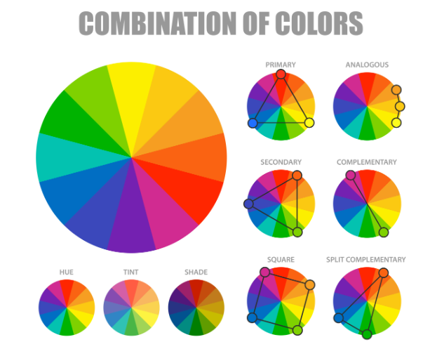
6. Create a Color Scheme

If you want to create a color palette with a square color scheme that works well together, there are several ways to do so.
For instance, you can pick one color and choose two or three others based on its tone, value, and saturation, or you can choose a base hue and then use complementary colors for accents.
Bonus: Square Color Scheme & Everything You Need To Know About It
How Do You Structure a Color Palette?
Don’t overthink it ! Color theory exists, but that doesn’t mean you should overthink and hesitate about them. There are bad color combinations, so keep experimenting on them.
4. Pick a Primary Color

The first step to creating a color palette is selecting a primary color. Choosing a primary color will be the foundation of your design and will help you choose complementary colors that work well together.
5. Add Secondary Colors
After you’ve picked your primary color, you can add secondary colors. These are hues that are directly across from the wheel and work well together with the primary color.
For example, if you pick blue as your primary color, red-orange and yellow-green will be your secondary colors.
6. Incorporate Tertiary Colors
Tertiary colors are the ones that sit between primary and secondary colors. They’re often more muted and subtle, which makes them great for adding depth to your designs.
It’s important to remember that tertiary colors don’t always have to be right next to each other on the color wheel – they can also be across from each other!
Bonus: The Ultimate Guide To Analogous Colors & How To Use Them
7. Keep It Simple
The best way to use the color wheel is to keep it simple. Pick a primary and secondary color and then experiment with different shades of each, rather than trying to incorporate all 12 hues into your design. It will help you avoid mixing too many colors and creating something that’s visually noisy.
What is a Color Palette Generator?
A color palette generator is a tool that helps you create a custom color scheme from scratch. In most cases, it will allow you to choose your primary and secondary colors and generate additional colors based on those hues.
Color palettes are a great way to create a cohesive design. They help you choose your colors without having to do all the work yourself, which can be especially useful if you’re working on something big like an entire website or app.
There are lots of different tools out there that will generate color schemes for you – all you have to do is enter in some basic information about what kind of feel you want your site to have and let it do the rest!
Bonus: The Ultimate Guide To Monochromatic Colors & How To Use Them
Use a Color Palette Generator
If you already have a color scheme in mind, it can be helpful to use a tool to help you generate different variations on that theme. For example, you may want to start by achieving a cohesive look by using a color palette generator by image.
You Can choose to Create Any Color Palette
Pick your brand’s most effective color scheme, or design a random scheme to spark your imagination. You can also use a generator to help you find the perfect color palette for your design.
Generators are helpful because they allow you to experiment with different color combinations quickly and easily.
You Can Use Color Palettes for Anything
From designing a website, creating an Instagram photo edit, or even picking out some new clothes, the colors you choose can significantly impact your project’s overall design. So if you are looking for inspiration, check out our color palette generator!
Create Eye-Catching Color Palettes
If you want to create a color palette, using a generator can help you pick some great, unique color combinations for your project. You can choose from various palettes and customize them to get what you need.
Create your own color palette as it can be easy, fun, and rewarding. And the best part is that it’s completely free and no gradients are required.
Practice on your own, and you’ll be ready to create beautiful palettes on-the-fly in an instant—and impress your family, friends, and co-workers in the process! Use our handy color palette generator from photo today to customize your color palette.
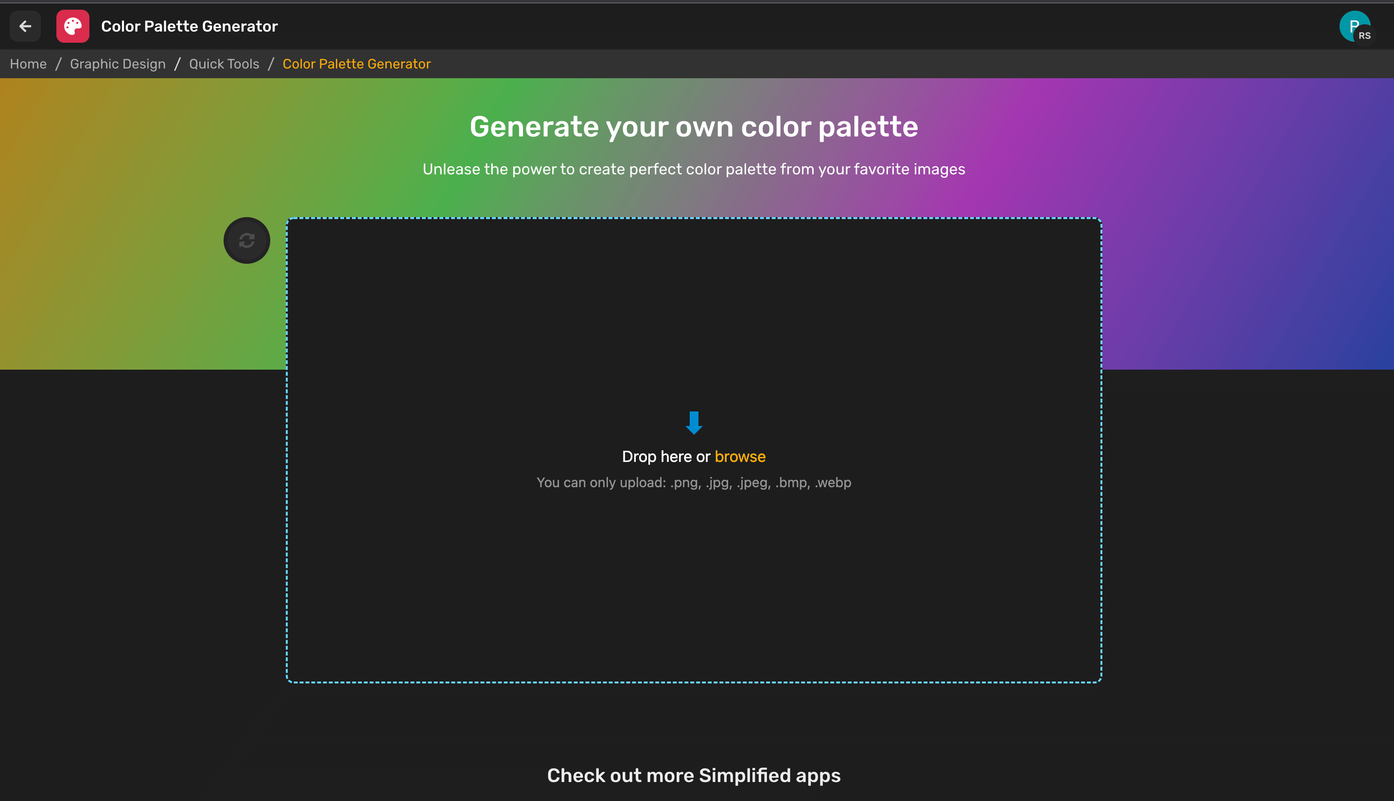
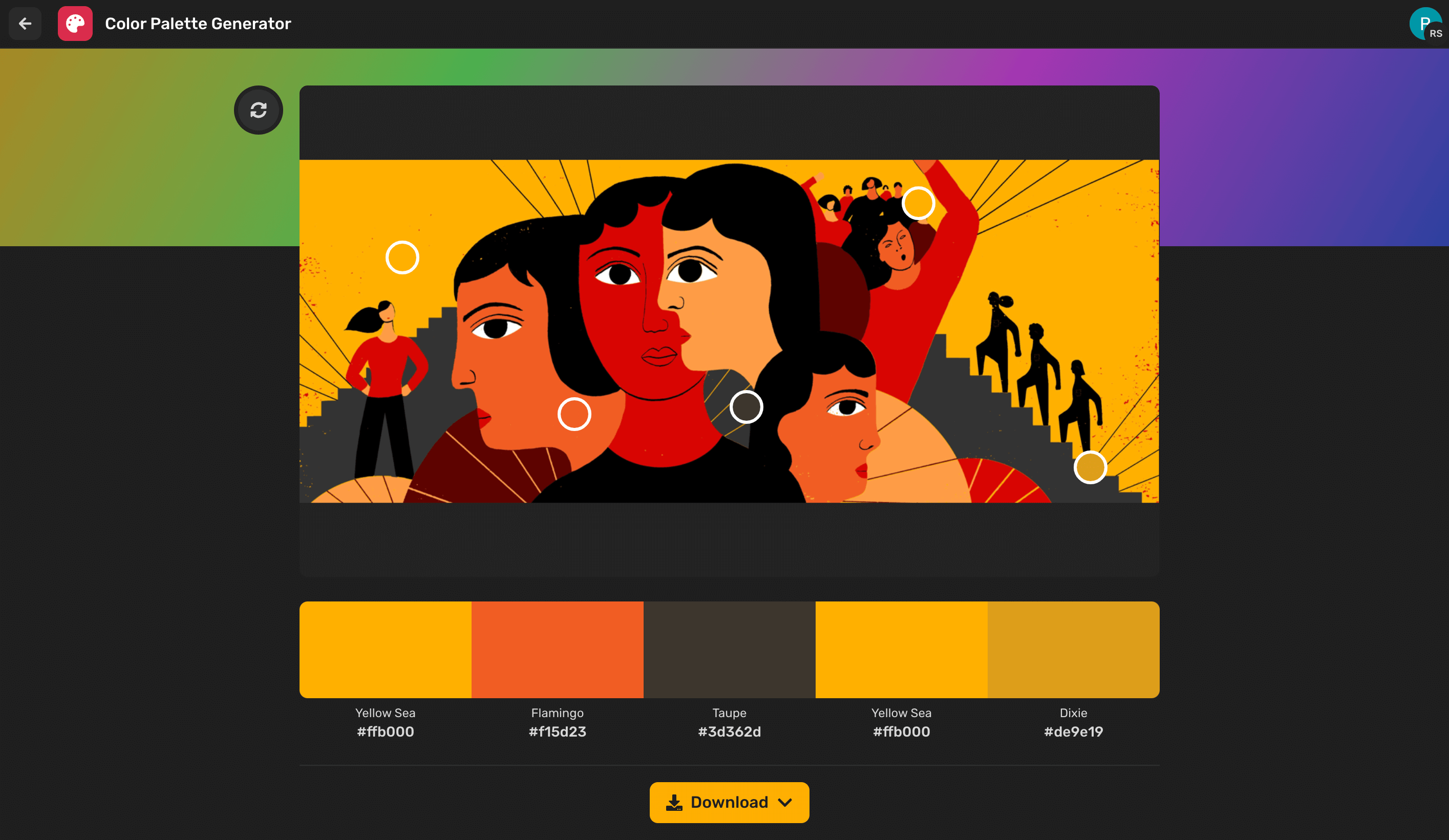
Using Simplified’s Color Palette Generator
Simplified color palette generator makes it easy to create the perfect palette for your design needs. Here’s how you can use it:
- Upload an Image:
Source: Simplified
- If you have an image that captures the mood or theme you’re going for, upload it to the generator. The tool will analyze the image and suggest a color palette based on the dominant colors.
- Adjust as Needed:
Source: Simplified
- You can fine-tune the suggested palette by adjusting the colors manually. This allows you to get the exact shades you’re looking for.
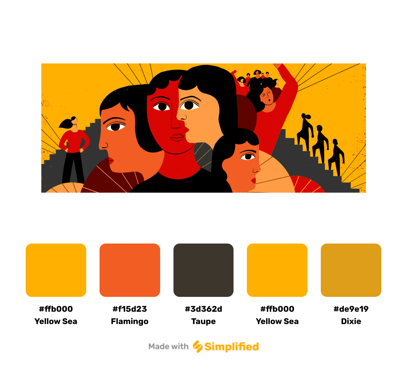
- Save Your Palette:
Source: Simplified
- Once you’re happy with your selection, save your custom palette. Simplified lets you keep your palettes for future projects, ensuring consistency across your designs.
- Apply to Designs:
- Use your new color palette in your projects within Simplified. Whether you’re designing a website, social media graphics, or branding materials, your custom palette will be at your fingertips.
Remember, the key is to start simple, test your choices, and don’t be afraid to play around until you find the perfect combination. Ready to give it a try? Head over to Simplified color palette generator and unleash your inner designer!


![10 Best AI Sticker Generator Tools for Seamless Graphic Design [Free & Paid]](https://siteimages.simplified.com/blog/Must-Try-AI-Sticker-Generator-Tools-02.png?auto=compress&fit=crop&fm=png&h=400&w=400 "10 Best AI Sticker Generator Tools for Seamless Graphic Design [Free & Paid]")


