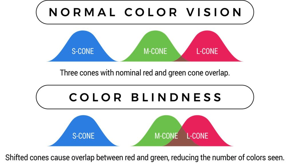
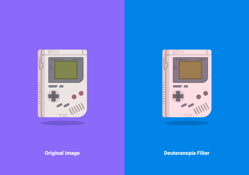
A common misconception is that the colorblind population can only see the world in black and white. This is not true – the majority of the people who are color blind are able to see just as clearly as the rest of the population, however, they are unable to distinguish between red, green, or blue light. The most common mutation is red/green color blindness, in which people mix all colors that have red or green as part of the whole color.
This design guide will help you tweak elements of your graphic designs to become more colorblind-friendly!

Related: 7 Easy Ways to Create Accessible Graphic Design
How common is color blindness?
Color blindness, also known as Color Vision Deficiency or CVD, is more common than the general population realizes:
- 1 in 12 men in the world are color blind, which accounts for 8% of the male population.
- 1 in 200 women in the world is affected by color blindness in varying degrees.
- If you are wondering whether the colorblind minority of the world should factor into your design process, it is important to remember that 60% of those who are colorblind are severely impacted by their visual limitations, making it difficult for them to navigate and understand the world around them through design that rests solely on the foundations of colors.

6 ways to Design for color blindness
Aiming for color accessibility in your graphic design doesn’t mean that you will have to compromise the integrity of your content.
1. Use Color and Symbols
This is especially relevant if your design has any signage that requires identification by color, i.e., red indicating error. In this scenario, it is best to use color as well as accompanying text because while colorblind people may not be able to see the red for error, they will be able to read the text.
Fun Fact: Facebook’s Mark Zuckerberg is famously red/green colorblind, and that is why the platform is chiefly blue because he sees it best.

2. Make Shapes Stand Out with Outlines
Adding solid lines to your shapes with thick, dark colors like black or navy blue will separate them from the other elements in the design. This makes it easier for the colorblind population to distinguish between different components.

Related: 7 Ways AI Art Generators Will Help Graphic Designers, Not Replace Them
3. Aim for High Contrast
Similar to adding outlines to your shapes, designs with higher contrast are easier to distinguish – try adjusting the brightness and saturation levels of the components of your design until they start to stand out instead of merging with the background.

Related: Exploring 2023 Color Trends in Graphic Design & Social Media
4. What Colors To Use
You can certainly opt for the greyscale color scheme. The focus then is solely on the artwork without the distraction of multiple colors. However, there is also the option of using a monochromatic color scheme that does not only consist of grays, whites, and blacks.
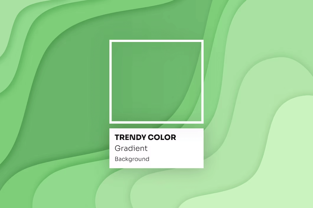
Using a monochromatic color scheme means picking one color and consistently using its various shades, tints, and tones. If you choose green, then you could also add light green, olive green, parrot green, etc. to your design.

Related: New Color Pallete Combos to Make Your Designs Standout in 2023
5. Add Texture
Use the options of adding grain, horizontal lines, or any other kind of texture to your design. Textures highlight a specific section of an image in your artwork and create a solid color boundary.

Related: The Importance of Photography In Graphic Design
6. Use more icons & text
Who says designs have to rely solely on color? Icons can play a crucial role in assisting visuals and conveying information effectively. Incorporating bold text can help emphasize key points and grab attention, ensuring that everyone, including those with colorblindness, can easily understand the main focus of the graphic.

Related: 10 Font Trends in 2023 to Jazz Up Your Creatives
Platforms To Test Color Accessibility
We have compiled a list of websites that will help you create more effective designs for colorblind people:
- Coblis: Generates images for all kinds of color blindness.
- Stark: To check the color contrast ratio of your text.
- WhoCanUse: To understand how color contrast may affect people with different visual abilities.
Design for Colorblindness With Simplified
We hope these small tips will help you create more inclusive designs for the colorblind population.
One tool you can use to put these tips to the test is Simplified. Its free graphic design tool helps you design stunning graphics in no time – and with complete ease. The best part’s that you don’t need ANY prior design experience to get started!
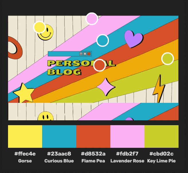
With Simplified’s color palette generator, you can also extract the exact color palette used in any design! Take a look below –

Check out some of our amazing graphic design templates here:


