Colors & branding go hand in hand. Have you ever noticed how you can recognize a brand instantly just by its color or silhouette? Perhaps you experience sensitivity towards certain colors and how they affect your mood. That’s because our brain uses colors & shapes to remember & distinguish. You don’t have to take our word for it, but you can try the infamous Button Test by Mark Hemeon. Additionally, the button test claims that users can recognize brands by their button design. Cool, right? How about you give it a try yourself? We have 20 figures below. Let’s find out how many of them can you guess correctly!
The Button Test By Mark Hemeon
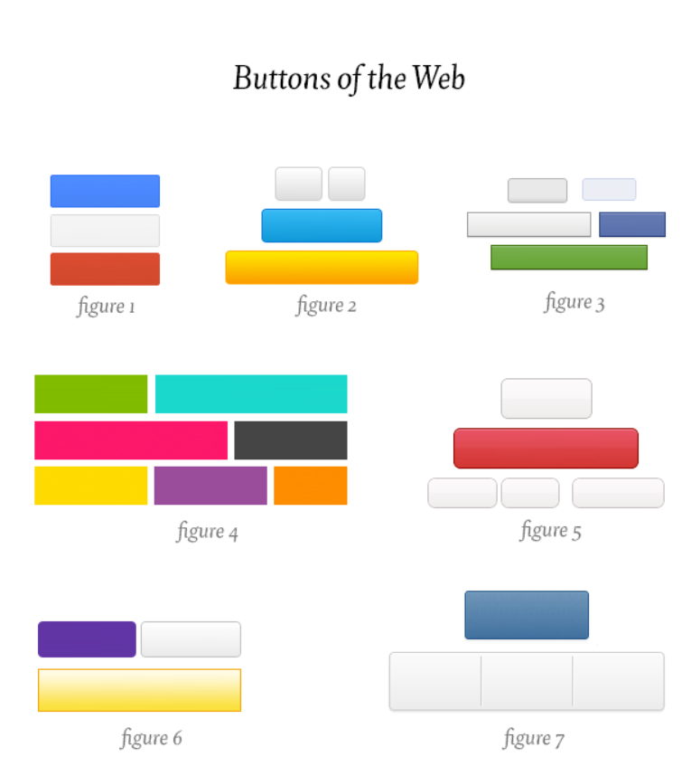
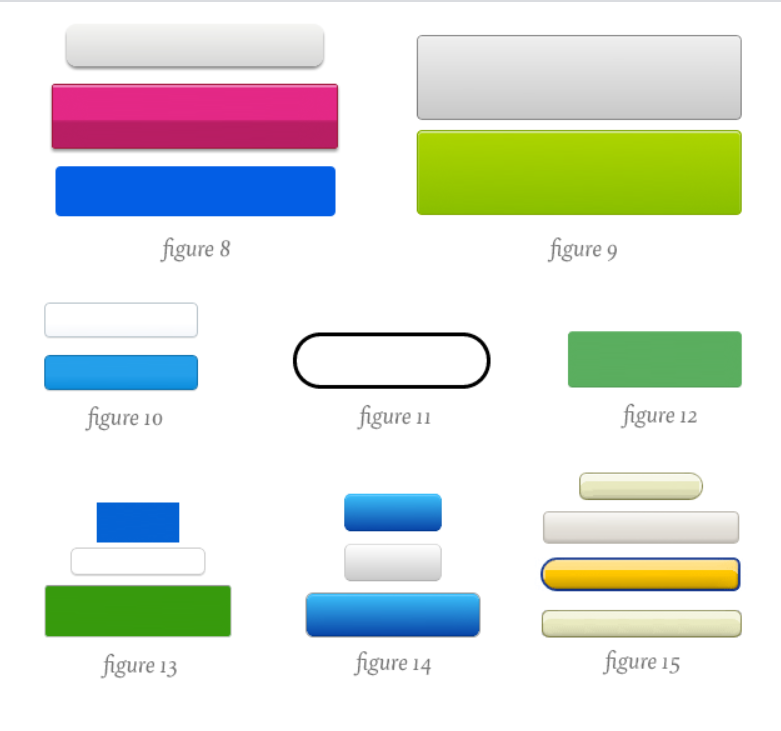
So how many could you guess? Check out the answers at the end of this blog! Now that you know the importance of design & color let’s find out the color psychology behind some of the most common branding & marketing colors.
How colors affect mood & their psychological impact on us?
1. The Color Psychology of Blue
Blue is known for its calming & soothing effect on the mind. The color also exudes a feeling of trust, dependability, maturity, reliability & intelligence. Further, it curbs appetite, stimulates productivity & offers a sense of security. Unlike the color red, blue lends a mental stimulation rather than a physical one, allowing the viewers to relax & destress. Overall, blue is the most liked color worldwide and is used by brands looking to promote trust & security. However, it’s also the last color to be noticed, and overuse could lead to feelings of indifference & detachment.

Find blue in
- Uniforms involving customer service industries: hotels & air hostesses
- Gyms & spas
- Hospitals
Popular brands that use blue!
- HP
- Pfizer
- American Express
- Ford
2. The Color Psychology of Orange
Based on its origin, orange comprises yellow & red. So, from a color psychology standpoint, it combines the power & energy from red along with the friendliness & fun from yellow. This exciting mix makes orange an inviting, warm, friendly, cheerful & confident color. Moreover, orange exhibits warmth, positivity & freedom. The color is also known to stimulate the appetite. No Wonder, when opting for custom fries boxes, many food businesses choose orange.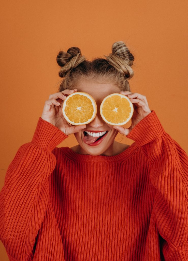
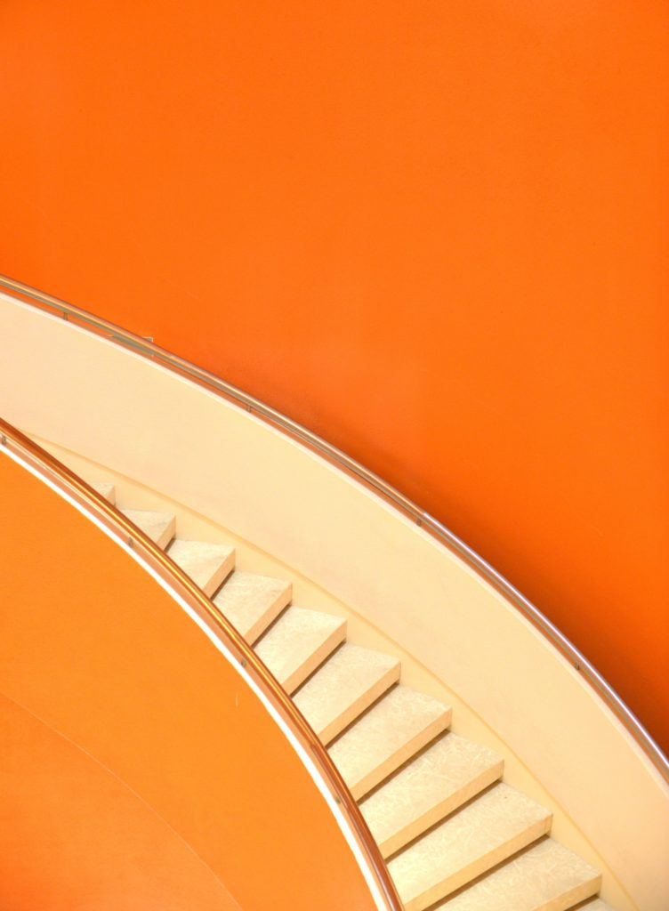
Find orange in
- Sporting events
- Board games
- Energetic brands
Popular brands that use orange!
- Nickelodeon
- Fanta
- Amazon
- Harley Davidson
- Gulf
Related: Color Psychology: How Colors Affect Mood & Behaviors In Marketing? (Part 1)
4. The Color Psychology of black
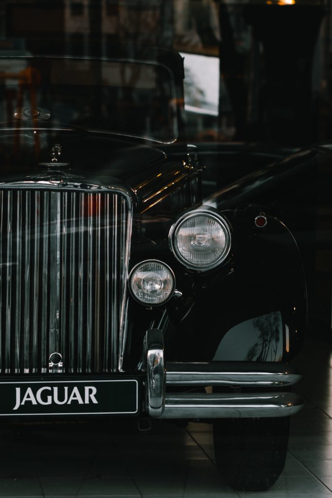
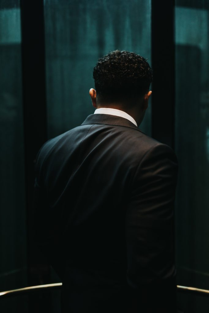
Undeniably the color of sophistication, independence, success & control. Although black is used to show darkness, mystery & evil, the presence also denotes high quality & sharpness. Examples in pop culture such as the little black dress & the powerful black suit prove how black symbolizes confidence & power. Additionally, black is devoid of color, which makes it a great choice for high contrast & legibility. However, overuse of this color could cause seclusion, negativity & sadness.
Find black in
- Business wear
- Luxury brands
- Limos & luxury cars
Popular brands that use black!
- Nike
- Cartier
- Luis Vuitton
- Apple
5. The Color Psychology of white
White is known for peace, purity, balance & innocence. Therefore, in marketing & branding, white is used in composing simple, striking & minimalistic designs. Furthermore, white represents new beginnings(the phrase blank slate), simplicity & cleanliness. However, an overuse could create isolation & emptiness; use sparingly and in high contrast for impactful branding & designs. White, when used with black, leads to formal, simple, functional & mature expressions!
Find white in
- Background color for many logos, website, app interfaces & design
- Weddings
- Product shoots
- Wall paint
- Hospitals & clinics
Popular brands that use white!
- WWF (World Wide Fund)
- BBC
- Gucci
- MAC
Eskimos use 17 words for white as applied to different snow conditions, wherein the Northwest United States there are only 4 or 5.” – Joe Hallock
Answers to the button quiz by Mark Hemreon
- Microsoft
- Yahoo
- Flickr
- Spotify
- Rdio
- Svbitle
- Medium
- Basecamp
- Square
- Amazon
That’s all for today, but we have more coming up! In our next blog, we will discuss designing the perfect UI that accommodates the needs of the visually impaired.
Love designing?


