
Seen by many as a ‘feminine’ color, pink is one of the most popular colors brands use when designing graphics and marketing materials aimed primarily at women. This is because shades of pink are commonly associated with emotions like love, kindness, tenderness, and affection.
Understanding pink color theory is crucial for creating impactful visuals and targeted messaging.
Do you need help deciding whether pink is a good fit? Read on as we break down the pink color theory and how you can use it effectively in your designs.

Source: Unsplash
A Brief History of Pink
Pink’s journey through the ages is as varied as its shades. Initially, pink was a color for both genders, but it evolved. Now, it is a symbol of femininity and romance.
In the 18th century, boys’ and girls’ clothing used pink. The association of pink with femininity is a more recent development, solidifying only in the 20th century.
Bonus: The Fundamentals of Understanding Color Theory
The color psychology of pink
Whichever tone you choose, the color pink is ultimately a combination of red and white. It takes the fiery and passionate tones of red with the pure and soothing qualities of white. The deeper shades of pink express passion, while lighter shades are more caring and gentle. You can use different shades of pink in your design to express or evoke a range of emotions, depending on your target audience and intended messaging.

Source: Unsplashx
Common uses of Pink in Color Theory for Designers
- Love: Pink is seen as warm, loving, and romantic
- Compassion: Empathy and caring qualities are associated with the color pink
- Hope: Shades of pink have a soothing and positive impression on the viewer
- Calm: Pink is seen as a gentle and kind color that has a calming effect
Positive and Negative traits associated with pink
Some of the positive traits associated with pink are passion, love, romance, caring, warmth, nurturing, understanding, safety, calming, and hope.
The negative traits associated with pink are timidity, neediness, naivety, disarming or non-threatening, lacking strength, childishness, and in the case of bright hues, loudness.
Bonus: A Beginner’s Guide to Additive and Subtractive Colors
Pink as a ‘feminine color’
Many brands whose products cater predominantly to women use Pink. It is because pink is traditionally seen as a feminine color, and blue is seen as a more masculine tone. These color associations come due to cultural and societal norms and are most evident in clothing and toys for children. Hence, designers often use this color theory concept in their product designs and marketing materials. However, pink is no longer seen as just a ‘feminine’ color, and you can use it in a variety of ways.
Bonus: Hues, Tints, Tones, and Shades: What’s the Difference?
Complementary Colors for Pink
Pink pairs beautifully with a variety of colors, depending on the desired effect. Here are some successful combinations:
- Pink and Green: This natural pairing creates a sense of balance and harmony, perfect for evoking feelings of growth and renewal.
- Pink and Grey: This sophisticated combination adds a touch of elegance to pink, making it suitable for more formal settings.
- Pink and Navy: Navy blue grounds the vibrancy of pink, creating a bold and eye-catching contrast.
- Pink and Gold/Silver: A touch of metallic adds luxury and glamour to pink.
Bonus: What Is Color Harmony & Why You Need To Know About It
Pink Color Palettes for Inspiration
To get your creative juices flowing, here are a few stunning pink color palettes:
1. Pink Parades Color Palette
This palette combines soft pink with purple, light blue and green for a delicate look.

2. Watermelon Flesh Color Palette
This gradient palette blends red with soft pink and a touch of baby pink, perfect for adding a touch of fun.
3. Sunsets Lovers Color Palette
It has a mix of orange, cream, peach and pink evoking a warm and vibrant sunset feel.

Bonus: All You Need To Know About Complementary Colors On The Color Wheel
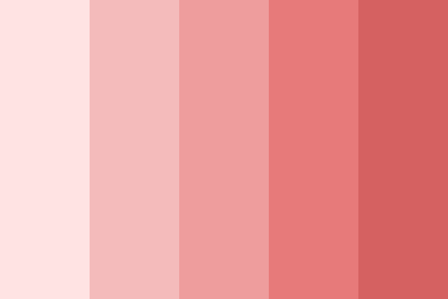
Popular shades of Pink
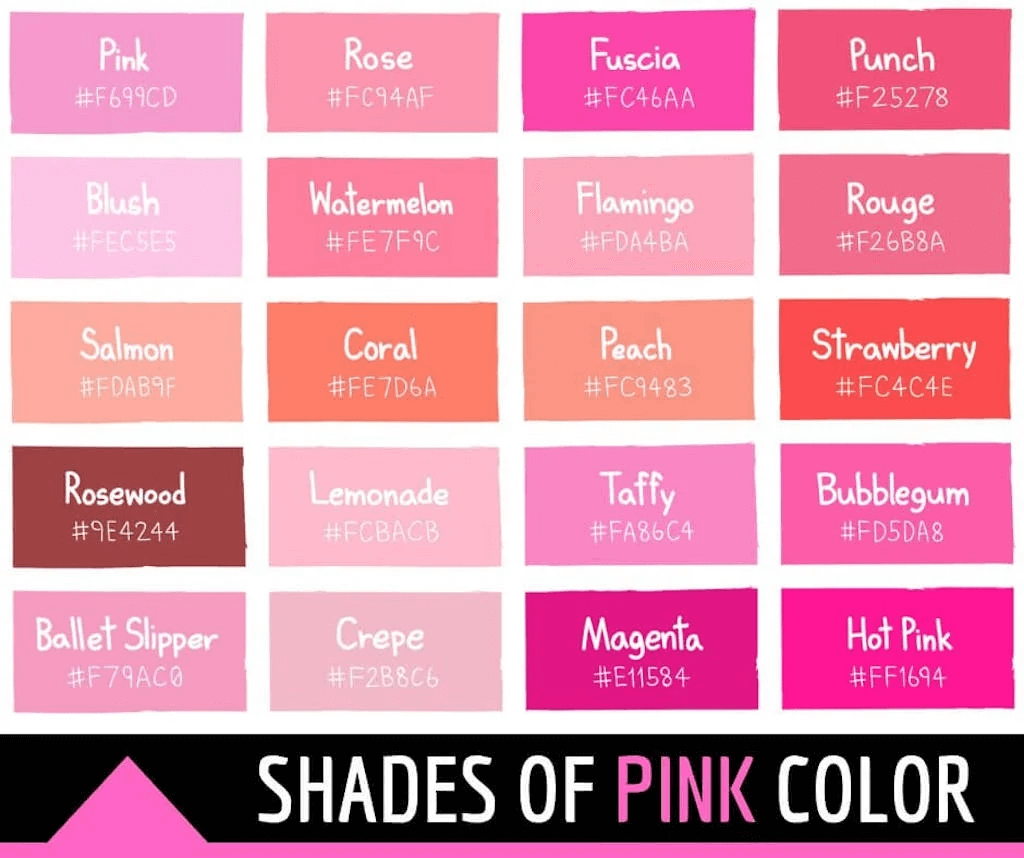
Source: Color Meanings
Shades of pink:
Pastel pink

Associated with purity and calmness, pastel pink is one of the lightest shades of pink. It also has links with the festival of Easter and is very pale and cool.
- Color codes:
- Hex #FFD1DC
- RGB 255, 209, 220
- CMYK 0, 18, 14, 0
Light pink

Light pink is similar to pastel pink, but it has a stronger red tone to it. It is brighter and more colorful than pastel tones. Moreover, you can see it frequently in products aimed at girls.
- Color codes:
- Hex #FFB6C1
- RGB 255, 182, 193
- CMYK 0, 29, 24, 0
Baby pink

Baby pink falls between light pink and pastel pink and is another popular light shade of pink. It is less saturated than light pink and has a cleaner, more toned-down look.
- Color codes:
- Hex #F4C2C2
- RGB 244, 194, 194
- CMYK 0, 20, 20, 4
Dark pink

Dark pink is a richer, warm pink that nicely complements lighter shades of pink. This makes it both aesthetically pleasing and handy for designers working with color theory.
- Color codes:
- Hex #E75480
- RGB 231, 84, 128
- CMYK 0, 64, 45, 9
Rouge

Rouge is one of the deeper and more muted shades of pink. It has a dusky purplish-pink hue and comes close to being a shade of red or purple under different lighting.
- Color codes:
- Hex #A94064
- RGB 169, 64, 100
- CMYK 0, 62, 41, 34
Neon pink

Neon pink is a bright pink that is louder and more eye-catching than other shades of pink. Often used to grab people’s attention, it is a bold and passionate color.
- Color codes:
- Hex #FF6EC7
- RGB 255, 110, 199
- CMYK 0, 57, 22, 0
Hot pink

Hot pink is warmer than neon pink, but not as bright. Its red and purple tones make it calmer and more pleasing to the eye. And, when it comes to color theory, it’s also more versatile for use in marketing and branding.
- Color codes:
- Hex #FF69B4
- RGB 255, 105, 180
- CMYK 0, 59, 29, 0
Pink Color Psychology in Business
Understanding pink color theory is essential for businesses. Studies suggest that pink has a calming effect, reduces stress, and even encourages consumers to spend more. This makes pink a strategic choice for businesses in the healthcare, hospitality, and retail industries. For instance, a spa might use calming rose tones to create a relaxing atmosphere, while a bakery might use a bright pink to entice customers with sweet treats.
Bonus: Bad Color Combinations to Avoid When Creating Your Brand Kit
Brands that use pink

Source: Pinterest
Due to pink’s versatile and pleasing nature, many large brands use it in their logos and designs. Some brands use pink primarily because it’s a ‘feminine’ color. However, many other brands that aren’t necessarily targeted at women use it due to its other characteristics.
Barbie
Barbie is one of the most prominent users of pink in its brand image. Their color theory heavily uses pink in designs, products, marketing, and even their logo. Barbie products have traditionally been targeted at girls. This is one of the reasons why they heavily incorporate pink. And, as a ‘pretty’ or ‘feminine’ color, it continues to be used by Barbie with much success.
Adobe InDesign
Adobe InDesign is a part of the Adobe Creative Suite software and is a popular tool for design and marketing. Used for typesetting and creating designs, it is the industry standard among professionals in the space. InDesign uses bold pink color in its logo and interfaces as part of a clean and minimal design. It effectively uses the different shades of pink that complement each other. This gives the design an elegant and professional feel, along with a sense of creativity and passion.
Baskin Robbins
Another huge brand that makes use of pink in its logo and designs is Baskin Robbins. The ice cream maker makes use of shades of pink and blue which complement each other. Furthermore, this clever use of color theory makes the logo instantly recognizable and creates a sense of fun, excitement, and joy to reflect the brand’s values. The ‘BR’ in the logo also features two colors to highlight the number ’31’. This is in reference to the number of ice cream flavors originally offered by the brand.
The versatile and eye-catching nature of pink makes it a hugely popular color for brands and marketing designers. With so many shades of pink to choose from, many of which complement each other, there’s plenty of color theory for designers to play with when producing graphics.
Bonus: Exploring Color Trends in Graphic Design & Social Media
Simplified: Your Design Partner

Source: Simplified
Introducing Simplified, an AI color palette generator. This innovative tool helps you to effortlessly generate stunning color palettes. Upload an image, and the tool will extract its color scheme, or use the built-in palette generator to discover new combinations. The pink color theory comes to life as you explore possibilities to find the perfect match for your project. With Simplified you can,
- Effortlessly Generate Color Palettes: Input an image or describe your desired mood, and the tool will generate harmonious color schemes to inspire you.
- Unmatched Precision: Simplified AI ensures your chosen colors complement each other perfectly, creating aesthetically pleasing visuals.
Source: Simplified
That’s not all. Simplified also has an extensive template library that helps you create designs faster. It has stunning pink palettes. With a simple click, customize these templates to fit your specific needs. And the best part is, all this for Free.

Frequently Asked Questions
1. Can pink be used for masculine designs?
Absolutely! While pink is often associated with femininity, deeper and cooler pinks can create a sense of strength and sophistication that appeals to a broader audience.
2. Is pink a good colour for branding?
Pink can be a powerful branding tool, depending on your target audience and brand message. Consider the emotions you want to evoke when choosing a pink for your brand.
3. Does pink have a negative meaning?
In some contexts, pink can be associated with weakness. However, the overall meaning depends on the shade and cultural context.
4. What shades of pink are most popular?
Blush pink, rose gold, and millennial pink are currently trending shades.
Bonus: The Ultimate Guide To Analogous Colors & How To Use Them
Bottomline
The versatile and eye-catching pink’s nature makes it a hugely popular color for brands and marketing designers. With so many shades of pink to choose from, many of which complement each other, there’s plenty of color theory for designers to play with when producing graphics.
Elevate your designs and connect with your audience on a deeper level by understanding pink color theory.


")