What’s the first secret ingredient of marketing a restaurant? The restaurant logo. Why, you ask?
Well, it’s the very first thing the customer sees, even before they enter the place. So if you want them to come to your door, your logo needs to stand out from the crowd.
Don’t know how to get started on designing your restaurant logo? Fret not. Here’s a list of the coolest, most popular 15 restaurant logos that you can draw inspo from whilst designing one for yours in 2024.
Let’s dig in, shall we?
19 Famous Restaurant Logos to Draw Inspo from
From newspaper ads and social media ads to your food delivery packets, your restaurant logo will be visible everywhere. It speaks volumes about your brand, the vibe, and the food you sell! There is art in creating a good logo design.
Here’s a list of 15 famous restaurant logos that we have curated for your inspiration:
1. Chick-Fil-A Logo
Cute, loud, and attention-grabbing. This logo is the perfect mixture of everything. Not only does it highlight their key selling dish, chicken (duh), but it also adds a fun, warm vibe to it with cursive than straight simple typography.
2. Costa Coffee Logo
Costa Coffee uses a nice burgundy color to invoke a feeling of friendliness and reminds you of the smell of coffee. The beans in the center highlight their main selling beverage, and the slightly curved ‘S’ shows the effect of steam from hot coffee.
3. Nando’s Logo
Nando’s again has a fun, cute logo. The red signifies they are a non-vegetarian chain, and the chicken highlights their main selling meat, chicken! The design overall is welcoming for all and doesn’t seem like an upscale, niche place.
4. Olive Garden Logo
The logo uses warm tones of olive green, which goes with the brand name. The design element is also an olive branch that is placed aesthetically over the name. Being an Italian chain, the name and the logo both go with the vibe of the place- classy, delicious, and upscale.
5. Burger King Logo
The logo shows the name of the restaurant written in bold red color between two orange-colored buns. The color of the buns is warm and subtle, giving them a feel-good vibe.
The logo shows precisely what the brand stands for, making it the king of not just burgers but also logos.
6. Pizza Hut Logo
Retaining their ever-iconic typography, the Pizza Hut Logo has wavy lines on the lowercase “z” and uppercase “H.” The brand has also kept its iconic red roof which is seen on its buildings. Thus, attracting consumers from afar.
This logo makes them stand out from all other pizza chains in the industry. You see the hat, and you know it’s Pizza Hut.
7. Domino’s Pizza Logo
The Domino’s logo shows a domino with the number ‘2+1=3’ on it, which resembles the number of pizza chains they had when they first began. At the same time, it also resembles the shape of two pizza boxes.
The color red represents hot sauce and tomatoes, making it appetizing and memorable from afar. While the color blue shows reliability and strength.
8. Dunkin Donuts Logo
Dunkin’s initial logo had both the words in it and gave a hint of both coffee and donuts. But now their logo only has the word ‘Dunkin’ with a raspberry sorbet pink apostrophe sign. The word donuts was removed as the brand now offers much more than just donuts.
The colors add a playful, fun vibe to the brand, inviting people from afar to come to have a sip of coffee with their fave donut while keeping the logo minimal.
9. Taco Bell Logo
A simple, clean, and fun logo, Taco Bell has a plain, black font along with a white and purple colored bell that resembles the bell part of the name. The logo is recognizable and inviting and makes people remember the brand just from the bell.
10. Wendy’s Logo

The iconic red-haired girl adorned in the Wendy’s logo makes it energetic and bright and invokes a feeling of friendliness. Inspired by the owner’s daughter, the logo has the girl on top of Wendy’s written in red, in friendly handwriting.
Bonus: Top 11 Simple Logo Inspiration To Inspire Your Brand
11. Outback Steakhouse Logo
The red color of the logo resembles the juicy, red steaks that they serve. The typography is bold and bright and can be identified from afar, making it a simple yet effective logo.
12. Habib’s Logo
Habib’s logo is one of the coolest, cutest logos out there. It gives a friendly vibe with the man winking at people. The red color is bright and bold and also highlights the non-veg nature of dishes served here, while the cap enhances the cuisine served.
13. Jersey Mike’s

Established in 1956, the restaurant believes in the value of fresh ingredients and always makes the best subs for its customers. The restaurant logo for Jersey Mike’s is simple, clean, and playful.
It has the primary colors blue and red, backed by a minimal white background to make them stand out further. The bold, cursive typeface in red is outlined in white for instant recognition. The color scheme reflects classic American colors found in the nation’s flag.
14. IHop
Did you also think of buttermilk pancakes? The magic of IHop (in part) is its restaurant logo! The red curve under the ‘o’ and ‘p’ represents a smile. Subsequently, the inner circles of the final two letters are the eyes, thereby creating “The IHop Smile”.
They have used only primary colors in the logo. Blue and red on a sharp white background stand out for maximum readability.
15. Chipotle
Chipotle Mexican Grill is integral to American metropolitan food. Their bowls and burritos have been around since 1993. Their initial restaurant logo has been rebranded from a simple typeface to a more professional-looking medallion.
Red dominates the logo to create a sense of excitement and spice – typical of Mexican food. The sans-serif typeface creates a clearer, more sleek version of the restaurant logo. The pepper design is stylized and fun, making the brand feel more friendly.
16. Carl’s Jr.

Carl’s Jr. is one of the most popular burger joints in the US, Australia, and Canada. The restaurant has rebranded many times but never left out the smiling star, “Happy”. But, in 2017, Carl’s Jr. and their sister restaurant, Hardee’s, wiped the smiles off their stars.
The color scheme switched from red, yellow, and white to only yellow and black for a more sleek look. A bold, modern typeface makes for smooth text. The new logo appeals to a wider audience by simplifying the restaurant logo elements.
17. Hard Rock Cafe
Did you know that Hard Rock is a larger brand, including casinos and hotels? What’s more fascinating is that two Americans founded the chain in London in 1971!
The Hard Rock Cafe restaurant logo features a custom 3D typeface that is both legible and creative. The colors are optimistic yellow paired with a brownish orange and white. The ‘H’ and ‘R’ are capitalized with unique strokes – likewise for ‘k’.
18. The Cheesecake Factory
Drooling at the thought of cake? In 1978, this iconic cheesecake restaurant chain began operations in California. The cursive and gold color typeface creates a classy look, while the soft yellow hue adds to the fun element of the restaurant logo.
The logo was designed to target the demographic of millennials, college students as well as mid-level income earners.
19. Texas Roadhouse
Texas Roadhouse opened its doors in 1993 and embodies the American Dream. This steakhouse has a nostalgic 1950s ambiance, with free peanuts and a classic jukebox to boot! Moreover, its retro feel and family-friendly approach to dining are mirrored in its restaurant logo.
The bright neon signage with bold capital typeface, along with a black solid shape as a background, highlights the vintage appeal. The crisp iconography in the green Texas state outline with a cowboy hat.
Key Takeaways from Famous Restaurant Logos
What goes into making an iconic restaurant logo? From the restaurant logos you see above, we’ve handpicked a few common factors:
- Adapting to the times and modernizing typeface and iconography.
- Keeping it clean and simple with minimal designs for better legibility.
- Using a maximum of 3 colors to prevent visual overcrowding.
- Last but not least, expressing the personality of the restaurant through the logo.
Simplify Designing Restaurant Logos With This FREE Tool
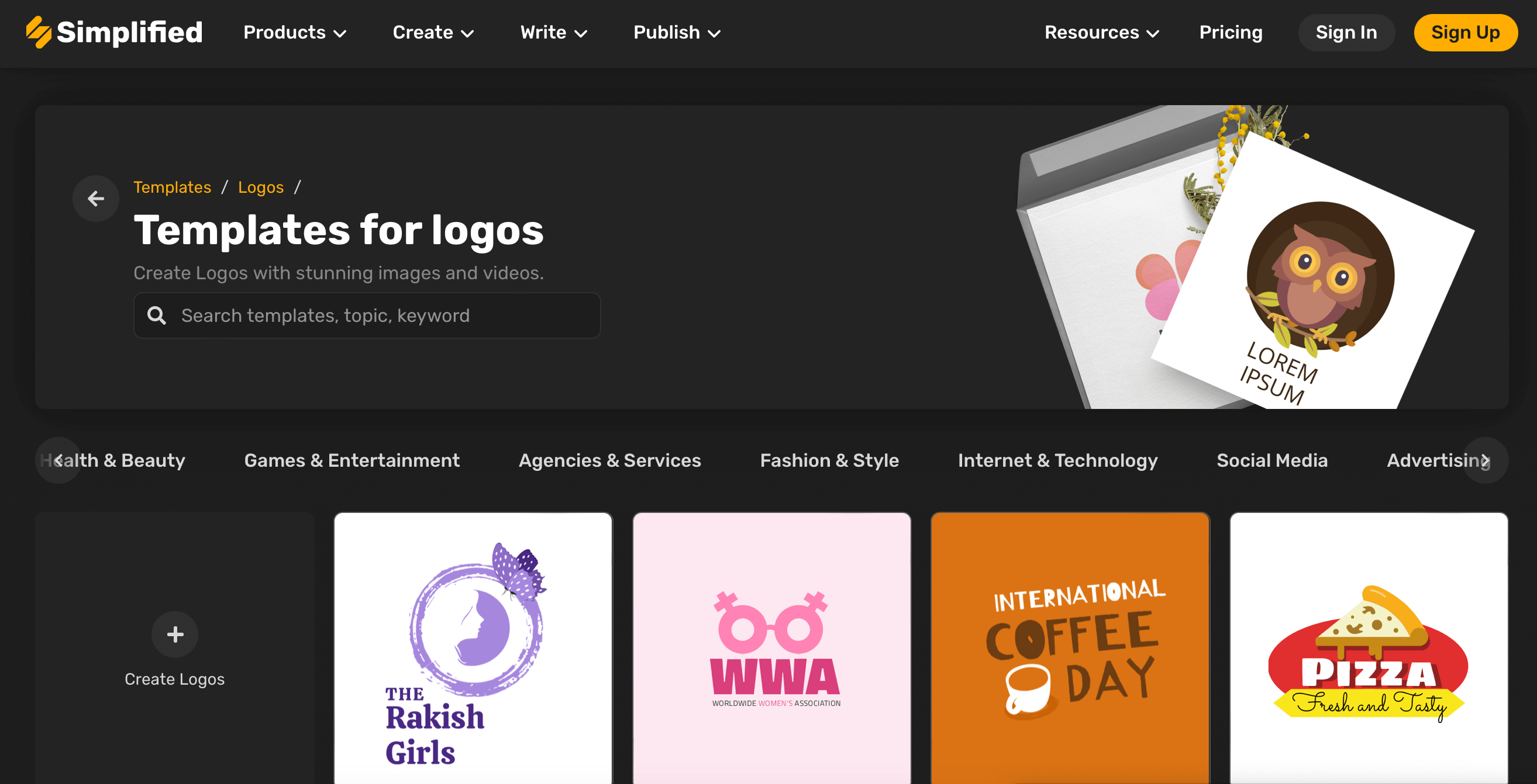
After browsing through these crazy restaurant logos, we know you are brimming with creativity, just like we were when we curated them. But designing a logo from scratch is never an easy task. People often make a lot of mistakes.
If you are a restaurant owner or a designer looking to create a restaurant logo that stands out from the culinary crowd, you have come to the right place!
From picking the right colors and perfect fonts for your brand to choosing the elements that represent your vibe, Simplified (this FREE tool) has got your back. Make your logo checklist and get started.
You can also generate color palettes by uploading an image on Simplified’s Color Palette Generator. Create color combinations that elevate your designs, or complement your logos.
Bonus: 10 Logo Design Trends to Watch Out For
Free Templates
Browse through hundreds of free templates you can modify per your brand’s need and tone.
Brand Kit
Create your own unique brand kit, including fonts, colors and elements which you can then use across all your communications.
Design Elements
With royalty-free vectors and design elements, create the best logo, for your restaurant deserves nothing but the best.
Download PNG
Download the PNG version of your transparent background logo for free and use it across on your website, menus, offline, and online communications.
So what are you waiting for?


