As the world of business evolves, so too does the world of logo design. In order to stay ahead of the curve and ensure that your brand is seen as contemporary and relevant, it’s important to keep up with the latest logo design trends.
A logo is one of the most important assets of any business. Also, it is a symbol that represents your brand and it can be found on everything from your website to your business cards. With so much riding on this one small image, it’s no wonder that businesses spend a lot of time and money on their logo design.
The trends in logo design change every year, and 2025 is sure to be no different. If you want your brand to stay ahead of the competition, then you need to be aware of the latest trends. Keep reading to learn about the 12 logo design trends that will help your brand stand out!
Simplified’s List of the 10 Coolest Logo Design Trends
1. Classic Black & White Logos
The classic black-and-white style doesn’t ever go away, and there’s no reason why it should. It is elegant and modish, yet evolving with the latest stunning effects. One of the biggest players in 2025’s trends in logo design will be the minimalist/high-impact design of this designer, providing the perfect canvas to play with new designs and techniques like animating and 3D.

2. Inventive Typography Logo
Inventive typography combines the effectiveness of text logos with the simplicity of modern design. Basically, inventive typography is the answer to the question of how text and iconography can work together to create an eye-catching and creative logo.
Recently, we’ve seen an upswing in this logo design trend, which leaves a lot to the creative imagination of the audience, arousing curiosity and capturing the attention of online viewers.
Related: Logo Design 101: How To Create A Logo That Captures Your Brand Essence
3. 3D Logo
3D logos are one of the hottest logo design trends, because with advancing technology, it’s easier to do more with less! So, why are 3D logos all the rage? In addition to its visual appeal, a 3D brand logo instantly grabs the attention of customers.
Furthermore, it communicates strength and growth, which is crucial to maintaining your brand’s online presence and attracting new customers. For example, Airbnb’s re-branded 3D logo has depth in color and instant visual appeal.
4. Animated Logo
This logo design trend is another nod to advanced technology. As of 2025, static logos are becoming a thing of the past. You can experiment with animations to communicate your brand’s identity to your audience. Why are animated logos effective? First of all, an animated logo helps you to stand out from your competitors.
Secondly, these animations are incredibly versatile, which means that they can be optimized for mobile apps, websites, and other social media marketing channels. For instance, we love Slack’s new colorful, animated re-branding! Experiment with this logo design trend yourself on Simplified using the new one-click animation maker tool!
5. Gradient Logo
What do the Instagram and Facebook Messenger logos have in common? Ka-ching! You guessed right – it’s gradient logos! When social media giants like Instagram and Facebook give us logo inspiration, we should all take a cue. After all, isn’t their goal also to reach as many people as possible? If you’re looking to shake up your brand identity, gradient logos are a good start! There are a couple of things to keep in mind while designing with gradients:
- Include 3 or more colors to create a cool gradient.
- Try unorthodox color combinations to create a unique brand logo.
- Choose minimalist shapes and icons and let the color do all the talking, just like Instagram.
Don’t know where to start? Check out the Simplified Color Harmony Guide to learn about color combinations.

6. Simple Geometry Logo
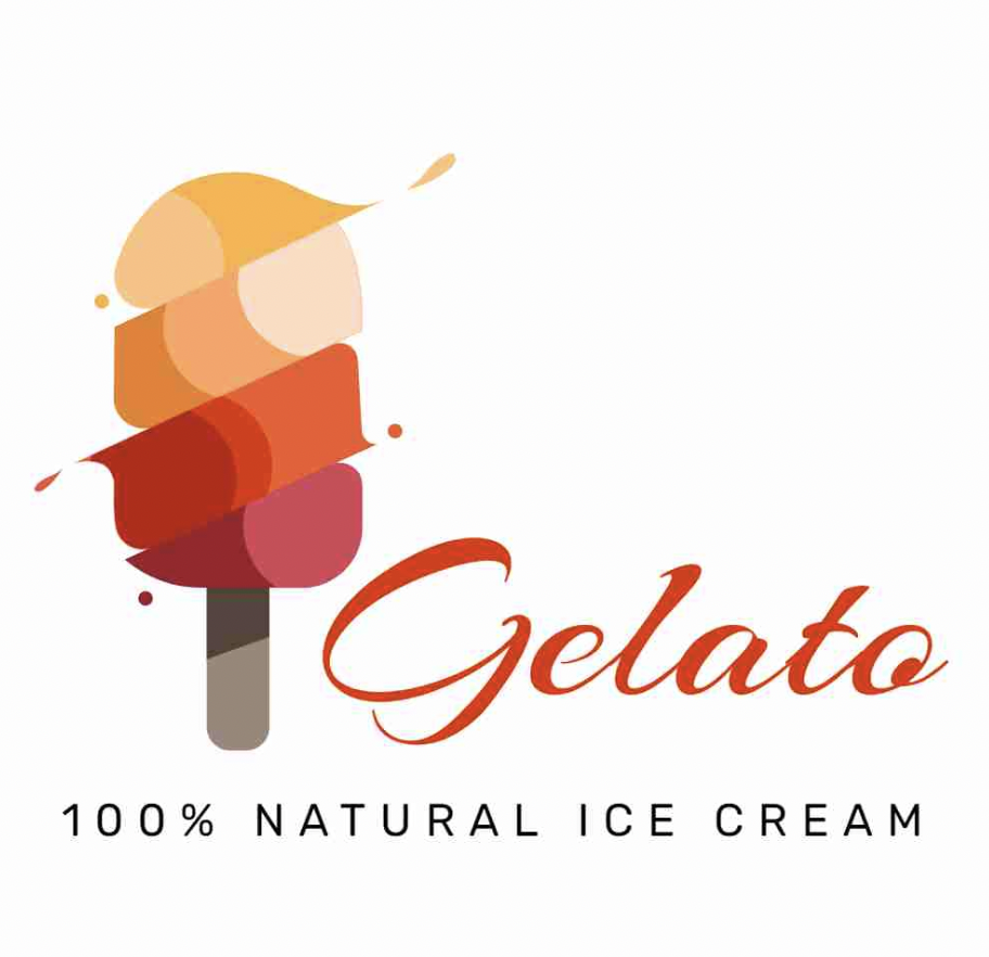
In 2025, one of the most powerful logo design trends is the simple and effective use of geometry for brand communication. Simple geometry affords you the freedom to explore complex ideas through simple shapes and angles. Before you hop aboard this trendy logo design train, take your time to read, research, and practice how companies like Microsoft have mastered simple geometry in their brand identity.
When done right, simple shapes are easily adaptable to other elements of your brand while still retaining their versatility across websites and mobiles. For instance, we love the Microsoft 365 workplace with different shapes and colors for Teams and OneNote.

7. Portraiture Logo
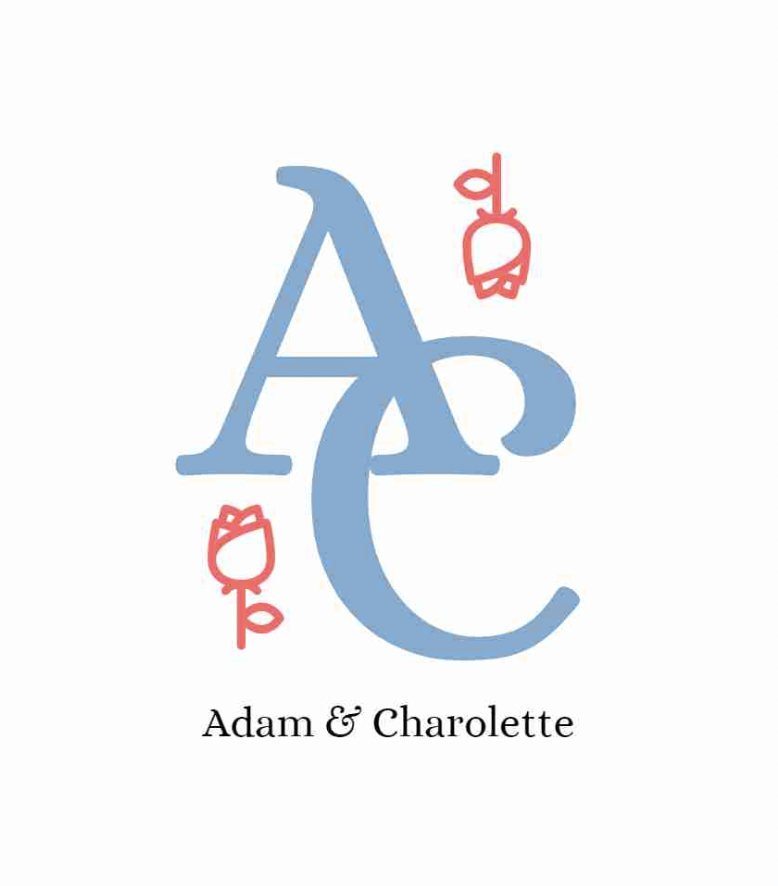
A logo is not just a design, it’s a symbol of your brand’s promise to your customers. When it comes to first impressions, portraiture logos make a lasting impact on new customers. Why? Well, because we have evolutionarily evolved to register faces in visual stimuli as part of our social perception skills. When it comes to logo design trends, this one is here to stay.
Did you know that with Simplified you can upload your photographs and start designing your very own portraiture logo? Take this all-in-one design platform for a spin!
8. Symmetrical Logo
A symmetrical logo shows your audience you really know who you are as a brand. Why do we like symmetry? According to an American scientist, Alan Lightman, humans crave symmetry to find balance and order in a large cosmos that otherwise doesn’t make sense. So, when your brand logo incorporates symmetrical elements, people are drawn to the balance in the design. It’s no wonder why, a symmetrical logo like Audi’s has lasted so long, just made up of four simple rings and a minimalist color palette.

9. Static Motion Logo
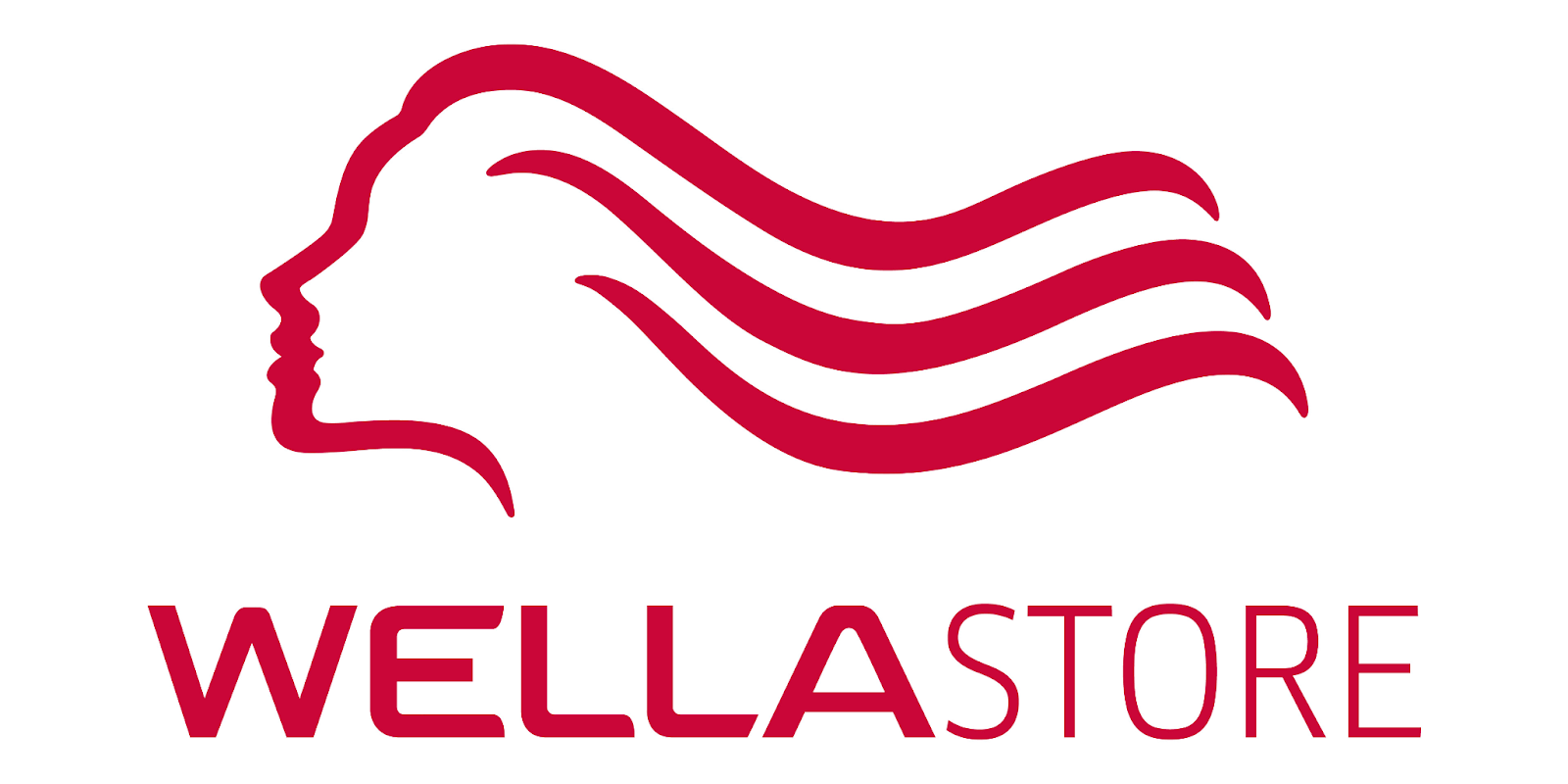
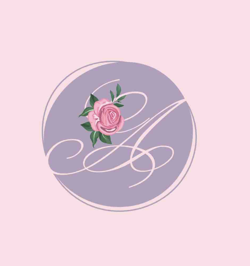
You’re probably wondering why static motion logos are one of the hottest logo design trends, especially when we’ve already covered animated logos. A static motion logo incorporates the illusion of movement in a motionless design. Therefore, when a brand communicates with its audience through a static motion logo, it signifies depth, like the brand is a living entity. For example, Wella’s brand logo is a beautiful illustration of flowing hair in a motionless design.
10. Artistic Chaos
We’re ending strong with a logo design trend that doesn’t need any rules! This is where you let your imagination run wild and experiment with colors, fonts, and iconography in any way that you like! However, your brand identity must remain consistent in design across all social media marketing channels, so your customers know that it’s you.
Bottomline
We believe that the best logo design trends for brands will be simplification and minimalism. This is in line with the current trend towards cleaner, more streamlined designs. There are a number of logo design trends that will help your brand stand out. These include using geometric shapes, organic shapes, and bold colors. Additionally, using a wordmark or monogram design will also help your logo to stand out. Keep these trends in mind when designing your logo, and you’ll be sure to create a brand that will be noticed.
Design Your Brand Identity With Simplified!
Simplified offers everything you need to create a beautiful and professional brand logo. A one-stop free logo maker to design and build a beautiful, cohesive brand. From logo design to social media templates, we make it simple. Why wait?


