Color psychology has always played a significant role in the way brands are marketed to consumers. Our visual perception, emotion, and behavior are all impacted by color. Humans eat with our eyes first, and brands have capitalized on this phenomenon for years with how they design restaurant logos.
Evidence shows that there are certain hues that trigger hunger signals in humans, with red being the primary one. So why do you feel hungry when you see the color red? The color psychology behind that is fascinating!
What’s the psychological significance of the color red?
Warnings and danger.

People tend to associate red with negative, danger-bearing emotions. This could be because it is the color of fire, blood, and sometimes of poisonous or dangerous animals.
Red is also used to convey danger in a non-literal way. Some examples include using the phrase “in the red” to describe financial loss or “red flag” to indicate when something is wrong with a person or situation.
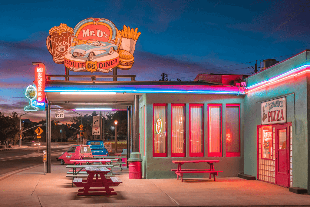
Thanks to its long wavelength, red is one of the most visible colors in the color spectrum (second only to yellow). Its ability to instantly grab people’s attention is the reason why it’s often used to warn people of impending danger. Think: stop signs, sirens, and red traffic lights. So why is the color red used in restaurant logos?
Energy and excitement!
Related: Design Inspo: Famous Restaurant Logos Edition
Because of how visually stimulating red can be, it is also associated with excitement. Red is a warm color that is known to draw people in, giving them energy and making them feel excited. Scientific American points out that seeing the color red has effects on one’s behavior, including making men perceive women wearing red as more attractive.
Studies show that being exposed to or wearing red can cause some of the following physical effects:
- Elevated blood pressure
- Enhanced metabolism
- Increased heart rate
- Increased respiration rate
All of these physiological changes naturally cause your energy levels to spike, which explains the increase in hunger when you see certain restaurant logos!
Restaurant branding and the color red.
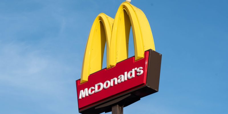
Think about it: McDonald’s is known for its red logo and yellow arches. But they are not the only fast-food franchises to capitalize on the color red: Burger King, Pizza Hut, Wendy’s, Dairy Queen, Domino’s Pizza, Arby’s, and KFC all use red in their restaurant logos!
A very interesting fact that Business Insider points out, is that our attraction to the color red might just be because we have happy memories associated with the color. For example, if you were rewarded with McDonald’s fries as a kid if you did something good, there is a good chance of you having happy memories associated with the color red!
So as an adult, when you have a bad day and want to make yourself feel better, you go straight for the nearest McDonald’s!
The ketchup-mustard theory.
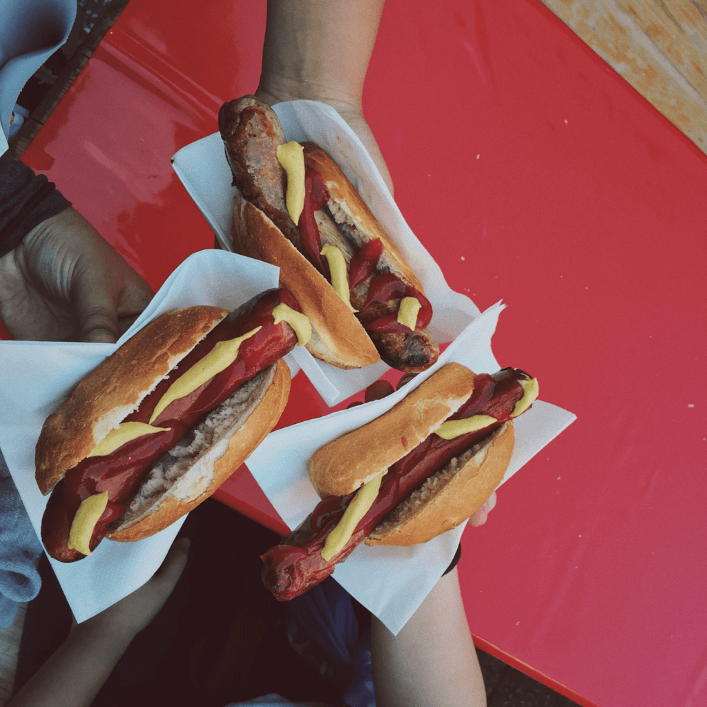
The phenomenon of feeling hungry at the sight of red and yellow, especially in formats we are conditioned towards (eg: logos of McDonald’s, KFC, etc) is called the ketchup-mustard theory.
The combination of red and yellow is associated with ketchup and mustard. These popular condiments can trigger hunger signals in humans!
But why yellow? Well aside from yellow mustard, yellow is a cheerful and exciting color. Moreover, it grabs attention (we can see yellow from far distances – like those jumbo golden arches). Most interesting, however, is that research has shown the color yellow has the ability to speed up our metabolism! This means, in theory, when we’re around yellow we burn more calories.
Ready to test your newfound knowledge of color psychology?


