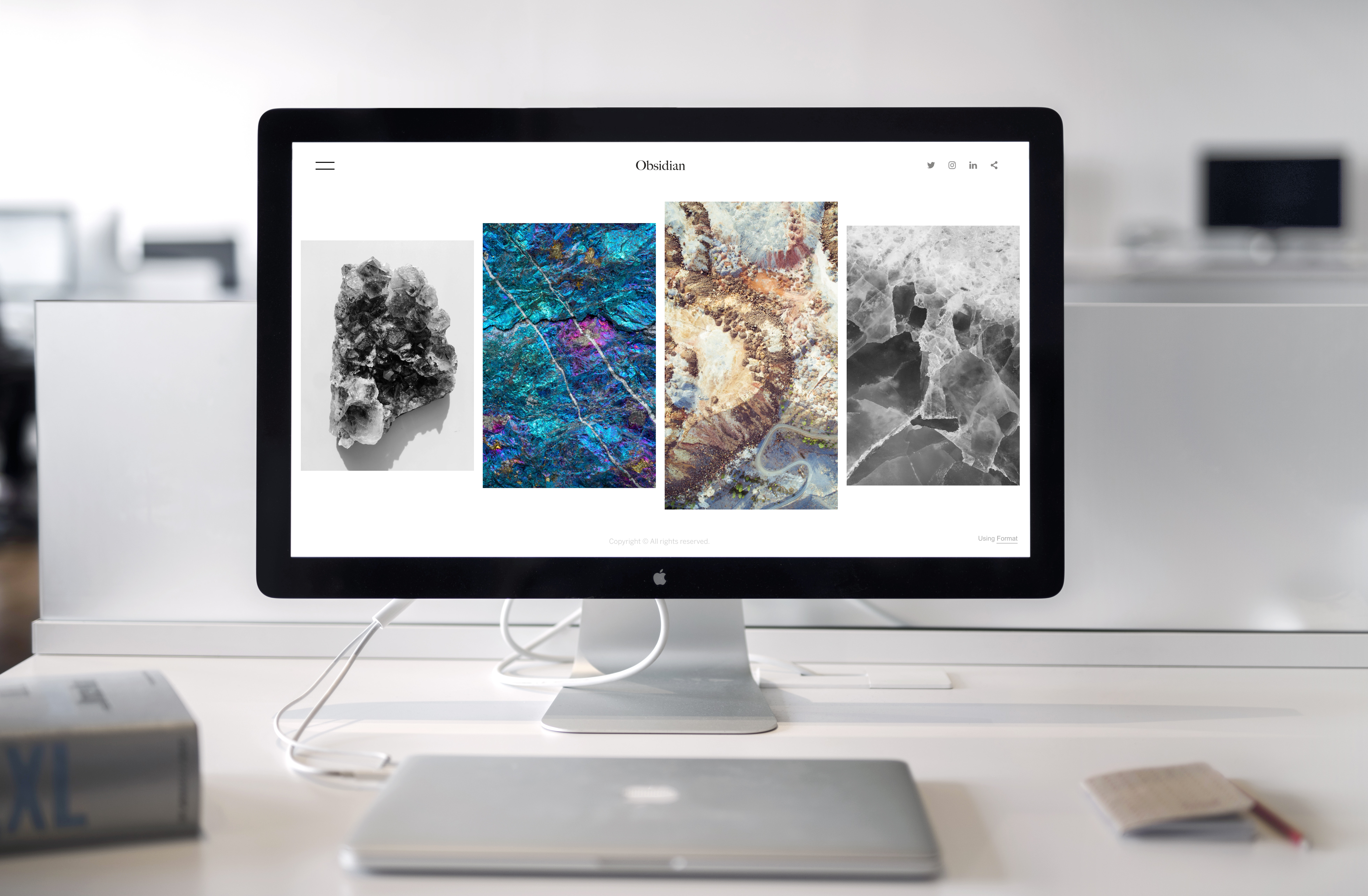
What are the things that pop in your head when you think of the word Minimalism? Maybe, ‘Simple’ or ‘Light.’ Perhaps even images that focus on a single object or piece of information?
In a world booming with creative ideas, the idea of simplicity can successfully be used for your web design. At the core, the goal is to remove any distractions away from your interface, so your audience can see it in the way you intend to.
Your art, your brand vision, your product , and your message- one piece at at a time.
So without further ado, let’s dive right into our Simplified web design guide to look effortlessly minimalist!
How “Less is more” applies to web design
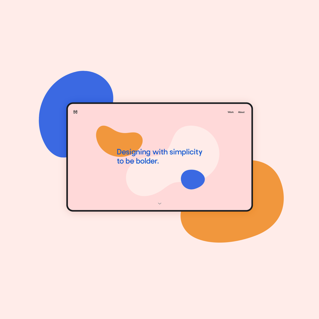
(Credit: Minal Studio) Keeping only the key colours and text can help you make a smarter web design
“It takes about 50 milliseconds (that’s 0.05 seconds) for users to form an opinion about your website that determines whether they like your site or not, whether they’ll stay or leave.” – Sweor.com
- Home / Landing Page
- Product placement
- Contact
- Gallery
- About
These are more or less the main pages on any website you visit. Now think of the core purpose of any webpage that you design and the message you wish it to convey.
Minimalism is about downsizing your design add-ons to only the most essential components needed for your brand vision.
Have a clear focus in mind, and narrow down your details to get your point across.
MiniMUSTS for a minimalist web design!
Intelligent Colors
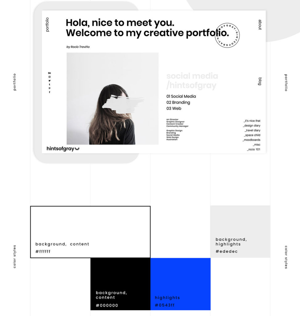
(Credit: Graykind Studio) Since multiple colors can distort viewer attention, contrast your palette minimally!
Colors serve the purpose of enhancing your visual experience to accompany the information you have on display. To yield the best results out of this dynamic, intercept the contrasts that would best bring out your elements.
Simplified Design Tip: Aim for a two-color combination for your palette. Maybe modern pairings like Neon Pink and Green (#99F443 and #EC449B), or Royal Blue and Lilac Purple (#E2D3F4 and #013DC4) on your workspace!
Effective Typography
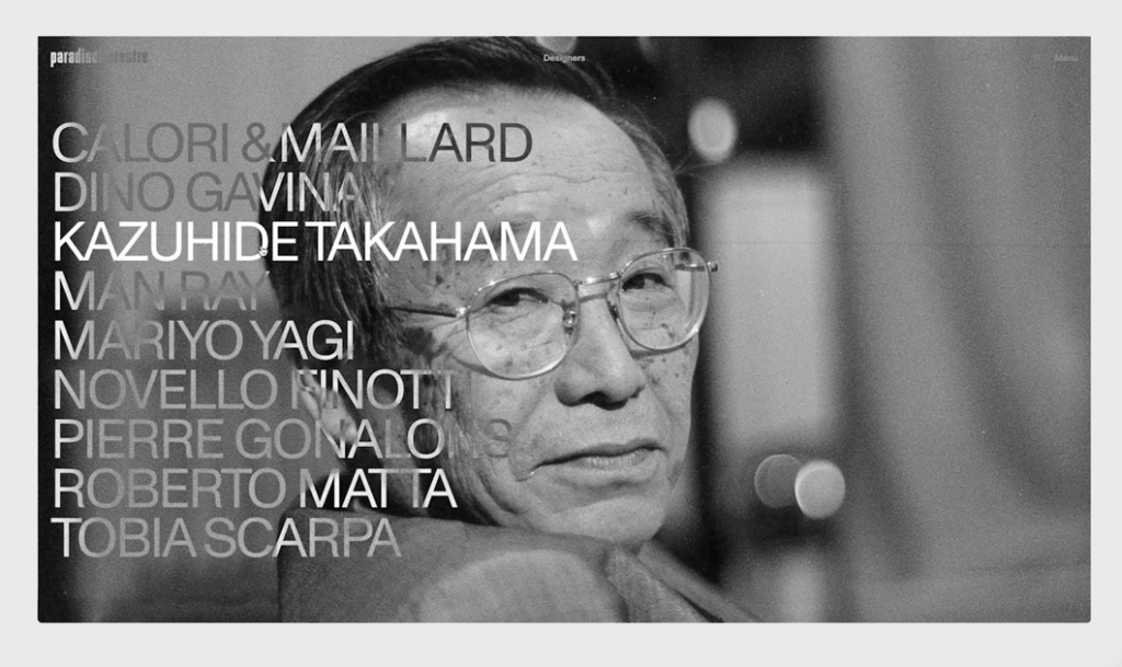
(Source: paradisoterrestre) Try alternating colors or play with image colors by using them in the font, as on this artists’ website
The three ‘S’s of Type,
- Size
- Spacing
- Style
can decide how much impact your textual information makes on the reader. Whether you use uppercase or lowercase letters to define what’s important, your Type will determine your web design output.
Simplified Tip: Remember, no matter how attractive your typography looks, a minimalist web design is one that is readable on any device!
Negative Space and Images
While adding elements to your web design, you may be tempted to add all images that you find attractive for the viewer to appreciate. However, this only makes your page overcrowded and can be mistaken for a collage.
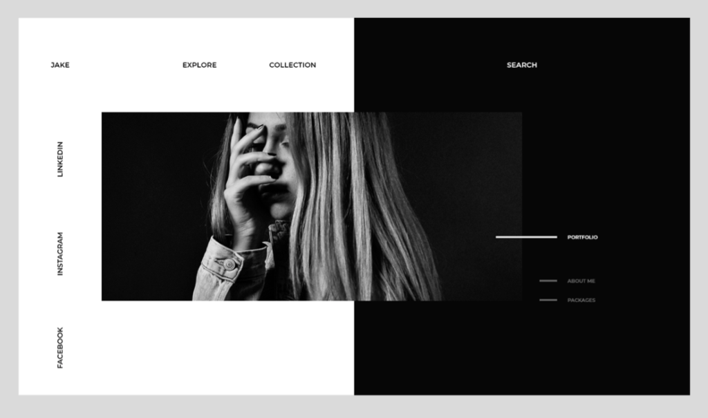
(Source: Andrés Soria) Leaving the right white/negative space between elements will let your design breathe!
Minimalism challenges that artistic overflow by restricting the visual elements to the required minimum. Can you do without it? Remove it. Then, space these elements out so all others can be more noticeable and attention grabbing.
Et voila! You have your minimal masterpiece ready to go live and establish your brand vision!
Maybe try designing your elements and graphics with our available templates, thousands of copyright-free images, and so many design tools, right here on Simplified!

![10 Best AI Image Restoration Tools to Try in 2025 [Free & Paid] 10 Best AI Image Restoration Tools to Try in 2025 [Free & Paid]](https://siteimages.simplified.com/blog/Best-AI-Image-Restoration-Tools-01.png?auto=compress&fit=crop&fm=png&h=400&w=400)
![How to Use Photoshop AI Generative Fill Feature [2025] How to Use Photoshop AI Generative Fill Feature [2025]](https://siteimages.simplified.com/blog/How-to-Use-Photoshop-AI-Generative-Fill-01-1.png?auto=compress&fit=crop&fm=png&h=400&w=400)
![20 Podcast Thumbnail Ideas to Boost Your Show’s Visual Appeal + Best Practices [2025] 20 Podcast Thumbnail Ideas to Boost Your Show’s Visual Appeal + Best Practices [2025]](https://siteimages.simplified.com/blog/Podcast-Thumbnail-Ideas-to-Boost-Your-Show-02-1.png?auto=compress&fit=crop&fm=png&h=400&w=400)
