
Your logo is the face of your brand. As you build brand awareness with logo-accompanied experiences, consumers will begin making valuable associations between your logo and brand. A logo with a simple design can make it easier for people to create those associations.
Hence, a simple logo goes a long way in creating a lasting impression in your customer’s minds.
To keep you inspired, this blog will help you bring the confusion out of your system so you can design the perfect simple logo for your brand.
Why are Simple Logos Good?
A simple logo design does not equate to a simplistic business model or brand message. On the contrary, it indicates a keen awareness of a logo’s purpose and your ideal client’s needs.
Here are some of the most crucial reasons why a simple logo will always be better than an intricate one.
Recognizable
An intricately designed logo may look impressive initially, but consumers need help to familiarize themselves with it. On the other hand, a simple logo is easier to absorb and understand and easier to recall when they see it again.
Prompt Emotional Reaction
A great logo is not only instantly recognizable, but it should also elicit an immediate emotional reaction. When the logo is simple in design, the mind can process it more quickly and efficiently to take over your sensitive side.
Convertible Across All Media
As any brand design expert will attest, a simple logo design is easier to publish across media, including print, web, stamps, embroidery, signs, transfers, promotional gifts, etc.
So, when it comes time to start sketching a logo idea, why don’t you try to imagine how it would look embroidered on a custom jacket? If you’re satisfied with what you envision, your logo is good to go.
What Goes Into a Simple Logo?
When it comes to logo design, sometimes less is more. Think of design concepts like minimalism and negative space.
Minimalist logos, like a flat logo design, use a single, versatile design that can be applied across backgrounds and mediums.
Consider these logo designs. They have been successful and are also highly simplistic and indicative of their brands’ qualities. Therefore, they have been effective in helping to build their brand identities:
It should be clear that simplicity in logo design is a good idea. But don’t worry that the result will be too simple or not enjoyable enough. Simple can make you billions of dollars.
Types of Simple Logos
When it comes to designing a simple logo, the key is minimalism. Here are a few types of simple logos you can consider.
Pictorial
Such logos are perfect if you plan to go global, as pictures don’t need a translation. It’s also great if you’d like to convey a specific message or an emotion to your audience.
Ex: Nike’s “swoosh” and WWF’s Panda
Monogram
These are excellent for businesses with long names or several owners.
Monograms are one of the most effective branding and marketing tools. Plus, such logos are super easy to revamp, making letter marks an excellent choice for startups.
Ex: CNN and NASA
Wordmark
It’s the cheapest way to get the recognition that market newcomers need. Just make sure your company’s name is brief.
Ex: Lego and Samsung
Mascot
Such a logo can help you attract the younger generation and families. It’s also a great way to encourage interaction with the target audience.
Ex: Pringles and Uncle Ben’s
Emblem
Emblem logos have a traditional and strict vibe about them. However, they can help you build the image of a trustworthy, reliable company.
The only thing a business owner should remember while creating an emblem logo is to ensure the picture is print-friendly and doesn’t have too many tiny details.
Ex: Converse and BMW
Related: Exploring Color Trends in Graphic Design & Social Media
Tips to Design a Simple Logo
Before diving into some inspirations from leading brands, let us look at some tips you can follow to design a simple logo.
Use a limited number of colors in a planned way
Colors play a crucial role in determining a brand’s message. For example, if you use red as the primary color in your logo, it will send the message of a powerful, passionate, and energetic brand.
This means your brand intends to target young customers. If blue is the dominant color, it will evoke feelings of intelligence and togetherness. This is why most social channels, such as Facebook, have blue logos.
If you want to create a social media-based business, consider blue the primary color. However, remember that less is more when it comes to a simple logo.
Stick to 1-2 colors, and ensure each color has a specific meaning and use in your logo.
Pick Fonts Carefully
Minimalistic fonts such as Montserrat and Chivo are excellent choices for a simple logo. However, you must avoid using gimmicky fonts. Instead, create a unique font, especially for your logo.
Logos such as that of Coca-Cola are recognized for their custom fonts. Ensure there is no mismatch between your chosen typeface and your brand personality.
If the choice of typeface does not speak for your brand, the logo will send the wrong signals to your potential customers.
There are many free, high-quality fonts available online that you can use for your logo.
Choose The Style Of the Logo
Creating a wordmark like Google or Coca-Cola places the focus on the text. You only need to worry about using an appropriate font and color scheme.
With so many choices available, it’s easy to create something eye-catching that resonates with your audience and is also unique.
Related: How To Make a Thumbnail That Stands Out
15 Simple Logo Inspirations
Start taking inspiration from these logos that continue to take the entire world by storm.
1. BBC

Did you know that in 2021, BBC spent $1.8 million on their simple logo? It is a striking and tasteful image composed of plainly written white letters encompassed by black squares.
The broadcasting powerhouse opted for a monochromatic look, eradicating unnecessary details. This will become a big trend – striking minimalism.
2. Nike

Carolyn Davidson created the Nike swoosh as a graphic design student in 1971. The story goes that she was paid $35 for this logo.
It is so beautifully simple yet makes it easy to understand what the brand is all about.
3. Twitter

The Twitter logo, as simple as it may appear, poses an interesting meaning behind it. Like a bird’s chirp, a user’s tweet is quick and short.
The simplicity behind Twitter’s logo blended well with its overall design, endearing users to the website.
4. Google

Millions of people see this logo on their computer screens every single day. This is the centerpiece of a website that handles over 100 billion visits per month; it’s got to look good.
Google is a fun company; its colorful yet simple logo reflects that. The font, as well, is minimalist and striking, making it a great inspiration for your simple logo.
5. Target
Target is among the brands with simple yet iconic logos, mainly because its design echoes the store’s name.
So, it’s vital to understand that a logo that thoroughly resonates with your brand name is an excellent marketing tool that subconsciously attracts customers.
6. Coca-Cola
Coca-Cola is a brand of brands. Coca-Cola’s branding has been slowly built over time. They are dedicated to associating themselves with happiness. The script font has only been tweaked slightly over the years but remains consistent.
7. Apple
The Apple logo has become synonymous with a reliable, modern, and stylish brand. The logo and Apple’s products continue to evolve – a beautiful representation of constant innovation.
Despite being simple, the logo works because it is very easy to understand. In fact, even non-Apple users can easily recognize the brand just by looking at the logo.
8. McDonald’s
The golden arches – who doesn’t recognize this logo? It’s partly because it’s internationally known and also because of how simple it is.
Initially, the McDonald’s logo was derived from its early architecture to be seen from afar, and now it’s incorporated into its branding.
Read Also: Logo Design 101: How To Create A Logo That Captures Your Brand Essence
9. Chanel

Chanel’s logo is undeniably one of the most iconic logos in the world. The double CCs stand for the original owner’s name, “Coco Chanel,” and its timelessness doesn’t go out of style.
The simple logo’s bold, unapologetic, minimalist design symbolizes luxury, prestige, and class.
10. Visa

Visa; it’s everywhere you want to be. So is this logo. This simple “Visa” emblem is constantly seen on TV, at restaurant windows, and on those little pieces of plastic, we hate so much yet bring with us everywhere.
This logo was introduced in 2006 and gave the boxy blue and yellow predecessor a more modernized feel.
11. Starbucks
Starbucks, a coffee house staple, has a distinctive and approachable logo. The combination of green and white colors alongside the iconic siren design quickly became a symbol of status.
The brand has over 31,000 branches worldwide and continues to grow every day.
These are some of our favorite simple logo picks. Which one is yours?
Read Also: Test Your Logo With This Quick Exercise
Design your Simple Logo with Simplified
Developing a simple logo that represents your brand and your values as a company is crucial. However, we understand that it can be a difficult and time-consuming process to design your logo from scratch.
Fortunately, Simplified has a free online logo maker that can help you formulate a logo in seconds!
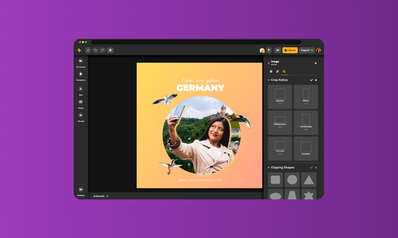
With Simplified, you won’t need a background in coding – choose from our wide range of logo templates and customize them according to your preference.
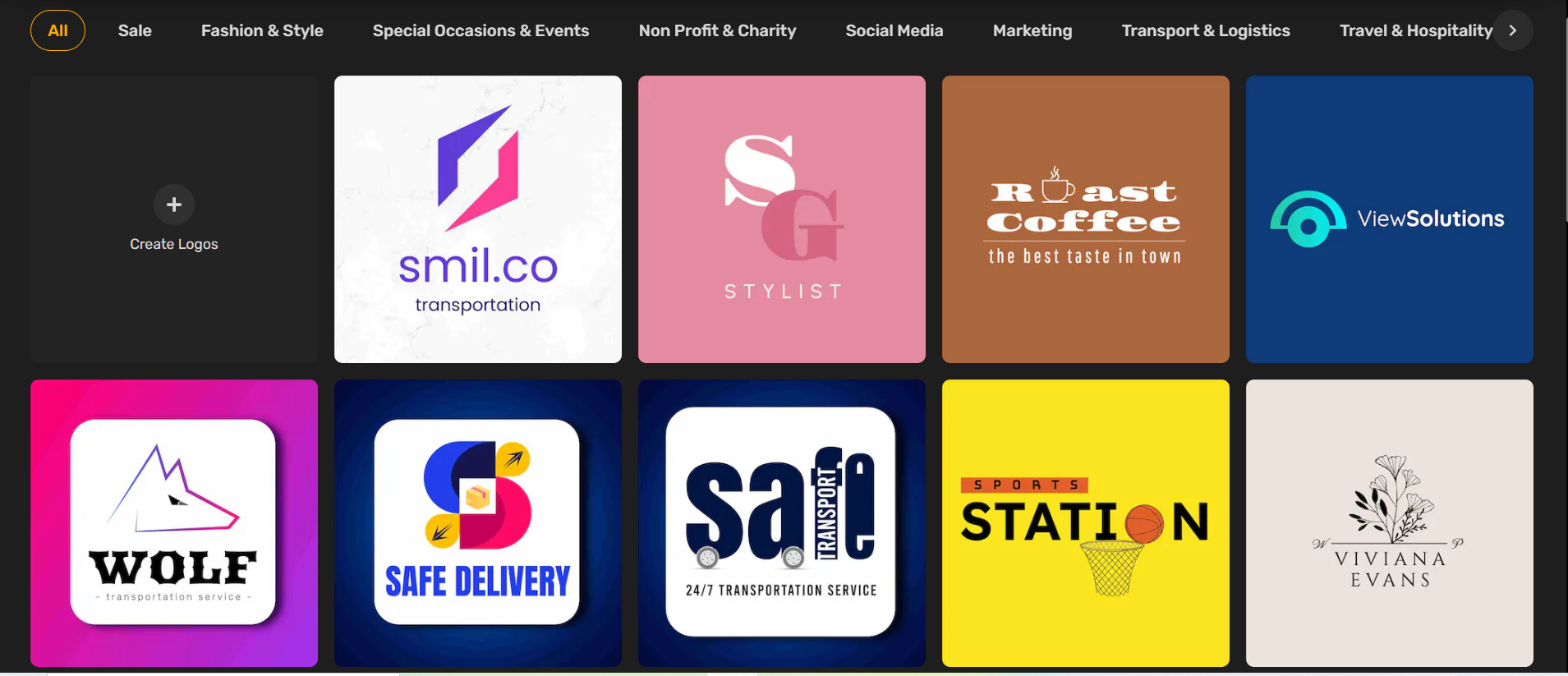
Moreover, you may also use Simplified’s software to add some character to your logo; you may add text and animation using graphic design tools.


