According to Entrepreneur.com, a business card is “a small card identifying a person in connection with his or her business, given to a client, potential customer, etc.” In this 2×3 inch space, how do you make sure your design makes the right impact? It’s the power of good branding.
Your logo, contact information, a call-to-action, and brand imagery- this currency to collaborations is like a staple for the business world. Even in the age of social media, it can extend a business conversation into something one can hold onto- a pocket-sized piece of your brand experience.
In this blog, we’ll show you how to design business cards that not only reflect your brand identity but also ensure a lasting impression. So let’s get started!
#1: Brand logo and color palette
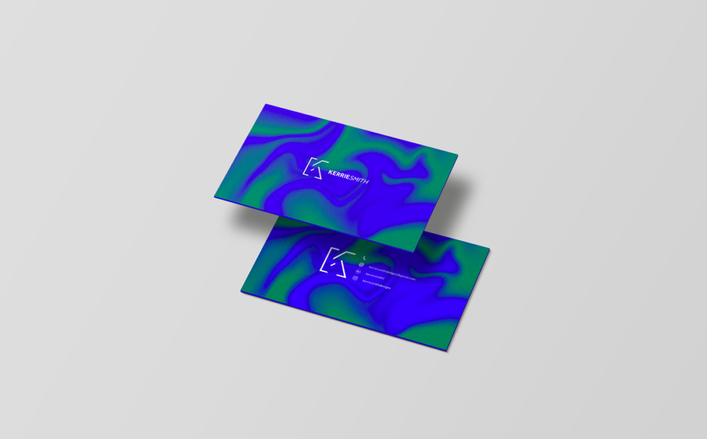
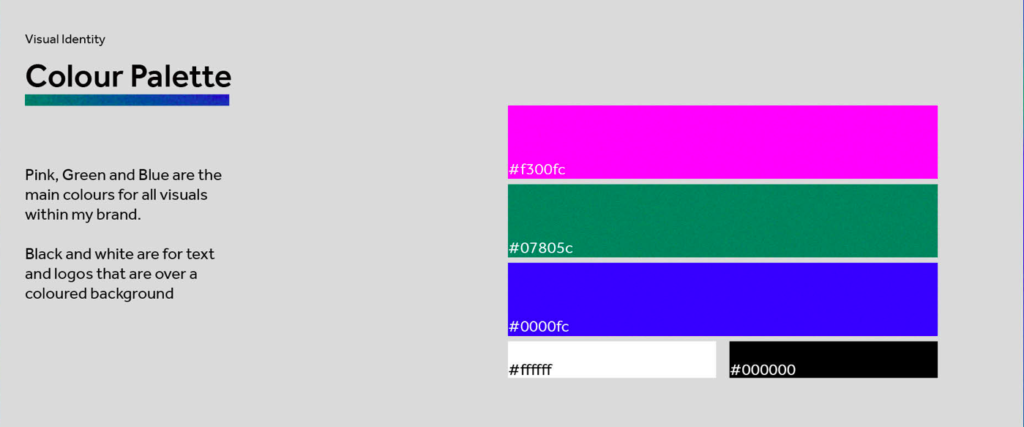
(Source: Kerrie Smith)
Consistency in branding is when your business cards accurately reflect your personality as well as brand identity
The key element of any branding design is- your logo. In most cases, one side of the card is completely dedicated to your logo, whereas the other is for your personal details. From this, elaborate on your options of what color palette and typography best suits the brand vision.
And as Aidan Cole once rightly said, “A business card is a physical reminder of who you are. It can also spark a memory of the time and place you met, separating you from others.” Whether you are the owner of a small business or the CEO of a million-dollar corporation, your design choices can shape how people remember you. Make. It. Count.
#2: Brand message and graphics
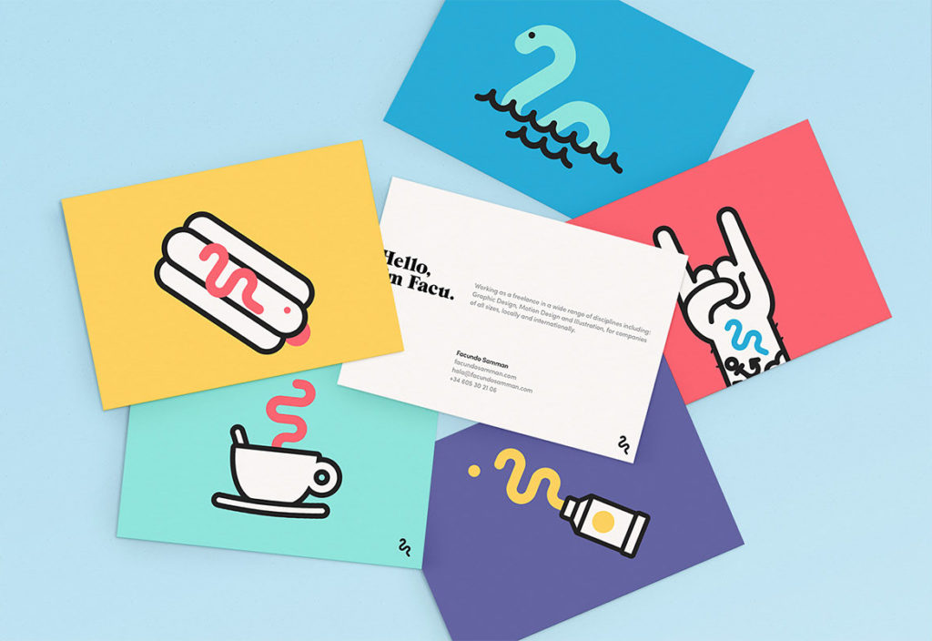
(Credit: Facundo Samman)
Instead of boring stock imagery, add illustrated graphics to make a fun business card!
“A colored card typically lasts 10x longer than the standard white card.” – Adobe
We all know how good branding is when your brand image is uniform and recognizable across all platforms. So how do you bring it to business cards? By hiring an illustrator/graphic designer, or better if you’re one yourself!
Moreover, it’s always a good idea to add a fun element to each card that you print. For example, add a doodle that represents the job title of every employee. It is the perfect way to say: what you see is what you get!
#3: Brand identity and styling
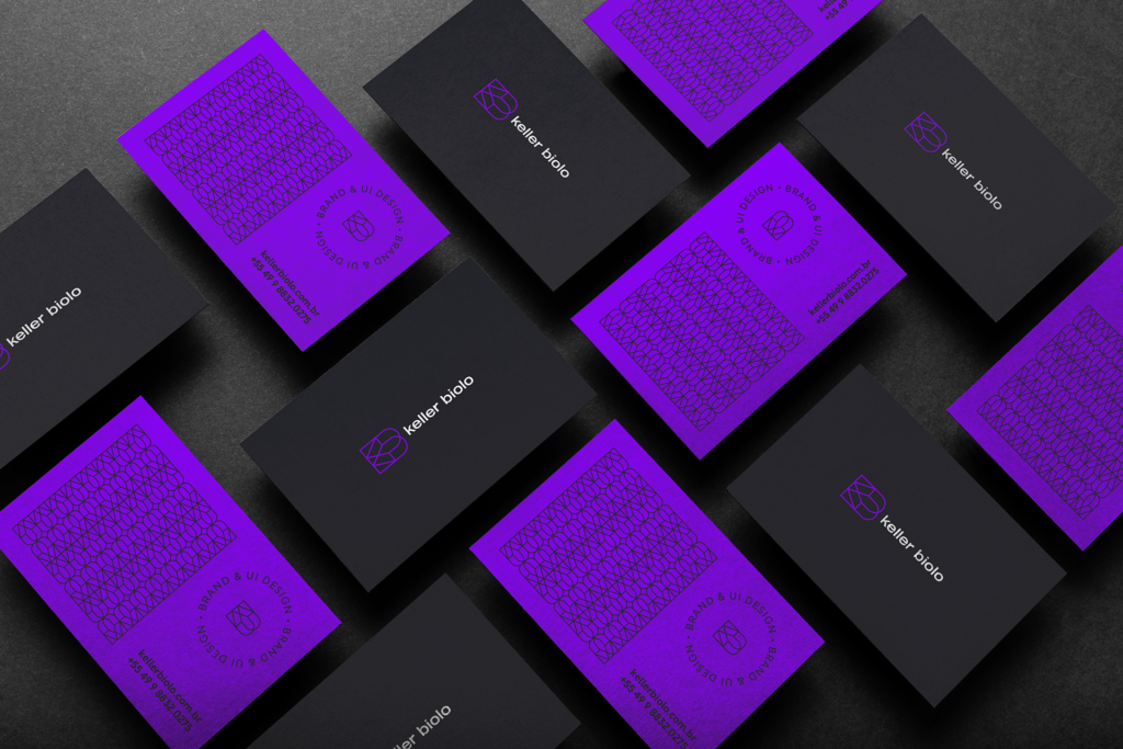
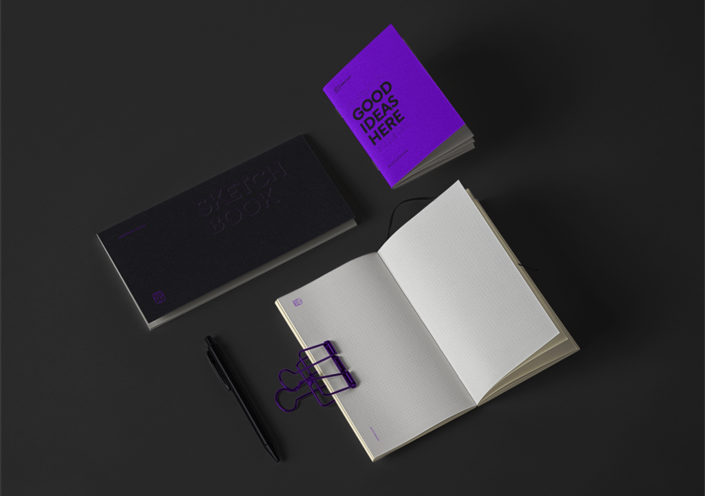
(Source: Keller Biolo)
Take your business cards a step further and use your branding on your merchandise!
Satisfied with your design? Now it’s the time to shape, stylize and showcase your business card to its future holders! There are many ways to go the extra mile and be creative with the usual process of selecting size and material. For example:
- Transparent sheets (or maybe plastic, rubber, wooden, etc.)
- Matte finish (or mixed finish with a glossy logo)
- Scented-inks (for perfume companies)
- Embossing (inwards or outwards, depending on your graphics)
- Gold-foils (for matte-black designs)
- Handlettering (for an elegant, wedding planner, or a calligraphy artist)
- QR codes (a call-to-action that lasts longer than the card itself!)
And the list is endless. So go ahead and make sure your business cards are the ones people would want to hold on to!
Simplified Design Tip: Need to place icons and graphics on your business card? Choose from several of the options available right on your Simplified workspace. Go to ‘Components’ or ‘Visuals’ and search the right ones for your brand!


