Good advertisements are essential to promoting a brand, whether you’re launching a new business or an innovative new product in your existing business. The best ad campaigns do more than offer basic information about the brand, they tell a story and make an unforgettable creative impact. So, how does one create a brand advertisement that catches people’s attention? We start with great design.
Our top 5 design tips to make your brand advertisements stand out!
1. Keep your message clear.

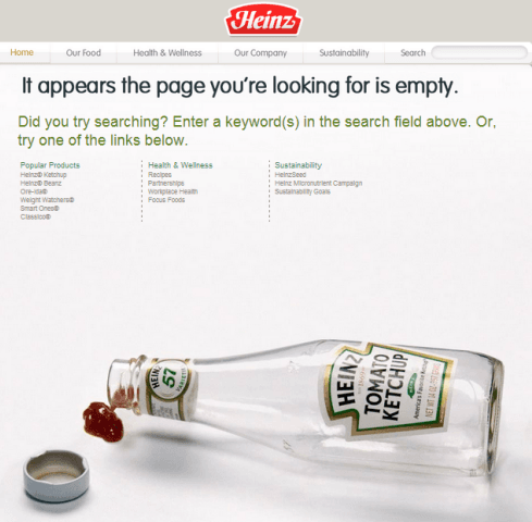
Image Source: Heinz
Simplified Design Tip: Creative catchphrases, like the one above by Heinz, is an excellent way to become a memorable brand!
The average person sees thousands of advertisements a day; at home, during their commute, and on social media. What are the ones we remember most and why?
- We remember the ads that are relevant and relatable to us.
- We remember the ads that highlight the one unique feature of the brand.
A simple and concise message is better than an information overload. So figure out what sets your brand apart and make it the core theme of your brand advertisements!
2. Be informative without being spammy.
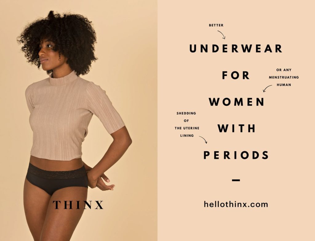
The main goal of an advertisement is to clearly communicate the benefits of your brand. But adding too much information can overwhelm your audience.
The above brand advertisement by Thinx deals with this challenge perfectly. They are able to highlight important conversations about people’s reproductive health through inclusive language, while also delivering product information!
3. Create your own spin on popular phrases!
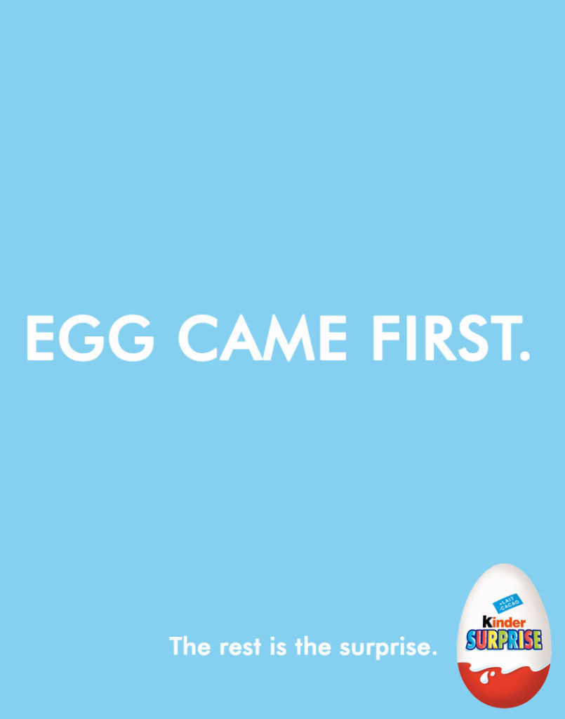
The advertisement above directly responds to the commonly known idiom, “Which came first, the chicken or the egg?” People respond well to brand advertisements that play off of well-known ideas and catchphrases. It creates an instant connection with people that will make your ad memorable!
Simplified Design Tip: Make sure the colors and graphics in your ad complement each other. Readability is crucial for your ad campaign!
4. Don’t be afraid to play with font type!
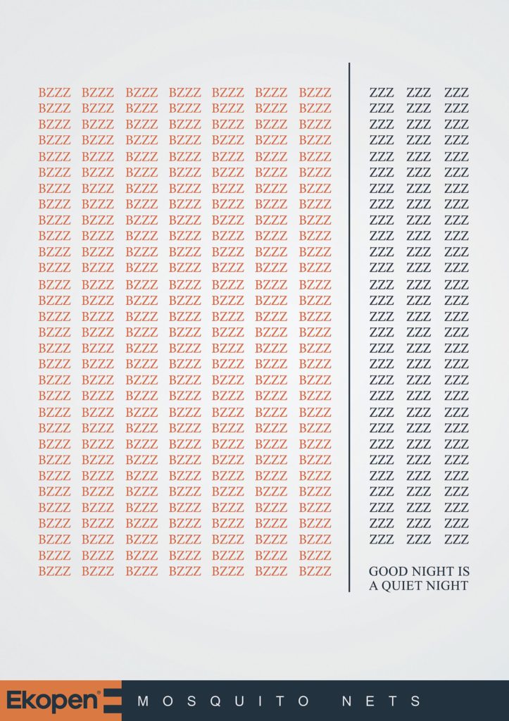
Once you have your copy in mind and your colors planned out, you must decide how the words will be displayed in the advertisement.
- Firstly, try playing around with fonts by changing their size, weight, color, and position.
- Secondly, move things around! Create patterns and repetitions with the text.
Check out the above print for Ekopen Mosquito Nets, for example. They cleverly used the letter Z to represent how their product keeps mosquitoes away, and offers a great night’s sleep. Genius!
Related: 4 Steps to Building Your Personal Brand
5. Less is more!
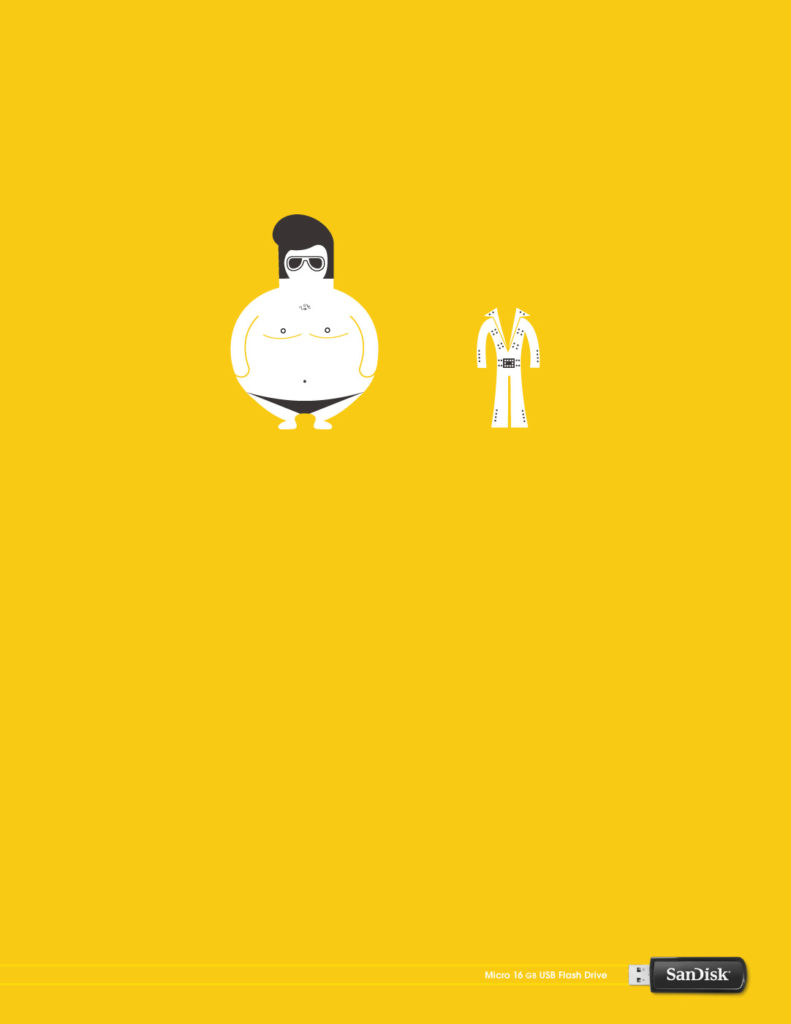
(Source: SanDisk)
Whatever you think your brand advertisement can do without, scrap it!
Humans understand visual stimulus in 250 milliseconds and over 50% of our brain is activated through it.
Minimal visual storytelling is an efficient way to communicate to your audience. In the SanDisk advertisement above, they use a bright color and a small graphic to grab the viewer’s attention, without overcomplicating it with text. Like tip number two says, a picture is worth a thousand words!
Simplified Design Tip: Check out the templates available on our website! With a wide variety of fonts, images, graphics, and more, you can make your next brand advertisement design in just minutes!
