
Pepsi is one of the most popular soft drinks all around the world. With its bold choice of colors, no one can miss its logo – or mistake it for its main rival! The company has never been afraid to adapt to how the world’s changing. Over the years, they have updated the fonts, patterns, colors, logos, and packaging of their brand. But with every evolution, the Pepsi branding has remained recognizable, and most importantly, relevant. Which is why it’s still going 129 years later!
Since its brand launch in 1898, PepsiCo has become one of the largest global companies. According to reports, the company generated a net revenue of over USD $70bn worldwide in 2020.
Let’s take a look the history of Pepsi branding in more detail to see how that’s contributed to their success.
Related: Evolution of Brands: A Case Study Of Coca-Cola
The Pepsi Branding History
To stay relevant to consumers and remain one of the world’s favorite beverages, Pepsi have updated their branding over time. To give you a better idea of what happened with each transformation, we will revisit the history of their logos.
1898: The Birth of Pepsi-Cola
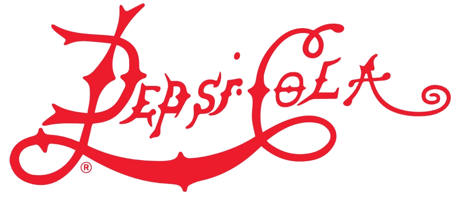
Looking back, you’d hardly recognize this first logo as belonging to Pepsi. The writing was red and spiky, reflecting a style of handwriting that was way more common in the 20th century.
1905: The First Logo Revision
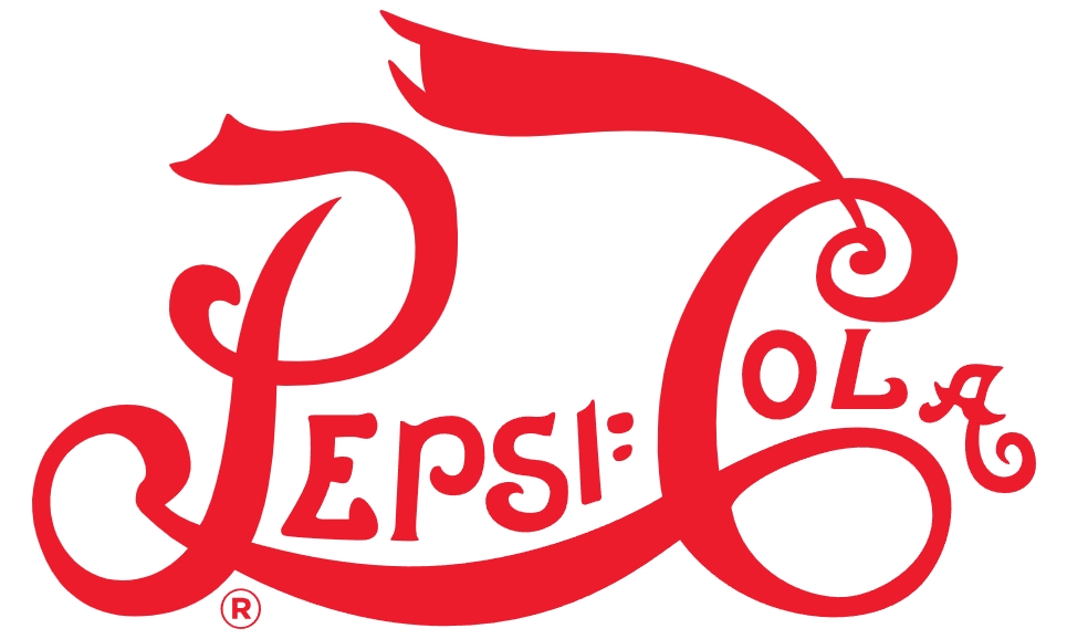
To make the logo more readable, the spikes were removed. Although the curls and swirls remained, they used a bolder font to make the logo stand out.
1906: A Quick Change
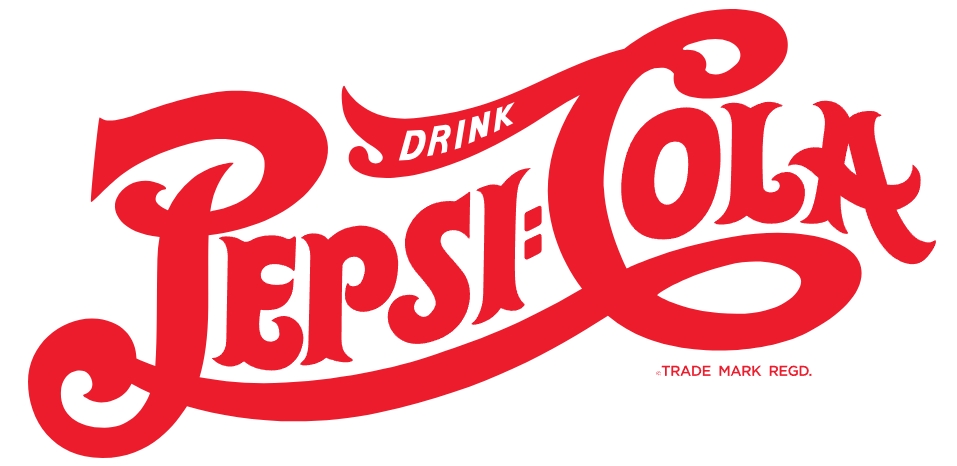
A year later, the logo was updated again, this time using a thicker font. The spikes returned to the edges of the uppercase letters. But the main difference was the addition of the word “drink” at the top – a 20th century CTA!
With this iteration of the Pepsi branding, people started comparing it to their rival brand. The curls and swirls of both their logos looked similar.
1940: The Last All Red Logo
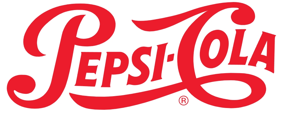
In the years between rebranding, a rivalry developed between Pepsi and their biggest competitor. It was during this time that Pepsi reached global markets for the first time.
This version of their logo is more legible. The font is cleaner and thinner, and there are less curls and swirls. The colon in the middle was replaced with a dash. This is now recognizable as their vintage logo.
1950: Introducing the Blue
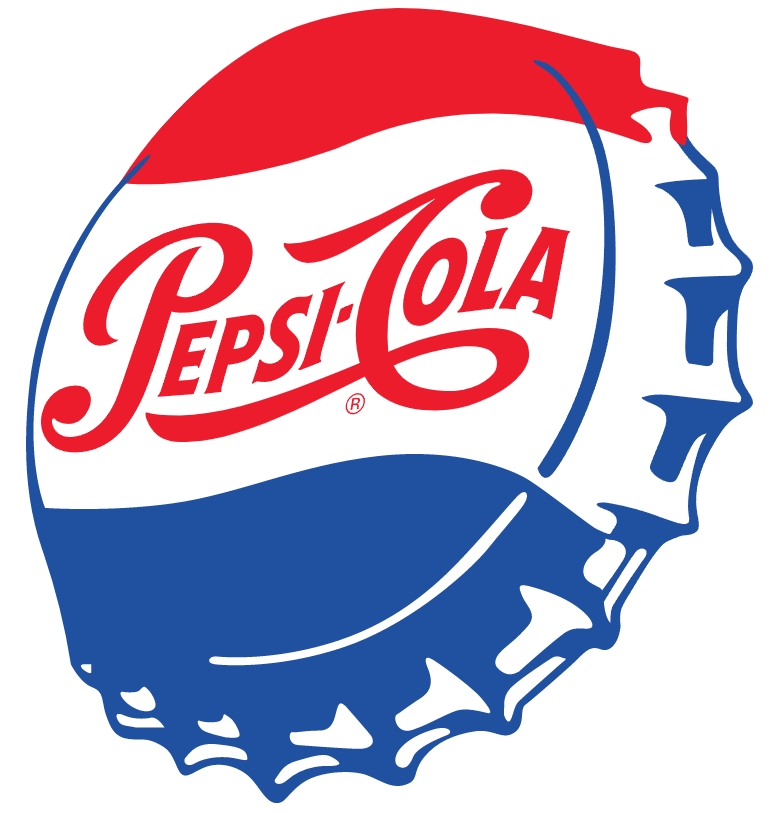
These days, we associate Pepsi with the color blue. But it wasn’t until the 1950s that Pepsi branding started to include this color. Ultimately, this is what set Pepsi apart from their rival on the shelf.
In this iteration of Pepsi’s logo, they created a side-view bottle cap design with the 1940s logo on it. They made use of red, white, and blue, the colors on the American flag. This could have been an expression of patriotism in the post-war era. The circular bottle cap design was also the first step towards the creation of the round logo we see today.
It was also in the 1950s that Pepsi started branding itself as more than just a soft drink. This was when Pepsi’s emotional branding began. They used people in their marketing strategy, e.g., sharing a Pepsi in print ads. This led to the identification of Pepsi as a fun and sociable brand.
Related: Test Your Logo With This Quick Exercise
1962: Dropping the Cola
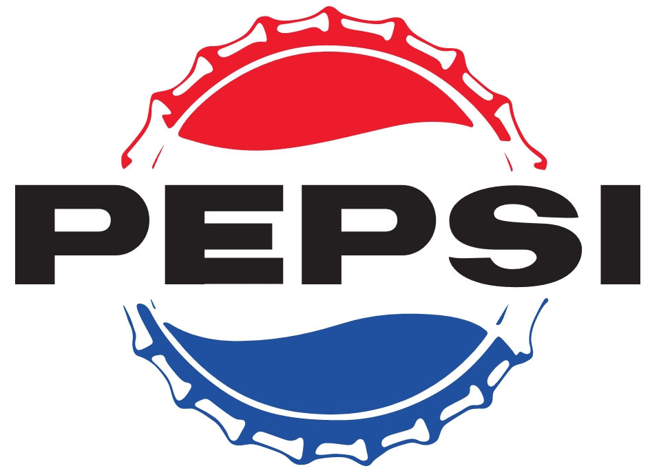
With this redesign, the Pepsi branding team made some noticeable changes. The bottle cap was now front-facing, and the cursive red lettering was gone. This was replaced by bold, black capitals, spelling out the word “Pepsi”. Dropping the word “cola” from their logo was another way for them to differentiate themselves from their rival.
In this iteration, Pepsi started to target themselves more towards the younger generation as well.
1973: Dropping the Bottle Cap
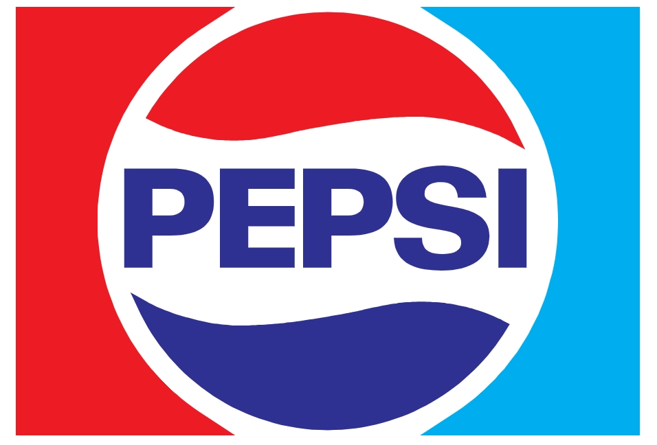
Trying to appeal to a younger demographic, Pepsi changed their logo again, hoping to resonate more with their target audience. For the first time, the bottle cap became a circle. And while the font remained uppercase, it was now blue and contained within the circle.
1973 was also the first time that Pepsi incorporated a colored box background in their logo.
1987: The Pepsi Font
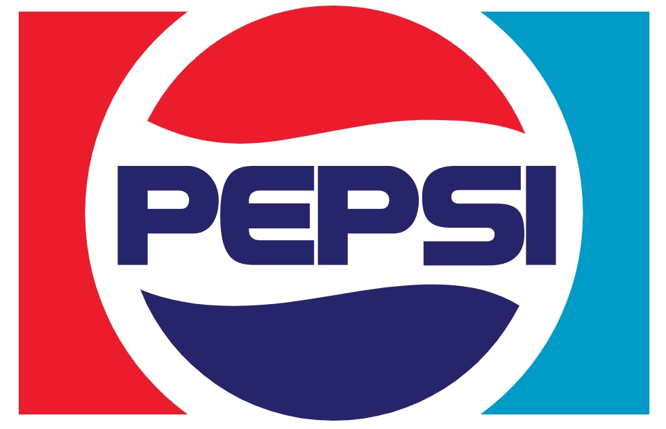
The rivalry in the carbonated beverage industry continued to grow. This time, aiming for a modern and dynamic feel, they created their very own Pepsi font. This typography looks fun and futuristic with its all-caps and rounded edges.
1991: Transformation
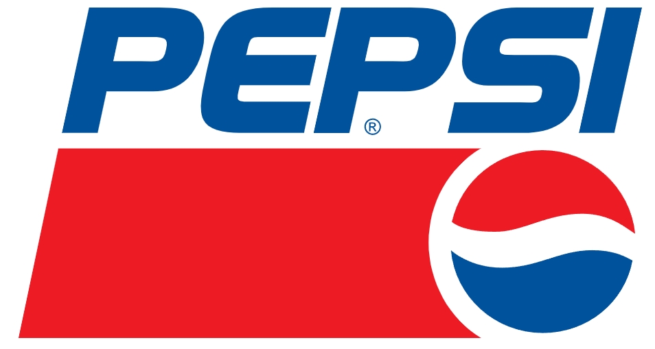
In 1991, Pepsi branding underwent another, more drastic change. The globe icon on their logo shrunk and the Pepsi font was italicized. The brand name became the main focus as it looked like it was underlined by the red bar.
This logo brought Pepsi into the modern age by showing that they could, quite literally, think outside the box. This unconventional and asymmetrical logo was a game-changer in the soft drinks industry during the 90s.
1998: Bluer than Blue
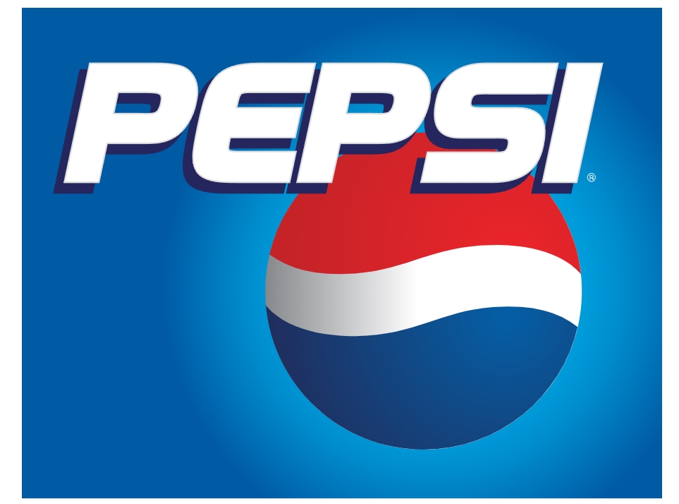
This version of the brand made even more use of the color blue. However, the original Pepsi red remained as part of the globe. The box returned, and they used a blue gradient for the background color.
It was also the first time that they removed the white outline from the circle, so it looked more like a proper globe. The overlapping of the font and image was a successful attempt to further modernize 90s Pepsi branding.
2003: Bevel and Emboss
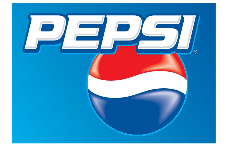
For a more futuristic feel, the early 2000s version of the Pepsi logo was designed to look 3D. The branding team made clever use of shading, shadows, and gradient to make the globe element pop.
2006: Visual Effects
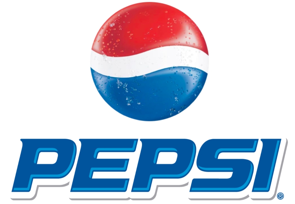
In 2006, they updated the Pepsi branding guidelines again. They stuck with 3D design for this iteration. And the globe was even more prominent as it was placed at the top of the logo. To up their game even further, Pepsi added water droplets to signify their brand as a thirst-quencher. This logo really gives the impression of a cold, refreshing beverage.
2008: Back to Simplicity
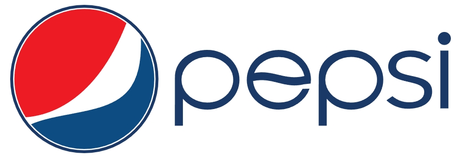
In another huge transformation, Pepsi branding went back to its roots with a narrow, lowercase font and an off-axis, tri-color globe.
This rebrand proved to be very controversial. Omnicom’s Arnell Group was hired to work on the redesign and was paid more than USD $1m. Because of this, Pepsi came under fire for having paid so much for such a simple logo.
Compared to its previous logos, this one was deemed “lazy” by critics. To defend themselves from public scrutiny, Arnell Group publicly discussed the science behind the logo. They said they used the Golden Ratio to determine the perfect angle for the globe and compared it to the Mona Lisa.
2014 and Beyond

Although their 2008 logo was unpopular, Pepsi branding hasn’t changed much since then. The most recent update happened in 2014. They removed the dark outline encircling the globe so the white band blended into the background. The company’s decision to stick with this minimalist and simple design despite the controversy has made the logo more elegant.
The tagline that goes with this logo, “Excitement of Now”, says a lot about its modern look and feel. Furthermore, there’s something decidedly futuristic about Pepsi’s current logo. The vibrant blues and its simple font captures Pepsi’s youthful exuberance and underscores its promise of deep, satisfying refreshment.
To match the updated logo, the company even redesigned the bottles to improve ergonomics. This gave the consumers a more enjoyable drinking experience.
Pepsi’s Inspiration
Looking at this, it’s safe to say that Pepsi has been flexible in how they’ve adapted to the changing times. The Pepsi branding guidelines have been updated over the years to reflect changes to colors, fonts, and icons. And the logos remain minimalist but elegant.
And one thing’s for sure. The people at Pepsi used emotional branding to incredible effect when designing their logos. They did not stick to a single design. They continued to evolve as the world around them changed. People change over time, and so has Pepsi’s logo.
Related: Secrets Behind Famous Brand Logos You Didn’t Know
Final Thoughts
Pepsi’s branding has changed a lot over the years but has remained true to its origins. The way they’ve modernized their logo to keep up with current trends means they think a lot about their customers. They know what is appealing to them, both visually and emotionally.
The “Be Sociable, Have a Pepsi” campaign capitalized on both of these things. They used product placements in advertisements to their advantage, showing people having a great time thanks to their product. And by continually reviewing and updating the Pepsi branding guidelines, they’ve made sure they’ve stayed relevant in a saturated market.
If the evolution of Pepsi branding has inspired you, go ahead and make your own brand kit using Simplified.
Here, you can get brand equity in an instant. All you have to do to create a brand kit is upload your company fonts, colors, and logos. You can also give access to your team members to make sure everyone’s following the same brand guidelines.
In addition to creating a standout logo, you can also generate all kinds of different content for your brand using Simplified. All the elements are already there. Think of this platform as the one-stop shop for all your branding needs.
And do you want to know the best part? Simplified is totally free forever. So, click here to start building your custom brand kit today!


