
The best brand logos are the ones that stand the test of time. Whether it’s for a company or an individual, having a logo is an important part of building your brand. Every brand has a story and every story needs a good logo. While some brands choose to update their logo on an annual basis, others stick with their original design for decades. Let’s talk about a few little-known secrets and Easter eggs behind some popular brand logos!
Amazon
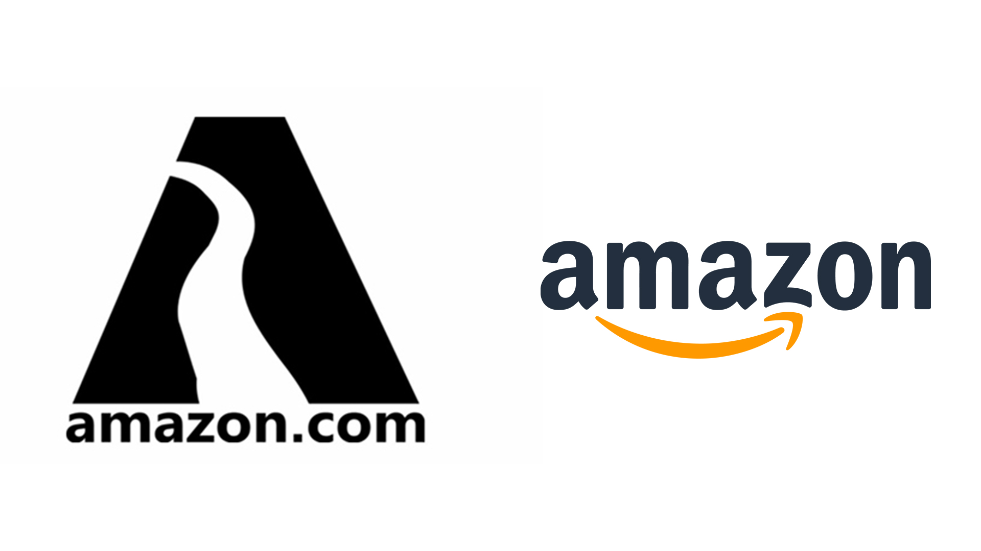
Original Amazon logo (left) and present Amazon logo (right) – Credits: Amazon
History
Amazon was founded by Jeff Bezos from his garage in Bellevue, Washington on July 5, 1994. Starting as an online marketplace for books, it has grown to sell just about everything under the sun. The first logo designed by Turner Duckworth was the letter ‘‘A’’ with a shape of a river inside it. Amazon brand logos have gone over many changes to bring us to the current day logo from 2000.
Design
A clever design element used here is the arrow beneath the logo that resembles a smile. This is used on all their packaging to convey that they ‘deliver smiles.’ Also, the arrow stretches from the letters ‘A’ to the ‘Z’ in Amazon. This symbolizes that Amazon sells everything ‘from A to Z’ and offers an exhaustive catalog for shoppers.
Related: 5 Lessons To Learn From Amazon Brand Strategy
Toblerone
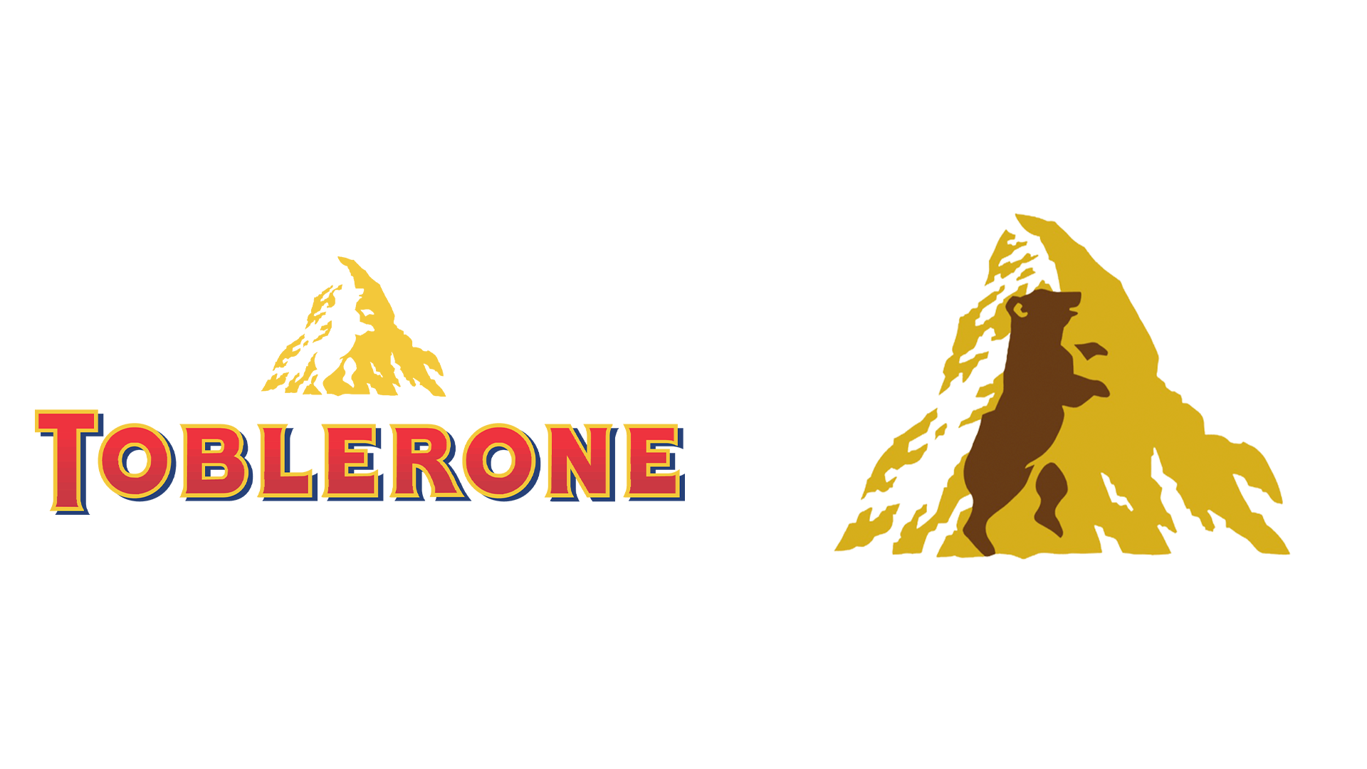
Toblerone logo on the left with the hidden bear, shown on the right highlighted in brown. – Credits: Toblerone
History
Toblerone was created by cousins, Emil Baumann & Theodor Tobler in Bern, Switzerland, in 1908. Emil created the unique recipe and Theodor came up with the iconic triangular shape and packaging. The Matterhorn mountain inspired the triangular shape of the chocolate pieces. However, the famous peak only appeared on the brand logo starting in the year 2000.
Design
What you may not have noticed is the bear in the Toblerone logo. Don’t see it? Look closely to the left side of the peak and you will see a white bear standing on its hind legs. This is a clever use of ‘negative space’; the subject is ‘hidden’ by the elements around it. Why a bear? Bern’s coat of arms has a bear on it! A logo design reference to the birthplace of the famous Swiss chocolate.
Nike
The Nike ‘Swoosh’ – Credits: Nike
History
Nike was founded by Phil Knight and his coach, Bill Bowerman, on January 25, 1964. It has grown into a multinational brand that designs and sells a variety of apparel, footwear, and more. Now, it is the world’s largest supplier of athletic shoes and apparel. However, the iconic ‘Swoosh’ brand logo was created for only $35 at the time!
Design
The Nike Swoosh was designed by Carolyn Davidson, a graphic design student at Portland State University. There she met Phil Knight, who was teaching at the university at the time. Knight offered to pay Davidson $2 per hour for her work to design the logo for Nike. Knight was actually not a huge fan of the design, saying “I don’t love it, but I think it will grow on me.” However, she was later celebrated by the company for her work and given stock in the company!
Related: Nike Marketing Strategy: How They Do It And You Can Too!
McDonald’s
McDonald’s ‘Golden Arches’ – Credits: McDonald’s
History
McDonald’s was started by siblings Richard and Maurice McDonald on May 15, 1940. The first store was opened at West 14th Street in San Bernardino, California. It is the world’s largest restaurant chain, serving over 69 million customers daily. McDonald’s has become a symbol of American fast food across the globe.
Design
The Golden Arches have gone through several changes since the 1960s and reached their current form in 2003. This iconic yellow and red logo is easy to spot and inviting. While you may think the ‘M’ just stands for ‘McDonald’s’, you’d be wrong! It is actually meant to symbolize a ‘pair of nourishing breasts.’ This is due to the Freudian impact it has on the subconscious minds of customers. Psychology plays a huge role in making good brand logos.
Pepsi
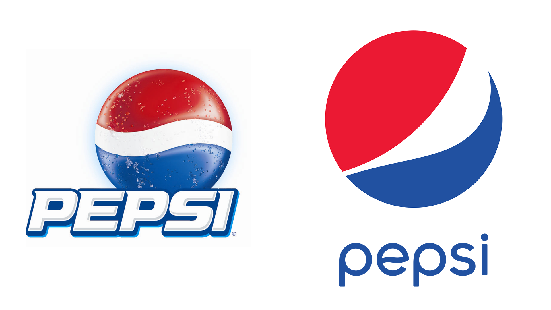
Pre-redesign Pepsi logo (left) 2008 redesigned logo (right) – Credits: PepsiCo.
History
Pepsi was created by Caleb Bradhamis in 1893 and was originally known as Brad’s Drink, being renamed Pepsi-Cola in 1898, and then Pepsi in 1961. The Pepsi brand logos have changed several times. However, the one that we are going to be focusing on is the 2008 redesign. While many of the logo design elements were retained, the redesign cost Pepsi a whopping $1 million!
Design
The brand consultancy agency Arnell Group was hired on a $1 million contract for the logo update. A leaked 27-page memo by Arnell explains the inspiration for the brand logos. It mentions the Mona Lisa, the Parthenon, the golden ratio, the relativity of space and time, and magnetic fields. If that wasn’t enough, it also spoke of the ‘gravitational pull’ of a can of Pepsi on a supermarket shelf. Do you think the redesign was worth $1 million? Apparently PepsiCo. did!


![10 Best AI Image Restoration Tools to Try in 2025 [Free & Paid]](https://siteimages.simplified.com/blog/Best-AI-Image-Restoration-Tools-01.png?auto=compress&fit=crop&fm=png&h=400&w=400 "10 Best AI Image Restoration Tools to Try in 2025 [Free & Paid]")
![How to Use Photoshop AI Generative Fill Feature [2025]](https://siteimages.simplified.com/blog/How-to-Use-Photoshop-AI-Generative-Fill-01-1.png?auto=compress&fit=crop&fm=png&h=400&w=400 "How to Use Photoshop AI Generative Fill Feature [2025]")
![20 Podcast Thumbnail Ideas to Boost Your Show’s Visual Appeal + Best Practices [2025]](https://siteimages.simplified.com/blog/Podcast-Thumbnail-Ideas-to-Boost-Your-Show-02-1.png?auto=compress&fit=crop&fm=png&h=400&w=400 "20 Podcast Thumbnail Ideas to Boost Your Show’s Visual Appeal + Best Practices [2025]")


