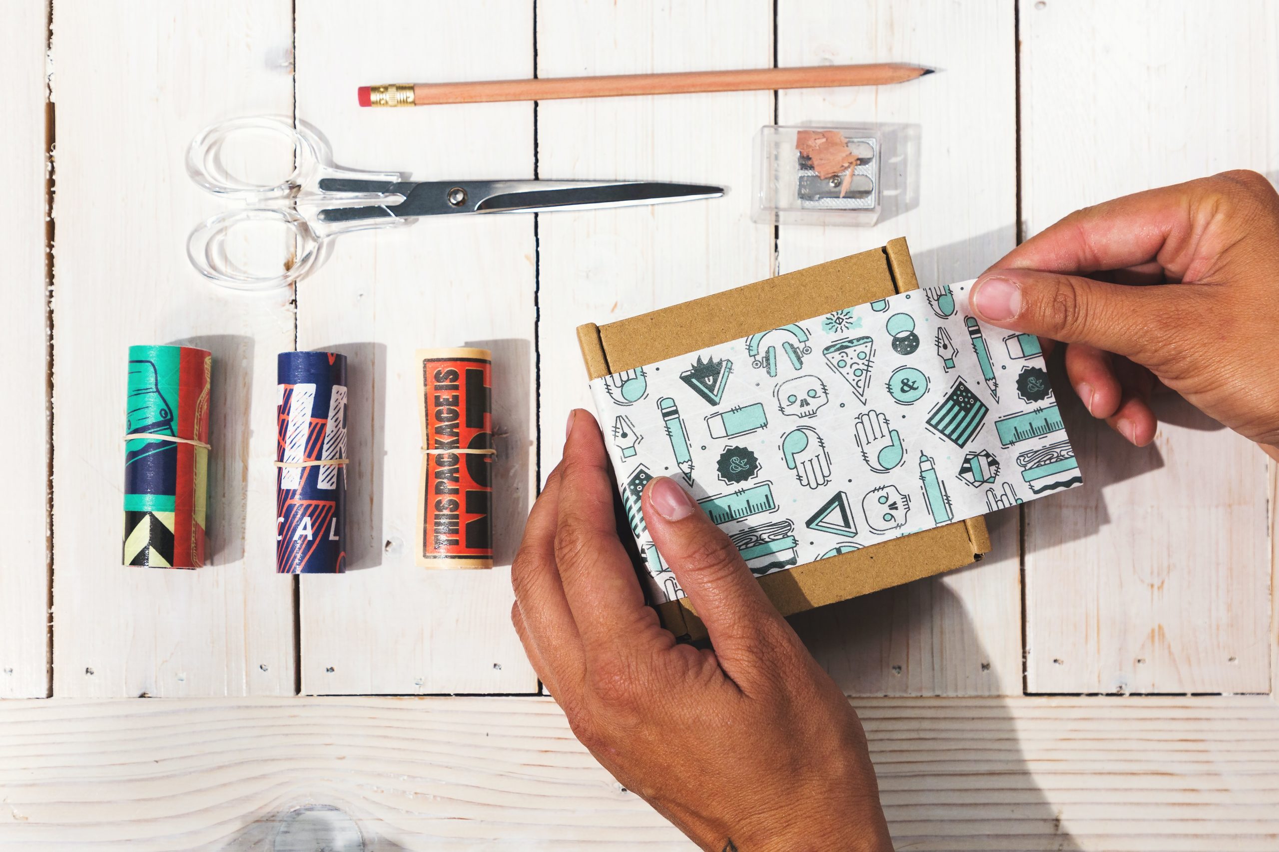
We all have heard that “big things come in small packages.” But chances are that if your product label isn’t attractive enough, it will go unnoticed among others on the shelf. So how do you ensure that all the goodness you’ve sealed in your product stands out and tells your story perfectly? That is exactly what the power of packaging design is all about.
As a product manager or a marketing and sales executive, there’s a huge pressure from companies to gain center-stage at every retailer’s shelf space. And, we all know it’s the showstopper design that will lead the crowd of any type of product, even if what’s inside is generic.
In this blog, we bring to you our top Dos and Don’ts. These pointers will help you make winning packaging designs that can rightly say “All eyes on me!”
Do: Clarity and Simplicity; Don’t: Oversaturate
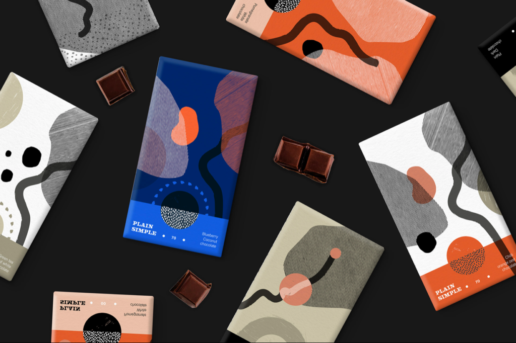
(Credit: Mary Zaleska)
Keep your food label designs simple, so they don’t distract from what’s inside!
“72% of American consumers say their purchasing decision is influenced by the packaging design.” – Ipsos
Often, at convenience stores, people get rightly confused about what the product in their hand is supposed to be. And to the employees’ dismay, it’s just a basic product with an irrelevant design overload.
The key to a simple, yet efficient design is how clearly the product packaging design conveys your brand message. Have clarity with your consumers about what’s inside and leave no room for questions. What’s most important in this process is to have the right balance between what you want them to see, what you will have to read.
For example: As a skincare brand that promotes cruelty-free ingredients, a colorful branding package may send the wrong message. Or worse: as a window cleaner company, your product label, and colors being similar to a soda brand (like Windex and a Blue Fanta)!
Don’t: Underestimate guidelines; Do: Cost-Efficiency
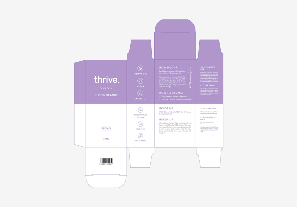
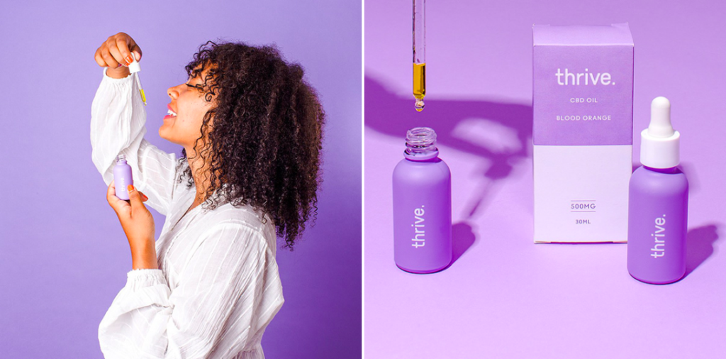
(Source: Mustafa Akülker)
Consistency for any brand packaging is to stick to the colors and visual identity
“61% of consumers say they are much more likely to repeat a purchase of a luxury product if it came in premium packaging.” – Dotcom Distribution
Every manufacturing company has set rules about the colors and dimensions of a packaging design. Your job as a brand is to envision your creativity from the perspective of a buyer and ensure that it adheres to a pattern of what works and what doesn’t.
Some ways to achieve this, are:
- Creating comprehensive guidelines
- Calculate cost of printing and designing
- Work according to the technical specifications of the manufacturer
Do: Variations; Don’t: Restrict
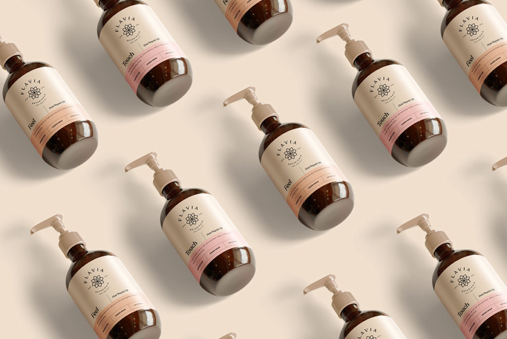
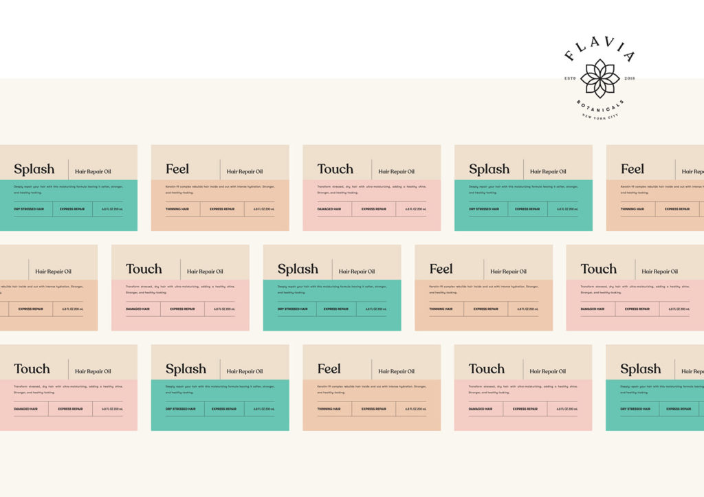
(Source: Marka Works)
Good brand packaging is one that offers multiple design variants under the same line!
When you go into a grocery store, it’s not uncommon to end up finding new variants by your go-to brand. A restrictive design would be one that is too exclusive for just one package. It would need multiple stages of designing (super expensive!). Extensions to a company’s line of products can be possible if you have a brand packaging that allows you to make slight changes to the colors- without having to redo the entire label.
This not only helps in building a consistent brand image but also ensures the recognisability of your products. Our suggestion? Stick to your brand kit for specified color palettes, typography, and logo variations.
Simplified Design Tip: Have a packaging design idea in mind but don’t know how to start? Try using a brand kit to organise your assets and create unlimited graphics for your sales or promotions- right here on Simplified!


![10 Best AI Image Restoration Tools to Try in 2025 [Free & Paid] 10 Best AI Image Restoration Tools to Try in 2025 [Free & Paid]](https://siteimages.simplified.com/blog/Best-AI-Image-Restoration-Tools-01.png?auto=compress&fit=crop&fm=png&h=400&w=400)
![How to Use Photoshop AI Generative Fill Feature [2025] How to Use Photoshop AI Generative Fill Feature [2025]](https://siteimages.simplified.com/blog/How-to-Use-Photoshop-AI-Generative-Fill-01-1.png?auto=compress&fit=crop&fm=png&h=400&w=400)
![20 Podcast Thumbnail Ideas to Boost Your Show’s Visual Appeal + Best Practices [2025] 20 Podcast Thumbnail Ideas to Boost Your Show’s Visual Appeal + Best Practices [2025]](https://siteimages.simplified.com/blog/Podcast-Thumbnail-Ideas-to-Boost-Your-Show-02-1.png?auto=compress&fit=crop&fm=png&h=400&w=400)


