What comes to mind when you think of texture? Most of us think of texture as something we feel when we run our fingers over an item. Like a soft pashmina or a smooth stone. In physical art, the texture is determined by the materials used – paint or carved stone, for example.
When it comes to texture in graphic design, artists aren’t limited to the materials they use to achieve texture. Instead, they use a variety of tools and techniques, such as photography, textured backgrounds, overlays, and more.
In this blog, we will cover exactly what texture in graphic design is and why you should use it. We’ll then take a look at how you can incorporate it into the designs you create. Let’s dive in!
What is texture in graphic design?
In graphic design, texture is a visual element that creates a 3D illusion using various artistic tools. In digital design, where textures are implied rather than actual, texture can be used to add visual interest and depth.
Texture uplifts other visual elements like patterns, colors, illustrations, content, and more. It also helps create compelling and lifelike design projects. The kind you feel you could almost reach out and touch!
Here are some examples of texture in graphic design.
– Paper and artificial textures
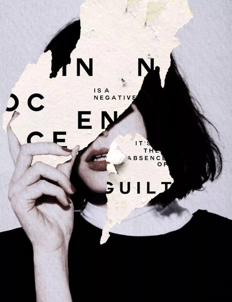
This graphic uses washed-out textiles, crumpled paper, and an uneven wall surface to create texture.
– 3-Dimensional Texture
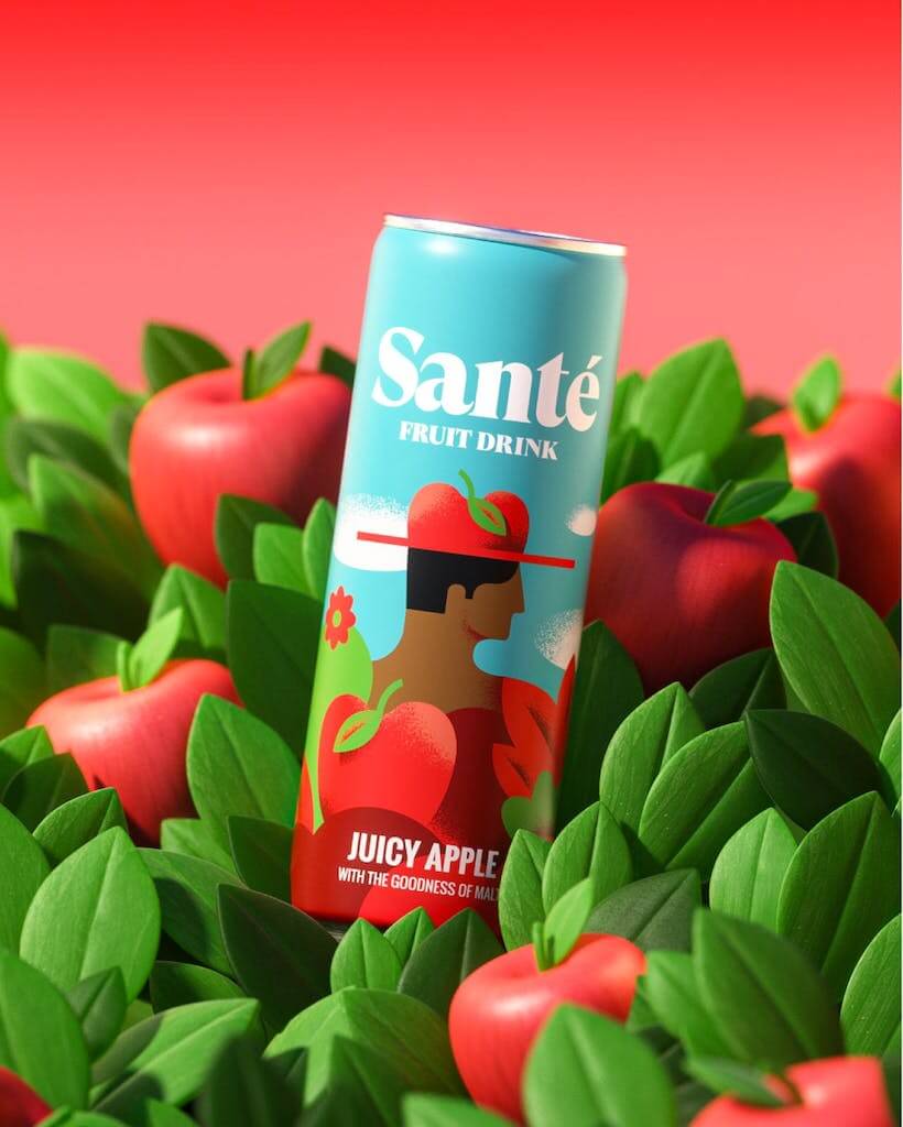
In this graphic, the leafy background is layered in a way that gives the design a 3D effect.
– Typography as texture
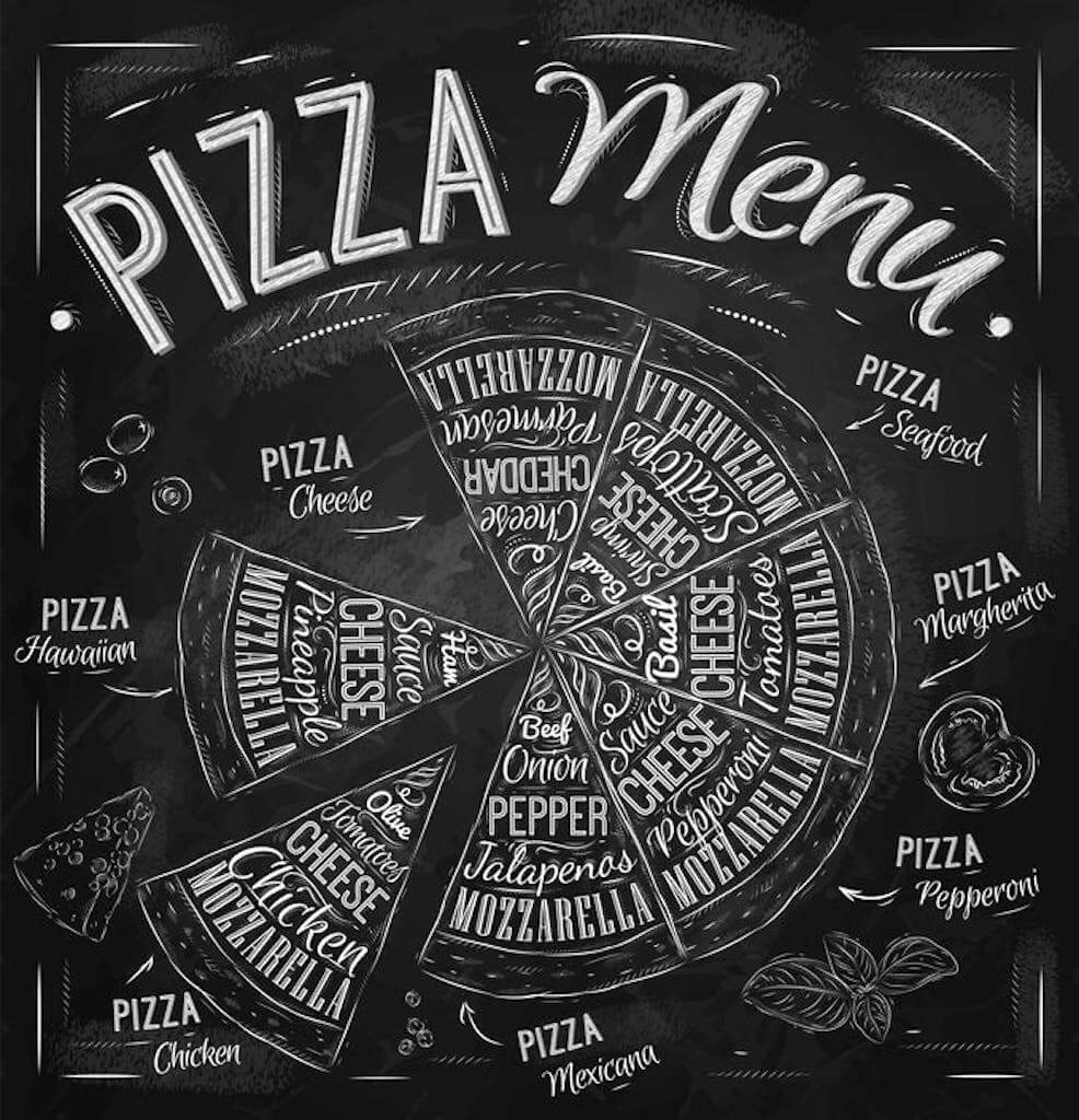
This creative typography project shows how texture can be used to emphasize specific elements of a design – in this case, a Pizza Menu.
Related: Using Typography In Your Digital Designs Re-Edits in 2023
Why should you use texture in graphic design?
Textures in graphic design work can quickly bring an extra layer of meaning to a previously static image. As a result, it’s a powerful tool to grab a viewer’s attention and engage them in your design. Specifically, the role of texture in graphic design is to:
1. Build visual interest
A texture is associated with a sense of feel, which draws all the viewers’ physical and mental attention to the graphics. This means adding it to graphic designs can relay a particular message and inspire desirable emotions to your target clients.
2. Evoke an emotional response
Texture can be a powerful tool to engage your audience in many ways. Certain types of textures can evoke subtle emotional responses, while others excite the visual senses. Texture can also be used to create balance and enhance a sense of seriousness or gentleness.
3. Build your identity
You can use texture in graphic design on websites and social media content to showcase a well-defined identity. Your graphic designs should fit your brand identity and send out a specific message to your audience.
To illustrate our point, here is the difference between a non-textured and textured graphic design.
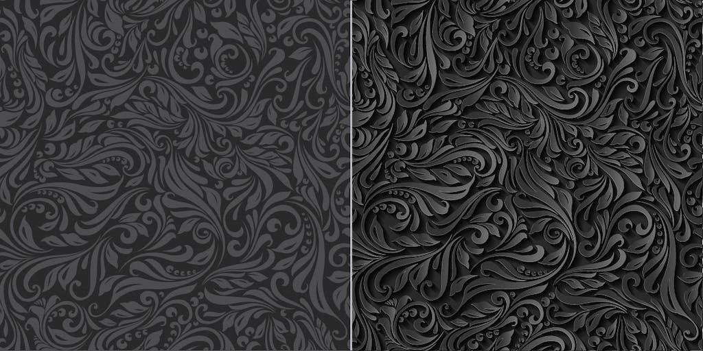
On the left is an untextured digital pattern. It looks:
- Flat
- Unrealistic
- Like it lacks depth
The right side is how it appears with an added effect:
- 3-dimensional
- Has weight
- More realistic
- Like an intricate carving with grooves
Texture in design, therefore, brings a real-life element and feel to your graphics.
How to use texture in graphic design
Now that we understand the importance of texture in graphic design, let’s explore ways to use it. Read on as we discuss different types of textures and explore some real-life examples.
1. Add a textured background
The first and easiest way to add texture is with a background.
Textured backgrounds are one of the most powerful tools for creating visually provoking graphic designs. They do this by creating an accent that captures attention using bright colors and diverse shapes.
Background textures and photographs are a clever way to send a message visually, without even needing to add copy, as the image speaks for itself.
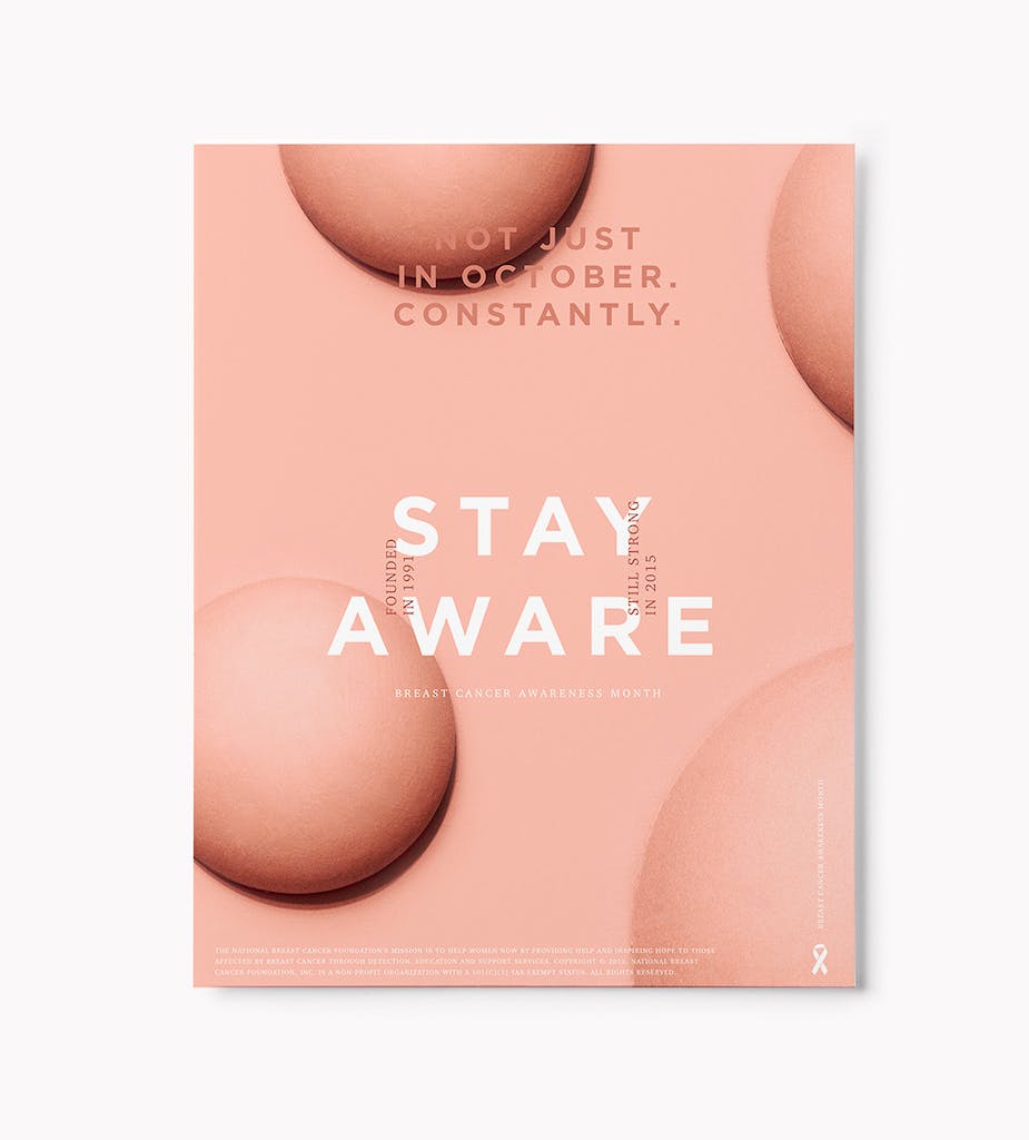
The Saxon Campbell breast cancer awareness poster includes a textured background, rounded shapes, and the color pink. This combination reminds us of their core message without needing to include a raw image.
2. Add layers to your design
There are two elements to texture: three-dimensionality and “feel,” which refers to the finer characteristics of form. In the real world, these can never be separated, but in design, they can be.
One way to convey three-dimensionality without necessarily dealing with “feel” is through the overlay. To convert 3D objects into 2D graphics, designers can adjust opacity and transparency.
The image below gives the impression of several successive layers receding back into space.
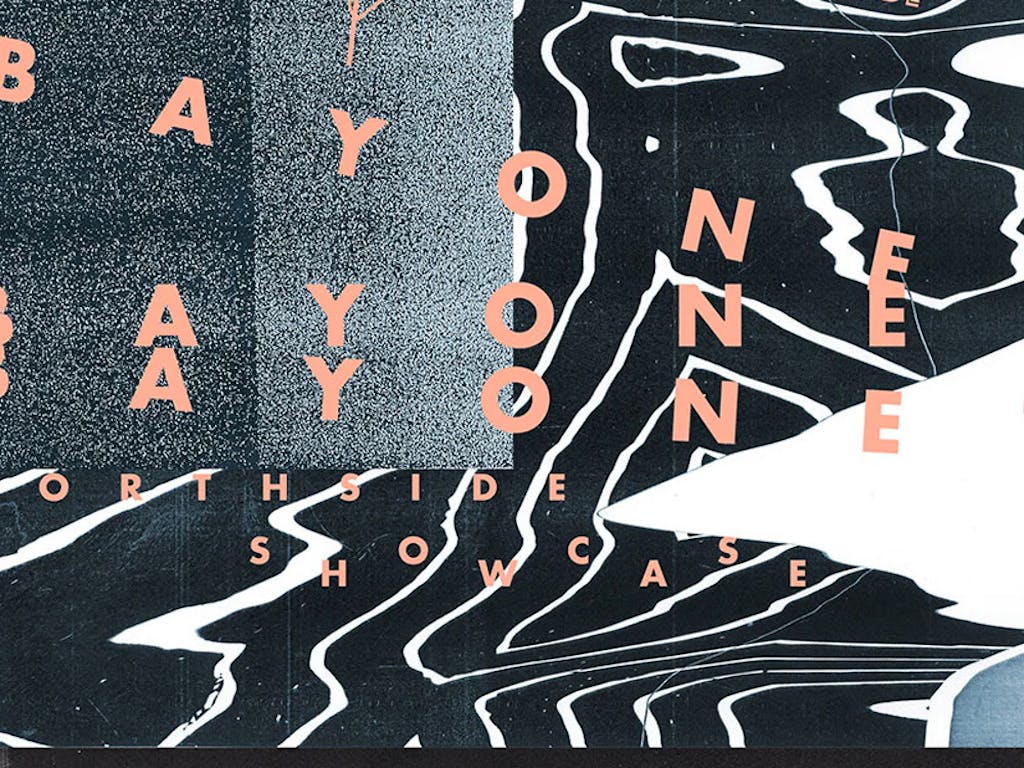
The scattered letters create an immersive image and are combined with high-transparency letters which appear as if they’re in the distant background.
3. Incorporate photography
Visual interest can also be added to graphic compositions through the use of photographs. In photography, playing with transparency and color adjustment works wonders in creating a sense of texture.
Below is an example of photography used as texture. The geometric patterns and colors are used to create visual interest and evoke curiosity in a black and white scene.

Related: The 10 Best AI Graphic Design Tools You Need To Know About
4. Experiment with textured typography
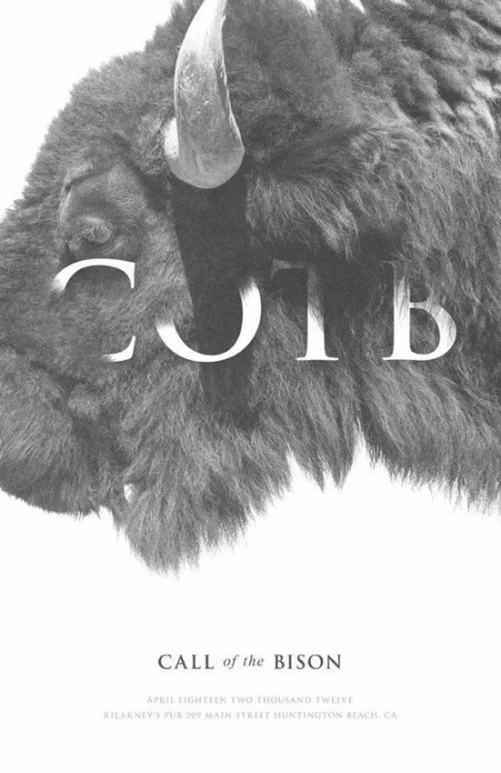
Texture can be combined with typography to create stunning and memorable effects. Because of its subtlety, textured typography can add a modern twist to minimalistic designs.
Depending on type size, shape, color, and texture, typography art can create a powerful statement without the need for complex design compositions.
Related: Why And How To Use Typography In Your Digital Designs
5. Go natural
Organic textures are trending and evoke a feeling of nature. If you want to refresh your viewers’ minds with colorful graphics, try nature-based textures. Brands, such as Patagonia and Numi Tea, that promote sustainability and market natural products often use organic textures. This helps them to get their key message and values across.
Bringing the natural world onto a digital platform using vivid textures also encourages customers to follow their imagination. Instead of explicitly stating your point, the image speaks for itself.
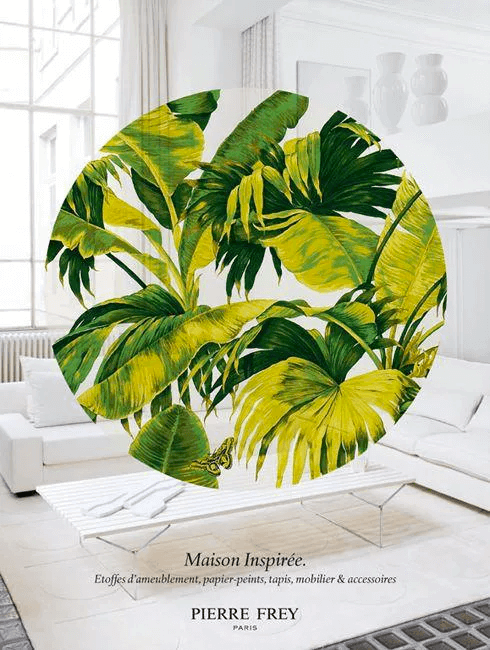
In the poster above, the designer has managed to strike the perfect balance between natural texture and minimalist art. The circle of leaves grabs the attention of the viewer due to its color, shape and texture. This then contrasts brilliantly with the white background to create a warm, clean, and organic design.
6. Make it multi-dimensional
Want to use your technical skills in graphic design? How about using texture to transform a simple, static element into a design with a 3D effect.
By using the power of modern 3D visualization software, designers can add a broad range of artificial textures to their designs. As a result, the final graphic is limited only by imagination! 3D images allow viewers to experience products from all angles, making them more life-like.
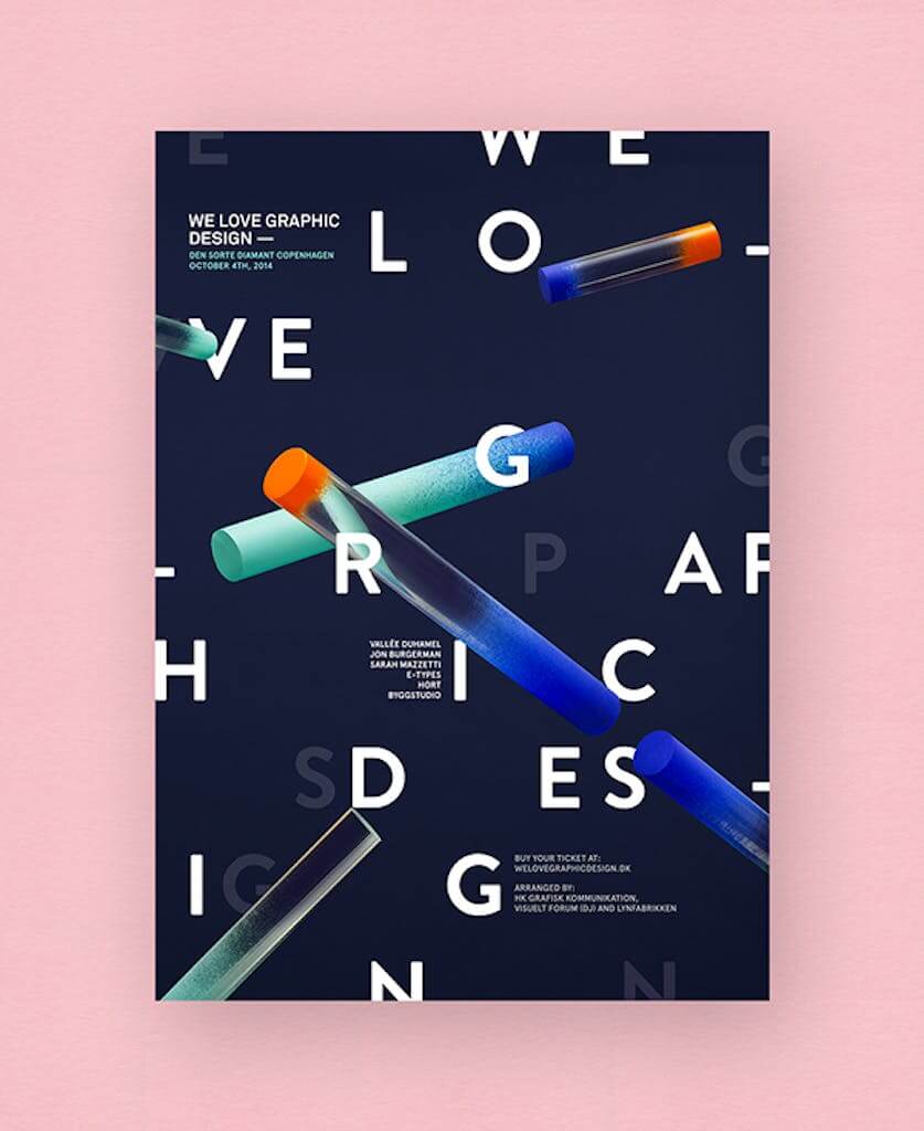
The visual identity for We Love Graphics Design 2014 shows how the right use of different elements can create a three-dimensional feel. The scattered letters create an immersive image and are combined with high-transparency letters which appear as if they’re in the distant background. The 3D objects are also placed over each other to create a sense of depth.
In summary, when it comes to using texture in graphic design, there are several ways to create more alluring compositions. Along with diverse shapes, patterns, colors, and other visual elements, the texture will be the “icing on the cake”.
Simplify Graphic Designing with Simplified
Graphic design is a core part of successful marketing and branding. You need graphics everywhere from your website to your social media pages and even outdoor billboards.
At Simplified, we understand how tough it can be to create enticing graphics that draw your audience in. That’s why we launched a tool that can help you do it all.
With Simplified, you can design anything you like, scale your brand, and even collaborate with your team. We have hundreds of beautiful templates for you to use, or you can start from scratch. Either way, you can create eye-catching brand assets and videos that incorporate texture effortlessly.
Once you’re done, simply publish with one click to reach your customers wherever they are.

![10 Best AI Image Restoration Tools to Try in 2025 [Free & Paid] 10 Best AI Image Restoration Tools to Try in 2025 [Free & Paid]](https://siteimages.simplified.com/blog/Best-AI-Image-Restoration-Tools-01.png?auto=compress&fit=crop&fm=png&h=400&w=400)
![How to Use Photoshop AI Generative Fill Feature [2025] How to Use Photoshop AI Generative Fill Feature [2025]](https://siteimages.simplified.com/blog/How-to-Use-Photoshop-AI-Generative-Fill-01-1.png?auto=compress&fit=crop&fm=png&h=400&w=400)
![20 Podcast Thumbnail Ideas to Boost Your Show’s Visual Appeal + Best Practices [2025] 20 Podcast Thumbnail Ideas to Boost Your Show’s Visual Appeal + Best Practices [2025]](https://siteimages.simplified.com/blog/Podcast-Thumbnail-Ideas-to-Boost-Your-Show-02-1.png?auto=compress&fit=crop&fm=png&h=400&w=400)
