Colors not only make life beautiful and vibrant but are used by animals as well as plants to announce danger, attract a mate, or trick predators. Even we humans use colors in our daily lives to send out subtle messages. Think about the way we dress – sober colors are worn for formal occasions, while bright reds and yellows are celebratory. If we want to mark something as important, we use red or yellow to highlight it. Green usually means ‘go’ and so on.
Blue is one of the most common colors used in web design. Besides being versatile enough to complement a whole range of other colors, it tends to convey a sense of professionalism. In this article, we’ll go over everything you need to know about how to mix, match, and position blue in design. So, before you start designing with blue using Simplified, you have a good foundation on its utility.
Color plays a huge role in the way we consume content on the World Wide Web. They are used to influence, draw attention to, and convey countless emotions to our fellow humans through art, advertising, marketing, and much more. We will dive into the special status that the color blue enjoys in design, but first, let’s take a quick look at some principles of color harmony.
The Color Wheel
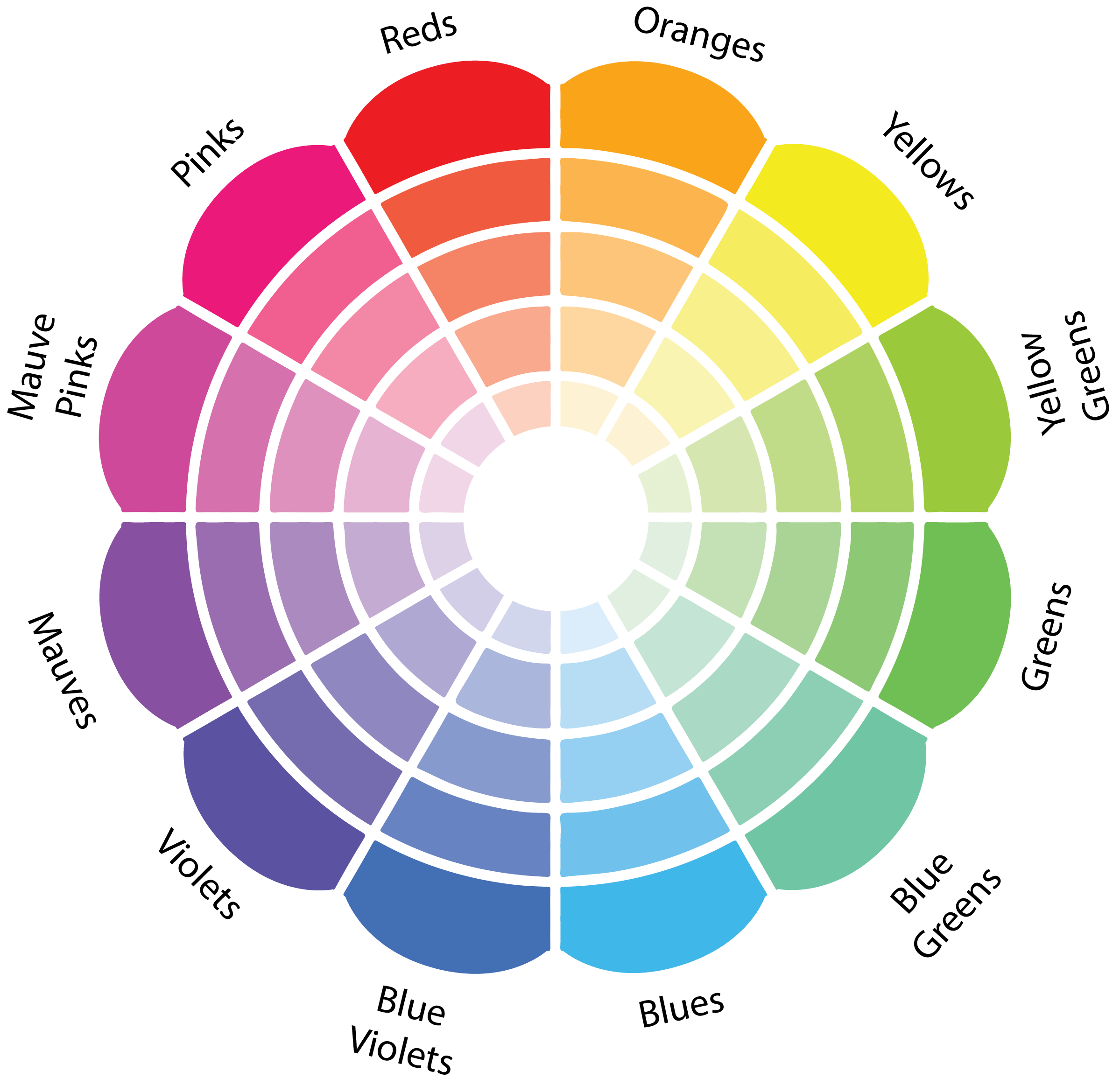
You may have seen some version of this Color Wheel before. It was first designed by Moses Harris and published in his book, ‘The Natural System of Colors.’ From three primary (or ‘primitive’) colors i.e. red, yellow, and blue, Harris teased out 18 colors. When all these colors are placed one on top of the other, you will get a solid black color.
What are Complementary Colors?
Complementary colors are placed opposite one another on the color wheel. When combined, two complementary colors cancel each other out by making some shade of grayscale like white or black. But when they’re used next to each other, they contrast very strongly to create an effect that is pleasing to the eye.
The traditional sets of complementary colors (based on the Red-Yellow-Blue color model) are
Red-Green, Yellow-Purple, and Orange-Blue
Using blue and blue complementary colors for branding
“The appeal of blue and blue complementary colors, according to experts, isn’t just a fad of the moment. How do we know? As early as the 1940s, when scientists started asking people about their color preferences, tons of people picked blue. That was despite researchers asking thousands of people in hundreds of countries. It was a global phenomenon among young and old, the rebellious and the conservative, Eastern and Western.” – Jessica Stillman, The Inc
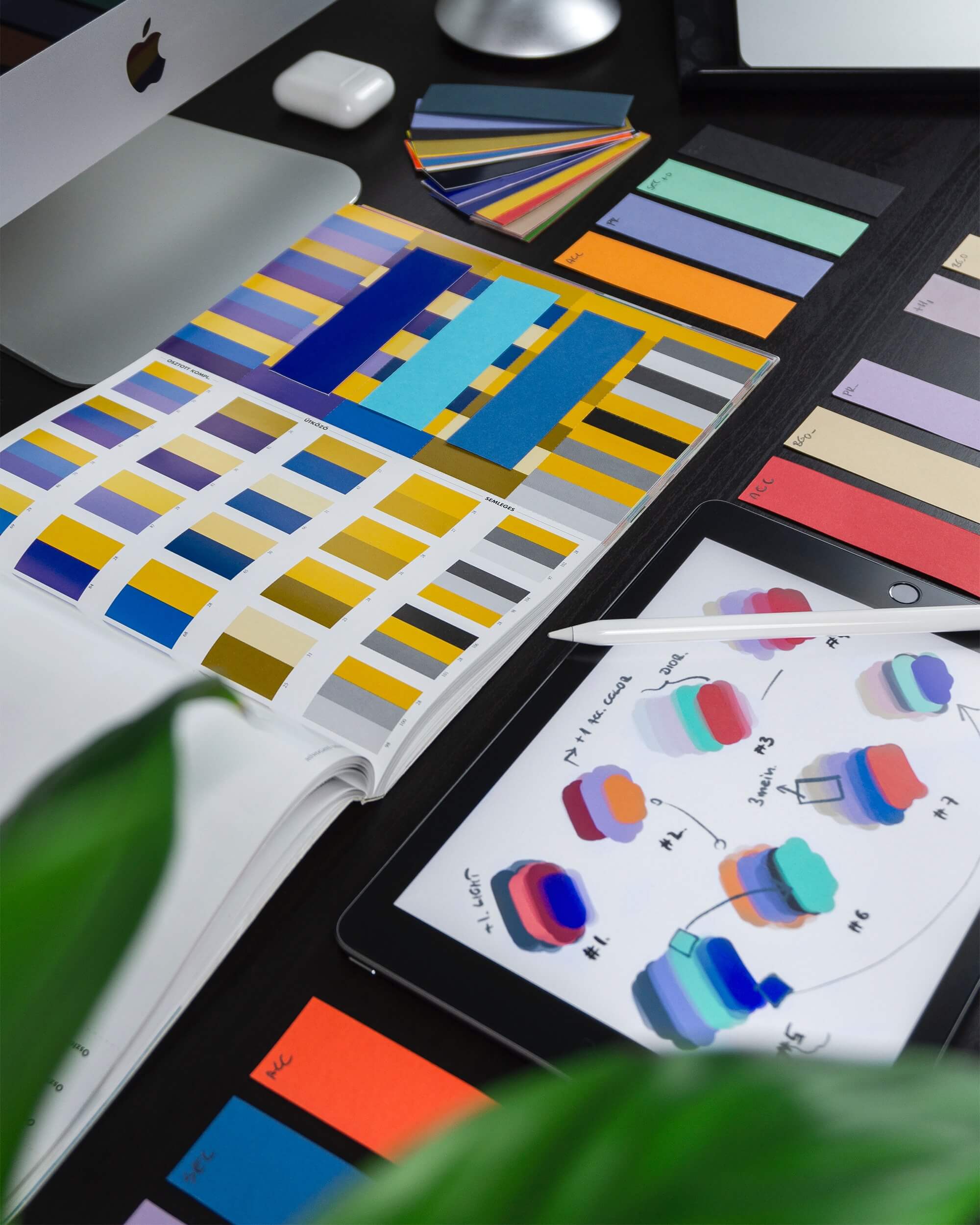
And it’s not just a preference, as Stephen Westland, Professor of Color Science and Technology at the University of Leeds, explains to The Conversation:
“The world’s favorite color also has measurable effects on the body. Red light does seem to raise heart rate, while blue light lowers it. The effect is small but has been corroborated in a 2015 paper by a group in Australia.”
It didn’t take long for the marketing industry to take advantage of the countless benefits of using blue and complementary colors of blue to create more persuasive creatives. When used right, blue and the colors that complement it can create a sensation of trust and security. It’s no wonder so many brands gravitate toward it.
Popular Brands that Use Blue in Their Designs
It was Smashing magazine that reported the shade of blue used in design impacted the way designs were perceived. While light blues are calming, brighter shades are seen as energizing. Dark shades, like navy, indicate strength and reliability.
1. LinkedIn

The professional networking site LinkedIn uses blue in its logo to develop trust, intelligence, and security for its users.
2. Skype & Zoom

The video calling apps Skype and Zoom use blue to convey a sense of loyalty, security, and trust to their users.
3. Calm

The meditation app Calm uses various hues of blue, using the properties of tranquility of the color.
4. The Guardian

This digital news website and app, The Guardian, uses blue to give a sense of security, trust, intelligence, and integrity to its readers.
5. Google

Google experimented with 41 shades of blue for its logo to make the most of this universal hue.
Bonus: The Ultimate Guide To Analogous Colors & How To Use Them
6. Ikea

The instantly recognizable blue and yellow IKEA logo was designed to give viewers a sense of cheer and upliftment. Blue is used to draw attention, while yellow was chosen for its optimism. The two colors contrast beautifully.
7. Pepsi

The Pepsi logo was thought up during the Second World War, and its colors of blue, white, and red
were chosen as they matched the colors of the American flag. It was designed to connect with a deep sense of patriotism that was very relevant during that time.
8. Meta

Meta’s infinity symbol logo is stylized and uses two shades of blue set on a white background. Interestingly, the Facebook logo also features a blue-and-white combination.
These two aren’t the only ones with the blue-and-white combination. Together these colors connote a neat, clean design with a strong sense of professionalism.
9. Prime Video

Prime Video’s logo draws from the original Amazon logo, but in this case, the colors are a dynamic shade of blue paired with a simple black. These colors were chosen to project confidence and to bring a sense of balance to the design.
10. PayPal

Paypal uses two shades of blue to spell out its name. This is usually set against a white background. Not only are they trying to stand out from other brands in their sector, but this combination of colors is meant to convey trust and open communication.
11. University of Oxford

Pantone 282 hex code #002147 is officially the ‘Oxford Blue’ known as the color of the University of Oxford.
12. Detroit Pistons

Stepping away from the blue-white combination for a moment, here we have the Detroit Pistons. This NBA team has always favored bold yet, simplistic designs. This logo lets that memorable blue-red combination take the lead.
What are hex color codes?
Just as we see wavelengths of light as red or blue, computer systems see color through hex color codes. So, when you want a web page or an app to display a certain color, instead of typing the color’s name, you type in the hex code.
As writers/coders at the problem site explain,
Hex colors are based on the RGB color model that has been in use since the early days of photography. The theory behind the model is that you can create virtually any color the eye can see by assigning different combinations of red, green, and blue color values. Televisions, digital cameras, and video projectors and practically every computer and phone screen in existence use the RGB color model.
Trying Blue in Your Design With Free Templates on Simplified
Simplified is an excellent resource for new designers or busy business owners who need support with design. Here are free templates that use blue in their design from Simplified
- For a tech-forward feel, the blues in this are mildly neon, with pops of bright pink and orange for contrast. The transparency of the blue in the center adds to the overall futuristic design theme.

2. Simple and on point, this design aims to focus on the messaging, which is written in white. This contrasts nicely with the deep solid blue background. The pattern of concentric lines in the center adds depth and breaks up the bold blue nicely.

3. Light, almost fairy-like blue, has been used very effectively to create this dreamy design.
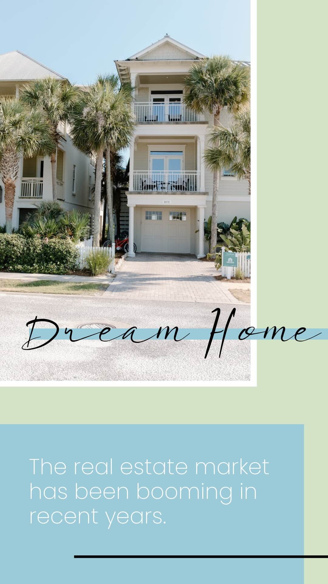
4. How do you use a lot of blue without making it overwhelming? Mix and match different shades! From the deep blue base to the turquoise blue of the pool and soft, clear skies, this design is a tutorial in balance.
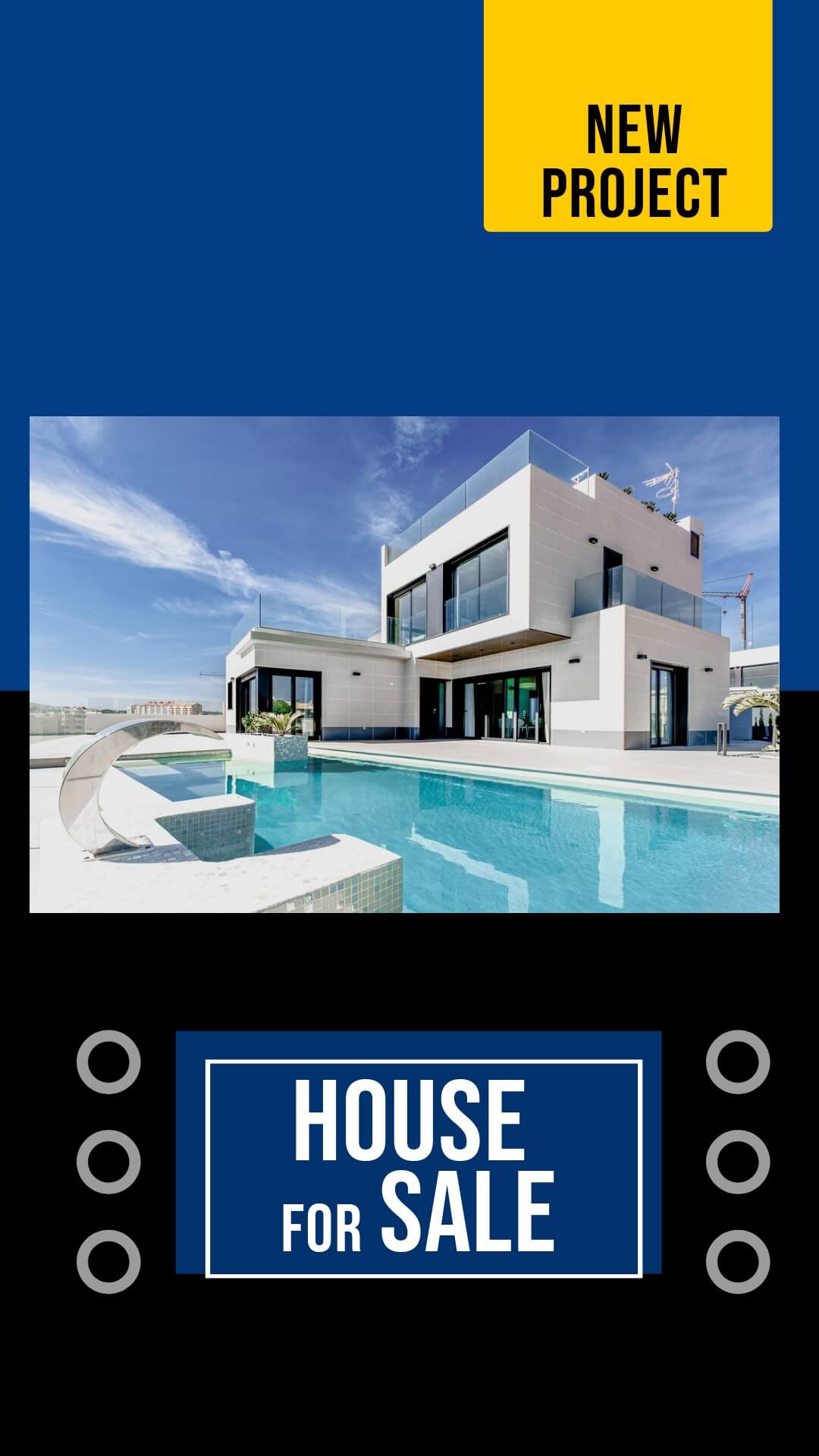
5. Simple and straightforward, white contrasting with two shades of blue.

6. An interesting way to draw an audience’s eye to the message. The shades of blue here have been stylized to showcase a range of shades. This creates an aesthetic background while the solid white text brings a sense of balance to the design.
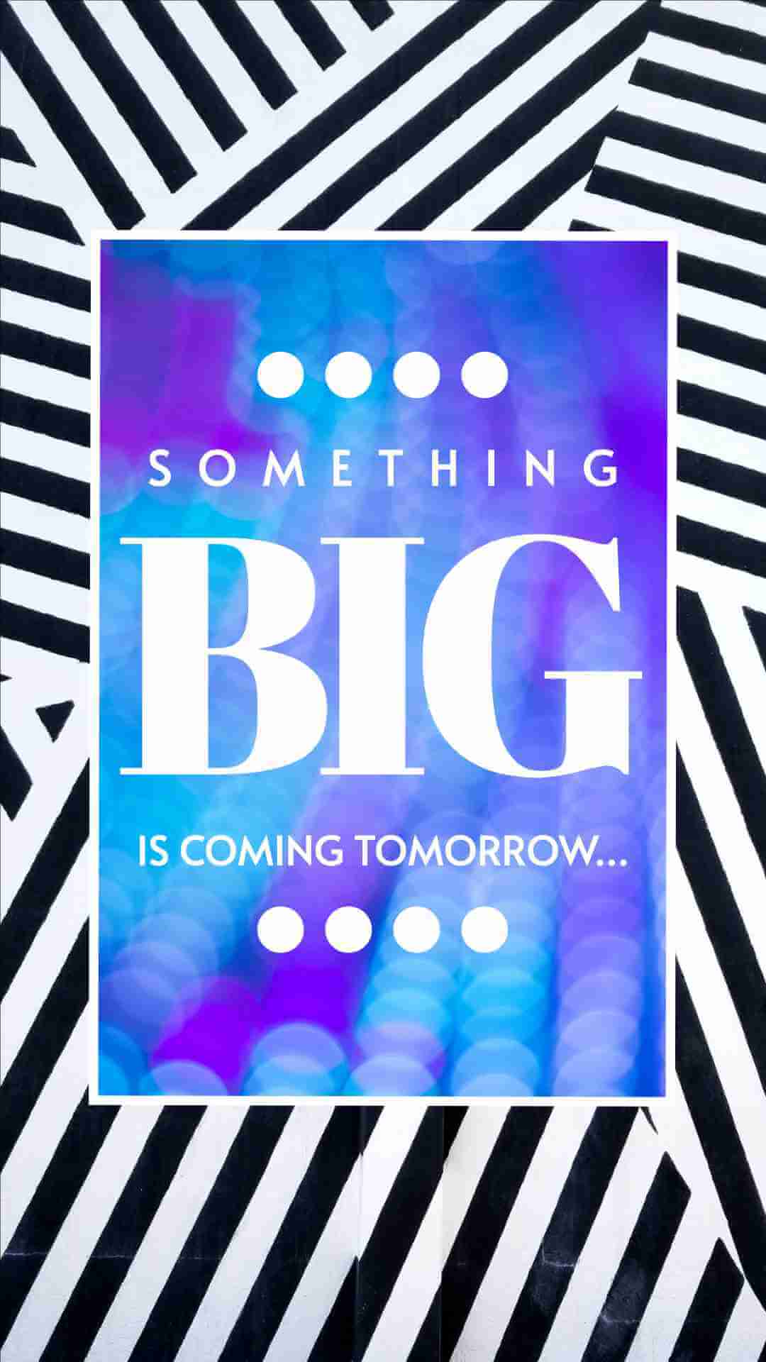
7. Use blue to draw the eye and make a nice, splashy backdrop to the central image and message!

Simplified is an equally great tool for novices to design as well as for experienced designers. Besides offering you excellent design tools, you also have access to an extensive library of free templates.
Bonus: Exploring 2024 Color Trends in Graphic Design & Social Media
Psychology and Symbolism of Blue in Design
Blue is a very popular option in design, especially for companies, because of the associations that this color has. Since it is the color we often use to depict clear skies and beautiful seas, it indicates a link with nature. Different shades are used to create differing positive notes. For example, light blue is as calming as a clear sky, while turquoise blue shades are reminiscent of a warm, tropical sea.
Using a bright blue shade of blue tends to connote themes of reliability, security, and loyalty. This is why there are so many logos in blue. There’s no doubt that blue ushers a sense of positivity and calm.
However, you should be careful not to use too much blue in your design. While shades of reds, oranges, and yellows are ‘warm’ colors, blue is a ‘cool’ color. When used too much or incorrectly, it can feel cold and impersonal. Overdoing the blue can be associated with feelings of sadness (feeling blue). Very dark shades of blue are reminiscent of stormy skies and chaos, which is unsettling.
Blue is generally a safe color choice for most designs. However, always think twice about how much and which shades of blue you use. Discover more tips on how to use color and more in your design projects.
Have trouble matching shades? Try the Color Palette Generator!
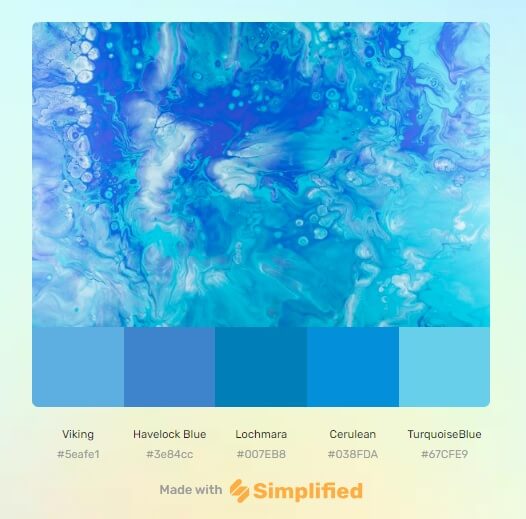

This quick AI color palette generator tool will generate the color shades for your design in seconds. All you have to do is upload a photograph from which you want shades generated, and this tool will do the rest for you.


