We could call movie posters elevator pitches for films, but let’s call a spade – a movie poster is bait to get audience into the movie theatres. Your movie poster design makes and breaks how the audience perceives you. We at Simplified have created the dogma every movie poster designer must follow to ensure a full house.

History of Movie Poster Design
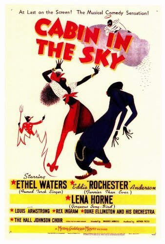
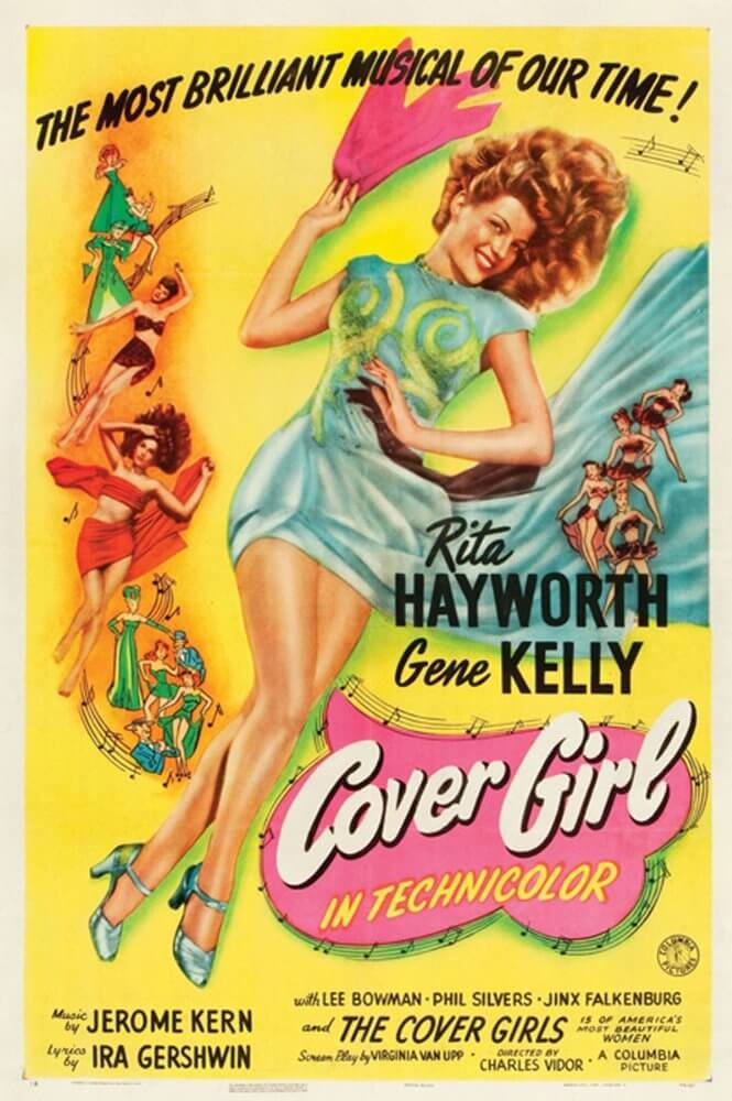
In the United States, film posters were usually returned to a nationwide operation called the National Screen Service (NSS), which printed and distributed most of the film posters for the studios. However, from the mid-1920s to the 1940s, American film studios hired famous artists and illustrators such as Al Hirschfeld, Hap Hadley, Ted Ireland, and Louis Fancher to develop their own style. For instance, MGM was known for its highly polished posters that used pastel color schemes on white backgrounds. In contrast, 20th Century Fox was famous for using rich and vibrant colors in its film poster design. Similarly, Colombia Pictures saw the popularity of colored graphics amongst the audience and pioneered the “fake color” process.
The Anatomy of a Movie Poster Design
To create buzz about an upcoming film, your movie poster design should aim to achieve the following:
- Give an understanding of the genre
- Capture the interest of spectators
- Broadcast the main idea of the picture
- Introduce the main actors
- Publish a release date
Movie Poster Design Basics: Standard Size
There is no strict rule about the size of a movie poster.
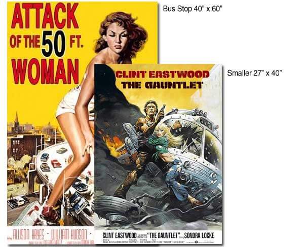
Common Movie Poster Sizes
| Size | Usage | Aspect Ratio |
|---|---|---|
| 27 by 40 inches (One-sheet) | Used to promote movies in theatres | Slightly more than 2:3 |
| 40 by 60 inches | Used to advertise at bus stops and subway stops | 2:3 |
| 24 by 36 inches (Architectural D) | Sold by retailers to customers | 2:3 |
Bonus: 7 Tips For Creating The Perfect Cohesive Color Palette
Movie Poster Design: 4 Essential Components
There’s a whole ocean of movies out there, so what is it that grabs the attention of your audience? Below are 4 components that make an effective movie poster design.
1. Capture the Essence
Your movie poster design should reflect what the movie is about without giving away the entire plot. The best way to do so is to recreate the main storyline or the conflict the movie revolves around. For some movie poster design inspiration, consider the following two Harry Potter movie posters.
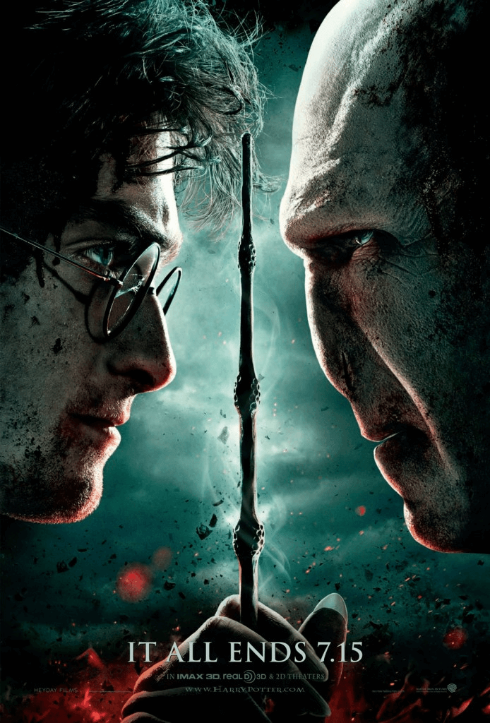
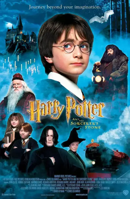
The genre of the movie also dictates some the elements of your movie poster design. For instance, a comedy flick can have the actors smiling, or a bizarre ridiculous scene. Similarly, a drama movie poster design should reflect the emotional mood of the film.
2. Color Palette
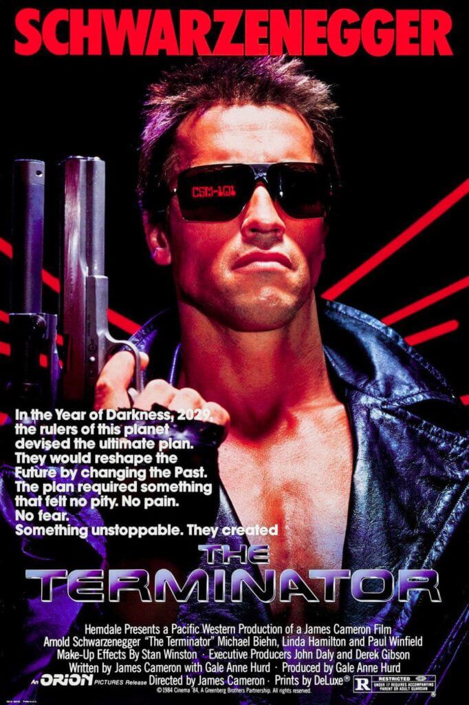
If you want to attract your audience’s attention, contrasting colors are your friends! You can also choose a primary, dominating color and select accompanying, complementary colors to create visual interest. The colors of choice for in a movie poster design based on genres are:
- Action and Thriller: red, as it’s the color of energy and passion.
- Comedy: bright, eye popping colors such as yellow and orange. Pastels work well for romcoms.
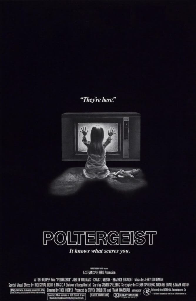
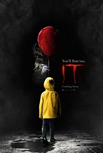
- Horror: dark, morose colors are the choice for these movie posters. Black or gray in contrast with red are popularly used to create an eerie atmosphere.
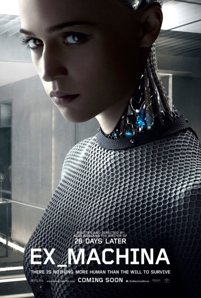
- Sci-fi: neon color palettes are all the rage for sci-fi movie poster designs. You will also see inky blues, purples, black and grey and space or planetary backgrounds.
Bonus: Square Color Scheme & Everything You Need To Know About It
3. Text and Typography
A movie poster design must have the following elements of text in it:
- Film title
- Name of the director, actors, and other crew
- Tagline (optional)
- Release date and other logistics
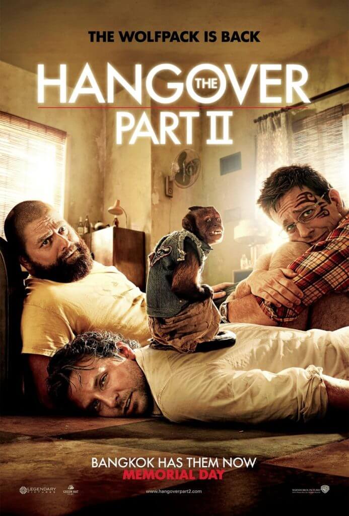
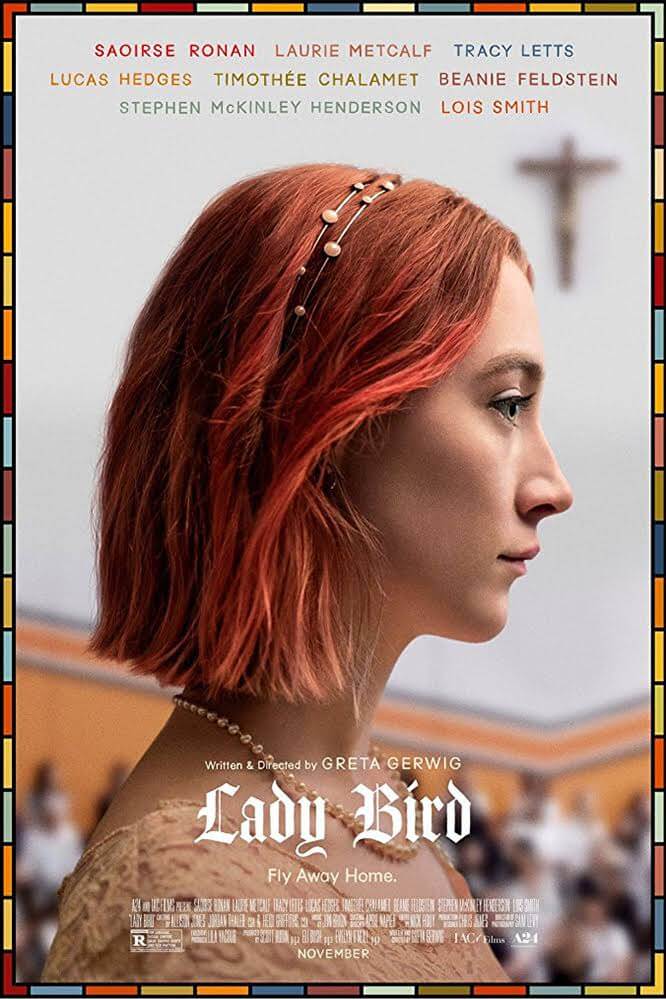
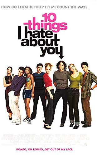
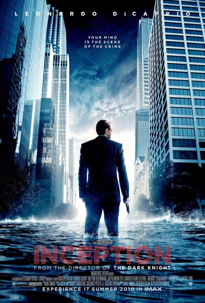
The above details tend to follow a certain hierarchy when displayed on the movie poster. For instance, the film title, director’s name, and the actors’ names must be prominent. On the contrary, details such as crew members’ names or the company logo are placed at the bottom. The tagline can be a catchy phrase that doesn’t necessarily feature in the movie, or it can be a quote. Remember, though, the ultimate goal of a tagline is to make the viewer curious about the movie (see below for movie poster design inspiration).
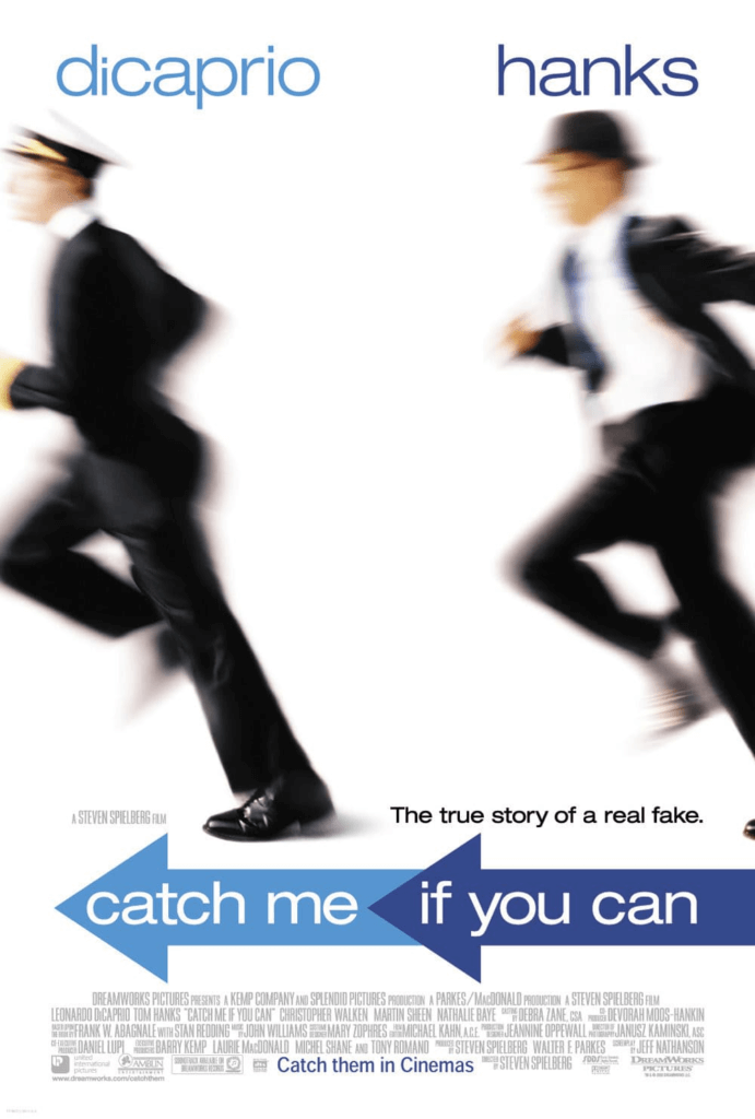
The taglines in the above movie perfectly summarize the movies.
The typography must be coherent with the overall theme and brand of the movie.
4. Recognizability
Ultimately, the image you use in your movie poster design is what makes it unforgettable. There are a number of ways to pick an image that best conveys the plot of the movie. One option is to pick a scene from the movie. Another option is to get the main characters of the movie to recreate a scene facing the viewers. Or you can pick a memorable object from the movie and make it the star of your movie poster. Whichever one you pick, remember not to overwhelm the viewers with too many elements.
We hope these were useful tips. Remember, the key to a brilliant movie poster design is consistency. All the element must work coherently around the chosen idea or the theme.


![10 Best AI Image Restoration Tools to Try in 2025 [Free & Paid]](https://siteimages.simplified.com/blog/Best-AI-Image-Restoration-Tools-01.png?auto=compress&fit=crop&fm=png&h=400&w=400 "10 Best AI Image Restoration Tools to Try in 2025 [Free & Paid]")
![How to Use Photoshop AI Generative Fill Feature [2025]](https://siteimages.simplified.com/blog/How-to-Use-Photoshop-AI-Generative-Fill-01-1.png?auto=compress&fit=crop&fm=png&h=400&w=400 "How to Use Photoshop AI Generative Fill Feature [2025]")
![20 Podcast Thumbnail Ideas to Boost Your Show’s Visual Appeal + Best Practices [2025]](https://siteimages.simplified.com/blog/Podcast-Thumbnail-Ideas-to-Boost-Your-Show-02-1.png?auto=compress&fit=crop&fm=png&h=400&w=400 "20 Podcast Thumbnail Ideas to Boost Your Show’s Visual Appeal + Best Practices [2025]")


