
Joe Rinaldi of Impact says that fonts provide the first impression of what your brand is. Hence, choosing the right font in your branding and website design is critical.
In the examples below, you can see that by simply changing the typography of these well-known logos, the personality and perception is entirely different. Brands that previously looked professional and sharp now appear unsophisticated.
When it comes to choosing fonts, the options are seemingly infinite: Helvetica? Times New Roman? Georgia Bold, perhaps? Or do you dare…. Comic Sans?! But before deciding what fonts fit best for your brand it’s important to understand the different typeface categories.
The two most important and commonly used categories you need to be familiar with are Serif and Sans Serif.
Serif vs. Sans Serif: What’s the Difference?
What is a Serif Font?
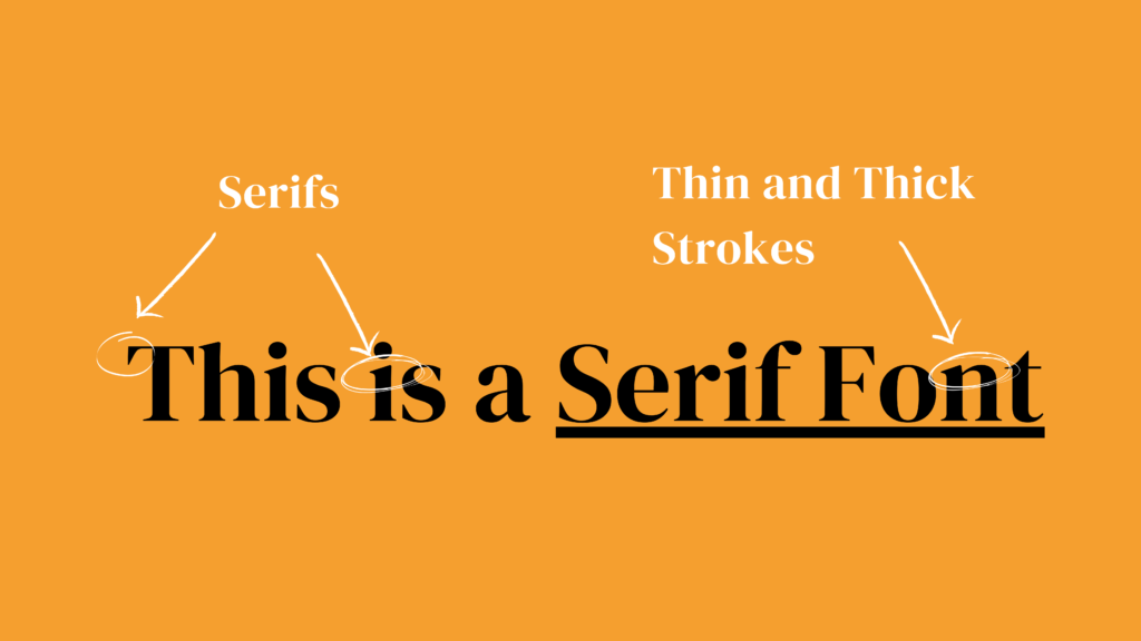
A serif is the small decorative stroke that continues after the end of the stems of letters. This makes serif fonts look more traditional and ornate compared to their counterparts.
The most common serif fonts are Times New Roman, Garamond, Baskerville, Georgia, and Courier New.
Serif fonts send a message of trustworthiness and grace. You can usually find serif in newspapers and magazine headlines. They are also used in large displays as they provide better readability.
Related: Design Terms: A Must Read for Beginners!
Well-Known Serif Font Logos:
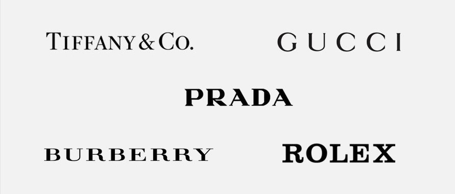
Examples of Serif Typeface in Branding:
- The New York Times
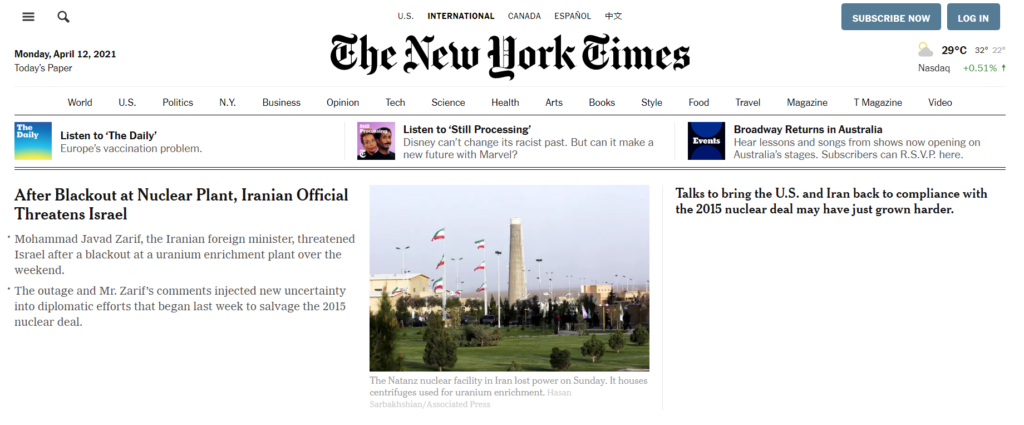
The New York Times is a publication that has been around since the 1850s. Their use of Serif typeface gives readers the impression of tradition, reputation, and dependability.
- The New Yorker
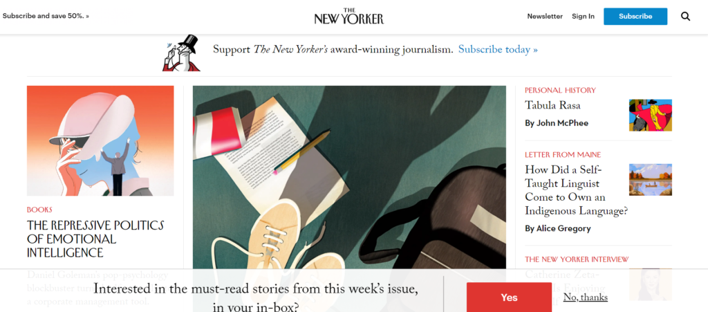
The New Yorker is another famous magazine that uses the Serif typeface to build trust, credibility, and reputability amongst its readers.
What is a Sans Serif Font?
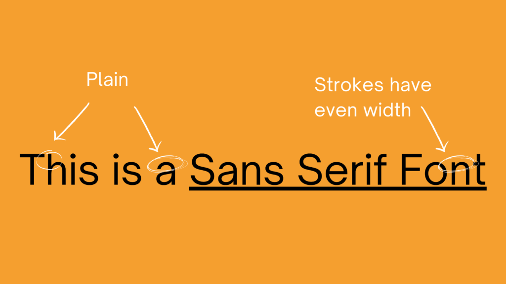
‘Sans’ is French for ‘without’. By definition, Sans Serif is one without decorative strokes on each letter. These look more modern and less ornate.
The most used Sans Serif fonts include Arial, Helvetica, Proxima Nova, Futura, and Calibri.
Sans Serif typefaces can make your design look more cutting-edge. These have become the go-to choice for most UI/UX and web designers. Their lightweight and even strokes also make them a popular choice for brochures, mockups, and business cards.
Well-Known Sans Serif Logos:
Examples of Sans Serif Typeface in Branding:
- Starbucks
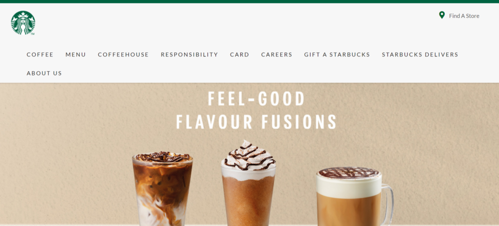
Starbucks is one of the most recognizable brands, and as they have evolved, they have moved away from hand-lettered typefaces. This change makes them more relatable to their target audience – millennials and Gen Zers.
- Hubspot

Hubspot, a CRM platform, uses modern, minimal fonts to evoke friendliness and approachability.
Drawbacks of Serif Fonts
- Web designers like to keep text small and minimal, and Serif fonts are elaborate.
- If used in small sizes, Serif can be disorienting, so they are best suited for larger-sized characters.
Drawbacks of Sans Serif Fonts
- The use of Sans Serif alone can appear too generic.
- They are not as readable in print because individual letters are not easily distinguishable in Sans Serif fonts.
Can you combine fonts?
Absolutely! When combining different typefaces, the rule of thumb is to not use more than 2-3 fonts. One for the heading and one for the body of the content. This improves readability and creates a slight contrast in your design.
Sans-Serif and Serifs are like peanut butter and jelly. They go perfectly together. Serifs are perfect for headings and Sans Serifs’ high readability in digital designs makes it a good fit for the content body.
In The End…
There is no one size fits all solution to picking the right font for your brand. But these Simplified guidelines can help you simplify the process!


![10 Best AI Image Restoration Tools to Try in 2025 [Free & Paid]](https://siteimages.simplified.com/blog/Best-AI-Image-Restoration-Tools-01.png?auto=compress&fit=crop&fm=png&h=400&w=400 "10 Best AI Image Restoration Tools to Try in 2025 [Free & Paid]")
![How to Use Photoshop AI Generative Fill Feature [2025]](https://siteimages.simplified.com/blog/How-to-Use-Photoshop-AI-Generative-Fill-01-1.png?auto=compress&fit=crop&fm=png&h=400&w=400 "How to Use Photoshop AI Generative Fill Feature [2025]")
![20 Podcast Thumbnail Ideas to Boost Your Show’s Visual Appeal + Best Practices [2025]](https://siteimages.simplified.com/blog/Podcast-Thumbnail-Ideas-to-Boost-Your-Show-02-1.png?auto=compress&fit=crop&fm=png&h=400&w=400 "20 Podcast Thumbnail Ideas to Boost Your Show’s Visual Appeal + Best Practices [2025]")


