
When you enter the world of design, there may be a lot of words and phrases that you are unfamiliar with. Learning these design terms can feel like learning a new language. What does analogous mean? How do you track a font?
We at Simplified have created a handbook of commonly used terms you need to speak fluent designer!
Composition
Composition is the building block of any design. Furthermore, It provides structure and navigational flow. To put it simply, it is the way your content is arranged. Composition follows six basic principles – proximity, white space, contrast, hierarchy, alignment, and repetition.
Proximity
Proximity is a design term used to describe how you utilize the components in the visual space. In short, it is how your design elements are grouped together. For example, content that is not related to each other should be separated to increase the readability of your text.
White Space
White space means negative space, or the empty space between your content, lines, and outer margins. It helps you define different sections and gives your design room to breathe.
The example below highlights an excellent use of proximity and white space. The content is well composed, with enough white space in between!
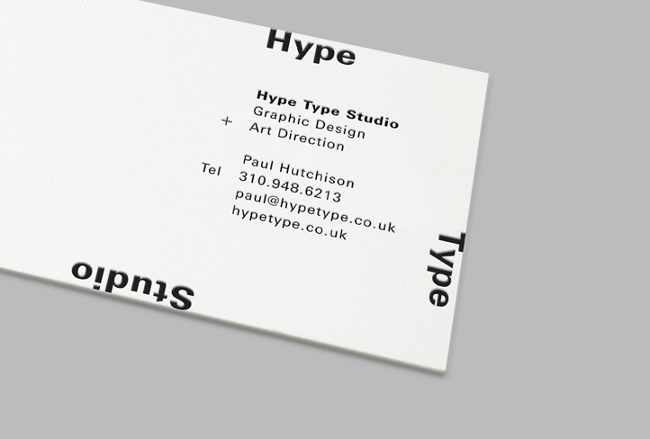
Source: Studio Network
Related: Your Ultimate Guide to Typefaces: Serif vs. Sans Serif Fonts
Contrast
Contrast points to the difference between two things. It is used to highlight or call attention to certain elements in the design. You can create contrast with colors, fonts, or the size of objects.
Hierarchy
It is important to guide your user through your design by using different levels of emphasis. This is what designers call the hierarchy. Furthermore, it can be observed that important elements are usually made bigger, bold, or eye-catching in some way.
Alignment
Alignment is a pretty straightforward design term: it is the position of design elements and content. It can be left, right, center, or justified (in which the text is formatted with a clean edge in both margins). A simple way to keep your alignment consistent is to first imagine your design on a grid and then place the components accordingly.
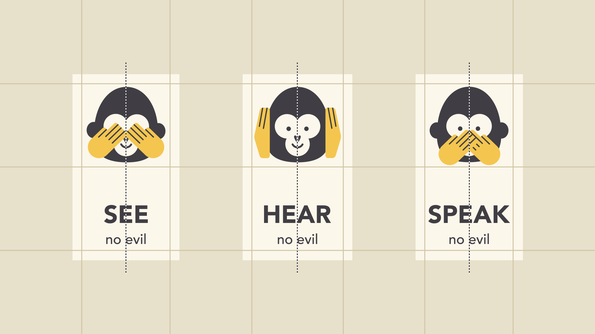
Source: GCF Global
Repetition
Repetition helps reinforce your brand identity throughout your designs by providing your user a consistent, trustworthy experience.
Looking to establish your brand identity? Check out our Simplified guide to creating a brand strategy!
Typography
Source: Original
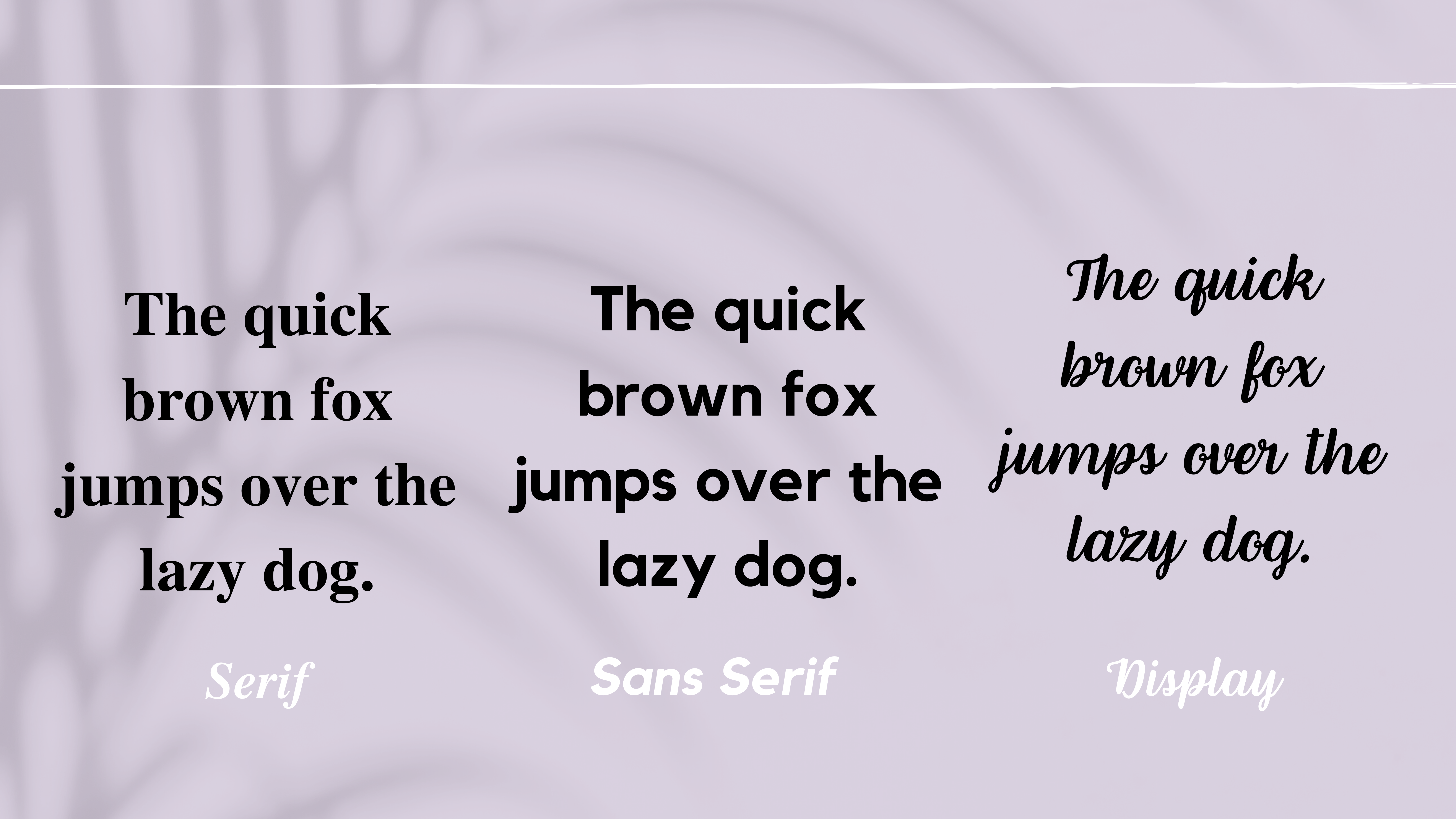
Serif Fonts
Serif fonts are fonts that feature little strokes called serifs attached to the letters. Their classic look makes serif fonts the preferred choice in traditional designs.
Sans Serif Fonts
Sans is the French word for without. Hence, sans serif fonts do not have serifs attached to the letters. They’re cleaner than serifs and thus are preferred on devices for their modern look.
Learn more about the difference between Serif and Sans Serif fonts here!
Related: 20 Best Fonts For Logos That Tell A Story
Display Fonts
Display fonts are commonly used in headings and come in various styles such as script, blackletter, all caps, and calligraphy. Their decorative style makes them the go-to choice for logos and titles rather than bodies of text. You can find them on invitations, save the dates, or graphic design posters.
Source: 99designs
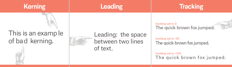
Spacing
The goal with spacing your content is to make your text comfortable to read. There are three type of spacing to remember:
Firstly, Kerning: space between pairs of letters;
Secondly, Leading: pronounced as ‘ledding’, is the space between lines of text; and
Thirdly, Tracking: refers to the space between characters; also known as character spacing.
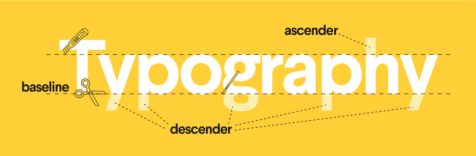
Baseline
The baseline is the imaginary line that your text rests on.
Ascender and Descender
The ascender is a design term used to describe the part of a lower-case letter that ascends above the word, such as in the letter ‘d’. The descender is the part of a lower case letter that descends below the word, such as in the letter ‘j’.
Source: 99designs
Color
Source: pngitems
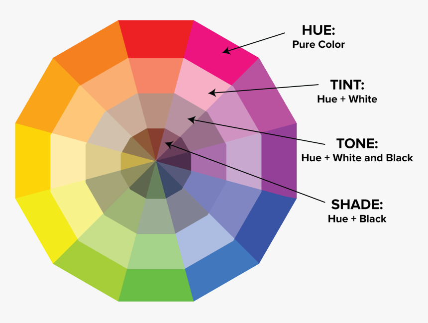
Hue, Tint, Tone, and Shade: What’s The Difference?
Hue describes the pure color. The tint is a hue with white added to it. The tone is a hue with grey added to it, and the shade is a hue with black added to it.
Here are some other design terms related to color:
- Saturation: the intensity of color.
- Palette: the set of colors used in a design. palettes can be monochromatic (use only one hue), analogous (use neighboring colors) or complementary (colors opposite on the color wheel).
- Triadic Colors: three colors evenly spaced on the color wheel. They consist of a dominating color, supporting color, and accenting color.
We hope this vocabulary lesson will help you feel more at ease as you begin designing your masterpiece!


![10 Best AI Image Restoration Tools to Try in 2025 [Free & Paid]](https://siteimages.simplified.com/blog/Best-AI-Image-Restoration-Tools-01.png?auto=compress&fit=crop&fm=png&h=400&w=400 "10 Best AI Image Restoration Tools to Try in 2025 [Free & Paid]")
![How to Use Photoshop AI Generative Fill Feature [2025]](https://siteimages.simplified.com/blog/How-to-Use-Photoshop-AI-Generative-Fill-01-1.png?auto=compress&fit=crop&fm=png&h=400&w=400 "How to Use Photoshop AI Generative Fill Feature [2025]")
![20 Podcast Thumbnail Ideas to Boost Your Show’s Visual Appeal + Best Practices [2025]](https://siteimages.simplified.com/blog/Podcast-Thumbnail-Ideas-to-Boost-Your-Show-02-1.png?auto=compress&fit=crop&fm=png&h=400&w=400 "20 Podcast Thumbnail Ideas to Boost Your Show’s Visual Appeal + Best Practices [2025]")


