
A new year calls for fresh perspectives, sparkling energy, and amazing color inspiration! Are you in the business of color? Do you want to be a part of a community of 10 million designers?
Then the world’s leading color expert, Pantone, should be on your radar! In the guide ahead, we’ll walk you through the what, why, where, and how of color trends in 2022. What is the Pantone Color of the Year 2022? Why is the color of the year important? How can you use it for your brand? All this and more, exclusively on Simplified!
What is Pantone?
Pantone was established in 1963 and is the world’s leading color institute. Every year, the institute releases a new color that influences every color-conscious industry. These industries include but are not limited to – textiles, apparel, fashion, and architecture.

Related: The Fundamentals of Understanding Color Theory
Why is Pantone Important for Designers and Marketers?
The institute forecasts the global direction of color every year. This means if you follow Pantone, you’ll remain ahead of the curve! What’s more? You can learn about visual inspiration and color harmonies 6 – 24 months ahead of the season!
How is the Color of the Year Decided?
The color of the year is a result of research across seasonal trends and color psychology. The Pantone Color Institute partners with global brands to leverage the power, psychology, and emotion of color in their design strategy.
Looking to learn more about the processes of selecting a color of the year? Great! Hop on over to read our comprehensive guide on color technology and trending color palettes.

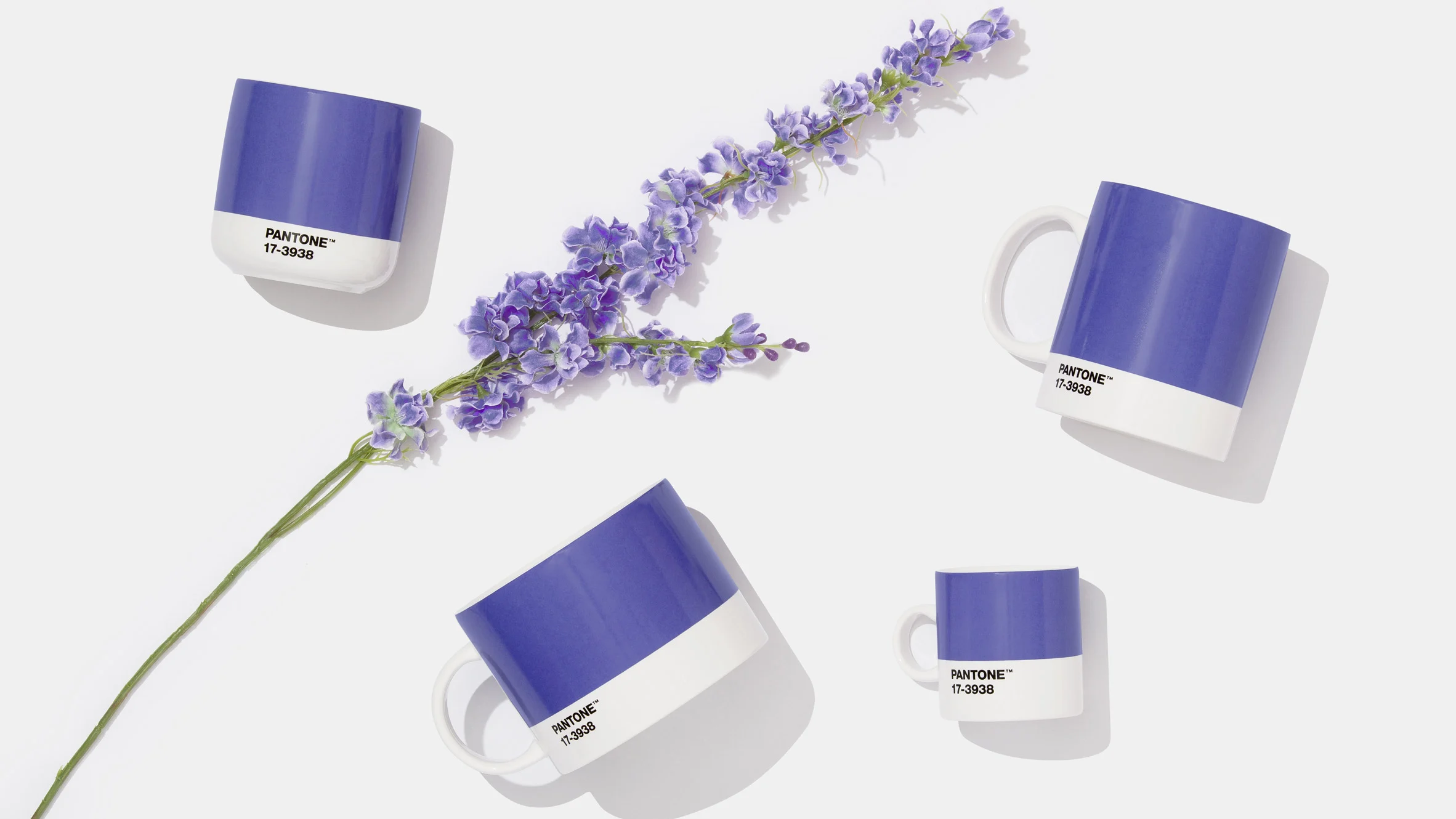
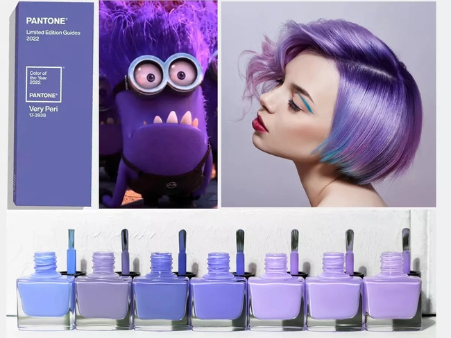
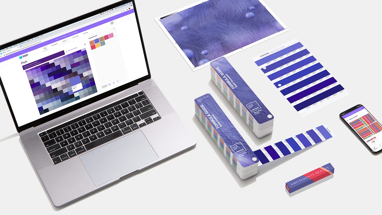
Meet Very Peri: Pantone Color of the Year 2022
The color of the year is a periwinkle blue, with undertones of violet-red. Pantone 17-3938 Very Peri is a special color. For the first time in the company’s history, Pantone has created a color of their own instead of choosing one from the existing catalog. Pretty cool, right?

What Does Very Peri Mean?
The pandemic is raging on, and AI technologies are developing rapidly to adapt to virtual living. Similarly, Pantone is breaking ground with innovation in color.
In 2021, we saw the consequences of global lockdowns but also the groundbreaking metaverse conceptualized by Mark Zuckerberg. Therefore, color trends in 2022 will celebrate a return to tranquility and creative breakthroughs in times of crisis.
Here’s what the Pantone experts have to say about Very Peri 17-3938:
Creating a new color for the first time in the history of our Pantone Color of the Year educational color program reflects the global innovation and transformation taking place.” – Laurie Pressman, Vice President of the Pantone Color Institute
This calming color represents our curiosity for new possibilities and nurtures our creative spirit. The combination of cooling blues and feisty red undertones signals courage to write our own lives. What better way to start the new year than with a new color, full of promise and hope?

3 Popular Brands Using Pantone Color of the Year 2022
A good starting point for research, whether in fashion, design, or art, is to look at titans of industry. These giant brands are superstars because they set trends, define creativity, and raise the bar each year! We’ll briefly look at three mega-brands and how they’re aligning their marketing and design strategy with the Pantone Color of the Year 2022.
1. Microsoft
The tech giant is encouraging fans to create something using the color of the year. The artwork that gets chosen will be featured on Microsoft’s social media cover photo!
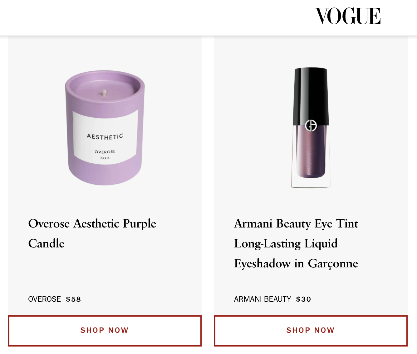
2. Vogue Magazine
The cult beauty magazine has compiled a list of products inspired by the trending color! From candles to makeup to nail polishes, there’s something for everyone on Vogue’s Very Peri bucket list.
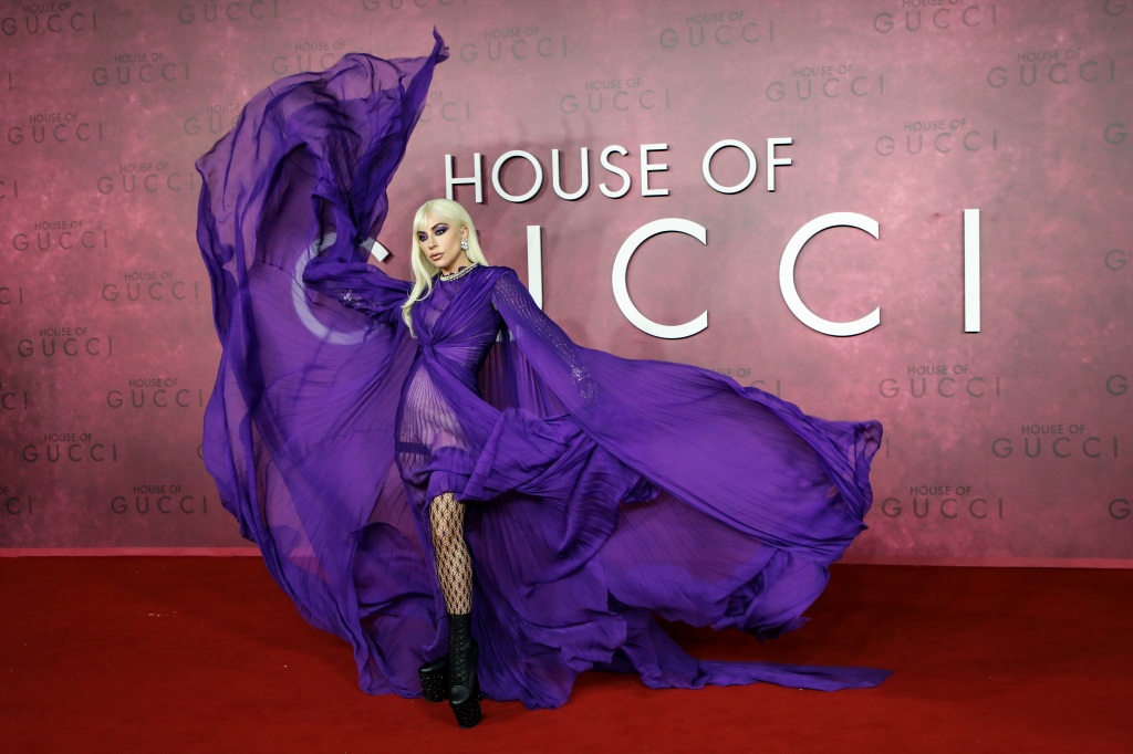
3. Lady Gaga in House of Gucci
The trifecta of celebrity singer Lady Gaga, fashion brand Gucci, and the movie House of Gucci, is a brand in itself!
Very Peri has managed to weave its way into music, fashion, and movies all at once!
3 Ways to Use Very Peri for Your Business (+ FREE TOOL INSIDE)
The amazing thing about Pantone is that the institute doesn’t just decide the color of the year; it defines it. Whether you’re a fashion enthusiast or a content creator, you must confidently communicate your identify!
In this section, let’s look at how you can use Very Peri 17-3938 to express your brand’s personality. Who knows? You might find inspiration to express your own too!
1. Test Color Palettes for Brand Marketing
From the examples above, do you notice how Very Peri is not exactly the same shade of color across different brands? This is because you have the freedom to make your own color palette!
The purpose of the color of the year is not to limit creativity. Rather, it provides a solid foundation for reimagining how we communicate with each other through color.
Wondering how to pair Very Peri 17-3938 with other colors? Pantone offers a handy palette exploration guide:
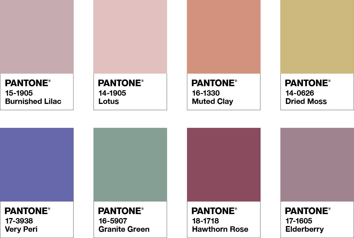
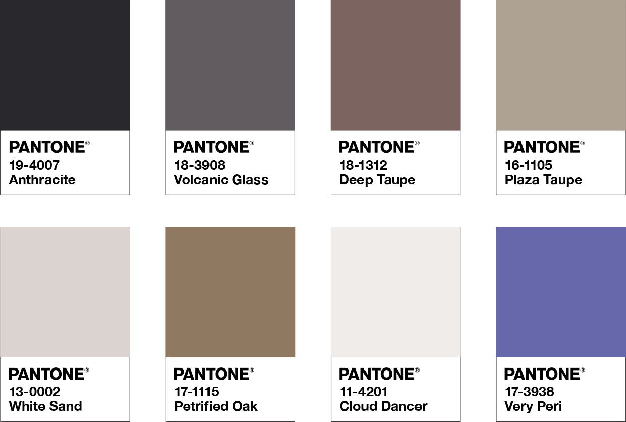
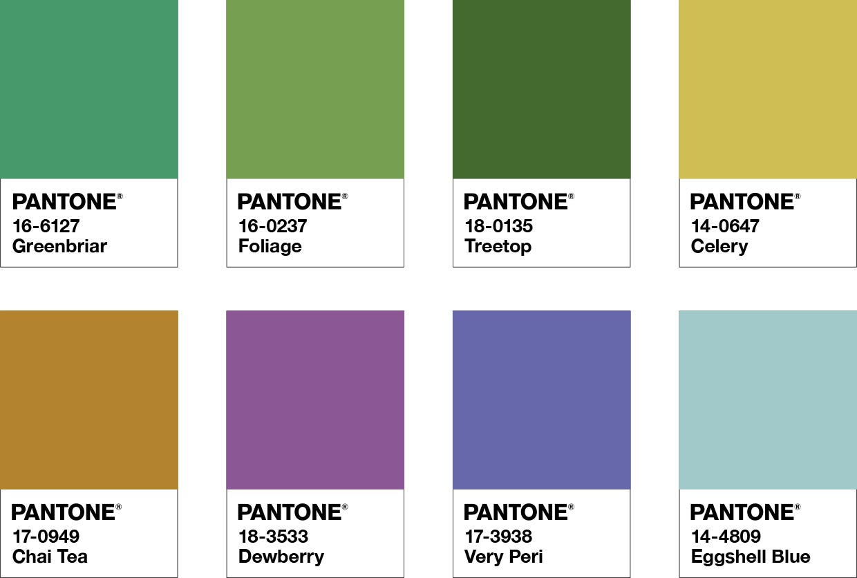
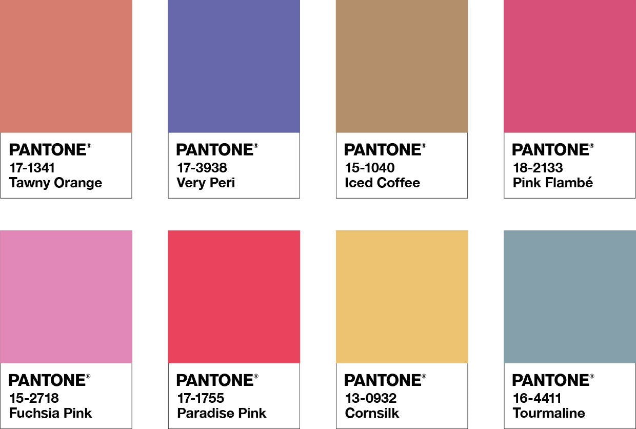
Let’s say you want to feature the Pantone Color of the Year 2022 prominently in your designs. Then, take note of the “Star of the Show” palette! If you want to design a playful graphic, we recommend trying out “Amusements.”
While you’re testing color combinations, make sure that your designs are readable and colorblind friendly to maximize your reach.
TIP: Are you featuring the Pantone Color of the Year 2022 in your designs? Add relevant hashtags when you share them on social media! Test drive Simplified AI Hashtag Generator for better and faster results!
2. Include Very Peri in your Brand Kit
When you think of your brand, what pops up in your mind first? Your brand’s logo is certainly an important element. However, there is so much more!
A brand kit includes the logo, colors, fonts, and everything in between that you use to communicate with your audience. You can include the Pantone Color of the Year 2022 by making easy changes to your brand’s visual language of color.

Related: 7 Tips For Creating The Perfect Cohesive Color Palette
For example, you can try pairing Very Peri with Lucent White for your brand logo to create a calming balance. Or, you can combine the color of the year with Yellow Cream for a lively social media post!
3. Make Subtle Color Tweaks to Virtual Content
You’ve probably noticed that the Simplified brand palette is a bold yellow with a black background for maximized readability.
In this guide, we’ve swapped our headings and sub-headings for Very Peri in honor of the Pantone Color of the Year 2022. Similarly, even if you’re not looking to change your brand colors, you can always make subtle tweaks! Moreover, since online copywriting is inseparable from other elements of design, the smallest of changes can have the biggest impact!
Related: New Color Pallete Combos to Make your Designs Standout in 2023
In Conclusion
You and your brand can be a part of the recognized community of 10 million designers by heeding Pantone’s advice.
For one, embracing the color of the year is a great way to stay on top of industry trends! Secondly, you have the opportunity to weave the universal language of color into your brand’s marketing. Pantone’s influence is massive, and for good reason – even Lady Gaga would agree!


")