
Whether it’s for advertising or information purposes, brochures are an extremely effective marketing tool. They provide a tangible method by which potential customers can learn more about your product, service, or business in general. Designing a good brochure is one thing – but designing a great brochure is something else entirely! In this blog, we’ll take you through our step-by-step guide to designing a great brochure.
Designing a Brochure: Prerequisites
1. Know your purpose
Whether you’re designing a brochure for your own company or for a client, the first step is always to define your objectives. Who is your ideal customer? Will it be a print or a digital brochure? What do you want to communicate to your audience? The answers to these questions will dictate your brochure layout and marketing strategy.
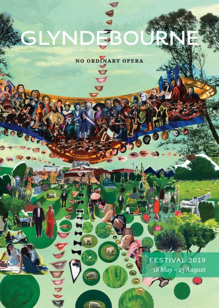

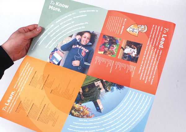
The vibrant imagery clearly showcases the company’s dramaturgy.
2. Stay true to your brand’s personality
Next on the agenda is revisiting the good ol’ brand guidelines. Your brand identity should remain consistent, no matter the medium you’re working in. Consequently, choose elements (images, fonts, and colors) that reflect your brand’s personality and the tone of your brochure.
Related: Your Step-By-Step Guide to Creating A Branding Strategy
3. Review your copy
Before you move on to designing your brochure, write your brochure copy. It’s important to be clear about what your brochure will say. If you’re a product company, make sure the USP of your product is reflected in the company catalog. An important point that companies often overlook is the content hierarchy. Grouping your content with clear, concise headings will improve the overall readability of your brochure design.
Simplified Tip: Use Simplified’s AI-led Content Rewriter tool to write engaging copy.
4. Set your budget
The next step, and an important one, is defining the budget. This must include the cost of printing, offline and online marketing, and logistics. Start with a budget per poster and then decide what’s most important. Does it need the more expensive inks? Do you need to spring for sturdier paper?
Designing a Brochure: Execution
1. Choose your brochure type
Did you know, there are over 15 different brochure folding styles to choose from? The planned brochure layout and content will determine which way you fold your brochure. Some of the commonly used ones are mentioned below:
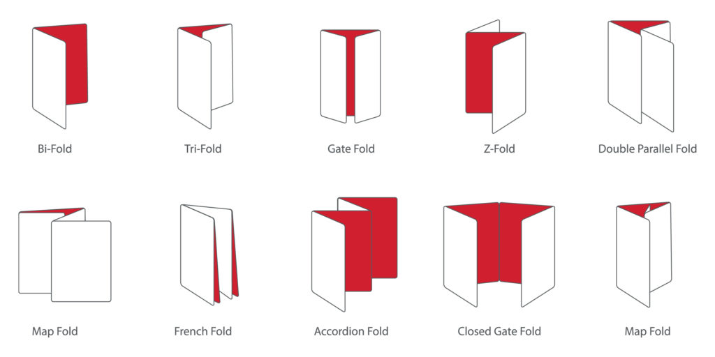
- Bi-fold: A simple but effective brochure layout. Take a single sheet of paper and fold it in two, giving you four consecutive panels to be read like a magazine.
- Tri-fold: The most popular option by far. Folding a single sheet into thirds offers multiple layouts. How you fold the paper determines the structure of your brochure. Common tri-folds are the ‘C’ and ‘Z’ folds.
- French fold: A French fold brochure looks like just another piece of paper in your pocket, but it is an effective brochure layout. You need to fold the brochure paper twice, vertically and horizontally, to get eight panels. It looks small, but opens into a full flyer, ideal for presenting lengthy content in bite-size chunks.
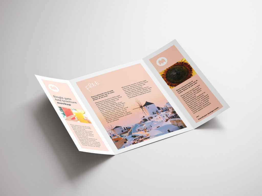
- Gate Fold: A gate fold is just an asymmetric tri-fold, sometimes called a window fold. This results in different sized panels. Generally, the center panel is the largest and thus can be used to provide more visual content. If you’re a product company, you can use the large panel to get across your product’s key feature. The smaller panels can be used to provide company overview, current customers, and contact details.
- Double Parallel Fold: While designing this brochure, you make two vertical folds – i.e., fold in half twice. The resulting panels are slightly smaller, but you get eight panels!
If, after folding the paper, you’re lost about what goes where, number the panels. This will help you plan out the flow of the brochure.
2. Choosing fonts and images
Images and fonts – the two visual elements that make a poster what it is. It’s important to remember that your brochure design has to reflect the corporate identity. It’s always fun to experiment with, but the brochure shouldn’t look disjointed from other brand collaterals.
When picking fonts, you should stick to the rule of three – a heading, subheading, and body font.
Always try to use your own images in a company brochure design. However, if you don’t have your own images, there are plenty of platforms that provide free stock photos.
Simplified Tip: Simplified has integrated Unsplash, a free photo site, allowing you to access thousands of free images while designing.
3. Adjust the Layout for improved readability
When designing a brochure, you should aim to direct the reader’s attention by creating contextual and visual hierarchies. Use different fonts and sizes or segment the copy and images into blocks. Additionally, use headings and subheadings to make the brochure skimmable for readers.
4. Know your paper stock and coating
Consider the paper stock that you will print your brochure on as well as the available coating options. This will affect the durability of the brochure as well as the perception of the company. For example, a thick brochure with a glossy finish will be perceived as more upscale.
Generally speaking, the higher the paperweight, the thicker the brochure. The common metric to measure the thickness is the GSM system. Most brochures fall between 170 and 300 GSM. After choosing the GSM, choose your finish. Pick any of out of the following three:
- Matte
- Semi-Gloss
- Glossy
Talk to the printer to find the best fit for your budget.
5. Exploring your Print Options
This is the most important step after designing a brochure. Visit the printer if you can to see some IRL samples and understand what to expect. Consider asking the following questions:
- Do you provide a sample to see if I like the final outcome?
- What fits my budget best?
- Do you do color matching?
Nowadays, some printers offer special inks to add that oomph factor to your company brochure design. Some of them are:
- Foil: A shiny, metallic ink
- Embossing: A process of pressing a shape or image into paper to create a raised effect
- UV Spot: A shiny coating applied to grab attention to headlines and other important elements.
6. Include a CTA
The main reason for designing a brochure is to encourage your audience to take an action. Therefore, it’s important to give your CTA center stage in your brochure design. Not only that, but you should put it in multiple places in your brochure layout. This will maximize customer engagement – even if they don’t read the entire poster.
Designing a brochure is a great way to get your name out there. We hope this step-by-step guide will help you get started on your next company catalog.


![10 Best AI Image Restoration Tools to Try in 2025 [Free & Paid]](https://siteimages.simplified.com/blog/Best-AI-Image-Restoration-Tools-01.png?auto=compress&fit=crop&fm=png&h=400&w=400 "10 Best AI Image Restoration Tools to Try in 2025 [Free & Paid]")
![How to Use Photoshop AI Generative Fill Feature [2025]](https://siteimages.simplified.com/blog/How-to-Use-Photoshop-AI-Generative-Fill-01-1.png?auto=compress&fit=crop&fm=png&h=400&w=400 "How to Use Photoshop AI Generative Fill Feature [2025]")
![20 Podcast Thumbnail Ideas to Boost Your Show’s Visual Appeal + Best Practices [2025]](https://siteimages.simplified.com/blog/Podcast-Thumbnail-Ideas-to-Boost-Your-Show-02-1.png?auto=compress&fit=crop&fm=png&h=400&w=400 "20 Podcast Thumbnail Ideas to Boost Your Show’s Visual Appeal + Best Practices [2025]")


