Thanks to the internet’s influence and engagement, more people have eyes on your brand than ever before! Your company’s identity is defined by its distinct logo, and it’s critical that you express your message clearly. While logo design is essential in pushing your company to the next level, finalizing it isn’t always easy. Even the most successful businesses have made logo design mistakes. In 2010, Gap’s logo was redesigned after barely a week, while Yahoo’s makeover was met with much criticism.
Let’s look at why logos are important and the most common logo design mistakes to avoid!
What Is the Value of Logo Design?
While the logo is only one component of your marketing plan, it is one of the most critical elements of any business to get right. It’s never an exact science to create the perfect logo. To create a logo that encapsulates your company’s vision, you’ll need to put in a lot of effort, experiment, and imagination.

While there isn’t a magic formula for making a great logo, you should have a fundamental theoretical grasp of what makes a successful design. It’s not simple to balance color, images, and font design to convey a message–but it might be the difference between your brand’s success and loss.
There are a number of typical logo design mistakes you can learn from, whether you’re just starting out or reworking an old identity. Let’s take a deeper look at some of the common blunders and mistakes that logo designers make–and what you should do instead.
Bonus: Top 11 Simple Logo Inspiration To Inspire Your Brand In 2024
7 Biggest Logo Design Mistakes To Avoid
1. Poor Font Selection
The perfect typeface may make or break a design when creating a good logo.

When it comes to finding the appropriate font for your design, it’s all about matching the font to the logo’s style. However, this can be difficult. If the contrast is too much, the logo and typeface will compete for the viewer’s attention; if the contrast is too little, the viewer won’t know where to look.
Finding the correct balance is key. Every font has its distinct personality. If the typeface you choose does not represent the icon’s attributes, the brand’s whole message will be misinterpreted.
2. Lack of Adequate Research
Logo design is primarily a concern of communication. How do you use visuals to capture and express a brand’s essence? To accomplish this skillfully, you must have a thorough knowledge of what you’re aiming to convey and not convey. The more information you have, the better you will be able to avoid the common logo design mistakes that stem from miscommunication.

Rookie designers (or impatient brands) may occasionally jump right into the brainstorming step without studying the brand. This invariably leads to a poor logo that fails to effectively represent or reflect the brand.
Simplified Tip: Conduct a brand audit survey that precisely describes your brand goals and objectives to ensure you get as much info as necessary. You can construct a compelling creative brief with this information to keep your team on the same page.
3. Design Plagiarism
There’s nothing like duplicating a more successful rival to damage your design quicker.
Having a design that seems similar to another company’s logo, whether deliberate or not, might damage your marketing efforts. It’s not only illegal but you’ll almost certainly get exposed sooner or later. Of course, you can’t look for parallels in every design on the planet. However, make a quick examination of your closest competitors to see if there are any major red flags.
4. Combining Color Schemes That Don’t Work
Another typical logo design mistake to avoid is in color selections.
Yes, logos could be quite bright and colorful. Going in that path is a great way to grab your audience’s attention and create a distinctive brand image. However, designers must keep in mind that not all colors complement one another.
Working in black and white is a great approach to avoid the blunder of a flashy, color-bomb-explosion logo. Designers may guarantee that the end product is timeless and flexible by taking away the colors at the planning process, even if the aim is for the final outcome to be colorful.
5. Using Raster Images
It’s not a good idea to use raster pictures for logos because they can pose issues with reproduction. While Photoshop can create really huge logos, you never know how large you’ll need to reprint your logo at some time. When you zoom in close enough on a raster graphic, it becomes pixelated and unattractive. It’s critical to maintain visual consistency by ensuring sure the logo appears the same at all sizes.
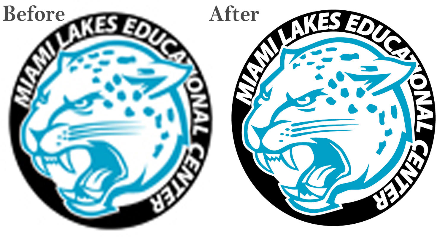
Here are the key advantages of vector graphics that’ll fix logo design mistakes:
- The logo can be resized to any size without losing out on the quality.
- It’s a lot easier to change the logo later.
- It is easier to adapt than a raster picture to multiple media.
Bonus: 10 Logo Design Trends That Will Help Your Brand Stand Out In 2024
6. Putting yourself first and the client next
There are several logo design mistakes, but prioritizing yourself before the client’s needs is a major one! Here are some ways to keep yourself and your logo in check.
Check if the typeface you’re using is genuinely relevant to the brand you’re creating for. For example, a beautiful trendy typographic font that you like is unlikely to be appropriate for a serious organization like a legal firm.
Some designers make the error of using a “trademark” in their work. While you should be pleased with your work, you should avoid imprinting your personality on a logo. So, before you start designing a logo, make sure you understand its objectives. More importantly, keep them in mind while you work on your designs. Stick to the brief to stay focused on the client’s needs.
7. Using Imagery That Isn’t Appropriate (Without Realizing It)
The devil, especially when it comes to design, is in the details. Shapes and empty spaces can be deliberately used to effectively convey brand messaging. This, however, has the potential to backfire. We’ve all seen logos with improper or offensive symbols in white space and so on that unwittingly send the incorrect message.
When you’re completely absorbed in a project, it’s difficult to identify any logo design mistakes. That’s why a sanity check from a third party is usually a good idea.
To Sum Up
As you can see, there are a number of logo design mistakes to avoid while designing a good logo for your clients. Fortunately, there’s a natural learning curve, so the more you do it, the better you’ll get at it.
Meanwhile, look out for these typical errors while you’re still improving your skills. Avoid them, and you’ve already won half the battle. With Simplified’s stunning templates and tons of design tools to choose from, you can effortlessly level up the aesthetics of your brand.
With Design + Copy AI, we are an all-in-one platform! If you’re just getting started, or even if you’re a seasoned graphic designer looking to scale your work, be sure to try out our free Simplified design software.


![10 Best AI Image Restoration Tools to Try in 2025 [Free & Paid]](https://siteimages.simplified.com/blog/Best-AI-Image-Restoration-Tools-01.png?auto=compress&fit=crop&fm=png&h=400&w=400 "10 Best AI Image Restoration Tools to Try in 2025 [Free & Paid]")
![How to Use Photoshop AI Generative Fill Feature [2025]](https://siteimages.simplified.com/blog/How-to-Use-Photoshop-AI-Generative-Fill-01-1.png?auto=compress&fit=crop&fm=png&h=400&w=400 "How to Use Photoshop AI Generative Fill Feature [2025]")
![20 Podcast Thumbnail Ideas to Boost Your Show’s Visual Appeal + Best Practices [2025]](https://siteimages.simplified.com/blog/Podcast-Thumbnail-Ideas-to-Boost-Your-Show-02-1.png?auto=compress&fit=crop&fm=png&h=400&w=400 "20 Podcast Thumbnail Ideas to Boost Your Show’s Visual Appeal + Best Practices [2025]")


