
Visual accessibility in graphic design is a must these days. Up to 25% of the population are experiencing difficulty in using the internet due to colorblindness or limited fine-motor control. But accessibility enables people with disabilities to perceive, understand, navigate, interact with, and contribute to what is happening online. The online world is becoming more and more visual. So, the goal now is to make accessible graphic design the norm.
Visual accessibility in graphic design equals inclusivity
The technological advancements we experience today allow people to connect with and access everything on the internet. We can use our mobile phones to see what was once only accessible through a computer screen. In just a few clicks, we can create and post anything we want. What you should remember is that not everybody is going to have the same, seamless user experience.
Providing accessibility in graphic design means granting people with disabilities the access to what everyone else is doing on your website. This is also the same with mobile apps and other online products.
And by making sure your website or app is accessible to everyone, you’re demonstrating that diversity and inclusivity are important to your brand.

Accessible graphic design doesn’t have to limit creativity
When you make something accessible, the first things you must consider are universality and usability.
The idea of universality is creating a design aimed at a variety of users. This means it should work for everyone, no matter their differences.
Usability, on the other hand, means your design should still work as it’s supposed to. It’s important to make sure that the user experience does not suffer.
Ideally, you want a blend of universality and usability on your website. And you can work around this idea without sacrificing the aesthetics.
Take note that you are not aiming for a perfect design. You are designing for everyone including those who are blind, color blind, or have low vision; deaf, or have hearing difficulties; people with mobility impairments; and people with cognitive disabilities.
To help you create something that works for everyone, here are some easy ways in which you can incorporate visual accessibility in graphic design without sacrificing many aesthetic elements.
Bonus: Designing Graphics That Are Colorblind Friendly
1. Use icons to indicate errors in addition to colors
The most common way to get your users’ attention is to use colors with right color palette tool to point out errors or missing information. Utilizing a well-curated color palette is essential in catching your users’ attention and signaling errors or missing information effectively. To ensure inclusivity for users who are colorblind, incorporating recognizable icons alongside highlighted text can aid in error indication. Additional techniques such as thick borders, bold text, or italics can further differentiate errors within your copy for improved user experience.
2. Use proper contrast between the text and the background
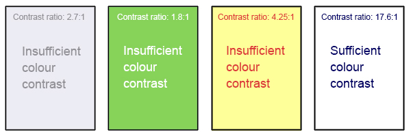
Has there been a time when you’ve encountered a website where the background colors made the text hard to read? As you can imagine, people with low vision experience this all the time. Even when the majority of users can read the text, people with low vision still find it hard to read. One effective solution is to change background color schemes, ensuring readability for all users.
According to the Web Content Accessibility Guidelines, there is a recommended contrast ratio between the text and the background. It should be at least 4.5:1. For example, if the text is 24px or 19px bold, the ratio becomes 3:1. When it comes to accessible graphic design, the text should always be readable, no matter what font you use.
Bonus: Startup Owner’s Guide To Hiring Graphic Designers
3. Use visual focus indicators for keyboard users
Some users navigate the internet using only the keyboard. This means they will not be able to browse the page without focus indicators showing them where they are clicking. Focus indicators are the borders that appear when we use the arrow keys to select something on the screen.
Some accessible graphic design examples you could incorporate include default borders around the focus area, tooltip pop-ups, or color changes.
4. Use text boundaries on input fields
For online forms, one of the most important features for accessibility is the text boundaries. These refer to the specified box where the text block should be located.
This is helpful for users with cognitive disabilities because it makes it easy for them to find and fill out the fields. Even for ordinary users, a blank form without a visible text box can be a bit confusing. You might miss out on a field just because you don’t know where to click.

5. Use field labels on fill-out forms
Another important accessibility feature that online forms should include is a label. Labels are indicators as to what the user should enter into the empty field.
These labels should not disappear when the field is clicked. When that happens, users with disabilities might get lost or forget what they’re supposed to write in there.
Aside from providing clarity on how to fill out the form, labels help to significantly improve the user experience.
Bonus: The Dos And Don’ts Of Packaging Design
6. Use a single-click dropdown menu
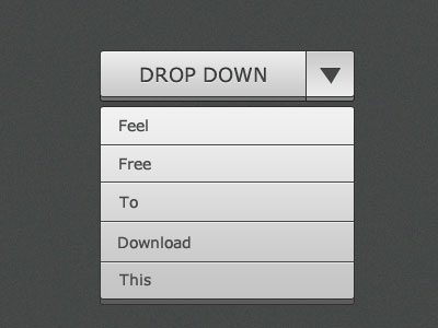
A dropdown menu should give you a list of choices that will automatically appear on the field when clicked. This also works for autocomplete fields, where possible words are filtered based on what you type.
It should not behave like a non-modal dialog. A non-modal dialog is a dropdown menu that requires you to do more than just click on an option. For example, a dropdown “menu” where the choices can be modified or deleted.
7. Use visible links, actions, and information
Your designs might look neater when certain things remain hidden unless the mouse hovers over them. But that often makes the page inaccessible for users with motor-related disabilities. This includes keyboard-only users and those who use speech recognition tools to interact with web pages. Keyboard users and assistive technologies rely on actionable items being visible on the screen. If links are hidden, keyboard users cannot see them on a page. They will not be able to navigate to the space where it’s supposed to appear. One way to provide accessibility without having to sacrifice aesthetics is to use speech recognition.
Via giphy
Final Thoughts
When designing for accessibility, always remember that you have to consider more than just how a page will look. It is important to think about users who might experience difficulties navigating your website or app.
Now that you have an idea of what to do when providing accessibility in graphic design tool, you can go ahead and redesign your website using Simplified.
Simplified is a content-creation platform where you can access all the tools you need. You can design, scale, and publish images, videos, and more. You can choose from original templates and search for visual elements in the asset libraries. And as an instant editor on our platform, you can create visual accessibility in graphic design using the tips above.

![10 Best AI Image Restoration Tools to Try in 2025 [Free & Paid] 10 Best AI Image Restoration Tools to Try in 2025 [Free & Paid]](https://siteimages.simplified.com/blog/Best-AI-Image-Restoration-Tools-01.png?auto=compress&fit=crop&fm=png&h=400&w=400)
![How to Use Photoshop AI Generative Fill Feature [2025] How to Use Photoshop AI Generative Fill Feature [2025]](https://siteimages.simplified.com/blog/How-to-Use-Photoshop-AI-Generative-Fill-01-1.png?auto=compress&fit=crop&fm=png&h=400&w=400)
![20 Podcast Thumbnail Ideas to Boost Your Show’s Visual Appeal + Best Practices [2025] 20 Podcast Thumbnail Ideas to Boost Your Show’s Visual Appeal + Best Practices [2025]](https://siteimages.simplified.com/blog/Podcast-Thumbnail-Ideas-to-Boost-Your-Show-02-1.png?auto=compress&fit=crop&fm=png&h=400&w=400)

