There are moments when there is so much to say that words are not enough. People may use a wink, a smile, or a frown, while brands use monogram logos. Why? Because a logo communicates a lot more beyond a simple expression. A monogram logo can denote the history and culture of an organization and shape the brand identity.
So what’s the best way to present your brand identity in just a few letters? Here’s the ultimate guide to monogram logo ideas to help you create a rich brand identity. Find out why and when monograms work. Get the latest tips on creating successful monogram logo designs. And then, explore some amazing designs and solutions with the Simplified logo maker.
What are monogram logos?
Monograms or “lettermarks” have been used since ancient times to represent communities, societies, and royal families. You may find them in old coins, family crests, and letterheads. With the aspect of deep symbolic art, monograms were eventually adopted for brands and big businesses. In the digital era of branding, monogram logo designs carry more influence than ever before.
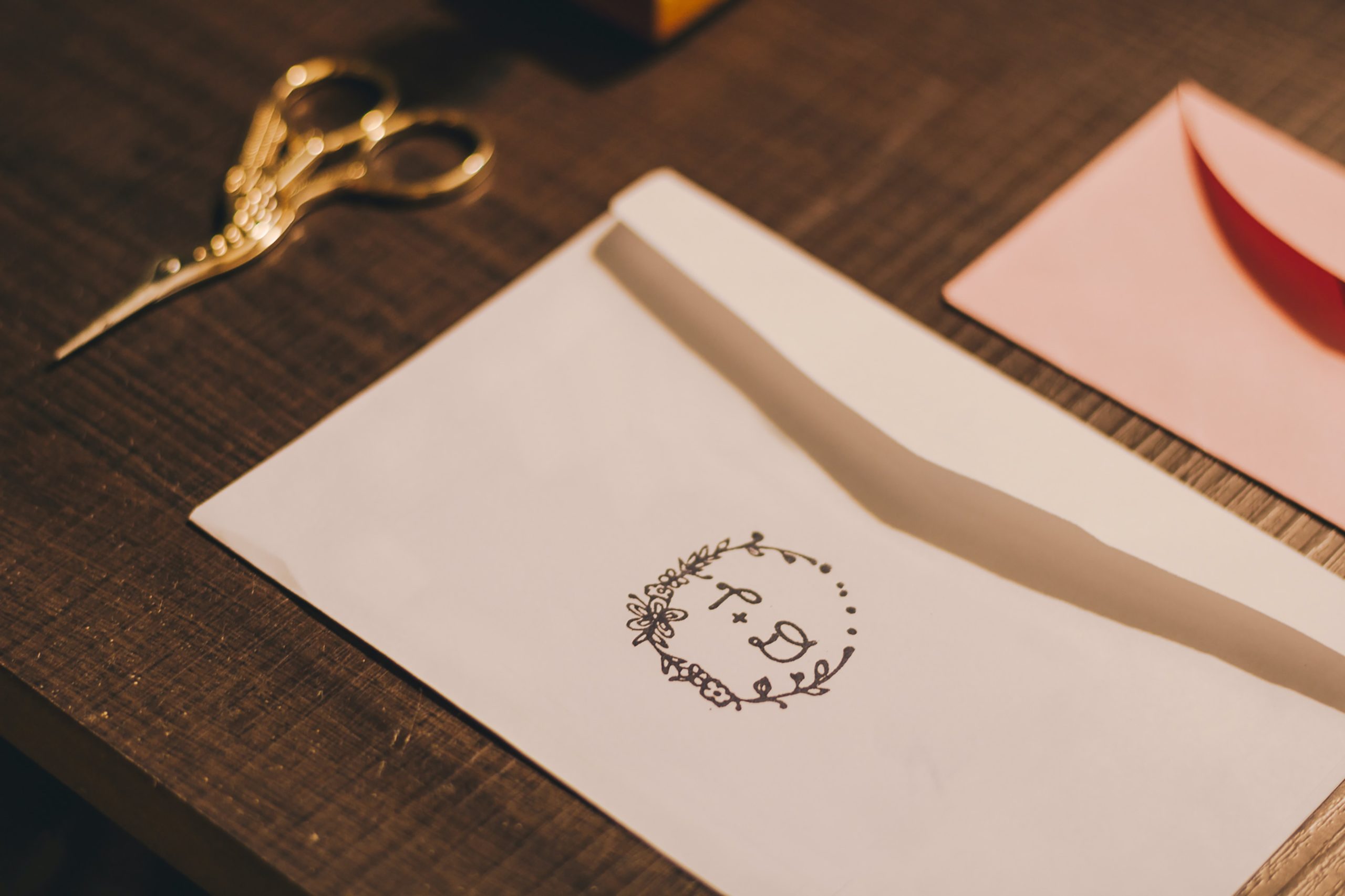
A symbolic expression in the form of a few letters, a monogram logo often uses just the initials. It, therefore, consists of just one or two letters in a stylistic format. Typography plays the biggest role in the designing of monogram logos, in order to make them memorable and impactful. This includes the color, font, shape of the letters, and perhaps, a lot more than what meets the eye!
Some solid monogram logo examples
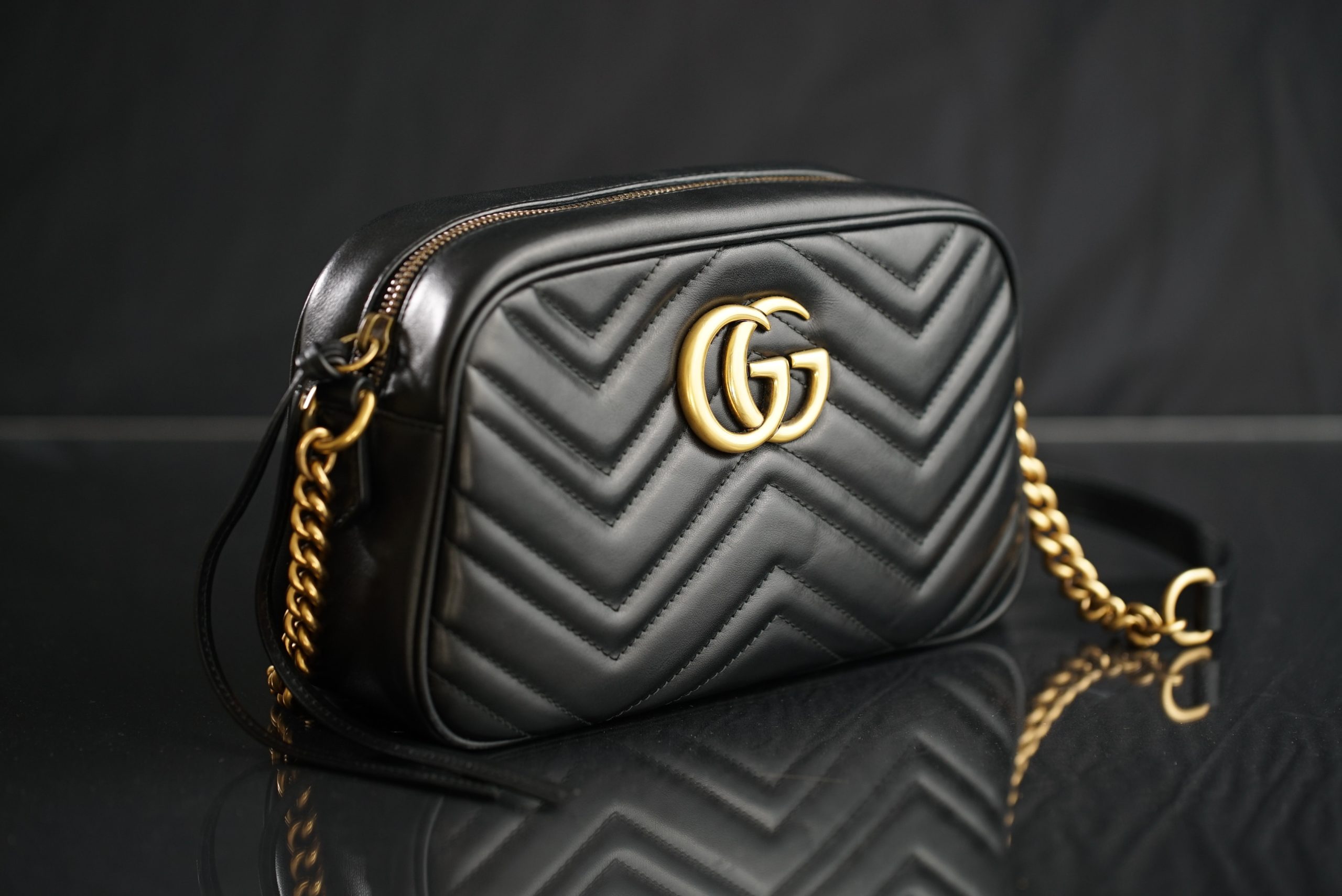
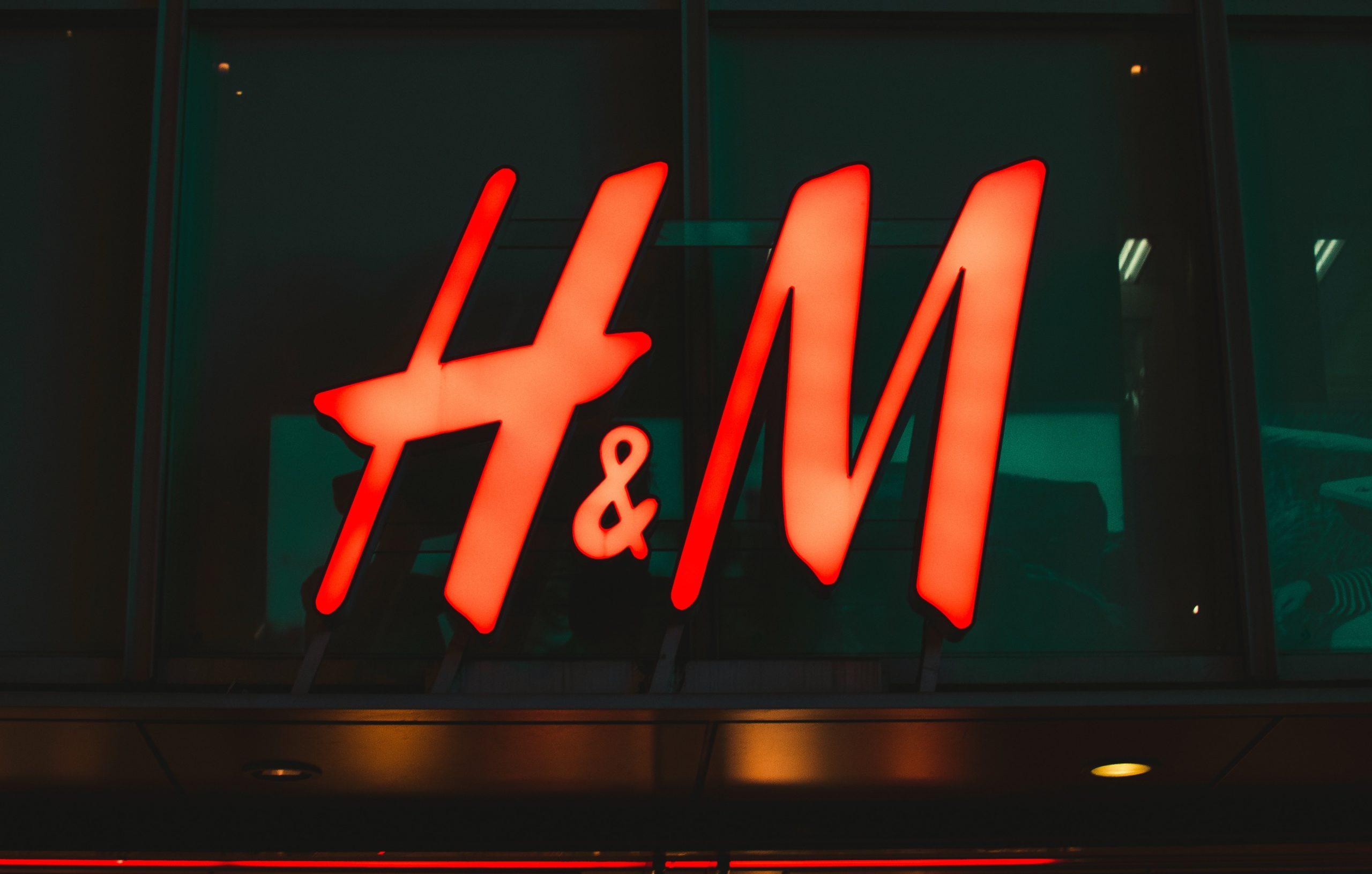
Think about the most impactful logos that you have come across. You may recall several names that have a global brand presence. Fashion brands like Gucci, H&M, Chanel, and Louis Vuitton all use monogram logos. Their simple initials mark their brand value and the overall quality of their products.
Tech brands like HP (Hewlett Packard) or LG (Life’s Good) are using monogram logos in completely different ways. HP takes a straightforward approach with slanted initials, while LG gives a little twist to the letters to create a logo that looks like a face.
Whichever route you take, your logo must represent the unique values of your brand. Whether it’s a luxury brand or a public initiative, your logo is added to all of your marketing materials to represent your brand identity. It must also connect with your target audience, otherwise, there would be no meaning to it.
The Simplified monogram logo features the brand’s initial with a geometric design that incorporates two arrows that represent growth and transformation.
Bonus: Test Your Logo With This Quick Exercise
Should you choose monogram logos for your business?
Monogram logo ideas can be quirky and fun but they’re not for everyone. Your logo design depends a lot on your brand name, business domain, and your target audience. Take the following pointers to find out when this kind of logo is perfect for you:
1. You have a long brand name
This is a no-brainer. If your business or brand name is pretty lengthy, you may need to simplify it to fit your logo. Your audience must be able to talk and think about it easily. Perhaps, you can automatically switch to an acronym and use the initials to make your brand identity. In the monogram logo example below, the initials of the London Symphony Orchestra are designed to look like the orchestra conductor. How creative is that?!
2. Global connections
Monogram logos are ideal for your business if you’re going global or international. This is because you want to appeal to a multinational audience. You don’t want to be restricted to one nation, language, or cultural representation. Hence, stylized initial-based logos come to your rescue.
3. Representing luxury brands
Letterheads and stamps have always been used as status symbols for a long time. They have represented royal families and many businesses continue to build on that brand persona. Luxury brands often use monogram logos with a simplistic style that is both classy and elegant.
4. You don’t want to use pictures or random symbols
Many brands use symbols or creative graphics to represent their niche. But this can be difficult if your brand is still in the growth phase. Instead, your initials can be used with your brand name underneath to let your audience know who you are. Once you create a following and people get to know you, you can start using the logo by itself.
Tips to create successful monogram logo designs
1. Distinct typeface
The typeface should be attention-grabbing but also in line with your brand voice. Essentially, you should aim to make it in sync with what your audience wants. The typeface or font you use is crucial for reflecting your brand personality and even enhancing it.

2. Colors that represent your brand
Colors are just as important as the typeface when it comes to branding. Using the right colors can have an instant psychological effect on your target audience. Red and yellow are often seen in food business logos because they enhance the appetite. On the other hand, blue and green are often seen in finance companies because they evoke trust and security. Your brand kit must also consist of colors that reflect your brand values.
3. Play with the shapes and layouts
Once you have set the font and the colors, it’s time to explore the perfect shape and layouts. A simple rectangular or circular frame is good, to begin with. But if you want to stand out, you may want to try fresh layouts. For instance, by interlocking letters, stacking them together, or using a mirrored effect. Just make sure to keep the proportions clean and symmetrical.
4. Speak more with negative space
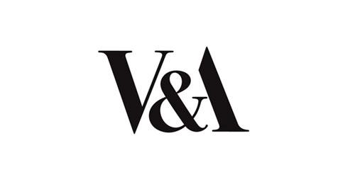
Different typefaces and colors can also be coupled with negative space. The gap between the letters and the overall design can have its own way of talking. This V&A monogram for Victoria and Albert Museum presents the initials by coiling the ampersand symbol into the “A”. The classical font is timeless yet modern and innovative – and that’s just how the museum wants to be seen by its audience.
5. Add punch with hidden meaning
While some feel that monogram logos are simply a safe choice, great design can do wonders. Having a hidden meaning can build intrigue and attention. It will automatically make your audience think more about your brand. LG shows a face with the right usage of typeface and layout.
Your two letters may mean more than just the name of your brand. You can show a smile or a wink to express personality – not a frown though! 😉
Final thoughts
Letters are not just helpful in creating blogs. They can help build brands and give a new direction to your business. It’s all about looking at things from a different perspective.
Taking all these monogram logo ideas and tips into account, we’re sure that your mind must be buzzing with inspiration. Why not begin creating monogram logo designs with Simplified? It’s easy, breezy, and just takes a few clicks. Explore a variety of fonts, layouts, and colors to create your amazing brand logo with our free ai logo maker tool today!

![10 Best AI Image Restoration Tools to Try in 2025 [Free & Paid] 10 Best AI Image Restoration Tools to Try in 2025 [Free & Paid]](https://siteimages.simplified.com/blog/Best-AI-Image-Restoration-Tools-01.png?auto=compress&fit=crop&fm=png&h=400&w=400)
![How to Use Photoshop AI Generative Fill Feature [2025] How to Use Photoshop AI Generative Fill Feature [2025]](https://siteimages.simplified.com/blog/How-to-Use-Photoshop-AI-Generative-Fill-01-1.png?auto=compress&fit=crop&fm=png&h=400&w=400)
![20 Podcast Thumbnail Ideas to Boost Your Show’s Visual Appeal + Best Practices [2025] 20 Podcast Thumbnail Ideas to Boost Your Show’s Visual Appeal + Best Practices [2025]](https://siteimages.simplified.com/blog/Podcast-Thumbnail-Ideas-to-Boost-Your-Show-02-1.png?auto=compress&fit=crop&fm=png&h=400&w=400)
