Who didn’t love drawing doodles in the margins of our notebooks back in school? Smiley faces, hearts, the names of our crushes – the list was endless and so were our memories. But what sets apart professional doodle art from these notebook creations is their innovative ability to transform what’s peculiar and creative into successful branding, merging artistry with graphic design expertise.
As a child, the notebook was our canvas for doodle art, but now, your website is your canvas!
In this blog, we’re going to show you ten of the most stunning web designs with doodle art!
#1: Kinetic
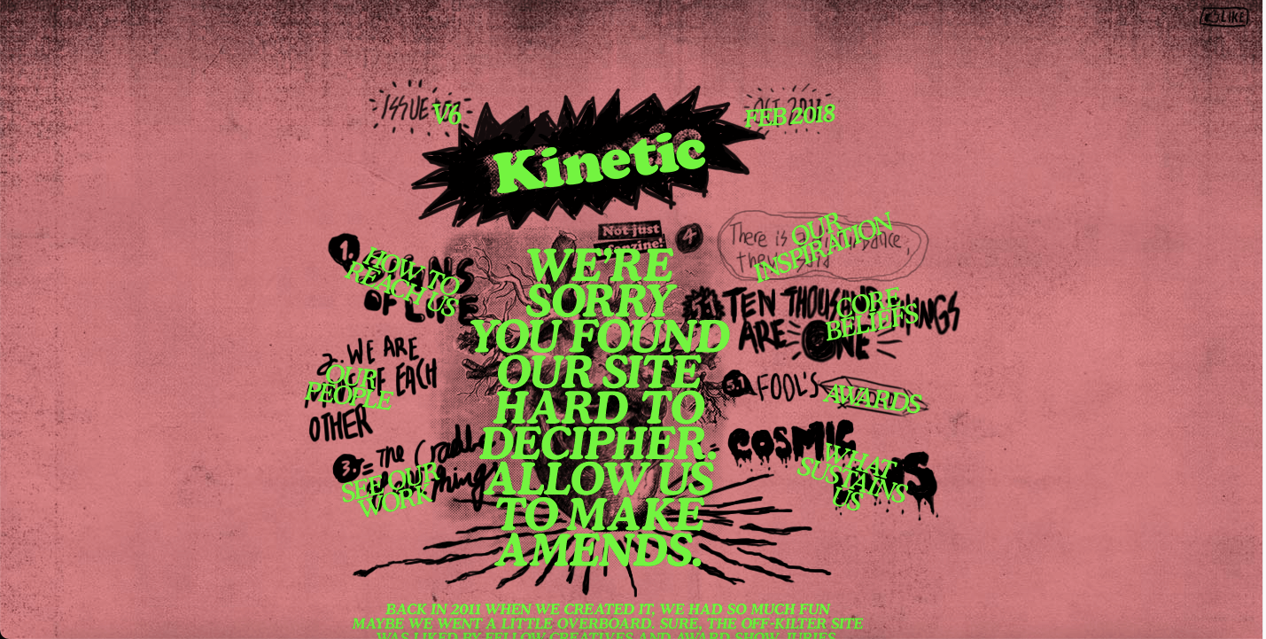
Kinetic tops our doodle art list! This website for a creative design company based out of Singapore features stellar graphics, animation, and even sound effects! The energy of this award-winning web design will make your heart pound from the second your cursor lands on it, literally!
#2: Familia Tipo
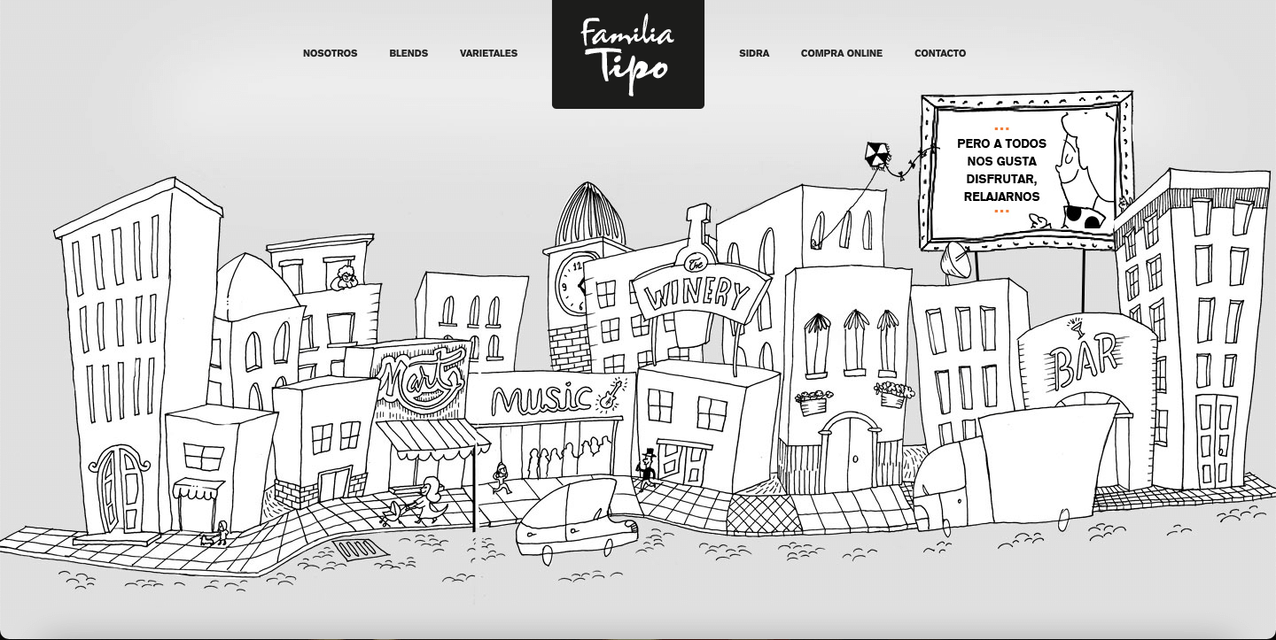
Familia Tipo has a website homepage that serves us quaint doodle art, with a side of Cabernet. The website for this Argentinian wine company is both playful and simple.
And the best part? Interactive UI allows online doodle art to go from black and white to color, with just a hover of your mouse! Check out Familia Tipo’s website to see this in action!
#3: Fixate
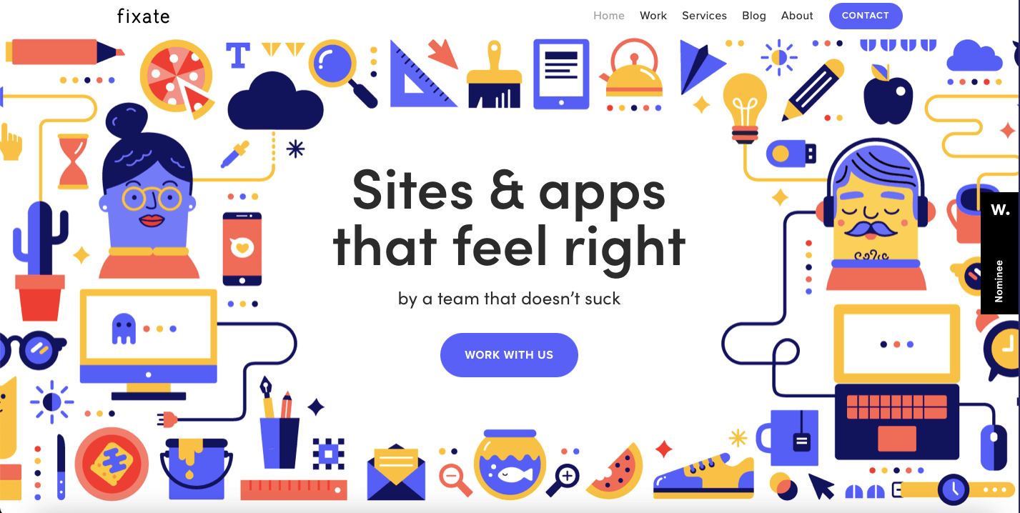
Fixate’s colorful web design is here to remind us that doodle art doesn’t have to be limited to black and white. They specialize in UX design, web design, and app development, so using such bright doodle art on their website is an advertisement in and of itself!
Bonus: How To Do The Beer Poster Trend On TikTok
#4: Art Attackk
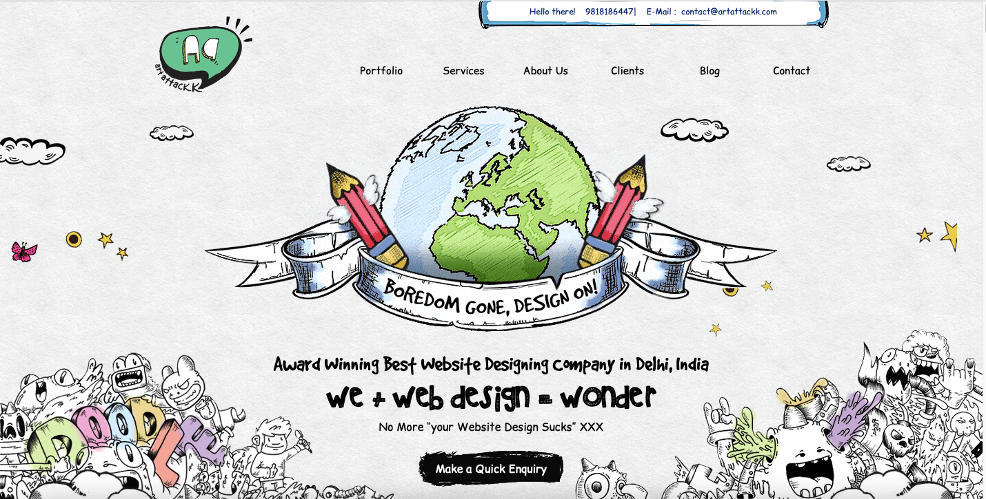
As their name suggests, Art Attackk’s website packs a major artistic punch! Their animations, fonts, and interactive UI that blends doodle art with images leave no room for doubt about how skilled this Delhi-based web designing company is.
#5: The Sum
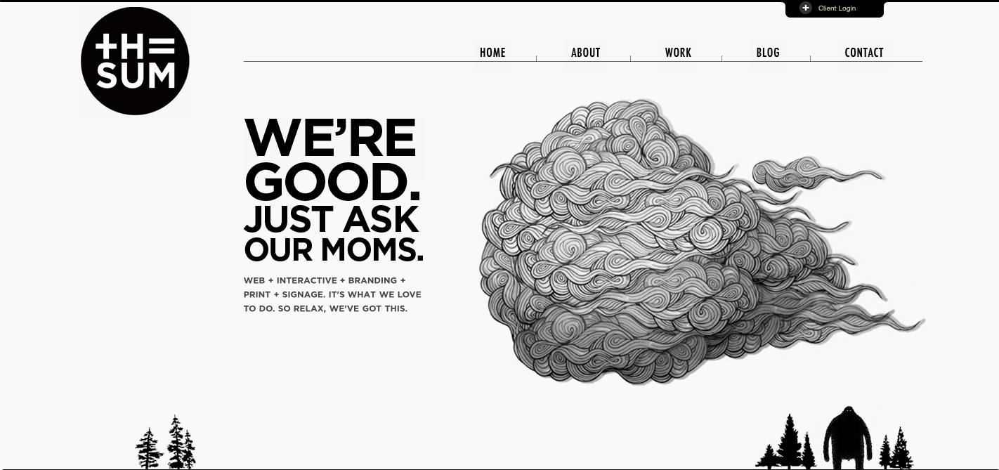
From the second you look at The Sum’s homepage, you’ll be mesmerized by the delicate details of their cloud-doodle. It hovers on the perfect amount of negative space, creating an ominous effect for their audience! This is a great example of less is more; just the detail on that cloud tells us that their team will work meticulously on any design work you hire them for!
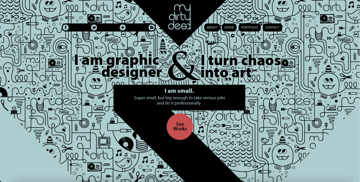
#6: My Dirty Desk
Bonus: 10 Best Kinetic Typography Examples
In her own words, Malgosia (a graphic designer from My Dirty Desk) turns chaos into art! The seamless doodle behind her geometric web design is the best example of how to balance chaos with artistic discipline.
#7: Mony’s Tacos
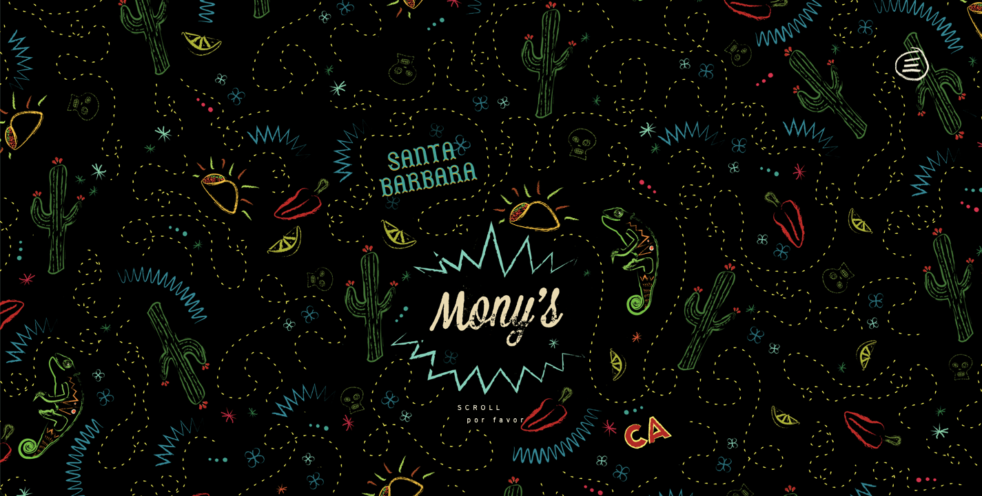
Everything about the Mony’s Tacos website is authentic Mexican desert energy – cactuses, tacos, jalapeños, limes, chameleons, and a map-like trail. Scroll to the bottom of their webpage for an animated surprise!
#8: Retour à Zero
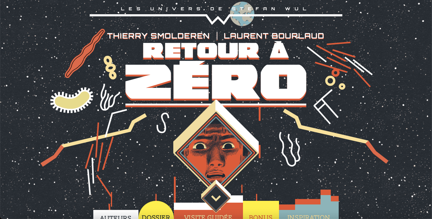
This website for the Retour à Zero comic book features the iconic cover of the book front and center. Their animated landing page has ironically landed in space – with microorganisms and objects flying about!
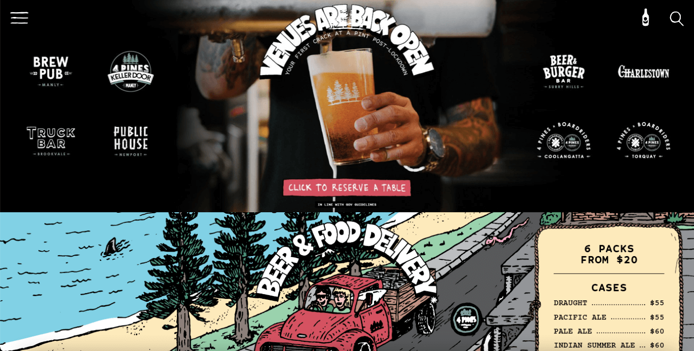
#9: 4 Pines Beer
Bonus: Your Simplified Guide To A Minimalist Web Design
4 Pines beer takes us on a road trip with doodle characters and pints of cold beer; that’s all we need for the summer! Their vibrant artwork and carefully curated color palette perfectly complement their black web interface and hand-lettered typography, creating an immersive experience that’s as refreshing as their brews.
#10: Szende Brassai
Interested in folk themes and art? Szende Brassai’s website serves you both in a mystical-Transylvanian web design filled with stunning doodle art! The best doodles are ones that come from a place that’s authentic to your culture and identity.
Simplified Design Tip: Feeling inspired to make your own doodle art online? Try uploading a rough sketch with a transparent background. Then upload a photo behind the doodle, to turn an ordinary photo into doodle art, right from your Simplified workspace!


![10 Best AI Image Restoration Tools to Try in 2025 [Free & Paid]](https://siteimages.simplified.com/blog/Best-AI-Image-Restoration-Tools-01.png?auto=compress&fit=crop&fm=png&h=400&w=400 "10 Best AI Image Restoration Tools to Try in 2025 [Free & Paid]")
![How to Use Photoshop AI Generative Fill Feature [2025]](https://siteimages.simplified.com/blog/How-to-Use-Photoshop-AI-Generative-Fill-01-1.png?auto=compress&fit=crop&fm=png&h=400&w=400 "How to Use Photoshop AI Generative Fill Feature [2025]")
![20 Podcast Thumbnail Ideas to Boost Your Show’s Visual Appeal + Best Practices [2025]](https://siteimages.simplified.com/blog/Podcast-Thumbnail-Ideas-to-Boost-Your-Show-02-1.png?auto=compress&fit=crop&fm=png&h=400&w=400 "20 Podcast Thumbnail Ideas to Boost Your Show’s Visual Appeal + Best Practices [2025]")


