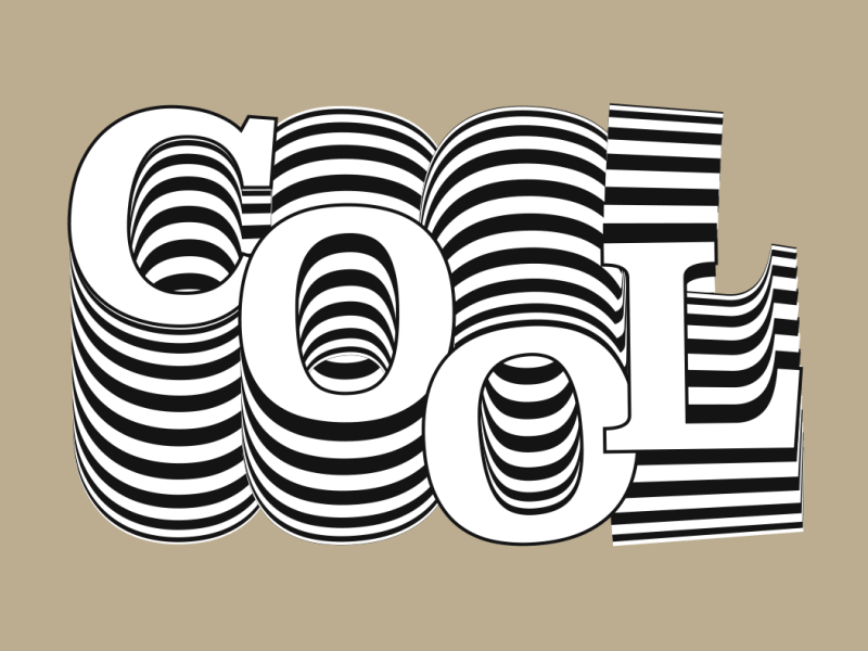
At Simplified, we talk a lot about digital design, typography, and animation to keep you updated with the latest trends. In this blog post, we’re delving into the captivating world of kinetic typography. Whether you’re already familiar with this animation technique or new to it, we’re here to explore and showcase some incredible kinetic typography examples that are bound to inspire and engage you.
Kinetic typography animation has been a prominent feature in music videos, movie tributes, and various other mediums. By harnessing the power of moving text, this animation style not only captures attention but also conveys emotions and central ideas to the audience.
We will be examining a selection of the finest kinetic typography examples, highlighting their seamless combination of technique, audience engagement, and effective communication.
Let’s dive in!
What is Kinetic Typography?
Kinetic typography, also known as “moving text,” is a mesmerizing animation technique that seamlessly blends motion and text to convey ideas through video animation. This dynamic approach to typography presents text over time in a way that captures and evokes specific emotions or concepts.

Related: Why Visual Content Is The Future Of Marketing?
In today’s visual landscape, kinetic typography is everywhere you look. It graces commercials, music videos, mobile apps, and websites, infusing words with a powerful impact and an artistic flair.
However, this dynamic form of expression is not just a passing trend. It has a rich history dating back to the 1960s, when feature films first embraced animated opening titles, and it continues to captivate audiences to this day.
So, buckle up and get ready to explore the captivating world of kinetic typography as we delve into some remarkable examples that showcase its enduring charm and versatility.
20 Best Kinetic Typography Examples
Kinetic typography animation is used everywhere, from movies to ads. Check out some of the best kinetic typography examples to inspire your artistry!
1. Alfred Hitchcock’s North by Northwest (1959)
This is credited as the first feature film to extensively use kinetic typography. Watch the two-minute opening title sequence 👇
While the opening scene doesn’t give away too much about the film, the moving typography makes it intriguing and captivates the audience. It sets the tone, grabs attention, and builds anticipation. It also helps the audience read the text easily.
2. Video introducing Campfire Rebranding
In this motion graphics video, the creator has amply used kinetic typography to create excitement for the new brand look. The creative use of 3D animation along with text has made the simple text convey more.
The use of kinetic typography makes the overall video very expressive and perfectly holds the attention of the viewer to reach the most important part of the video, i.e. the brand-new look of the brand.
3. Jump (Ford F-150)
A car advertisement is not someplace you’d expect to see kinetic typography. And yet, in this video about the Ford F-150, the text is what tells the story.
Thirty seconds isn’t a lot of time to make an impact, and Ford seems to be aware of this, starting the video with the phrase, ‘OK, LOOK…’
This no-nonsense approach holds for the rest of the video and works to grab viewers’ attention.
Ford uses big, bold text to match a big, bold car, and the result is a captivating video that gets its message across plain and simple!
Related: How to Create an Engaging Video Script [+Free Generator]
4. The Alphabet – NEWGOLD
The Alphabet is an animated short video created by Alessandro Novelli of NEWGOLD in 2010.
The video features alphabets from A through Z represented by different fonts for each alphabet.
The video has added Fréhel’s “Si tun’étais pas là” as a background track to add more charisma.
It uses kinetic typography animation to create a nice and engaging learning experience
Related: Add Music To Your 2023 iMovie Projects in 3 Simple Steps
5. Tomorrow I’ll be Brave (Jessica Hische)
Tomorrow I’ll be Brave is a children’s bedtime story by Jessica Hische. This animated video uses kinetic typography to bring the book’s pages to life in this fun, short trailer.
The most interesting thing about this video is that the words themselves create entire scenes. For example, the word ‘STRONG’ becomes the tunnels of an ant farm, and the word ‘CONFIDENT’ is the battleground for a knight slaying a dragon.
This approach makes the video quite different from typical book trailers and presents an interesting way to use kinetic typography.
6. Husbands: Dream
This music video manages to make good use of kinetic typography with black. It is fresh music with a black background that lights up the lyrics, using bright fonts.
Cauboyz is behind the creative style of presenting individual boxes and putting words inside of them.
The way the animator designed the whole animation in the video is cool, as it perfectly matches the nature and beats of the song.
7. Emotions
This kinetic typography example showcases how kinetic typography animation can express emotions in just a few seconds.
It takes kinetic typography to the next level by implementing clever wordplay. The way that the words rearrange to create something new is mesmerizing, and the interesting use of colors really makes them more effective.
8. Rick and Morty
What’s better than a kinetic typography example from your favorite TV show?
Created by the motion graphics artist Gary Motion, this example of kinetic typography adds visuals to a classic comedy TV moment. It is quite flashy and fast-moving, but it conveys the moment perfectly.
It’s a super slick piece that has some great detail, like the diagonally-sliding text and the varied use of style and color.
9. Fusion Design
The video is a remarkable example of combining motion graphics and kinetic typography to create an engaging video. You would enjoy listening to music and viewing the artistic work that the artist embedded in the video.
Dusan Tatalovic uses incredible text movements to communicate the message, combining it with dazzling animation and a cool song to make you stay and watch the video till the end.
If you are looking to create a music video, you can take some ideas from this work.
Related: 10 Ways To Use Doodle Art In Web Design
10. Apple
No list of amazing videos can be complete without an Apple ad.
The purpose of this video is to showcase how Apple is going carbon neutral, and the use of typography conveys it strongly. The use of string visuals in between, along with the minimalist color palette, adds more personality to the narrator, resonating with the brand identity.
Related: Your Personal Guide to Minimalist Fonts
11. Be Water, My Friend (Júlio Cargnin Pereira)
This short video packs an incredible punch.
The audio, snipped from an interview conducted shortly before Bruce Lee’s untimely death, is married perfectly with the kinetic typography, and this superb editing has earned the video thousands of views.
Message aside, this video is a great example of how versatile kinetic typography can be.
The words stretch, float, melt, flow, and do whatever else is required to complement the story. It shows that, just as water can be manipulated, so can typography.
12. Find your Focus – Headspace
This kinetic typography example is an animated short video by Headspace that came out in 2018.
The video makes excellent use of typography to coax people into following the steps to guided meditation through kinetic typography.
13. Uptown Funk – Music Video
This kinetic typography example is another visualization of the hit song “Uptown Funk” by Bruno Mars.
The typography visualization is as entertaining and fun as the beats of the famous song. The artist plays with different types of fonts in a vibrant color palette to match the vibe of the song.
14. Curisity – Student Design Awards
This kinetic typography video explains the concept of curiosity through words, simple illustrations, and a voiceover.
The typographic effects make the narration impactful and powerful. The moving words and illustrations make the message more memorable as well.
15. Nobody Tell This to Beginners
Here is another example of a video trying to explain a concept in kinetic typography.
The overall template has a soothing effect, which is further enhanced by the instrumental music. Despite having no narration or voiceover, the video wins because of the sharp movements and effects added by the creator.
16. The Dark Knight – Joker’s Scene
Here is another kinetic typography example from the memorable movie scene of The Dark Knight.
The movement of the words, along with creative effects added for emphasis, makes this an interesting example to study. The video also plays on the meaning of the words based on their impact.
17. Burger King – Rebranding Video
This creative video uses kinetic typography in multiple parts to emphasize on some fundamental aspects of the brand.
What makes this video great is how the typography is shown across mediums in both online and offline communication. The video plays seamlessly to take the viewer on a fun and tasty ride!
18. Rolling Stones Video – Doom and Gloom
The use of kinetic typography, along with striking illustrations, makes this video stand out. The overall aesthetic of the video is gritty, resonating with the music and beats of the band.
19. Coldplay – Atlas
In this mesmerizing collaboration, New York-based agency Blind Pig and creative agency Hugo & Marie have crafted a stunning video that brings together the captivating art of kinetic typography and motion graphics.
Drawing inspiration from the sky map and myths created by Mika Liedberg, this visually enchanting animation takes viewers on a continuous journey. Accompanied by the soul-stirring melodies of Coldplay, prepare to be enthralled by the blend of visuals and music that unfolds before your eyes.
Related: 9 Creative Branding Trends of 2023
20. The Light in the Dark
Prepare to be amazed by Eli Guillou’s remarkable video, designed to inspire those who find themselves lost in the darkness.
With stunning kinetic typography at its core, this masterpiece sheds light on the path forward. Get ready for a mind-bending experience as the meticulously crafted combination of text, voice acting, music, effects, and transitions takes you on an unforgettable journey.
Join the Ride with Typography Today!
Through this blog post, we have explored the enchanting world of moving text, delving into awe-inspiring examples that demonstrate the power of kinetic typography to captivate and communicate.
As a creative person, whether you’re a professional designer or an enthusiastic learner, Simplified is your go-to resource. Discover the latest trends, gain insights, and unlock your creative potential with our comprehensive toolkit and expert guidance to create videos.
Now, take the next step on your kinetic typography journey and unleash your creativity with Simplified. Explore a world of modern fonts, graphic design, color palettes, and create engaging video scripts with the AI writer. Try it today and experience the transformative power of kinetic typography firsthand.


![10 Best AI Image Restoration Tools to Try in 2025 [Free & Paid] 10 Best AI Image Restoration Tools to Try in 2025 [Free & Paid]](https://siteimages.simplified.com/blog/Best-AI-Image-Restoration-Tools-01.png?auto=compress&fit=crop&fm=png&h=400&w=400)
![How to Use Photoshop AI Generative Fill Feature [2025] How to Use Photoshop AI Generative Fill Feature [2025]](https://siteimages.simplified.com/blog/How-to-Use-Photoshop-AI-Generative-Fill-01-1.png?auto=compress&fit=crop&fm=png&h=400&w=400)
![20 Podcast Thumbnail Ideas to Boost Your Show’s Visual Appeal + Best Practices [2025] 20 Podcast Thumbnail Ideas to Boost Your Show’s Visual Appeal + Best Practices [2025]](https://siteimages.simplified.com/blog/Podcast-Thumbnail-Ideas-to-Boost-Your-Show-02-1.png?auto=compress&fit=crop&fm=png&h=400&w=400)


